
When we started building the Documentation page here at Deepgram, we had a lot of nested pages and routes. Rather than have all those links listed out on the side, we wanted the user to be able to expand and collapse them in order to have a cleaner look and feel.
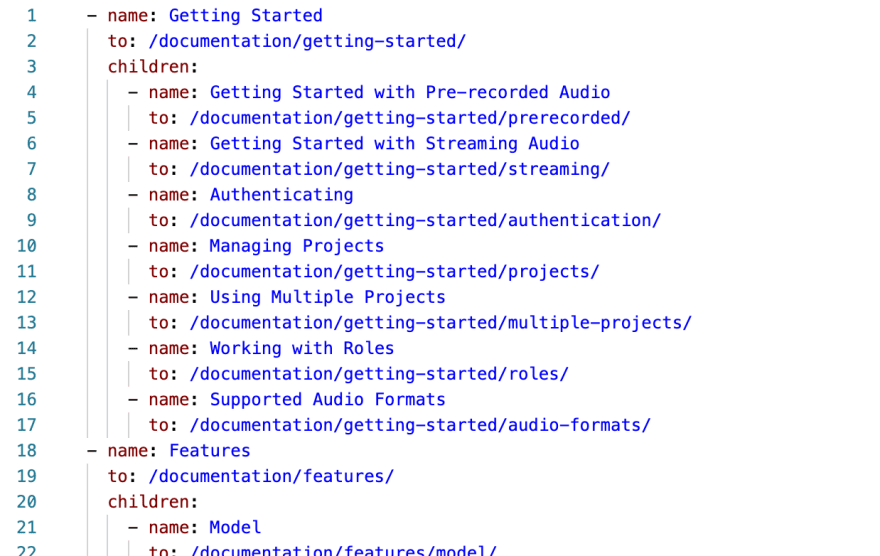
At the top level of our navigation, we have a SideNavigation.vue component that gets the navigation information from a navigation.yml file in our content folder. Each navigation element can have a children property (shown below) that lists out the child routes of that page.
This is the original template we had set up for the component:
<template>
  <ul>
    <li
      v-for="nav of navigation"
      :key="nav.to"
      :class="{ active: isActive(nav) }"
    >
      <NuxtLink :to="nav.to" :title="nav.title || nav.name">{{
        nav.name
      }}</NuxtLink>
      <NavList v-if="nav.children" :navigation="nav.children" />
    </li>
  </ul>
</template>
The component was recursively going through the navigation object and creating new NavList components if there were children routes. Basically, it is rendering another version of itself inside of itself. So the NavList component renders another NavList component. Sort of like component Inception. Don't worry about an infinite rendering of NavLists though. It will render a child NavList only if there are children to the navigation object.
I like the fact that it is recursive, making it dynamic. That way, we don't have to specify when to use a 'child' NavList component. It also presented a problem. I needed some way to identify which sub-menus were open and which were not. After some thought and some rubber ducking, I settled on having a data property containing an array of the parent route paths that were expanded. I called it childrenShow.
data() {
    return {
      childrenShow: [],
    }
  },
If a parent route has a path of /documentation/getting-started/, the entire string gets pushed into the array. Then, as the child NavList components get added to the page, I needed to check if they should be shown using a v-show directive. I did this by using the isExpanded method, which takes in the current nav object (which comes from the original YAML file for the nav list structure via the v-for above) and checks it against the childrenShow array to see if should be shown.
Also, since there is already a v-if on the NavList, and I can't use both a v-if and a v-show on the same element, I had to create a container template to handle the v-if. So the NavList line will change to this:
<template v-if="nav.children">
  <NavList v-show="isExpanded(nav)" :navigation="nav.children" />
</template>
This worked well as-is. The menus collapse and expand when the user clicks on the respective expand/collapse button. The only issue now is that the transition wasn't smooth, which can be a little jarring.
After playing with transitions for a while and not having much success for this use case, I talked to a co-worker, and he sent me this article from Markus Oberlehner that talks about transitioning to an element's full height. So I created a new component called TransitionExpand.vue and put this code in there:
<script>
export default {
  name: `TransitionExpand`,
  functional: true,
  render(createElement, context) {
    const data = {
      props: {
        name: `expand`,
      },
      on: {
        afterEnter(element) {
          // eslint-disable-next-line no-param-reassign
          element.style.height = `auto`
        },
        enter(element) {
          const { width } = getComputedStyle(element)

          /* eslint-disable no-param-reassign */
          element.style.width = width
          element.style.position = `absolute`
          element.style.visibility = `hidden`
          element.style.height = `auto`
          /* eslint-enable */

          const { height } = getComputedStyle(element)

          /* eslint-disable no-param-reassign */
          element.style.width = null
          element.style.position = null
          element.style.visibility = null
          element.style.height = 0
          /* eslint-enable */

          // Force repaint to make sure the
          // animation is triggered correctly.
          // eslint-disable-next-line no-unused-expressions
          getComputedStyle(element).height

          requestAnimationFrame(() => {
            // eslint-disable-next-line no-param-reassign
            element.style.height = height
          })
        },
        leave(element) {
          const { height } = getComputedStyle(element)

          // eslint-disable-next-line no-param-reassign
          element.style.height = height

          // Force repaint to make sure the
          // animation is triggered correctly.
          // eslint-disable-next-line no-unused-expressions
          getComputedStyle(element).height

          requestAnimationFrame(() => {
            // eslint-disable-next-line no-param-reassign
            element.style.height = 0
          })
        },
      },
    }

    return createElement(`transition`, data, context.children)
  },
}
</script>

<style scoped>
* {
  will-change: height;
  transform: translateZ(0);
  backface-visibility: hidden;
  perspective: 1000px;
}
</style>

<style>
.expand-enter-active,
.expand-leave-active {
  transition: height 0.5s ease-in-out;
  overflow: hidden;
}

.expand-enter,
.expand-leave-to {
  height: 0;
}
</style>
There is a lot of stuff happening in that component. To understand it better, visit the link above to Markus' blog. He goes into the detail you need.
I then changed the template tag that was containing the child NavList component, to a transition-expand tag like this:
<transition-expand v-if="nav.children">
  <NavList v-show="isExpanded(nav)" :navigation="nav.children" />
</transition-expand>
That made the expand/collapse transition much smoother and created a better user experience. It was a challenging problem that was fun to figure out. If you want to see a working example of it, you can check out this code sandbox. If you want to see it on our production site, you can see it on our Documentation page.

Top comments (0)