
Python has a rich set of data visualization libraries. You may be familiar with charting libraries such as Matplotlib, Seaborn, Bokeh, Plotly that allow visualization capabilities. Pygal is one among them.
However, Pygal specializes in SVGs(Scalable Vector Graphics). SVG is an XML based vector image format that supports interactivity and animation. Since SVGs are stored in XML based text files, they are easily searchable and compressible. SVG images can also be created and edited using any text-based editor. All major modern browsers support SVG format.
Pygal library supports several charting types like Bar, Line, Histogram, Pie etc. Here is the complete list of charting types supported by Pygal. Also, Pygal generated SVGs could be integrated with Flask and Django responses.
In this article, let’s explore Pygal charting library’s capabilities by creating charts using COVID data. I am using COVID data from by NY times from this Github link Here is the raw data source for states data.
Install Pygal libraries
We are going to use the render_in_browser command to render created charts in the default browser. This command needs the lxml library.
pip install pygal
pip install lxml
Bar chart using default styling
import pandas as pd
from datetime import date
import pygal

def extract_data():
    # read states data using Panda's library
    df = pd.read_csv("us-states.csv")
    df['date'] = pd.to_datetime(df['date'])

    # Filter dataset to only have data for July 1, 2020
    date_to_filter = pd.Timestamp(date(2020,7,1))
    df = df[ (df['date'] == date_to_filter ) ]

    # Get top 10 states with most cases by sorting data by descending number of cases
    df.sort_values("cases", inplace=True, ascending=False)
    top_10 = df.head(10)

    # Extract top 10 states
    state_list = list(top_10['state'])
    cases_list = list(top_10['cases'])

    return zip(state_list, cases_list)


def make_chart(data):
    # Generate Bar chart using default style
    b_chart = pygal.Bar(explicit_size=25)
    b_chart.title = "Top 10 US states with most COVID cases on July 1, 2020 using Pygal"
    for (s, d) in data:
        b_chart.add(s, d)
    b_chart.render_in_browser()


if __name__ == "__main__":
    data = extract_data()
    make_chart(data)
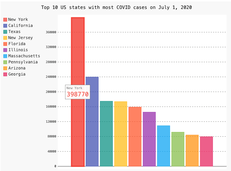
Here is the generated bar chart:
Pie chart using custom styling
import pandas as pd
import pygal
from datetime import date
from pygal.style import Style

def extract_data():
    # read states data using Panda's library
    df = pd.read_csv("us-states.csv")
    df['date'] = pd.to_datetime(df['date'])

    # Filter dataset to only have data for July 1, 2020
    date_to_filter = pd.Timestamp(date(2020,7,1))
    df = df[ (df['date'] == date_to_filter ) ]

    # Find total cases in all states
    df['total'] = df['cases'].sum()

    # Get top 5 states by sorting data by descending number of cases
    df.sort_values("cases", inplace=True, ascending=False)
    top_5 = df.head(5)

    # Extract states and top 5 states and cases percent to total
    state_list = list(top_5['state'])
    cases_percent = list((top_5['cases']/top_5['total']) * 100)

    return zip(state_list, cases_percent)


def make_chart(data):
    # Create custom styles
    custom_style = Style(colors=('#DB8274', '#338391', '#D3A3D9', '#900C3F', '#D4D068'))

    # Generate Pie chart using custom style
    pie_chart = pygal.Pie(explicit_size=25, style=custom_style)
    pie_chart.title = 'Top 5 US states with most COVID cases on July 1, 2020 (in %)'
    for (s, d) in data:
        pie_chart.add(s, round(d, 2))
    pie_chart.render_in_browser()


if __name__ == "__main__":
    data = extract_data()
    make_chart(data)
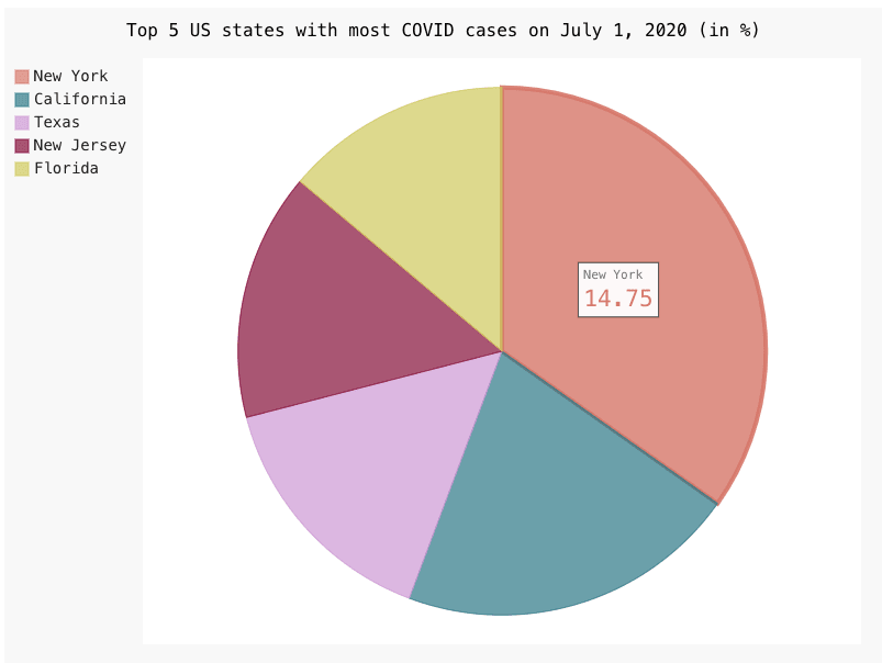
Here is the generated Pie chart using custom styling:

Top comments (0)