
CSS Grid Layout is a powerful tool for creating complex and responsive web layouts. It provides a grid-based system that allows you to arrange elements on a webpage in rows and columns. Here is an outline for a blog post on exploring CSS Grid Layout:
Introduction to CSS Grid Layout
The CSS Grid Layout Module offers a grid-based layout system, with rows and columns, making it easier to design web pages without having to use floats and positioning.

      <div class="grid-container">
        <div className="grid-item">1</div>
        <div className="grid-item">2</div>
        <div className="grid-item">3</div>
        <div className="grid-item">4</div>
        <div className="grid-item">5</div>
        <div className="grid-item">6</div>
      </div>
.grid-container {
  display: grid;
  grid-template-columns: auto auto auto;
  background-color: #f1f1f1;
  border: 1px solid #000;
}
display: grid;: This property is set to grid, which establishes the element as a grid container. Any direct children of this element will become grid items.
grid-template-columns: auto auto auto;: This property defines the number and size of the columns in the grid. In this case, there are three columns, and the auto value indicates that each column should take up the necessary space to accommodate its content.
background-color: #f1f1f1;: This property sets the background color of the grid container to #f1f1f1, which is a light gray shade. You can modify the color value to suit your design preferences.
border: 1px solid #000;: This property creates a border around the grid container. It sets the border width to 1px, the border style to solid, and the border color to #000, which represents black. Adjust these values as needed.
With this code, any element with the class .grid-container in your HTML markup will display as a grid container with three columns, a light gray background, and a black border.
To use this grid layout, you can add grid items as direct children of the grid container and apply appropriate positioning or span properties to them, such as grid-column or grid-row, to control their placement within the grid.
Grid spacing :
In grid spacing gap property is used.
gap: 20px;

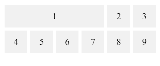
Grid Column Property
The grid-column property is used in CSS Grid Layout to control the placement and spanning of grid items along the horizontal axis (columns) within a grid container. It specifies the starting and ending grid lines that the item should occupy.
The grid-column property accepts two values: the start line and the end line. Here's the syntax:
.grid-container {
  display: grid;
  grid-template-columns: auto auto auto auto auto auto;
  gap: 10px;
  padding: 10px;
}

.grid-container > div {
  background-color: #f1f1f1;
  text-align: center;
  padding: 20px 0;
  font-size: 30px;
}

.item1 {
  grid-column: 1 / 5;
}
 <div class="grid-container">
    <div class="item1">1</div>
    <div class="item2">2</div>
    <div class="item3">3</div>
    <div class="item4">4</div>
    <div class="item5">5</div>
    <div class="item6">6</div>
    <div class="item7">7</div>
    <div class="item8">8</div>
    <div class="item9">9</div>
  </div>
Grid Screen Layout Examples
CSS Grid Layout is a powerful layout system in CSS that allows you to create grid-based designs for webpages. It provides a two-dimensional grid of rows and columns, where you can position and align elements with precision.
.item1 {
  grid-area: header;
}
.item2 {
  grid-area: menu;
}
.item3 {
  grid-area: main;
}
.item4 {
  grid-area: right;
}
.item5 {
  grid-area: footer;
}

.grid-container {
  display: grid;
  grid-template-areas:
    "header header header header header header"
    "menu main main main right right"
    "menu footer footer footer footer footer";
  gap: 10px;
  padding: 10px;
}

.grid-container .grid-item {
  background-color: #f1f1f1;
  text-align: center;
  padding: 20px 0;
  font-size: 20px;
}
 <div class="grid-container">
      <div class="grid-item item1">Header</div>
      <div class="grid-item item2">Sidebar</div>
      <div class="grid-item item3">Section</div>
      <div class="grid-item item4">Section</div>
      <div class="grid-item item5">Footer</div>
  </div>

Top comments (0)