
I was building a site for displaying and selling art so I wanted a site layout that displays variable-sized products in a clean and organized way.
Creating Cards
I knew I wanted to focus mainly on the image since it's an art display, but I also wanted to include the title and an add-to-cart button for each piece of content. As I started to build the element in my mind, it naturally took form in a card style with the image on top and the rest of the info stacked below it. Of course, I also wanted to make sure that the elements, particularly the images, could resize themselves to fit correctly within the screen-size. Flexbox it is.
Firstly, I create a div to serve as the container element. This will be the "card" part of the card layout, with the image, title, and add-to-cart button contained inside it, I'll add a .product-card class to this.
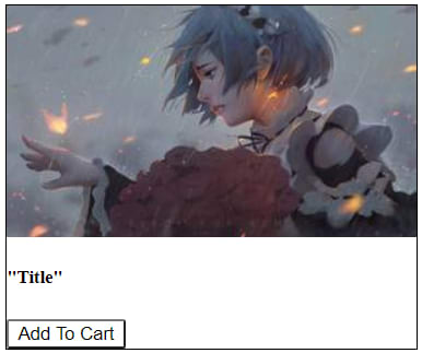
    <div class="product-card" id="1">
      <img src="#" />
      <h5>"Title"</h5>
      <button class="add_to_cart">Add To Cart</button>
    </div>
This will eventually need to be a flex container to keep everything easily responsive, so I'll set display: flex; and since I want the content to be stacked from the top to the bottom (rather than left-to-right), I'll set flex-direction: column;. Adding a few other lines for style and we get our basic responsive card.
.product-card {
  display: flex;
  flex-direction: column;
  margin: 5px;
  outline: 1px solid black;
}

.product-card button {
  max-width: 6.5em;
}
Customizing Cards
To make the card look a little better, I'll add some custom formatting. I'd like the title to be more pronounced and superimposed over the image. Since we'll be working with position: absolute; to do this, I'll also add position: relative; to my product-card container so that it acts as the anchor, and I'll add a small margin to the top of the add-to-cart button. I also want the content to shrink if necessary, rather than being cut off if the screen size is too small. Since the images are inside of the container div, that's as easy as setting the images' max-width: 100%;
.product-card h5 {
  font-size: 1.5em;
  margin: 0;
  position: absolute;
  bottom: 15%;
  opacity: 60%;
  max-width: fit-content;
}

.product-card img {
  max-width: 100%;
}

.product-card {
  ...
  position: relative;
}

.product-card button {
  ...
  margin-top: 7px;
}

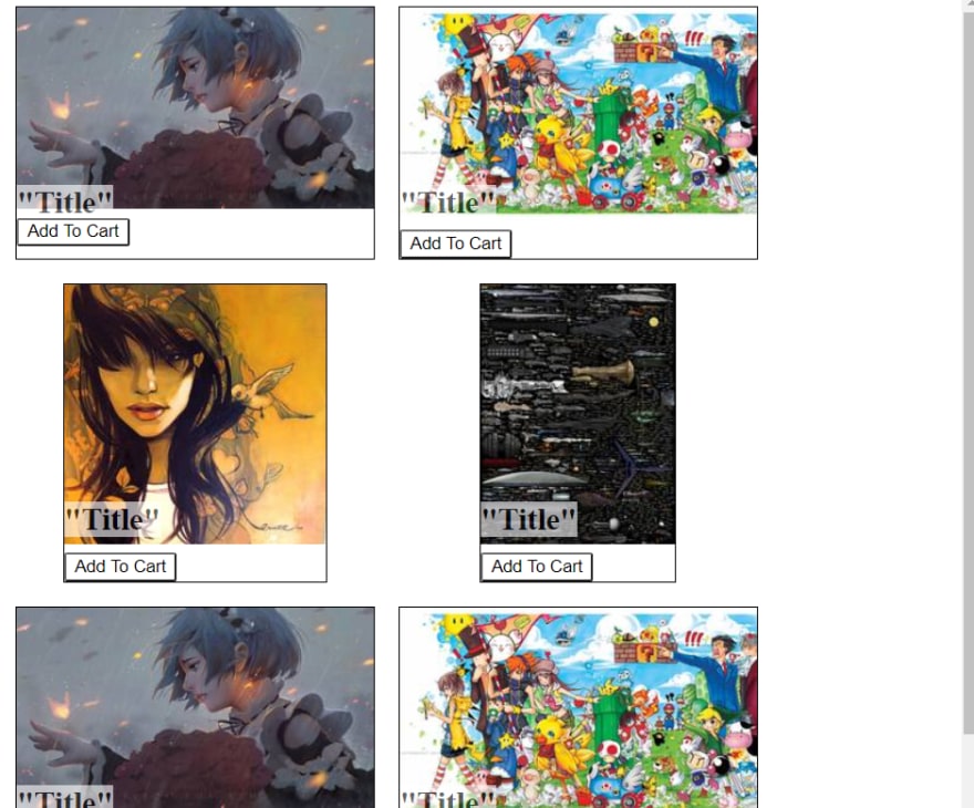
Displaying cards in the layout
Now that I have a pretty card-based display for my content, it's time to organize the layout. Here are my layout requirements:
- The layout should be organized into rows of content
- Content width should adjust as needed based on screen-size without distorting the images
- Cells in same row/column should be uniform height & width and should conform to largest item
- Content should be centered in its cell
- When new content is created it should automatically be uniformly added to the layout
The first thing I'll definitely need is to wrap the list of content cards into a container div. This div will provide the structure and formatting for the actual layout.
<div class="products-container">

  <div class="product-card" id="1">
    <img src="#" />
    <h5>"Title"</h5>
    <button class="add_to_cart">Add To Cart</button>
  </div>

  <div>...next product card</div>
  <div>...next product card</div>
  <div>...etc</div>

</div>
FlexBox Layout
Normally, I'd continue with Flexbox to make responsive design simple. All I'd do is create a container element with flex display, add some sizing guidelines and wrapping rules just like I did with the cards, and then I’m pretty much done.
.products-container {
  width: 80%;   /* products take up 80% of page leaving room for other components */
  display: flex;
  flex-wrap: wrap;
}
Unfortunately, that approach didn’t work this time. Due to the varying size of the images, the layout started doing some pretty funky things, especially with the way the elements were wrapping. It works, and it satisfies all the requirements except for #3, but it's just not as clean and organized as I want it to be without the uniform sizing.

Grid Layout
So I needed to use something to enforce the row/column structure. When I think row and column (2-dimensions), I think of a grid. Handily, CSS has a grid display built in, so I'm going to use that.
.products-container {
  width: 80%;   /* products take up 80% of page leaving room for other components */
  display: grid;
}
Now comes the fun part. How do I set up the grid to satisfy all the requirements, particularly #2 (changing width as needed)? The line of CSS I need looks like this: grid-template-columns: repeat(auto-fit, minmax(200px, 1fr));. This basically says "create as many uniform-width columns as will fit on each row, then wrap to the next row and repeat," but I'll break this down and explain.
-
grid-template-columns: defines how many columns there should be and their respective sizes. In a simpler use case, this could simply begrid-template-columns: 100px 100px 100pxto create a table with 3 100px columns. -
repeat(): This specifies a column sizing pattern that will be repeated a given number of times. -
auto-fit: In order to satisfy requirement #5, I need to avoid hardcoding column size or count, this should be determined by the content and screen-size. Auto-fit will fill the row with as many columns as will fit based on the width of the columns (which is in turn determined by the largest content in its row). -
minmax(200px, 1fr): This sets a minimum column size (200px) to avoid the grid trying to fit all the content onto a single row and squeezing the cells to nearly invisible, and a maximum column size (1fr) which denotes "one equal share of the remaining available space." This is how we specify the width should be determined by the largest content in its row.
Once that's done, we'll have our grid layout complete, but you'll notice that requirements #2 and #4 are not completely satisfied. The width does indeed adjust, but it's distorting the images and messing up some other card styling, and there's just a lot of white space since the content isn't centered. To fix, we'll just add justify-items: center; to center horizontally and align-items: center; to center vertically.
.products-container {
  display: grid;
  width: 80%;
  grid-template-columns: repeat(auto-fit, minmax(200px, 1fr));
  justify-items: center;
  align-items: center;
}
And done! Now we have a clean, organized UI that is responsive both to the screen-size and to the specific content that's rendered. This is really important in the real-world since content is generally rendered programmatically so it needs to be added to the layout without the programmer knowing its dimensions.
Here is a comparison of these 2 UI results in my real site, built with React. You can better see the wonky effects from using flexbox with the various sized images:
| First using FlexBox | Then using Grid |
|---|---|
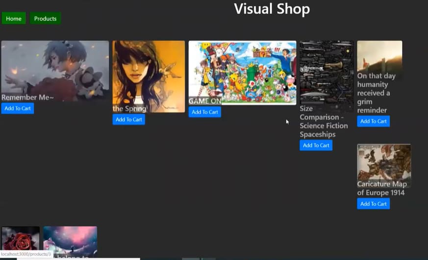 |
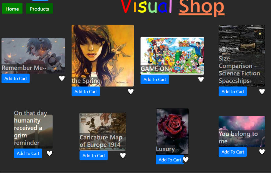 |

Top comments (0)