
Introduction
As part of my ongoing series, I’ll cover some basic principles of responsive design when it comes to accessibility. So what is responsive design? On the surface level, It is ensuring that regardless of screen size it should automatically expand and contract to fit the respective container, fluidly. But, I prefer to extend the definition past that and include that all user preferences should be taken into account when loading the page.
Thankfully, CSS and HTML give us plenty of options to ensure we can make all elements of our website responsive!
Responsive design and fluidity
It’s crucial to make your webpage elastic. Most users will view your page from a variety of different screen sizes from a variety of devices (computers, mobile, tablets, tv, etc). No matter the dimensions of the said screen it should fit appropriately stretch and elongate however necessary for the content to continue being accessible.

By Muhammad Rafizeldi from https://commons.wikimedia.org/
This can be achieved through a variety of different techniques. Flexbox and Grid are something that will cover most of our bases.
One helpful video I’ve seen that clearly explains several responsive layouts is this one from Google:
These are only some layouts. But essentially we want our page to be fluid.
Another helpful tool to aid in making layouts more responsive is a media query.
Responsive media queries
Layout
First and foremost I STRONGLY recommend creating media queries with EM and REM units As in my previous post, EM units are far superior for font and layouts. It will ensure it scales with personalized configurations of the browser whether it be font size or extensions for custom style sheets.
Here is an example:
@media (max-width: 46.875em) {
// ...apply specific rule
}
Safari bug
There is a famous bug with safari that made this kind of media query a risk to do for users of this browser. But at the time of writing this article, there are still some inconsistencies. Credits to @thecodercoder in this Twitter thread for some visual examples:
Does anyone use em units in their media queries? I've noticed that most websites (including big popular ones and frameworks) seem to all use pixels.03:56 AM - 11 Mar 2022


Does anyone use em units in their media queries? I’ve noticed that most websites (including big popular ones and frameworks) seem to all use pixels.
Although this may require some more testing to cover all edge cases, this may not be the optimal solution. As always test and adapt to your use case. Here’s another blog post with more details on the EM media queries.
Responsive design: animations
But this doesn’t stop here! If your page has animations to help beautify the page it’s important to consider users who have possible adverse effects to animations on the webpage. There is a media feature that helps us combat this: prefers-reduced-motion.
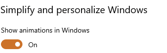
The user can typically toggle this preference through the system. Windows example:
Windows animation settings
The animations used throughout the application should have a media query toning done or completely disabled the animation in cases where the user may have these options enabled/disabled.
@media (prefers-reduced-motion) {
    .animation {
        // Or which ever name you have to turn off the animation animation-name: disabled;
    }
}
Another important media feature to consider for users that may have some sensitivity to pages with a light or dark theme: prefers-color-scheme. While we should offer the. The two possible values are light and dark. These can be checked for within the CSS.
Here is a pure CSS example:
@media (prefers-color-scheme: dark) {
    // ...dark theme styling
}

@media(prefers-color-scheme: light) {
   // ...light theme styling
}
Responsive Design: Media and Viewport
Media
We’ll start off with some of the initial configurations that can be done for the web page. Stylesheets have a little-known property called media. This can have the following values:
I’ll leave this link explaining more in detail what each property means. But this is important to take into consideration for rendering certain different styles for users with different needs. For example, a stylesheet that is more important for user’s who use braille would need the following stylesheet:
This can also be applied with media properties:
@media braille {
    // ...styles
}
Viewport
The viewport is what you’re most likely looking at right now. It’s the window within which the web content is displayed. On smaller devices, there is typically a virtual viewport that scales down the web content to fit on smaller devices.
This can change the responsiveness of our media queries. So what do we do? Enter the viewport meta tag.
The code above is the most common viewport adjustment you’ll see. Let’s break it down. This is a meta tag in HTML and it is labeled with the viewport name. The width can be set to a PX amount, device-width , in this case, refers to the width of the screen in px but at a scale of 100%. The initial-scale property manages the initial zoom level on page load.
One caveat is that this does not have universal support:
caniuse for viewport
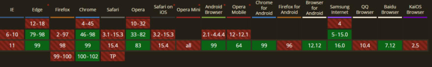
Find more info here.
Conclusion
As always making your website as accessible as possible is incredibly important. All users should be able to use the internet and all its pages.
I hope some of these tips and tricks aid you in creating a more user-friendly and accessible page. I guarantee you that users will truly appreciate it!
In the next article, I plan to cover accessible media (images, video, and audio).
Leave down in the comments below any other accessibility tips when it comes to responsive design.
More content at Relatable Code
If you liked this feel free to connect with me on LinkedIn or Twitter
Originally published at https://relatablecode.com on March 16, 2022.

Top comments (4)
Brilliant post, Diego. Love that you've included
prefers-reduced-motionas well! 👊Thank you! it's not too much effort for a huge gain in experience for some users 👊
Very useful tips! Enjoyed reading the entire series.
Thank you. Glad you enjoyed them! 🙂