
In my previous post about reviewing accessibility, I covered a lot of the HTML-structure-based implementations you can do to make it more accessible, especially for screen readers!
However, there are a ton of options to making a webpage more accessible from a visual point of view. In the second part of this series, I’ll cover font.
Accessibility: Relative length units
EM and REM are CSS units that describe the size of spacing or font. The important aspect of EM and REM is that they scale according to different font sizes. EM scales according to the font size of the parent element while REM scales according to the font size of the root element.
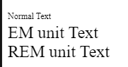
Why is this scaling so important? Well, a user can adjust the font size in their browser:
Or they could have extensions/plugins that can load custom style sheets with custom font sizes. It’s important to take these possibilities into consideration. All padding, margin, spacing, and font sizes should be changed to use these types of units!
Here’s a visual example breaking it down:
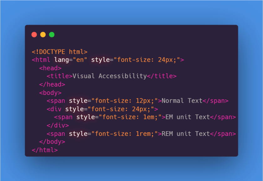
The output:
The EM and REM units have the same size as the EM unit takes the size from the parent div and the REM unit takes it from the root element (aka the HTML Tag).
Font size in general should not go below 0.875rem which in most cases is the equivalent of 14px. Anything smaller and users will most likely have to zoom in to read the text comfortably.
Accessibility: Colors and Contrast
One of the more important factors of choosing a color for the text is the corresponding contrast between the foreground and the background. This is a very important factor in choosing the color scheme.
This can affect the readability of text in not only visually impaired readers but even past that it helps all users have an easier time digesting the text.
Thankfully there are some tools that can help us overcome this contrast problem. WebAIM has a popular one of their website:
https://webaim.org/resources/contrastchecker/
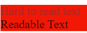
This comes built into the dev tools. Let’s take this text as an example:
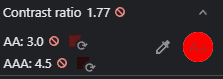
If we right-click the text on a webpage, go to the Elements tab and click on the color of the tab we’ll see some contrast ratio options near the bottom of the newly opened popup:

Expanding the contrast ratio will give us two options to help out with some new colors!
Clicking on the little icons next to the square will suggest a better color to go with the background.
To give a small explanation of the meanings of the numbers:
WCAG 2.0 level AA requires a contrast ratio of at least 4.5:1 for normal text and 3:1 for large text. WCAG 2.1 requires a contrast ratio of at least 3:1 for graphics and user interface components (such as form input borders). WCAG Level AAA requires a contrast ratio of at least 7:1 for normal text and 4.5:1 for large text.
Comparing the new colors side-by-side we get the following:
New and improved accessible font color
Wow, that’s a lot better!
Choosing the best font style
This is far more straightforward than the previous two as the font style should be standardized across the website. However, there are some considerations that are important when choosing a font.
The best fonts are simple with little ambiguity about what each character is. The natural space and weight of the fonts are important. As a general rule of thumb, the weight should not be below as it becomes significantly harder to read.
The natural font size should follow similar guidelines to what I mentioned before. nothing below the 0.875em.
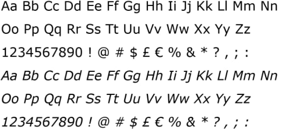
One good example of a readable font is (there are others but just to show an example of what it may look like).
Verdana:
That about wraps up fonts for now! In the next part of this series I plan to cover images and what to do (and not do) to make them more accessible.
Hopefully, this served as a good introduction to making your site’s font more accessible. Leave any additional tips or feedback in the comments below.
More content at Relatable Code
If you liked this feel free to connect with me on LinkedIn or Twitter
Originally published at https://relatablecode.com on March 9, 2022.

Top comments (0)