
Disclaimer: The graphic and model materials involved in this article are only for personal study, research and appreciation. Please do not re-modify, illegally spread, reprint, publish, commercialize, or conduct other profit-making activities.
Background
If you have played 🎮 《King of Glory》 , 《Onmyoji》 and other mobile games, you must have noticed its startup animation, skin vertical drawing cards and other scenes, often using static A simple animation of the base image and local liquid flow effect. These flow animations may appear in the slow-flowing water flow 🌊, the flag fluttering in the wind 🎏 , the game character sleeve 🧜♀️, Cloud, rain, fog weather effects that slow down with time ⛅ etc. This transition effect not only saves the cost of developing full-scale animations, but also makes the game screen more enthusiastic, adventurous, 💰, and advanced, and it is also easier to attract players.
This paper uses front-end development technology, combined with SVG and CSS to achieve a similar liquefaction flow effect. Knowledge in this article: mask-image 、 feTurbulence feDisplacementMap 、 filter 、 canvas drawing method, TimelineMax animation and input[type=file] local image resource loading, etc.
Effect
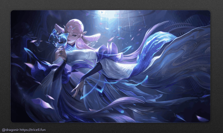
Let's take a look at the implementation effect first. The following examples and the 👆 article Banner figure are all applied with the liquid flow animation effect generated by the content of this article. Since GIF the image compression is serious, the animation effect does not look very smooth 🙃 , you may wish to experience the effect yourself through the following demo page link and generate your own legend , Collection Skin vertical painting 😅.
-
👁🗨Online preview: https://dragonir.github.io/paint-heat-map/ -
👁🗨Online preview: https://codepen.io/dragonir/full/qBoxQKW
🌀 Mist Diffusion The Legend of Zelda: Breath of the Wild

💃 Fluttering Diao Chan: Cat Shadow Phantom Dance
🌅 Huguang Wave

🔠 Text Liquefaction

📌Tips: the experience page is deployed in Gitpage the uploading image function is not really uploaded to the server, but will only be loaded into the browser locally, the page will not get any information, you can experience it with confidence , don't worry about privacy leaks.
Codepen
See the Pen
paint-heat-map by dragonir (@dragonir)
on CodePen.
Accomplish
The page is mainly composed of 2 part, the top is used to load the picture, and you can draw the hotspot path by pressing the 🖱 mouse swipe to add a flow effect to the picture; the bottom is the control area , click the button 🔘 清除画布 , you can clear the drawn flowing animation effect, click the button 🔘 切换图片 to load the local picture.

📌Note, there is also an invisible function, when you finish drawing, you can click🖱Right mouse button , and then choose to save the picture, the saved picture is the path we draw fluid animation Using this heat map and using the knowledge ofCSSin this article, you can convert static pictures into dynamic pictures!
HTML page structure
#sketch element is mainly used to draw and load the drawing board of the flow effect heat map; #button_container is the button control area at the bottom of the page; filter svg element filter Filters to achieve liquid flow animation effects, including feTurbulence and feDisplacementMap filters.
<main id="sketch">
  <canvas id="canvas" data-img=""></canvas>
  <div class="mask">
    <div id="maskInner" class="mask-inner"></div>
  </div>
</main>
<section class="button_container">
  <button class="button">清除画布</button>
  <button class="button"><input class="input" type="file" id="upload">上传图片</button>
</section>
<svg>
  <filter id="heat" filterUnits="objectBoundingBox" x="0" y="0" width="100%" height="100%">
    <feTurbulence id="heatturb" type="fractalNoise" numOctaves="1" seed="2" />
    <feDisplacementMap xChannelSelector="G" yChannelSelector="B" scale="22" in="SourceGraphic" />
  </filter>
</svg>
💡 feTurbulence and feDisplacementMap
- feTurbulence : The filter uses the
Perlinnoise function to create an image, which can be used to simulate artificial textures such as moiré and marble. - feDisplacementMap : Map displacement filter that replaces pixel values from in to space
inan image with pixel values fromin2to space from the image. That is, it can change the pixel position of elements and graphics. By traversing all the pixels of the original graphics,feDisplacementMapremaps and replaces a new position to form a new graphics. The mainstream application of this filter in the industry is to deform, distort, and liquefy graphics.
CSS styles
Then look at the implementation of the style, main element as the main container and the main pattern as the background image; canvas as the canvas to occupy the space of 100% ; .mask and .mask-inner are used to generate the effect of the hotspot path and the background image as shown below, which is achieved with the help of mask-image . Finally, in order to generate a dynamic flow effect, .mask-inner pass the filter:url(#heat) the previously generated svg as the source of the filter, and the follow-up will be in JavaScript By continuously modifying the properties of the svg filter, a liquid flow animation is generated.
main {
  position: relative;
  background-image: url('bg.jpg');
  background-size: cover;
  background-position: 100% 50%;
}
canvas {
  opacity: 0;
  position: absolute;
  top: 0;
  left: 0;
  width: 100%;
  height: 100%;
}
.mask {
  display: none;
  position: absolute;
  top: 0;
  left: 0;
  width: 100%;
  height: 100%;
  mask-mode: luminance;
  mask-size: 100% 100%;
  backdrop-filter: hard-light;
  mask-image: url('mask.png');
}
.mask-inner {
  position: absolute;
  top: 0;
  left: 0;
  width: 100%;
  height: 100%;
  background: url('bg.jpg') 0% 0% repeat;
  background-size: cover;
  background-position: 100% 50%;
  filter: url(#heat);
  mask-image: url('mask.png')
}

💡 mask-image
mask-image CSS attribute is used to set the image of the mask layer on the element.
Syntax :
// The default, a transparent black image layer, i.e. no mask layer.
mask-image: none;
// <mask-source><mask> or CSS image url
mask-image: url(masks.svg#mask1);
// <image> image as mask
mask-image: linear-gradient(rgba(0, 0, 0, 1.0), transparent);
mask-image: image(url(mask.png), skyblue);
// multiple values
mask-image: image(url(mask.png), skyblue), linear-gradient(rgba(0, 0, 0, 1.0), transparent);
// global value
mask-image: inherit;
mask-image: initial;
mask-image: unset;
Compatibility :

⚡ This feature is still under development in some browsers and requires a
browser prefixto be compatible with different browsers.
JavaScript methods
① Draw a heat map
Listen for mouse movement and click events, and draw wave path hotspots on canvas.
var canvas = document.getElementById('canvas');
var ctx = canvas.getContext('2d');
var sketch = document.getElementById('sketch');
var sketchStyle = window.getComputedStyle(sketch);
var mouse = { x: 0, y: 0 };

canvas.width = parseInt(sketchStyle.getPropertyValue('width'));
canvas.height = parseInt(sketchStyle.getPropertyValue('height'));
canvas.addEventListener('mousemove', e => {
  mouse.x = e.pageX - canvas.getBoundingClientRect().left;
  mouse.y = e.pageY - canvas.getBoundingClientRect().top;
}, false);

ctx.lineWidth = 40;
ctx.lineJoin = 'round';
ctx.lineCap = 'round';
ctx.strokeStyle = 'black';

canvas.addEventListener('mousedown', () => {
  ctx.beginPath();
  ctx.moveTo(mouse.x, mouse.y);
  canvas.addEventListener('mousemove', onPaint, false);
}, false);

canvas.addEventListener('mouseup', () => {
  canvas.removeEventListener('mousemove', onPaint, false);
}, false);

var onPaint = () => {
  ctx.lineTo(mouse.x, mouse.y);
  ctx.stroke();
  var url = canvas.toDataURL();
  document.querySelectorAll('div').forEach(item => {
    item.style.cssText += `
      display: initial;
      -webkit-mask-image: url(${url});
      mask-image: url(${url});
    `;
  });
};
After the drawing is completed, you can right-click on the page to save the generated heat map of the wave path, and directly put the heat map that you are satisfied with drawing into CSS , you can add local wave effect to the picture you like, the following one The image is the fluctuating heat path map used on this example page.

② Generate animation
In order to generate the real-time updated wave effect, this article uses TweenMax to achieve the same function by changing the value of the baseFrequency property of feTurbulence, you also can use other animation libraries or using requestAnimationFrame.
feTurb = document.querySelector('#heatturb');
var timeline = new TimelineMax({
  repeat: -1,
  yoyo: true
}),
timeline.add(
  new TweenMax.to(feTurb, 8, {
    onUpdate: () => {
      var bfX = this.progress() * 0.01 + 0.025,
        bfY = this.progress() * 0.003 + 0.01,
        bfStr = bfX.toString() + ' ' + bfY.toString();
      feTurb.setAttribute('baseFrequency', bfStr);
    }
  }),
0);
③ Clear the canvas
Click the 清除画布 button to clear the drawn wave path, mainly by clearing the attribute value of the page element mask-image and clearing the canvas.
function clear() {
  document.querySelectorAll('div').forEach(item => {
    item.style.cssText += `
      display: none;
      -webkit-mask-image: none;
      mask-image: none;
    `;
  });
}

document.querySelectorAll('.button').forEach(item => {
  item.addEventListener('click', () => {
    ctx.clearRect(0, 0, canvas.width, canvas.height);
    clear();
  })
});
④ Switch pictures
Click to switch the picture, you can load a local picture as the drawing base map, this function is to obtain the picture resource through input[type=file] , and then set it to a new one by modifying CSS Canvas background.
document.getElementById('upload').onchange = function () {
  var imageFile = this.files[0];
  var newImg = window.URL.createObjectURL(imageFile);
  clear();
  document.getElementById('sketch').style.cssText += `
    background: url(${newImg});
    background-size: cover;
    background-position: center;
  `;
  document.getElementById('maskInner').style.cssText += `
    background: url(${newImg});
    background-size: cover;
    background-position: center;
  `;
};
At this point, all the functions have been realized. Let's make a startup page of your favorite wave skins or Odyssey mini game by this way 🤣 .

📥 Source address: https://github.com/dragonir/paint-heat-map
Summarize
The knowledge points included in this article mainly include:
-
mask-imagemask element -
feTurbulenceandfeDisplacementMapsvgfilters -
filterattribute -
Canvasdrawing method -
TimelineMaxanimation -
input[type=file]local image resource loading
If you want to know other front-end knowledge or other knowledge that is not described in detail in this article Web 3D development technology related knowledge, you can read my previous articles. Please indicate the original address and author when reprinting . If you think the article is helpful to you, don't forget to follow me 👍 .
Appendix
- My 3D column can be accessed by clicking this link 👈
- [1]. 🌐 Use Three.js to achieve a cool cyberpunk style 3D digital earth screen
- [2]. 🦊 Three.js implements a 3D open world game: Ali's multiverse
- [3]. 🔥 Three.js flame effect to realize the dynamic logo of Aerden's Ring
- [4]. 🐼 Three.js Realize the 2022 Winter Olympics theme 3D fun page, including Bing Dun Dun
...- [1]. 📷 The front-end implements a very impressive browser-side scanning function
- [2]. 🌏 The Legend of Zelda: Breath of the Wild
- [3]. 😱 Realize cyberpunk 2077 style visual effects with CSS only a few steps
...

Top comments (3)
Gosh! It's even hard to believe that such an amazing effect can be done using only CSS & Three.js 😱 Loved the article buddy, looking forward to learn new things from Three.js with you! 🥳
Thanks, I just created DEV account yeaterday and this is my first article, I'll post more useful article in the future 😊
Love this one already, can't wait to see it! 🤙🏼