Creating custom components in Vue can be a great way to abstract out logic and complexity, and form input components are often a great place for that. I recently created a custom radio group component, and although I found documentation for many of the necessary pieces, it was particularly challenging to find fully-coded examples — so after finishing it up, I decided to share the full code here.
There isn’t one way to solve this problem, and there were absolutely tradeoffs along the way. I’ll do my best to highlight those, and you should feel free to make different choices based on your specific needs.
Finally, a huge shoutout to my coworkers at EnergySage, who spent hours reviewing my code, researching, and coming up with new ideas. I find that the best work is often done collaboratively, and this was no different.
What does this component do?
This custom radio group component can be used at a variety of complexities. It supports simple radio button questions, like this:

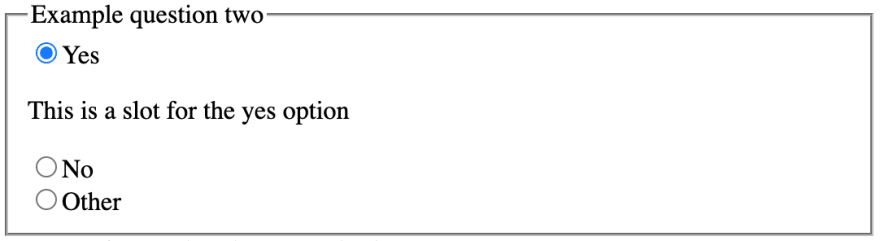
It also supports more complex radio button questions, like toggling the visibility of extra details between the options:
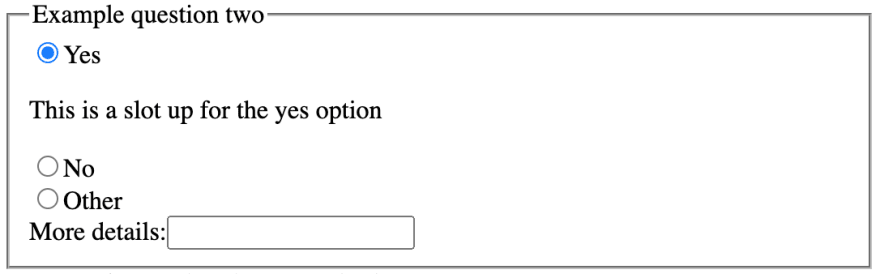
And even nesting interactive elements:

This component also supports required and disabled questions.
The Code
Here’s the CodeSandbox for the component. Feel free to use this code, or read on for details on some of the implementation decisions and troubleshooting tips I ran across in creating it.
Setting the :checked attribute
One of the most challenging parts was figuring out how to set the checked attribute properly. For a while, I was using the approach from a Smashing Magazine tutorial (definitely worth a read if you’re looking into different ways to go about this; it got me 90% of the way there). However, I ended up consolidating the logic into the checked attribute on the <input>. option.value === value compares whether the current value of the component is equal to the value of the given radio button option on this iteration of the v-for loop; if they are the same, then we must want to display that the given radio button option is selected. I personally found this to be more concise and readable, plus it helped out with the logic for nested elements.
Supporting nested elements
Supporting nested elements can be done using the same logic that the checked attribute uses:
<slot v-if="option.value === value" :name="option.value" />
This slot will be filled with any content passed in from ParentComponent.vue whose <template> matches the slot’s name attribute. The slot’s v-if ensures that only the currently selected option’s slot renders, as opposed to all of the slots passed in from the parent rendering.
I found this logic a bit confusing at first. I think a good way to understand it is to look at how the component renders without the v-if attribute:
And without the :name the slots can’t be matched up with the options properly (this is also what would happen if the <template> didn’t match the values in the options array):

You can add interactive elements inside one of these slots, and access its value just as you would any other element. In the example code above, we have v-model="fields.otherText" on our “More details” <input>. This will update the fields.other_text attribute in our data just as we would expect it to with any other input.
More resources
Again, huge thanks to my coworkers; many of these insights and ideas were theirs and the collaboration that went into this was incredibly helpful. Here are a few of the other resources that came in handy while creating this:
- https://www.smashingmagazine.com/2017/08/creating-custom-inputs-vue-js/
- https://www.vuemastery.com/courses/vue3-forms/base-input
- https://bootstrap-vue.org/docs/components/form-radio
This article was cross-posted on Medium.com here.

Top comments (0)