
For an interactive tutorial, visit here
If you've been trying to get a grip on Flexbox - here's a practical tutorial for you. No crap, no fluffs, just the very important practical tricks you need to know.
1. How to perfectly center an element
The first thing that comes to mind here may be, “hey, that’s so simple to achieve”. But is it?
Consider the Markup below.
Pretty simple. It’s essentially just placing an image into a document.
<!doctype html>
<html lang="en">
<body>
    <img src="https://media.giphy.com/media/JIX9t2j0ZTN9S/giphy.gif" width="200px" />
</body>
</html>
No one loves ugly designs. So we’ll go ahead and give the entire document a backgound-color.
body {
  background-color: #f1c40f;
}
Below is what we have now.
HTML
<!doctype html>
<html lang="en">
  <head>
    <title>Centering with Flexbox</title>
  </head>
<body>
    <img src="https://media.giphy.com/media/JIX9t2j0ZTN9S/giphy.gif" width="200px" />
</body>
</html>
CSS
html,
body {
    width: 100%;
  height: 100%;
}
body {
  margin: 0;
  background-color: #f1c40f;
}
Output

So, let’s perfectly center the image to the center of the document.
First step, make the body element a flex-container.
body {
  display: flex
}
Simple enough. Now we may perfectly align the image.
body {
  display: flex;
  justify-content: center;
  align-items: center;
}
Voila! The image is now centered perfectly. In the code listing above, Lines 3 and 4 are the magic wands that make things happen.

Now the image will be center-aligned.
The complete code solution is seen below. If you'd like, you can play around with the code here. You can take away the highlighted lines, and see how they individually affect the display.
HTML
<!doctype html>
<html lang="en">
  <head>
    <title>Perfeclty centered image</title>
  </head>
<body>
    <img src="https://media.giphy.com/media/JIX9t2j0ZTN9S/giphy.gif" width="150px" />
</body>
</html>
CSS
html,
body {
    width: 100%;
  height: 100%;
}
body {
  margin: 0;
  display:flex;
  background-color: #f1c40f;
  justify-content: center;
  align-items: center;
}
2. How to create sticky footers
If you’ve written CSS for a while now, I’m certain you recognize this problem.
It’s a pain in the neck to keep the footer of your page at the bottom of the page even when the page sparse content. Gladly, there is a solution with Flexbox.
Consider the markup below:
<!doctype html>
<html lang="en">
  <head>
    <title>Sticky footer</title>
  </head>
<body>
  <header></header>
  <main></main>
  <footer></footer>
</body>
</html>
It’s a basic page setup with a header, an area for the main content, and a footer.
So that each section of the page is distinguishable, let’s go ahead and give them different background colors.
header {
  background-color: #27ae60;
}

main {
  background-color: #3498db;
}

footer {
  background-color: #c0392b;
}
Now make certain that the body of the document fills the entire screen
body {
  min-height: 100vh;
}
Technically, line 2 says, “make sure the minimum height (min-height) of the body element is 100% of the viewport height (vh)”
The term viewport refers to the user’s visible area of a web page.
Now let’s make make things happen
body {
  margin: 0;
  display: flex;
  flex-direction: column;
  min-height: 100vh;
}
In the code above, line 3 initializes the flexbox model. And line 4?
Remember, the default value for flex-direction is row.
flex-diection:column changes the direction from horizontal to vertical.
The children elements, header, main and footer will now be aligned vertically
Move on to the sweet spot. Give footer and header fixed heights.
header, footer {
  height: 50px;
}
And finally, on to making the footer sticky.
main {
  flex: 1 0 0;
}
I thought we were supposed to target the footer, and not main?
Yes, but the way we make the footer sticky is by instructing the browser to make main take the entire available space on the screen.
This leaves header and footer to heights of their own, while main grows to fit the available remaining space.
If you remember, flex: 1 0 0 says, “grow the container to fit the entire available space, keep the initial width at zero, and don’t shrink the item too”
Again, here’s the full code.
HTML
<html lang="en">
  <head>
    <title>Sticky footer</title>
  </head>
<body>
  <header></header>
  <main></main>
  <footer></footer>
</body>
</html>
CSS
header {
  background-color: #27ae60;
}

main {
  background-color: #3498db;
}

footer {
  background-color: #c0392b;
}

body {
  margin: 0;
  display: flex;
  flex-direction: column;
  min-height: 100vh;
}

header, footer {
  height: 50px;
}
main {
  flex: 1 0 0;
}
JavaScript
$(document).ready(function () {
$('#content').html('<span>Hello World!</span>');
});
Output

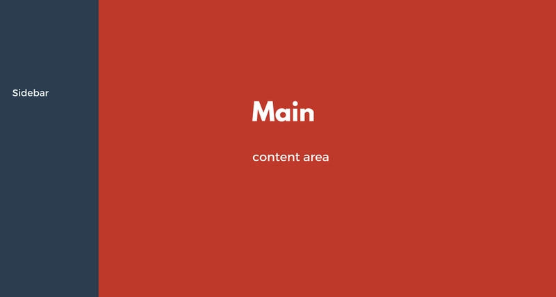
3. How to create basic grids with Flexbox
User Interfaces get complex. Chances are you’ll someday be needed to create sections with varying widths.
Examples of this include, pages with multiple column layouts such as the 2 column layout below.
Consider the basic setup below:
<html lang="en">
  <head>
    <title>2 column layout</title>
  </head>
<body>
  <aside></aside>
  <main></main>
</body>
</html>
So, we have an aside and a main tag. The aside will contain sidebar elements while the main tag will house the major contents of the page.
To begin solving this problem, as always, make body a flex container.
body {
  display: flex;
}
Let body fill up the user’s viewport
body {
  min-height: 100vh;
  display: flex;
}
On to the sweet spot of the solution.
Specify the widths of both aside and main.
aside {
  background-color: #2c3e50;
  width: 200px;
}

main {
  background-color: #c0392b;
  flex: 1 0 0;
}
Line 3 sets the width of the sidebar section to 200px. Easy enough.
Line 8 sets the main section to take up the remaining space available (i.e the entire space available minus 200px)
Remember that flex: 1 0 0 says “grow to fit the available space, DON’T shrink, and have an iniial width of zero”
Here’s all the code in action, with the result below too.
HTML
<html lang="en">
  <head>
    <title>2 column layout</title>
  </head>
<body>
  <aside></aside>
  <main></main>
</body>
</html>
CSS
body {
  height: 100vh;
  margin: 0;
  display: flex;
}

aside {
  background-color: #2c3e50;
  width: 200px;
}

main {
  background-color: #c0392b;
  flex: 1 0 0;
}

As always, you’ve NOT mastered the concept until you toy with the code. Please do!
4. How to create media objects with Flexbox
What is a media object?
To be honest, I’m not sure I have a very technical answer to that. However, below is an example:
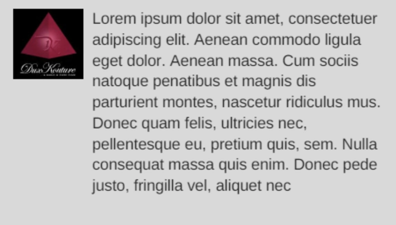
So, is it just a bunch of texts with an image side by side?
Well, sort of.
Don’t be quick to judge though. You’d be surprised how many sites implement this. For instance, take a look at a regular tweet:
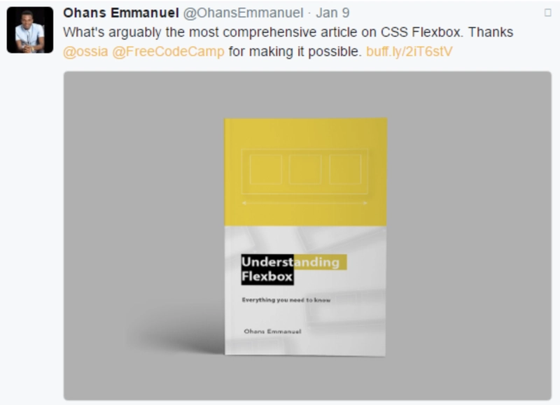
What do you see? A media object!
Let’s build one with Flexbox.
Consider the basic markup below:
<html lang="en">
  <head>
    <title>Media object with Flexbox</title>
  </head>
<body>
    <img src="https://media.giphy.com/media/JIX9t2j0ZTN9S/giphy.gif" width="200px" />
  <main>
    Lorem ipsum dolor sit amet, consectetuer adipiscing elit. Aenean commodo ligula eget dolor. Aenean massa. Cum sociis natoque penatibus et magnis dis parturient montes, nascetur ridiculus mus. Donec quam felis, ultricies nec, pellentesque eu, pretium quis, sem. Nulla consequat massa quis enim. Donec pede justo, fringilla vel, aliquet nec, vulputate eget, arcu. In enim justo, rhoncus ut, imperdiet a, venenatis vitae, justo. Nullam dictum felis eu pede mollis pretium. Integer tincidunt. Cras dapibus. Vivamus elementum semper nisi.
  </main>
</body>
</html>
So, we have our basic setup with an image and a main content area.
This is what that looks like now:
HTML
<html lang="en">
  <head>
    <title>Media object with Flexbox</title>
  </head>
<body>
    <img src="https://media.giphy.com/media/JIX9t2j0ZTN9S/giphy.gif" width="200px" />
  <main>
    Lorem ipsum dolor sit amet, consectetuer adipiscing elit. Aenean commodo ligula eget dolor. Aenean massa. Cum sociis natoque penatibus et magnis dis parturient montes, nascetur ridiculus mus. Donec quam felis, ultricies nec, pellentesque eu, pretium quis, sem. Nulla consequat massa quis enim. Donec pede justo, fringilla vel, aliquet nec, vulputate eget, arcu. In enim justo, rhoncus ut, imperdiet a, venenatis vitae, justo. Nullam dictum felis eu pede mollis pretium. Integer tincidunt. Cras dapibus. Vivamus elementum semper nisi.
  </main>
</body>
</html>
Output
Initiate the Flexbox model by making body a flex-container.
Here’s the result of that:
HTML
<html lang="en">
  <head>
    <title>Media object with Flexbox</title>
  </head>
<body>
    <img src="https://media.giphy.com/media/JIX9t2j0ZTN9S/giphy.gif" width="200px" />
  <main>
    Lorem ipsum dolor sit amet, consectetuer adipiscing elit. Aenean commodo ligula eget dolor. Aenean massa. Cum sociis natoque penatibus et magnis dis parturient montes, nascetur ridiculus mus. Donec quam felis, ultricies nec, pellentesque eu, pretium quis, sem. Nulla consequat massa quis enim. Donec pede justo, fringilla vel, aliquet nec, vulputate eget, arcu. In enim justo, rhoncus ut, imperdiet a, venenatis vitae, justo. Nullam dictum felis eu pede mollis pretium. Integer tincidunt. Cras dapibus. Vivamus elementum semper nisi.
  </main>
</body>
</html>
CSS
body {
  display: flex;
}
Output
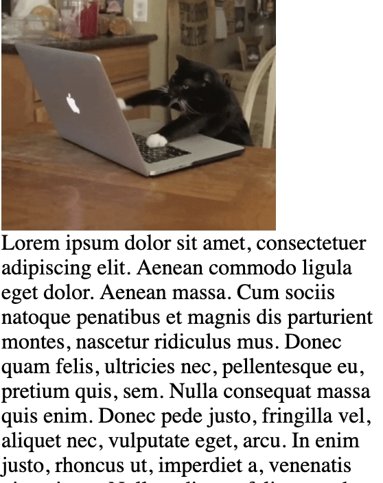
Yeah - that looks horrible.
The image is stretched to fit the vertical axis. This is because by default, align-items is set to stretch.
Let’s change that.
HMTL
<html lang="en">
  <head>
    <title>Media object with Flexbox</title>
  </head>
<body>
    <img src="https://media.giphy.com/media/JIX9t2j0ZTN9S/giphy.gif" width="100px" />
  <main>
    Lorem ipsum dolor sit amet, consectetuer adipiscing elit. Aenean commodo ligula eget dolor. Aenean massa. Cum sociis natoque penatibus et magnis dis parturient montes, nascetur ridiculus mus. Donec quam felis, ultricies nec, pellentesque eu, pretium quis, sem. Nulla consequat massa quis enim. Donec pede justo, fringilla vel, aliquet nec, vulputate eget, arcu. In enim justo, rhoncus ut, imperdiet a, venenatis vitae, justo. Nullam dictum felis eu pede mollis pretium. Integer tincidunt. Cras dapibus. Vivamus elementum semper nisi.
    Lorem ipsum dolor sit amet, consectetuer adipiscing elit. Aenean commodo ligula eget dolor. Aenean massa. Cum sociis natoque penatibus et magnis dis parturient montes, nascetur ridiculus mus. Donec quam felis, ultricies nec, pellentesque eu, pretium quis, sem. Nulla consequat massa quis enim. Donec pede justo, fringilla vel, aliquet nec, vulputate eget, arcu. In enim justo, rhoncus ut, imperdiet a, venenatis vitae, justo. Nullam dictum felis eu pede mollis pretium. Integer tincidunt. Cras dapibus. Vivamus elementum semper nisi.
  </main>
</body>
</html>
CSS
body {
  display: flex;
  align-items: flex-start;
  background-color: #8cacea;
  color: #fff;
}

img {
  margin-right: 1em;
}
Output

Now we have our media object - perfect aligned. You may have noticed I put in some color there.
As always, you’ve not mastered the concept until you toy with the codes. That’s the whole point of this interactive article.
Please go back and make sure you subtract, add and play around the code - you can do anything!
Conclusion
I’m really glad you not only began this tutorial, but have completed it!
So what are you going to do now?
Be sure to go over the code, master it and go build some incredible UIs!
Over time, you’ll come to see how helpful these tricks are. Happy learning!

Top comments (0)