I recently watched a recording from Figma's "Office Hours" series.
The session was all about components. They covered a ton of great stuff. There's something for everyone -- from those in the early days of their component journey to advanced component creators.
One thing they mentioned offhandedly (a little too offhandedly, for how cool and useful it is!) is using auto-layout to hack an editable progress bar component.
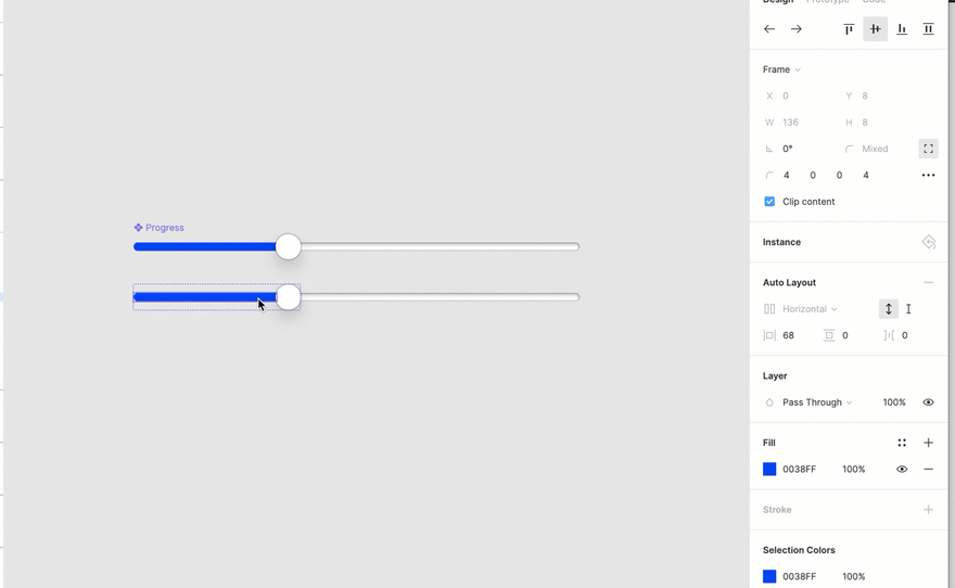
This really caught my eye. I work on a budgeting tool called You Need a Budget (YNAB). As you can probably imagine, simple "progress bar" data visualizations are quite useful to help people quickly make sense of their money and how they're doing on achieving their financial goals.
In the past, if we wanted to add a "progress bar" component to our design system, we would have to create a bunch of different variants (e.g. 25% full, 50% full, etc.) to represent various states of completion, because you can't override the width of elements within a component.

This autolayout hack will allow us to create a single "progress bar" component that designers can adjust to whatever width they'd like. Pretty handy!

Here's how to do it:
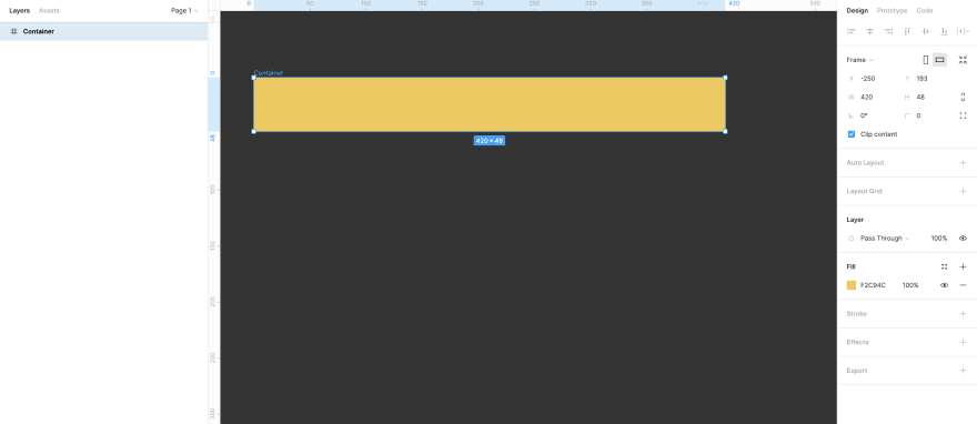
1. Create a container frame
This will be the background of your progress bar component, so give it whatever dimensions and styling you'd like. I chose a simple bright yellow background with sharp corners:
2. Create a "progress bar" frame within the container frame
Style this however you'd like your progress bar to look. Don't have to worry about its width, for now -- we'll make that editable in the next steps.
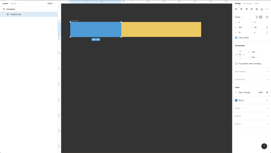
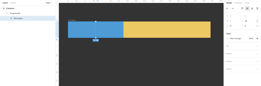
3. Create rectangle in the center of the progress bar frame.
This is where things get weird but cool. Just do it - you'll see why in the next step :) Make it 1px wide and go from the very top to the very bottom of your progress bar frame.

4. Add auto-layout to the progress bar frame
You can do this by selecting the progress bar frame and hitting shift+a or by adding auto-layout from the right-hand properties panel.
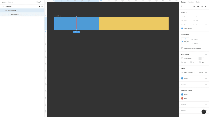
5. Make the rectangle in the progress bar frame invisible
You can do this a number of ways -- I chose to simply remove the fill.
5. That's it!
You can now adjust the horizontal padding on the progress bar frame to increase/decrease the size of the progress bar, like so:
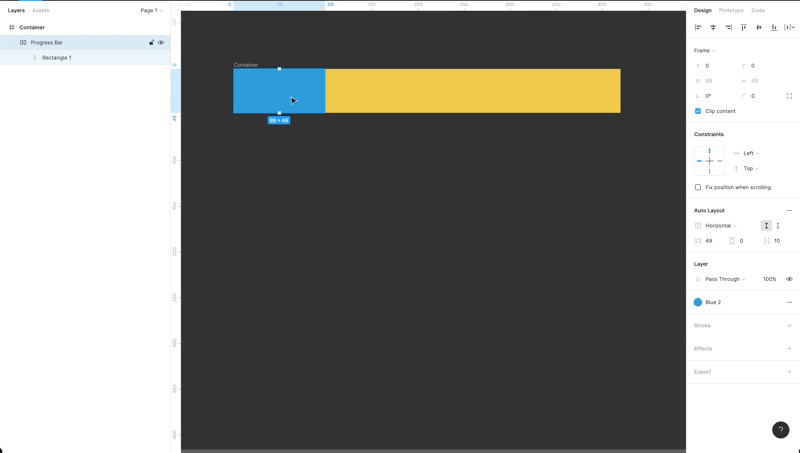
This works because auto-layout is applied to the parent container -- in this case, the progress bar. The only element within the parent container is the invisible rectangle.
So when you add horizontal padding to either side of the rectangle, that ends up increasing the parent container's (i.e. the progress bar's) overall width.
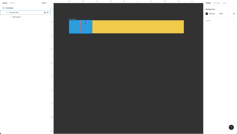
You can see this more clearly if I make the invisible rectangle visible; the padding on either side of it increases/decreases, which changes the overall width of the progress bar (i.e. the parent container):
And if we turn this into a component, the progress bar will remain editable because you can adjust auto-layout properties in component instances. Pretty handy!
Feel free to comment with any questions. I'd also be curious how other teams are using auto-layout and if anyone has discovered any other fun "hacks" like this one :)

Top comments (0)