The follow-up to “Reopening Safely: The Data Science Approach.” We examine the use of lockdowns, social distancing and other citywide measures and their effectiveness.

Notes:
- This article is the second in a series about using data science to analyze reopening strategies. If you haven’t already, read the first article before this one.
- All the code in this article has been based off of the covid-19 repository set up by epispot to help fight the coronavirus. The complete source code for the simulations in this article can be found there.
The last article has clearly proven that doing nothing is not a strategy when it comes to reopening cities in wake of the coronavirus. The speed at which the coronavirus spreads is too fast and uncontrollable to be left up to chance. However, the secret to mitigating the spread of COVID-19 lies in its predictability. As explained in the previous article, the SIR Model, and many others, can quite accurately model how a virus spreads. In fact, there exist many free open-source libraries that can run these models and give predictions. Just like in the last article, we will be using epispot throughout this article for modeling and analysis.
Part 1: Tracking Hospitalizations
In order to compare the various reopening strategies employed across the globe, we have randomly selected 4 cities with sufficient COVID-19-related hospitalization data. The cities are:
- Tokyo, Japan
- San Francisco, US
- New York, US
- London, UK
The associated hospitalization data has been linked along with the city names.
First, let’s take a look at how hospitalizations* in each of the five cities has progressed since the start of the coronavirus:
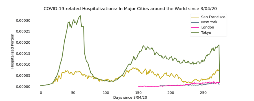
*We examine COVID-19-related hospitalization data because this data is the most accurate of all other data sources. Other sources, like case counting, rely on testing efforts which can only reach a small portion of the population each day.
Clearly, there is one trend line that completely dominates this graph — those hospitalizations are from Tokyo. Upon closer analysis, we can see that the peak begins to flatten after about the 40th day after 3/04/20, which corresponds with the date Japan imposed a nationwide state of emergency. After further lockdowns were implemented, Tokyo’s hospitalizations plummet within just 20 days, again highlighting the importance of small changes on a citywide or national level.
Even small changes made on a large-scale can have profound impacts on the change in coronavirus cases.
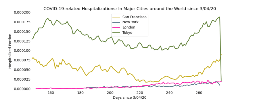
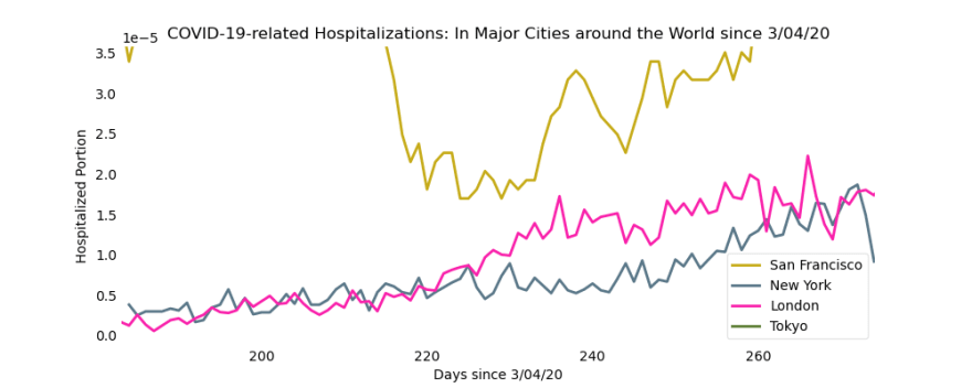
In order to focus on the more minute fluctuations of the hospitalizations, we zoom in on the bottom-right corner of the graph. Here are an additional two views:
Part 2: Tracking Cases
Example: San Francisco
Great! We have the hospitalization data, but there’s one crucial piece of information that is escaping these graphs: the confirmed cases! Without case information, it is impossible to truly understand how fast the disease will continue to spread. Thankfully, that’s not too hard to implement in epispot.
For those of you who are interested in the full source code, definitely check out the covid-19 repo from epispot, where all the code from this article is hosted. Here’s a quick snippet of the code used to fit the model:
If this code looks confusing to you, don’t worry! The goal here is to analyze the results, not worry about the code. Again, if you are interested in understanding this code, the epispot documentation is a great place to start (all resources linked at the end of this article). Essentially, the goal of this code is to fit a model to the hospitalization data that we downloaded earlier. Then, we can use epispot to predict the number of cases:
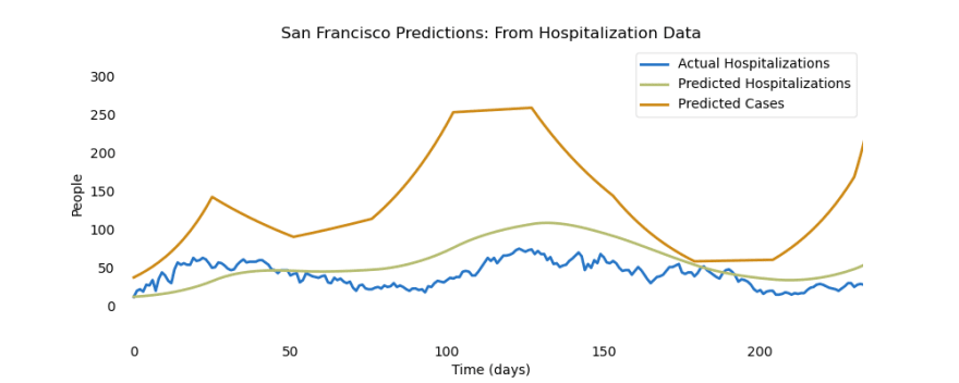
This graph reveals two important ideas, one of which we have already discussed. That is the fact that even small changes in some parts of the model (like changes in hospitalizations) can result in huge changes in other parts of the model (like changes in cases). This massive surge in cases over San Francisco’s coronavirus “waves” tell us that the rate that the disease is spreading will continue to increase, causing an exponential increase in the number of cases.
In other words, if the spread is controlled quickly by the use of lockdowns or other preventive measures, it won’t take long before San Francisco or any city is completely overwhelmed with coronavirus cases (and hospitalizations).
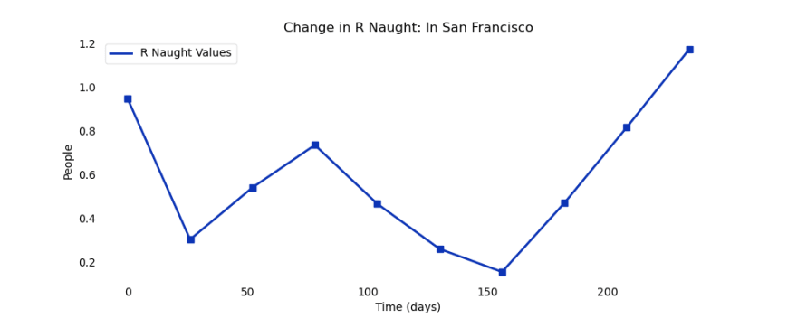
For the second and last part of the analysis, we examine the crucial R Naught parameter, also known as the basic reproductive number. This was one of the important parameters in SIR Model because it tells us how fast an outbreak is growing. In its most basic form, it measures how many people one infected infects over their entire infectious period.
R Naught > 1: Epidemic is growing
R Naught = 1: Epidemic has stopped growing
R Naught < 1: Epidemic is ending
Here is the corresponding R Naught graph for the cases in San Francisco:
The Wrap-Up (Not Quite)
Clearly, we have seen how the coronavirus has developed in many cities across the globe. We have used hospitalization data to generate case data, understand how different factors affect the growth rate of COVID-19, and seen some amazing visualizations of the spread of the coronavirus. Of course, there is still much, much more to be done. To start, we have not even started with predictions … and we still have not examined the hospitalization spike in Tokyo, and the slow case growth in New York and London as they begin reopening. All this and more in the next article in this series …
This is article two of the series “Reopening Safely”
References
epispot: The code library on GitHub used for the predictions and analysis shown in this article
matplotlib: The amazing Python graphics library used for the stunning visualizations shown throughout this article
covid-19: The repo where all code in this article is stored at (hosted by epispot & GitHub). You can find the full code, data, and sources for this article there.
Reopening Safely Part One: The first article in this series (goes over epispot, the SIR Model, and basic modeling techniques)
epispot documentation: For creating “Lessons Learned from Japan’s Response to the First Wave of COVID-19: A Content Analysis”models of your own! (make sure to check out the repo for instructions as well)
“Lessons Learned from Japan’s Response to the First Wave of COVID-19: A Content Analysis”: A paper for more information on Tokyo and Japan’s response as a whole to the coronavirus

Top comments (0)