interrupt_call(&pain, &timer(Time::from_sec(1.5))).meltdown();
I'm using tiling window managers since the beginning of my BSc. Obviously using Windows for software development, especially in case of embedded development is a horror. Another thing to mention is, floating windows and user interface interruptions can make me crazy. Sometimes when I am forced to use windows it's so hard to take control over my patience. People around me said that I am just hysterical (and maybe I am) but since I could use Linux on my working computer not just on my personal ones, my life gone calm.
Why should I process so many irrelevant, visual information every time I want to do a simple job? I spend my entire life behind monitors. 10-16 hours a day, I mean. I just simply don't have a nervous capacity for all of the interrupting popup windows, the icons, the clicky-clicky GUIs and the repetitive, manual workflows that proprietary software offers as "user friendly" features. I don't need guides and wizards.
I had the same problem with Gnome, KDE, XFCE and other floating window managers too. If you feel the same, try i3, dwm or other tiling wms.
This post is not about the ultimate solution of mine, just about a slice of it: my statusbar.
I am using dwm by suckless.org. To be honest, I have my own fork with some extra patches and my own config: exodwm
I tried i3 before and it was very handy. I think it's very good for a cold start if you are new to tiling wms.
complexity === wasting resources
Soon we will realize that, bloatwares and over-engineered solutions are as dangerous to our environment and health as toxic waste, wrong resource management and so on. Ok, this sentence leads to somewhere else. When I design a system I try to keep this in mind and make my product as simple as possible, to get the same functionality with the possibly lowest complexity. It's just a simple rule just like I don't leave the toliet dirty.
So let's talk about your desktop! Please drop every window down to the task bar and count every informative fields that you see now. Every text, icon, numbers, everything. Now try to sort them by their informative level. Suppose that we've got a ranklist with 3 levels:
- Information that are relevant in every workflow.
- Information that are relevant in a specific workflow.
- Irrelevant information. (If you have a "start" or "Applications" text near the taskbar's leader icon, it counts one.)
I think you can decide what conclusion you should get after this.
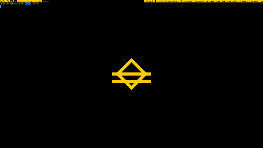
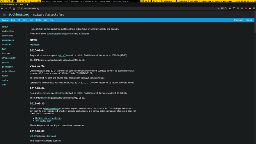
I tried to collect only those information that are relevant in all the workflows, put them into my taskbar and that's all. Therefore I have the following on my desktop screen:
- Keyboard layout. (Sometimes I have to write letters on my native language.)
- CPU temperature.
- Network RX/TX stats for all interfaces. (KBytes/sec, icon colors indicates if there were traffic in the previous iteration)
- Battery capacity in percentage and AC plug status (icon color).
- Current time.
- Current time in binary format. (just for fun)
Nice and simple. Comfy.
under the hood
The guys behind dwm were wise enough to implement a simple feature for this statusbar. dwm displays xroot's window name in this place, so the only thing I had to manage to fill xroot with a well forged string.
I decided to make this project in Rust. For system stats I chose systemstat.
Here you can find my repository for exostat.
happy ever after
Finally, after all of this, I found piece...
Ok, I have lot of plans with my own desktop environment setup, but I can say, using this tiling setting with this simple-to-modify statusbar,my workflow became fast and even to use this environment can be even recreational.


Top comments (0)