
Awwwards, in collaboration with Google, produced a great eBook called Speed Matters. Designing for Mobile Performance. It explains what mobile web users expect and how they behave, and then provides great insights on how to optimize your sites to provide a better experience.

This article is a summary of that eBook, which contains the things that I considered to be interesting and useful. Please read the full eBook for more details. On the last pages you’ll also find an extensive list of articles, videos and tools for more information.
The need for speed
53% of mobile site visits are abandoned if the pages take longer than 3 seconds to load.
The need for speed is a research carried out by Google which studies the relation between real and perceived performance by users.
The most important insight this study provides is this one:
Speed matters on the mobile web, but perception of speed is just as important.
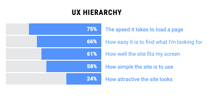
How important is speed for users?
Speed was rated as the most important UX factor for users when visiting a website: 75% of them mentioned it 🏆
In general, real downloading speed is quite fast. 7 out of 10 sites loaded in less than 4 seconds, and around 33% loaded in less than 1 second.
Google’s PageSpeed Insights is a great tool where you can test your website and get results for several speed metrics, both for desktop and mobile
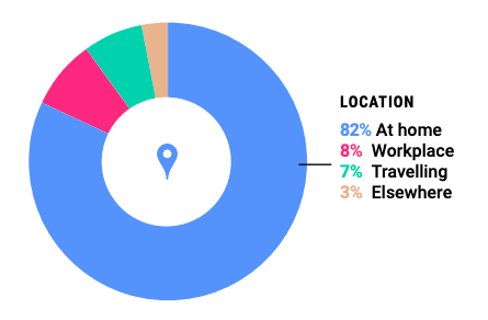
Mobile browsing in context
Mobile web browsing mainly happens at home (82% of the total) by people that are relaxed and calmed 😮 This fact was very surprising to me. If someone had asked me, I would have answered the opposite.
Which is not surprising is that in this context, page load speeds are perceived as being faster. For people that are at work or traveling/elsewhere, load times are perceived as being slower.
But even for fast loading sites, 29% of people still don’t actually perceive them as fast 🤔
So what affects the perception of speed?
These are the 4 external factors that affect speed:
Effective use of the site 👆
Web visits where actual speed was slow but felt to be fast tended to be retail sites. We know that long scroll sites are designed to populate the page “above the fold”, giving the impression that the page is complete, even though loading is still ongoing “below the fold”.

This can explain some of the distortion between the real and the perceived speed: the difference between the time after which a site can effectively be used vs. the time it takes to fully load. This is a prime example of design thought to optimize the perception of performance.
Age 👴
Younger users are more demanding. Users between 18 and 24 years old only perceived 50% of the sites as fast loading sites. This number goes up to 73% for users between 35 and 44 years old.
State of mind 💆♂
As previously said, when users are calm and relaxed, sites are perceived as being faster. In this context around 80% of the sites were perceived as fast loading sites.
When users are feeling rushed or anxious, the perceived speed slows down. In this context only around 40% of the sites were perceived as fast loading sites.
Place of activity 🏠
On the move things feel slower. For people sat down, 75% of the sites were perceived as fast. But for people on the move, only 52% of them. When we’re not at home and need the information as soon as possible, things feel slower.
Outcomes of speed
When perceptions of speed were thought to be fast, a higher percentage of users reported that:
- They could achieve their goals (92% vs 73% for slow perceived sites)
- They were more likely to return to the website again (95% vs 62% for slow perceived sites)
Speed also significantly impacted brand NPS (Net Promoter Score): an average of 92 points vs 44 for slow perceived sites.
Improve the perception of speed 🏃
Understanding interface response time
Not only the waiting time during loading is important, but also the time that the interface takes to respond to each interaction of the user. If the user has to wait 8 seconds for anything, he/she will most probably abandon the task 😰
Users have less patience when they first enter a site than when they make successive interactions within the same site. Some users will tolerate waiting up to 5 seconds for tasks that are part of the user flow.
First Meaningful Paint and Time to interactive
· First Meaningful Paint is the time required to show something useful in the screen to engage the user.
· Time to interactive is the time required by the browser to finishing building the DOM so the user can begin to interact with the application.
As we already discussed, most retail sites use a very good trick that addresses these two metrics: they produce a quick FMP and prioritize the load of necessary scripts so that the content becomes interactive.
Put the user in active mode
SOME years ago, executives at a Houston airport faced a troubling customer-relations issue. Passengers were lodging an inordinate number of complaints about the long waits at baggage claim. In response, the executives increased the number of baggage handlers working that shift. The plan worked: the average wait fell to eight minutes, well within industry benchmarks. But the complaints persisted.
Puzzled, the airport executives undertook a more careful, on-site analysis. They found that it took passengers a minute to walk from their arrival gates to baggage claim and seven more minutes to get their bags. Roughly 88 percent of their time, in other words, was spent standing around waiting for their bags.
So the airport decided on a new approach: instead of reducing wait times, it moved the arrival gates away from the main terminal and routed bags to the outermost carousel. Passengers now had to walk six times longer to get their bags. Complaints dropped to near zero.
You can see the full story here.
There are two forms of waiting: passive and active. In passive waiting, the user simply watches something loading, without doing anything. When this happens, people overestimate waiting times by 36%.
You want to get people to active mode. Just like in the Houston airport story, you have to occupy users to hack their perception. If you make them wait while interacting with a game or answering a little questionnaire, the same amount of waiting time will feel shorter.
Create instant interactions
Instant feedback from the interface make the experience feel fluid and generate the illusion of continuity. They entertain the user while the “real” action is pushed into the background on a second thread.
Check these UI animations and microinteractions for some prime examples.
Use the right loader ⏳
Use spinners for short waiting times, and progress bars for longer ones.

It can also be more informative to show the length of the remaining waiting time than the percentage of data still to be loaded.

UX Patterns
You can also use the following UX patterns to improve speed perception and minimize time in passive wait.
Preemptive start
It is the realization of the beginning of a task before the user demands it. For example, by showing a questionnaire you distract the user while other assets are loaded.
Other examples are:
- Loading assets on login screen
- Preload assets on rollover
- Preload content on previous states (preload the content of the next screen)
- Preload assets while the user is on a multi-step forms
Early completion 🕐
In this case we partially show content that is not yet complete. The most common example is video streaming.
🖼 Other techniques regarding images include:
- Progressive images. Images are loaded in successive states. The user can see a low resolution representation of the image that continues downloading.
- Placeholders or low-res blurred images like used here in Medium.
Optimistic UI
Optimistic design, which can sometimes be dangerous, is a model where an incomplete task is presented as complete. It is based on the fact that only between 1% and 3% of client requests get a server error 🎉 It helps to create a smooth and interrupted experience for the user.
Only between 1% and 3% of client requests get a server error
A great example of this are Instagram likes. When you like a post, the action appears to be immediate, but in reality it is stored in the database at a later stage.
Smooth and optimized animations
To get a smooth motion, animations must maintain 60fps and each frame needs to be rendered in less than 16ms.
Easing functions
Choosing the right “easing” is decisive to produce a smooth animation. Easing functions are curves that describe the acceleration or deceleration of a motion in a period of time.

- Use Ease-out for UI elements
- Avoid Ease-in and Ease-in-out with long times. They are perceived as too slow for the users. Use them only for short times
- For Ease-out and Ease-in use a duration of between 200–500ms
- For Bounce and Elastic effects use a duration of 800–1200ms
Animation optimization
Animate the correct properties 🎯
When using CSS transitions or animations, try to only use opacity and transform properties. All other properties are very slow to animate, especially on mobile devices.
CSS or JS animations?
- Use CSS for simple animations, transitions and to animate DOM elements.
- Use JS for complex animations, to animate sequences, independent transformations and path animations.
Designing for mobile performance
Content strategy ✍️
Optimization isn’t just about compressing assets, optimizing server architecture or cache. It should begin in the analysis part of the project, where you understand the user path and the way the users will interact with the site. This way you can establish viable goals and design the content based on your target audience behavior and needs.
A very useful tip is to always create a Performance Budget to avoid an excess of unnecessary resources.
The performance budget 💰
Establish a series of limitations based on the analysis of our target, their devices and possible access conditions to the site.
The performance budget should include the following data:
- Page weight in kilobytes, including all assets
- Percentage assigned to each type of asset (images, CSS, JS, etc.)
- Number of HTTP requests
- Max time to load over 3G connections
Image strategy 🖼
A very high percentage (around 70%) of a site is composed of images. You really need to understand which graphic material is actually useful or significant for your brand.
Separate your images in these 4 categories:
- Navigation and action images
- Branding and priority images
- Decorative images
- Informative images
The first two types are very important and are the images that need to be always present. You need to work on decorative and informative images. While they’re nice to have, they are not critical, so try to replace them whenever possible with alternative designs (color blocks, text, etc.).
Deliver the minimal code needed
Most websites ship all the JavaScript a website needs upfront. This is bad, because all that also needs to be parsed, compiled and executed by the browser. This is especially important when working with mobile devices.
You want to deliver the minimal code to make a page useful upfront. Consider splitting your JS and only serve down the minimal code to make the current page useful for the user. Non-critical code should be lazily loaded in or added on the pages that absolutely need it.
Preload critical resources ❗️
Browsers like Chrome load resources like JS, fonts and images with different priorities. They try to guess what the user’ll need first.
But nobody knows more about your assets than you, the author of the site. You need to know which of them are critical to load early on each page, and design/code them according to that.
Inline critical CSS
Try to put the CSS that you expect the current page to use (critical CSS) inside a style tag in the header section. This allows the browser to paint the page without any network call and therefore it’s super quick.
Eliminate render-blocking resources in above-the-fold content
In web development, the term “above the fold” refers to the portion of a webpage that is visible without scrolling.
Loading contents that are not directly involved in the rendering of this prioritized visible content causes a delay that directly impacts conversion rates and user’s speed perception of the website.
So… What do you think? 😃
I found these insights and tips really interesting and useful. Some of the data was even surprising to me. What are your thoughts? Please leave a comment and let me know!
Thanks for reading ❤️

Latest comments (0)