
Backdrop-filter is as the name implies used for adding a filter on an element’s backdrop. It is similar to and shares the options of the CSS property filter.
Backdrop-filter is mostly known for making it possible (finally) to create a frosted glass effect just using CSS.
Example of Frosted Glass Effect:
Apart from the popular blur setting, there are several other effects. More than one effect can be used simultaneously by adding each effect after one another:
.classname{
    backdrop-filter: brightness(150%) saturate(150%) blur(5px);
}
NOTE: To see the effects, there have to be some transparent (or partially transparent) parts of the element. No effects will be visible if the element for example has a solid background-color or background-image.
Backdrop Filter Values
-
Blur: takes a length value, much like blurring effects in graphical software programs. Example:
backgroup-filter: blur(2px); -
Brightness: takes a number or percentage value.
backdrop-filter: brightness(100%)orbrightness(1)is the normal brightness. Anything below 100% or 1 will make the area darker, and any number above 100% or 1 will make the area brighter. -
Contrast: takes a number or percentage value.
backdrop-filter: contrast(100%)orcontrast(1)is the normal contrast. Anything below 100% or 1 will lower the contrast, and any number above 100% or 1 will increase the contrast. -
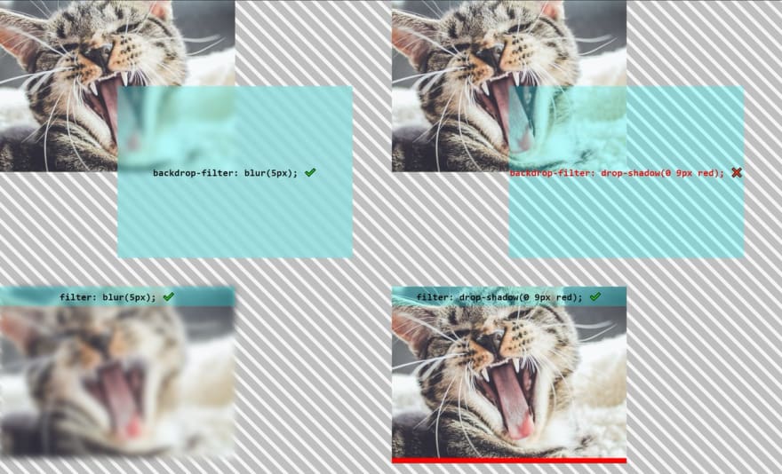
Drop-shadow: takes 3 length values controlling offset-x, offset-y and blur-radius (in that order), and a color at the end. Example:
backdrop-filter: drop-shadow(4px 4px 10px blue);However, since it will only show outside of the parent container, the result of this setting might be difficult to predict. An example by A.Montoro can be viewed on Codepen.
 Ana Tudor 🐯@anatudor
 Dumb CSS question: what does `backdrop-filter: drop-shadow()` even do?
Because it really doesn't seem like it does anything at all
¯\_(ツ)_/¯
codepen.io/thebabydino/pe…14:34 PM - 08 Jun 2020
0
15
- Grayscale: takes a number or percentage value. Any number above 100% or 1 leads to a complete black-and-white result. 0 or 0% means no black-and-white filtering is applied, and anywhere from 0 or 0% to 1 or 100% means applying a partial black-and-white filter.
-
Hue-rotate: takes an angle that represents how much the hue should change. Degree values range from 0 to 360, where 0 is red, 120 is green and 240 is blue. Negative values are also accepted. Example:
backdrop-filter: hue-rotate(45deg); - Invert: takes a number or percentage. 0 or 0% means no effect is applied. 1 and 100% means a totally inverted effect.
- Opacity: takes a number or percentage between 0 to 1 and 0 to 100%. It seems like the effect can only be seen when it is also paired with for example a mix-blend-mode. When using backdrop-filter opacity with mix-blend-mode it is also possible to work with background-colors and colors that are not semi-transparent.
- Sepia: takes a number or percentage between 0 to 1 and 0 to 100%, where a lower number indicates a fainter sepia-tone level.
- Saturate: takes a number or percentage, where a lower number means lower saturation and a higher number increases saturation.
-
None, inherit, initial, unset: There are also the values
none,inherit,initial, andunsetto control inheritance, reset or remove any existing setting. -
SVG filters: It is possible to add a URL to an SVG filter to use as well. Example:
backdrop-filter: url(filters.svg#filter);There is a bug infilterthat prevents linking to external SVG file filters in Chrome, that might also impact backdrop-filter. Even though linking to external SVG file filters might work at some point in the future, the recommendation is to link to filters in the same HTML document using inline styles.
<!--HTML-->
<div class="frosted-glass-parent">
    <div class="frosted-glass-child" style="backdrop-filter: url(#duotone);">
        <p>Frosted Glass Effect</p>
    </div>
</div>
Another alternative to avoid using inline styles in the HTML document is to just reference the SVG filter ID (which still has to be placed in the HTML file) in the CSS file:
.classname{
    backdrop-filter: url(#duotone);
}
Areas of Use
Just like with blend-modes and filters, backdrop-filters are useful for adding enhancements and effects that are uniform and does not require website administrators to know how to edit images in an image editing software program.
Browser Support
Backdrop-filter is at the time of writing supported in about 86% of all modern browsers.
Support is missing from Internet Explorer as well as from a handful of mobile browsers. Most importantly, the feature is behind a flag in Firefox, meaning users will have to enable it manually for it to work. Since the normal user will probably not have done this, it is important to have sufficient fallbacks when using this feature in production.
One way of creating fallbacks is to use @supports queries for browsers where such queries work. Browsers where @support queries does not work will need special treatment in the form of separate, additional fallback styling served specifically to them.
How to Allow the Feature in Firefox:
- Enter about:config in the URL input bar.
- Accept that you are now going to alter important settings.
- Search for backdrop-filter in the search bar.
- Click on the arrows to toggle true/false.
- Apart from allowing backdrop-filter, there is also a bug that requires you to also to set gfx.webrender.all to true.
- After changing the settings, restart Firefox.

Top comments (1)
I used that for my project Gate but
backdrop-filterisn't supported for Firefox.. too bad :c