If you already have a WordPress website for magazines, newspapers, or reading blogs..., you may have difficulty in drawing visitors' attention to outstanding posts because your site is crammed with too much information. To solve this, news tickers are definitely a perfect feature to make your reading site more readable, informative and outstanding!
In this post, we will show you what news tickers are, why we should use them, and how to create an impressive news ticker with only a few simple quick steps.
Let's get started!
What are News Tickers?
On some types of websites like online magazines, online newspapers, you may see some news slides scrolling at the bottom or the header, footer or sidebar. These news slides look like those in TV news programs.
By glancing at the news ticker on a TV news program or a magazine website, viewers can get the hottest and most noticeable information. There are usually many pieces of information, which are called ticks, in one news ticker.
As in the gif below, do you see the headline news running? That is how a news ticker works.
Why Should We Use News Tickers?
News tickers have various benefits for different types of website:
- For magazines, news tickers help you highlight what information and posts to be noticed.
- For portfolios, they draw recruiters' attention to noticeable work experience and rewards of yours.
- For other kinds of websites, news tickers themselves will become a highlight of the sites, to make your blogs, for example, more attractive and professional.
Thus, news tickers are clearly a useful tool for websites' owners. More than that, it's very easy to add news tickers to your WordPress website. Let's move to the next part and get one for yourself!
How to Add News Tickers in WordPress?
There are many ways to add a news ticker.
You can use a theme pre-built with news tickers in the beginning; that would be the easiest. Just read the theme's documentation carefully.
However, not every theme has a pre-made news ticker like that. So in these cases, you can think about using page builders or plugins.
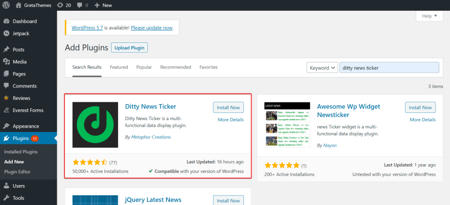
In this post, we will use a free plugin called Ditty News Ticker plugin. It is free, very easy to use and highly customizable. You just need to download and activate it on Dashboard.
You can read more about how to install a plugin here.
Now, let's hesitate no more and follow our 3 steps to have an amazing news ticker on your site:
Step 1: Add a New News Ticker
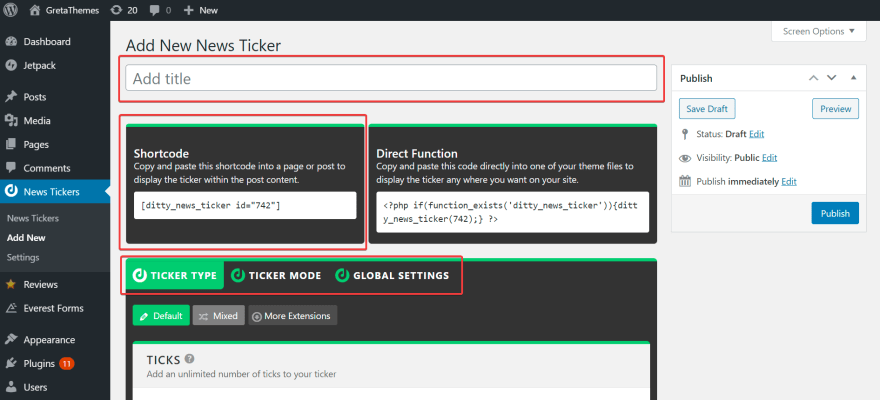
First, go to News Ticker > Add New.
On the next screen, you will see 5 tabs below: Add Title, Shortcode, Ticker Mode, Ticker Type and Global Settings. These tabs are used to configure and display your news tickers.
Do you think there are too many things to keep in mind? Don't worry, we will make it short and clear for you:
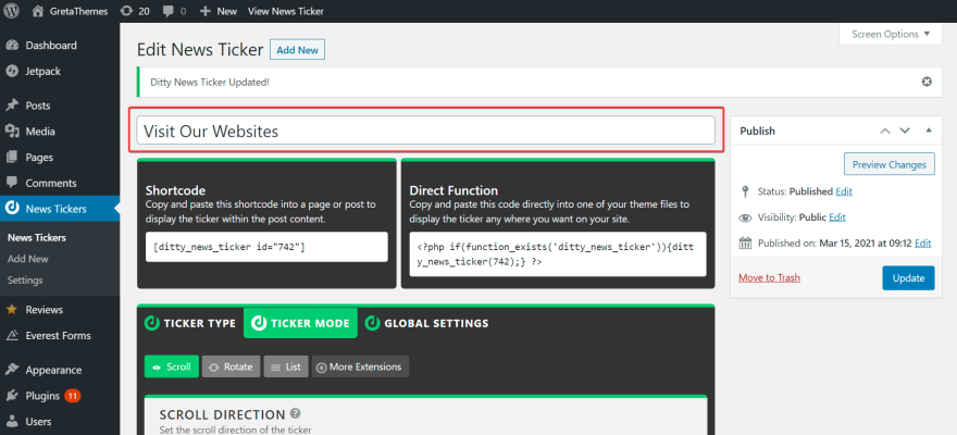
First, give your ticker a name. Type the name in the Add Title tab. The title is usually displayed on the top of the ticker, so try to come up with an attractive name to draw visitors' attention.
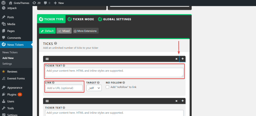
After that, click Ticker Type, then add the content to display in the news ticker (with a link if necessary) in the Ticker Text section.
As I mentioned above, your news ticker may contain many ticks. Just click the (+) button to add one, and click the (x) button to delete.
Step 2: Configure News Ticker
After having a new news ticker, you need to make it more eye-catching by configuring it.
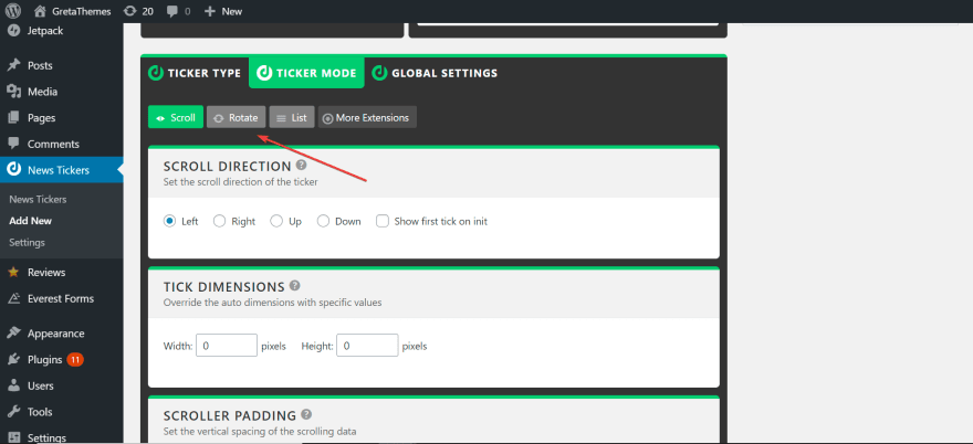
First of all, choose how your news tickers will be displayed. Click Ticker Mode, you will see 3 options: Scroll, Rotate, and List. In fact, Scroll is the most common option, but you can decide what is the most suitable one for your site.
Once choosing one of the three options above, you can adjust the behaviour of the tickers by various tabs below.
Personally, I chose Scroll mode, so I will adjust the scrolling action. There are two important things to notice: Scroll Speed and Tick Space. Actually, you have to try many times to find out the most suitable parameters. For me, I prefer the scroll speed of 8 and the tick space of 10 pixels.
Besides, I also tick Pause on mouse over option, so that the news ticker will stop moving when I want to click on a tick.
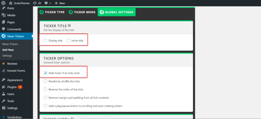
In addition, when clicking Global Settings, you will see some other options to customize the tickers. For example, if you want tickers' title to be on the top of them, tick on Display title. Or if you want to hide the tickers when there are no ticks, tick on the option like in the picture below.
Now your news ticker is ready to be displayed!
Step 3: Display News Tickers
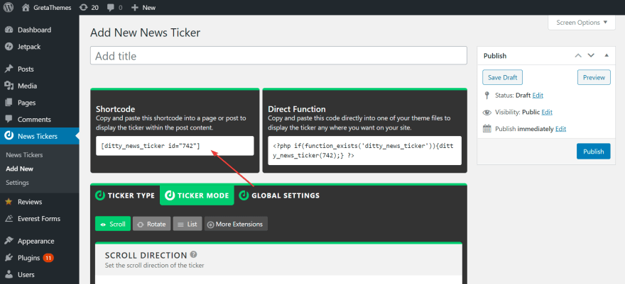
Let's come back to the Shortcode tab at the top of the screen:
The news ticker will be displayed at where you insert this shortcode. You can add it to any position: homepage's footer, post, sidebar widget,...
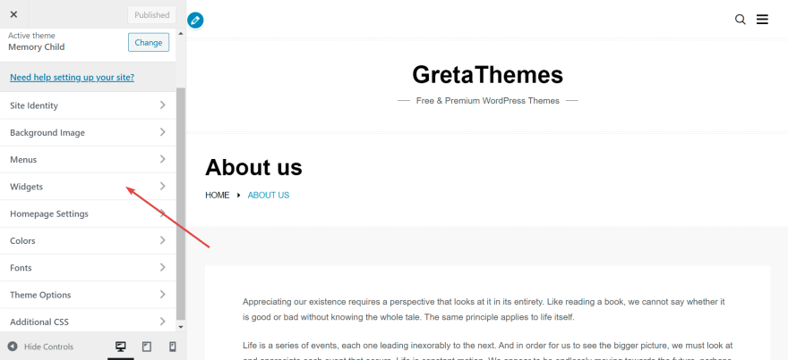
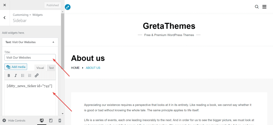
Normally, we do not use news tickers for the content of a post. It would be better if you place news tickers on the header, footer or sidebar. I can give you an example of a sidebar's news ticker. First, I choose a random page, go to its Preview > Customize > Widget.
Then, go to Sidebar > Add a Widget. You will see a lot of options for additional sidebars like Audio, Calendar,... Choose Text, then you will see a small box to add the sidebar's name and paste your shortcode:
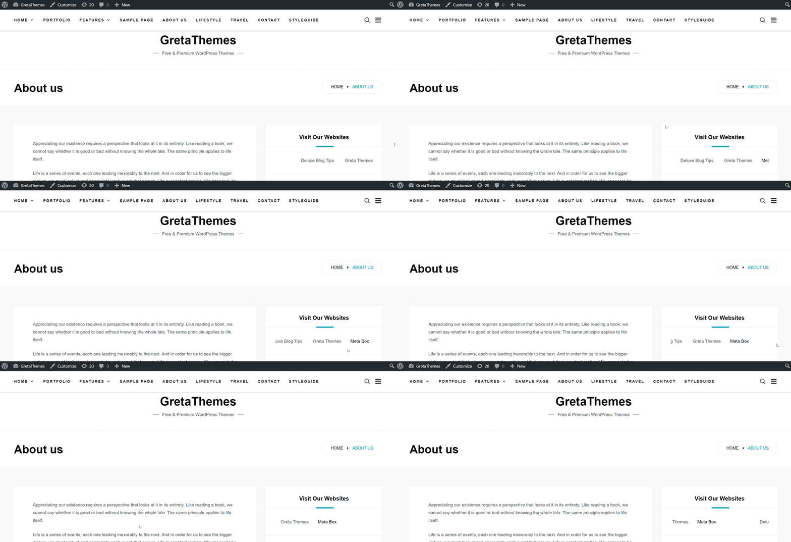
You have done many steps, right? But if you want to make your news tickers more beautiful, with custom colors, font size, opacity,..., you still have a little work to do. The free version of this plugin does not support users to adjust those parameters. So we only have result like the gif below:
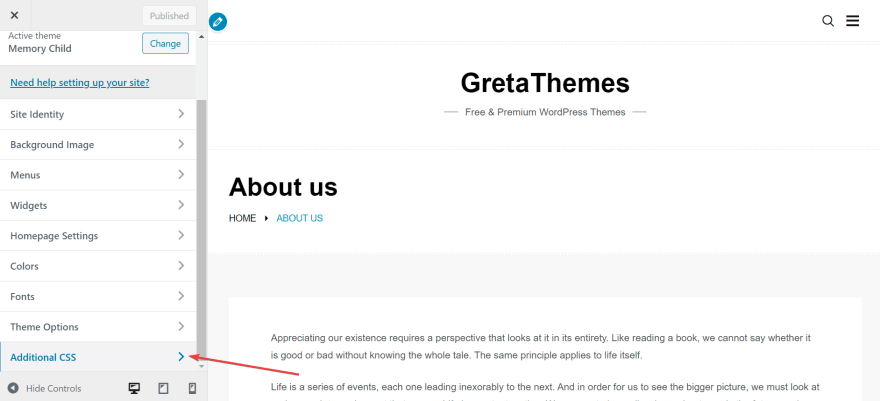
The news tickers don't look so beautiful, so I styled it a bit with CSS. Go to Customize > Additional CSS.
There you will see a small box to add code. These codes will change the appearance of your news tickers.
I'm using Memory theme with the main palette of blue and white. Therefore, I added this CSS to have a news ticker of blue color:
.mtphr-dnt-tick-contents a {

color: var(--main-color);

}

.mtphr-dnt-tick-contents a:hover {

color: #000;

}
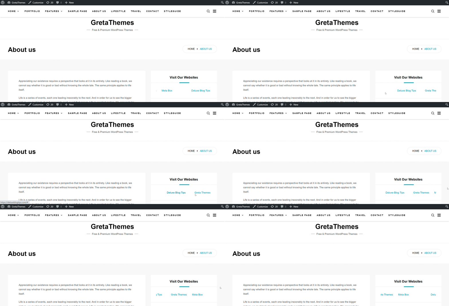
Click Publish, and see what we've got:
Here is just a simple example for you. I'm sure that you can make a much more stunning news ticker by yourself. Let's give it a try!
Last Words
So that's all about adding a news ticker to your WordPress website by Ditty News Ticker plugin. We have tried our best to make it short and clear, so we hope that this post is useful for you.
Maybe you might have some wonders or questions about our tutorial, so feel free to tell us in the comment section. We are willing to show you a more detailed tutorial about advanced options in this plugin, or other methods to add news tickers without using plugins. Thus, don't forget to connect us!





Top comments (0)