
Over the years, the internet and the World Wide Web have grown tremendously. It has allowed companies to build cross-functional teams and ship their products to a broader range of audiences.
As the famous saying goes, “With great power comes great responsibility”. Medium to large organizations with global teams are constantly burdened with the workload of creating a source of truth and maintaining brand integrity when building software across multiple channels.
In this post, we will learn how to build a monitoring dashboard using Next.js, Appwrite, and Pink Design. The project’s GitHub repository can be found here.
Prerequisites
To fully grasp the concepts presented in this tutorial, the following are required:
- Basic understanding of JavaScript and React.js
- Appwrite cloud account (preferred) or an Appwrite instance running on docker; check out this article on how to set up an instance or install with one-click on DigitalOcean or Gitpod
Getting Started
We need to create a Next.js starter project by navigating to the desired directory and running the command below in our terminal.
npx create-next-app@latest pink-dashboard && cd pink-dashboard
This command will ask us some questions on how to configure our application. We can answer the questions as shown below:
Would you like to use TypeScript with this project? <select "No" and press enter>
Would you like to use ESLint with this project? <select "No" and press enter>
Would you like to use `src/` directory with this project? <select "Yes" and press enter>
Would you like to use experimental `app/` directory with this project? <select "No" and press enter>
What import alias would you like configured? <press enter>
The command creates a Next.js project called pink-dashboard and navigates into the project directory.
Installing dependencies
Installing Pink Design
Pink Design is Appwrite’s open-source design system for building consistent and reusable user interfaces. It ships with a set of standards that companies can leverage as a source of truth for building unified experience across multiple channels. To use it in our application, run the command below in our terminal.
npm install @appwrite.io/pink
Next, we need to update the src/_app.js file with the required CSS and icon library that Pink Design ships with.
import '@appwrite.io/pink';
import '@appwrite.io/pink-icons';

export default function App({ Component, pageProps }) {
    return <Component {...pageProps} />;
}
Installing Appwrite
Appwrite is a development platform that provides a powerful API and management console for building backend servers for web and mobile applications. To install it, run the command below:
npm install appwrite
Building the User Interface (UI)
We can start building the UI with our project and the required dependencies fully set up. The design resource can be found here.

Creating components
To get started, first, we need to navigate to the src directory and create a component folder, and in this folder, create a DashboardCard.js file and add the snippet below:
import React from 'react';

const DashboardCard = () => {
    return (
        <div
            className='card u-flex'
            style={{
                boxShadow: 'var(--shadow-small)',
                paddingTop: '0px',
                paddingBottom: '0px',
            }}
        >
            <section
                style={{
                    marginLeft: '40px',
                    borderRightStyle: 'solid',
                    borderRightWidth: '1px',
                    borderRightColor: 'hsl(var(--color-neutral-30))',
                    paddingTop: '33px',
                    paddingBottom: '20px',
                    width: '100%',
                }}
            >
                <div className='u-flex u-cross-center'>
                    <p
                        className='icon-academic-cap'
                        style={{ marginRight: '15px' }}
                    ></p>
                    <h5 className='u-bold'>Total project courses</h5>
                </div>
                <h1
                    className='u-bold'
                    style={{ fontSize: '80px', color: '#5D5FEF' }}
                >
                    1200
                </h1>
            </section>
            <section
                style={{
                    marginLeft: '80px',
                    paddingTop: '33px',
                    paddingBottom: '20px',
                    width: '100%',
                }}
            >
                <div className='u-flex u-cross-center'>
                    <p
                        className='icon-user'
                        style={{ marginRight: '15px' }}
                    ></p>
                    <h5 className='u-bold'>Total students</h5>
                </div>
                <h1
                    className='u-bold'
                    style={{ fontSize: '80px', color: '#5D5FEF' }}
                >
                    120
                </h1>
            </section>
        </div>
    );
};
export default DashboardCard;
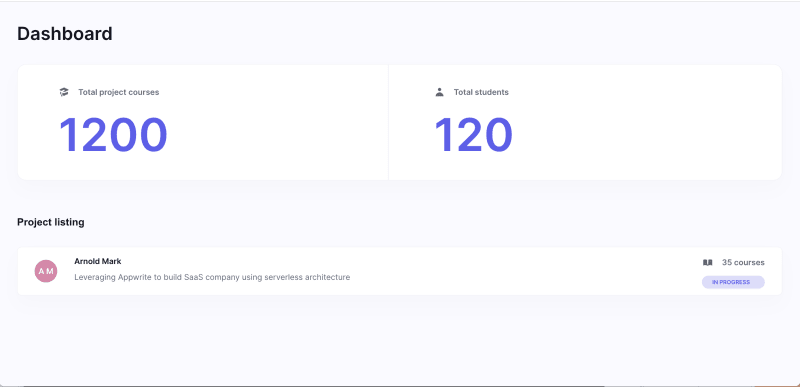
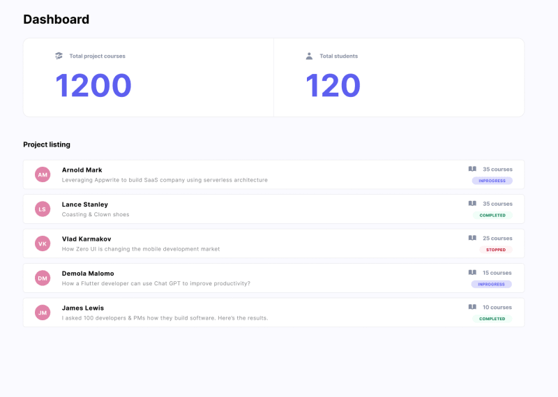
The snippet above uses Pink Design’s utility classes, elements, layout, and icons to build the dashboard card component.
Lastly, we need to create a ListingCard.js file and add the snippet below:
import React from 'react';

const ListingCard = ({
    firstname,
    lastname,
    projectTitle,
    courses,
    status,
}) => {
    return (
        <div
            className='card u-flex u-main-space-between'
            style={{
                boxShadow: 'var(--shadow-small)',
                paddingTop: '11px',
                paddingBottom: '11px',
                paddingLeft: '30px',
                paddingRight: '30px',
                borderRadius: 'var(--border-radius-small)',
                marginBottom: '15px',
            }}
        >
            <section className='u-flex u-cross-center'>
                <div
                    className='u-flex u-main-center u-cross-center'
                    style={{
                        height: '40px',
                        width: '40px',
                        backgroundColor: '#E084A9',
                        borderRadius: 'var(--border-radius-circular)',
                        marginRight: '30px',
                    }}
                >
                    <p
                        className='u-bold'
                        style={{
                            color: 'hsl(var(--color-neutral-0))',
                            letterSpacing: '4.5%',
                        }}
                    >
                        {`${firstname.charAt(0)} ${lastname.charAt(0)}`}
                    </p>
                </div>
                <div>
                    <p
                        className='u-bold text'
                        style={{
                            color: 'hsl(var(--color-neutral-500))',
                            marginBottom: '7px',
                            textTransform: 'capitalize',
                        }}
                    >
                        {`${firstname} ${lastname}`}
                    </p>
                    <p className='text' style={{ marginBottom: '7px' }}>
                        {projectTitle}
                    </p>
                </div>
            </section>
            <section>
                <div
                    className='u-flex u-cross-center'
                    style={{ marginBottom: '8px' }}
                >
                    <p
                        className='icon-book-open'
                        style={{ marginRight: '15px' }}
                    ></p>
                    <h5 className='u-bold'>{`${courses} courses`}</h5>
                </div>
                <div
                    className='u-bold'
                    style={{
                        paddingTop: '4px',
                        paddingBottom: '4px',
                        paddingLeft: '18px',
                        paddingRight: '18px',
                        backgroundColor: '#DDDDFB',
                        color: '#5D5FEF',
                        textTransform: 'uppercase',
                        borderRadius: 'var(--border-radius-medium)',
                        fontSize: '10px',
                    }}
                >
                    {status}
                </div>
            </section>
        </div>
    );
};
export default ListingCard;
The snippet creates a component that accepts sets of required properties and uses the Pink Design system to build the listing card.
Putting it together
With the components created, we can update the pages/index.js file as shown below:
import Head from 'next/head';
import { Inter } from 'next/font/google';
import DashboardCard from '@/components/DashboardCard';
import ListingCard from '@/components/ListingCard';
const inter = Inter({ subsets: ['latin'] });

export default function Home() {
    return (
        <>
            <Head>
                <title>Student Dashbaord</title>
                <meta
                    name='Student Dashboard'
                    content='Generated by create next app'
                />
                <meta
                    name='viewport'
                    content='width=device-width, initial-scale=1'
                />
                <link rel='icon' href='/favicon.ico' />
            </Head>
            <main
                className='u-padding-32'
                style={{ backgroundColor: 'hsl(var(--color-neutral-5))' }}
            >
                <h1
                    className='text u-font-size-32 u-bold'
                    style={{
                        color: 'hsl(var(--color-neutral-500))',
                        marginBottom: '30px',
                    }}
                >
                    Dashboard
                </h1>
                <DashboardCard />
                <section className='' style={{ marginTop: '60px' }}>
                    <h5
                        className='text u-bold heading-level-7'
                        style={{
                            color: 'hsl(var(--color-neutral-500))',
                            marginBottom: '30px',
                        }}
                    >
                        Project listing
                    </h5>
                    <section>
                        <ListingCard
                            firstname='Arnold'
                            lastname='Mark'
                            projectTitle='Leveraging Appwrite to build SaaS company using serverless architecture'
                            courses={35}
                            status='in progress'
                        />
                    </section>
                </section>
            </main>
        </>
    );
}
The snippet above uses the created components to build the dashboard interface.
We can test our application by running the command below:
npm run dev
Setting up Appwrite
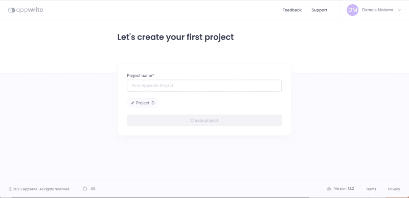
To get started, we need to log into our Appwrite cloud account, input pink_dashboard as the name, and then click Create project.
Create a database, collection, attributes, and add sample data
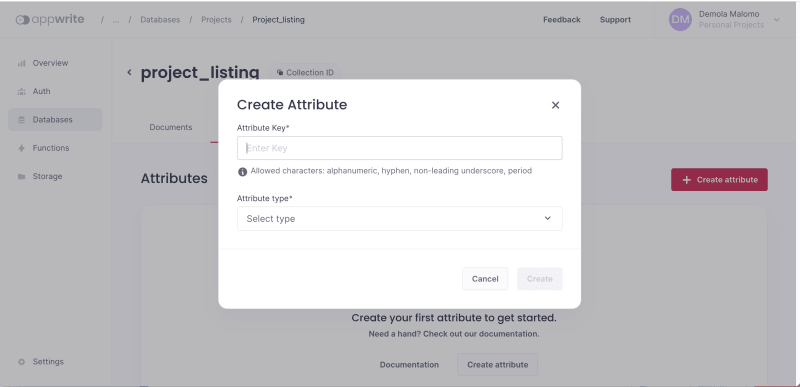
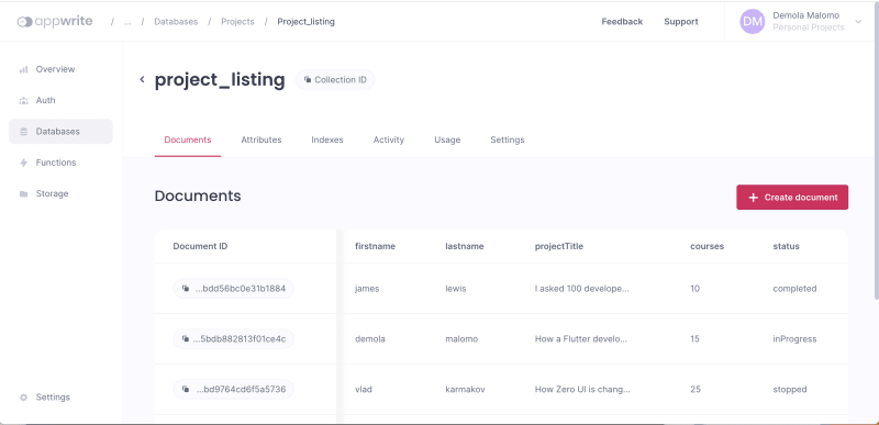
With our project created, we can set up our application database. First, navigate to the Database tab, click the Create database button, input projects as the name, and then click Create.

Secondly, we need to create a collection for storing the project details. To do this, click the Create collection button, input project_listing as the name, and then click Create.

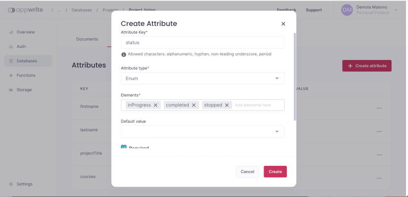
Thirdly, we need to create attributes to represent our database fields. To do this, we need to navigate to the Attributes tab and create attributes for our collection as shown below:
| Attribute key | Attribute type | Size | Elements | Required |
|---|---|---|---|---|
| firstname | string | 225 | NIL | YES |
| lastname | string | 225 | NIL | YES |
| projectTitle | string | 5000 | NIL | YES |
| courses | int | NIL | NIL | YES |
| status | enum | NIL | inProgress completed Stopped |
YES |

Fourthly, we need to update our collection permission to manage them accordingly. To do this, navigate to the Settings tab, scroll down to the Update Permissions section, select Any, mark accordingly, and Update.

Lastly, we need to add sample data to simulate our dashboard. To do this, we need to navigate to the Document tab, click the Create document button and add data to the collection as shown in the design below:
Integrating Appwrite with Next.js
To get started, we first need to create a components/utils.js to abstract the application logic from the UI and add the snippet below:
import { Client, Databases, Account } from 'appwrite';

const PROJECT_ID = 'REPLACE WITH PROJECT ID';
const DATABASE_ID = 'REPLACE WITH DATABASE ID';
const COLLECTION_ID = 'REPLACE WITH COLLECTION ID';

const client = new Client();

const databases = new Databases(client);

client.setEndpoint('https://cloud.appwrite.io/v1').setProject(PROJECT_ID);

export const account = new Account(client);

export const getProjectListing = () =>
    databases.listDocuments(DATABASE_ID, COLLECTION_ID);
The snippet above does the following:
- Imports the required dependency
- Initializes Appwrite
clientanddatabaseswith required arguments - Creates
accountandgetProjectListingfunctions for managing user sessions and getting the list of projects in the database
PS: We can get the required IDs on our Appwrite Console.
Secondly, we need to update the _app.js file to use the account helper function to check if a user has a valid session.
import { account } from '@/components/utils';
import '@appwrite.io/pink';
import '@appwrite.io/pink-icons';
import { useEffect } from 'react';

export default function App({ Component, pageProps }) {
    useEffect(() => {
        account
            .get()
            .then()
            .catch((_) => account.createAnonymousSession());
        return () => {};
    }, []);
    return <Component {...pageProps} />;
}
Lastly, we need to update the index.js file as shown below:
import Head from 'next/head';
import { Inter } from 'next/font/google';
import DashboardCard from '@/components/DashboardCard';
import ListingCard from '@/components/ListingCard';
import { useState, useEffect } from 'react';
import { getProjectListing } from '@/components/utils';
const inter = Inter({ subsets: ['latin'] });

export default function Home() {
    const [data, setData] = useState(null);

    useEffect(() => {
        getProjectListing()
            .then((res) => setData(res))
            .catch((err) => alert('Error loading dashboard data'));
        return () => {};
    }, []);

    return (
        <>
            <Head>
                <title>Student Dashbaord</title>
                <meta
                    name='Student Dashboard'
                    content='Generated by create next app'
                />
                <meta
                    name='viewport'
                    content='width=device-width, initial-scale=1'
                />
                <link rel='icon' href='/favicon.ico' />
            </Head>
            <main
                className='u-padding-32'
                style={{ backgroundColor: 'hsl(var(--color-neutral-5))' }}
            >
                <h1
                    className='text u-font-size-32 u-bold'
                    style={{
                        color: 'hsl(var(--color-neutral-500))',
                        marginBottom: '30px',
                    }}
                >
                    Dashboard
                </h1>
                <DashboardCard data={data} />
                <section className='' style={{ marginTop: '60px' }}>
                    <h5
                        className='text u-bold heading-level-7'
                        style={{
                            color: 'hsl(var(--color-neutral-500))',
                            marginBottom: '30px',
                        }}
                    >
                        Project listing
                    </h5>
                    <section>
                        {data &&
                            data.documents.map((list) => (
                                <ListingCard
                                    key={list.$id}
                                    firstname={list.firstname}
                                    lastname={list.lastname}
                                    projectTitle={list.projectTitle}
                                    courses={list.courses}
                                    status={list.status}
                                />
                            ))}
                    </section>
                </section>
            </main>
        </>
    );
}
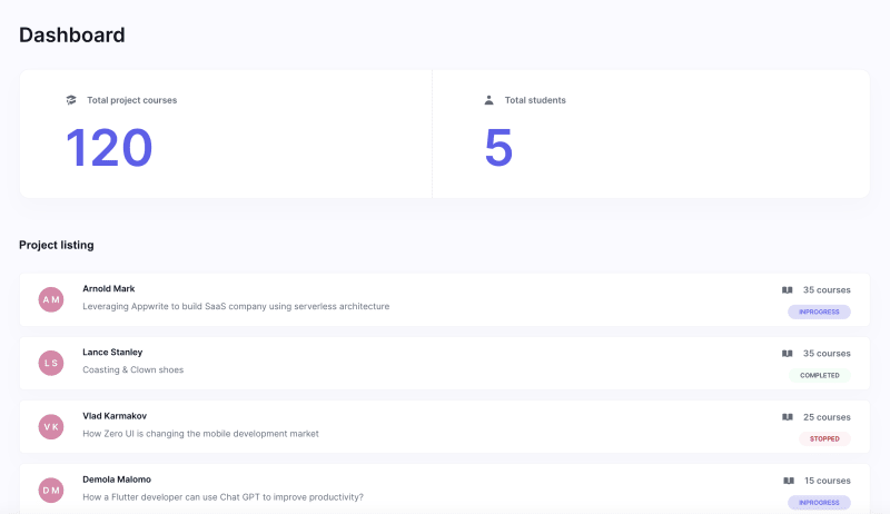
The snippet above does the following:
- Imports the required dependencies
- Creates the application state
- Uses the
getProjectListinghelper function to get the list of projects after rendering - Modifies the components by passing in the required props
Updating the components
First, we need to update the DashboardCard.js component as shown below:
import React from 'react';

const DashboardCard = ({ data }) => {
    //modify
    const getTotal = () =>
        data.documents
            .map((list) => list.courses)
            .reduce((prev, next) => prev + next);

    return (
        <div
            className='card u-flex'
            style={{
                boxShadow: 'var(--shadow-small)',
                paddingTop: '0px',
                paddingBottom: '0px',
            }}
        >
            <section
                style={{
                    marginLeft: '40px',
                    borderRightStyle: 'solid',
                    borderRightWidth: '1px',
                    borderRightColor: 'hsl(var(--color-neutral-30))',
                    paddingTop: '33px',
                    paddingBottom: '20px',
                    width: '100%',
                }}
            >
                <div className='u-flex u-cross-center'>
                    <p
                        className='icon-academic-cap'
                        style={{ marginRight: '15px' }}
                    ></p>
                    <h5 className='u-bold'>Total project courses</h5>
                </div>
                <h1
                    className='u-bold'
                    style={{ fontSize: '80px', color: '#5D5FEF' }}
                >
                    {data ? getTotal() : 0}
                </h1>
            </section>
            <section
                style={{
                    marginLeft: '80px',
                    paddingTop: '33px',
                    paddingBottom: '20px',
                    width: '100%',
                }}
            >
                <div className='u-flex u-cross-center'>
                    <p
                        className='icon-user'
                        style={{ marginRight: '15px' }}
                    ></p>
                    <h5 className='u-bold'>Total students</h5>
                </div>
                <h1
                    className='u-bold'
                    style={{ fontSize: '80px', color: '#5D5FEF' }}
                >
                    {data ? data.total : 0}
                </h1>
            </section>
        </div>
    );
};
export default DashboardCard;
The snippet above does the following:
- Modifies the component to accept props
- Creates a
getTotalhelper function to get the total courses available - Modifies the UI to show values returned from the database
Lastly, we also need to modify the ListingCard.js component as shown below:
import React from 'react';

const ListingCard = ({
    firstname,
    lastname,
    projectTitle,
    courses,
    status,
}) => {
    const bgColorHelper = (statusState) =>
        statusState == 'inProgress'
            ? '#DDDDFB'
            : statusState == 'completed'
            ? '#F0FEF7'
            : '#FFF4F5';

    const textColorHelper = (statusState) =>
        statusState == 'inProgress'
            ? '#5D5FEF'
            : statusState == 'completed'
            ? '#01754A'
            : '#B51212';
    return (
        <div
            className='card u-flex u-main-space-between'
            style={{
                boxShadow: 'var(--shadow-small)',
                paddingTop: '11px',
                paddingBottom: '11px',
                paddingLeft: '30px',
                paddingRight: '30px',
                borderRadius: 'var(--border-radius-small)',
                marginBottom: '15px',
            }}
        >
            <section className='u-flex u-cross-center'>
                <div
                    className='u-flex u-main-center u-cross-center'
                    style={{
                        height: '40px',
                        width: '40px',
                        backgroundColor: '#E084A9',
                        borderRadius: 'var(--border-radius-circular)',
                        marginRight: '30px',
                    }}
                >
                    <p
                        className='u-bold'
                        style={{
                            color: 'hsl(var(--color-neutral-0))',
                            letterSpacing: '4.5%',
                            textTransform: 'capitalize',
                        }}
                    >
                        {`${firstname.charAt(0)} ${lastname.charAt(0)}`}
                    </p>
                </div>
                <div>
                    <p
                        className='u-bold text'
                        style={{
                            color: 'hsl(var(--color-neutral-500))',
                            marginBottom: '7px',
                            textTransform: 'capitalize',
                        }}
                    >
                        {`${firstname} ${lastname}`}
                    </p>
                    <p className='text' style={{ marginBottom: '7px' }}>
                        {projectTitle}
                    </p>
                </div>
            </section>
            <section className='u-flex u-flex-vertical u-cross-end'>
                <div
                    className='u-flex u-cross-center'
                    style={{ marginBottom: '8px' }}
                >
                    <p
                        className='icon-book-open'
                        style={{ marginRight: '15px' }}
                    ></p>
                    <h5 className='u-bold'>{`${courses} courses`}</h5>
                </div>
                <div
                    className='u-bold'
                    style={{
                        paddingTop: '4px',
                        paddingBottom: '4px',
                        paddingLeft: '18px',
                        paddingRight: '18px',
                        backgroundColor: bgColorHelper(status),
                        color: textColorHelper(status),
                        textTransform: 'uppercase',
                        borderRadius: 'var(--border-radius-medium)',
                        fontSize: '10px',
                    }}
                >
                    {status}
                </div>
            </section>
        </div>
    );
};

export default ListingCard;
The snippet above does the following:
- Creates
bgColorHelperandtextColorHelperfunctions to show the appropriate colour dynamically - Updates the UI by using the helper functions to display the appropriate background and font colour dynamically
With that done, we can restart a development server using the command below:
npm run dev
Conclusion
This post discussed how to build a monitoring dashboard using Next.js, Appwrite, and Pink Design. The Pink Design system allows developers and companies to build complex systems into their existing products. The framework-agnostic approach also makes it adaptable for multiple teams using different front-end frameworks.
These resources may also be helpful:

Top comments (4)
Nice work!!
Thanks for sharing Boss! I think there's a Typo here The command creates a Nuxt.js project called pink-dashboard and navigates into the project directory. It should be Next.js I guess.
Also, I think
app/directory is no longer an experimentalOoops! My bad.
Thanks! I have made correction.
Alright Boss