Introduction
This post was originally published on Hackmamba
The Plotly python library is an open-source library for rendering interactive charts. With Plotly, we can visualize data using several plots like a bar, box, histogram, line, etc.
Plotly supports over 40 chart kinds, encompassing a wide range of statistical, financial, geographic, scientific, and 3-dimensional applications. Plotly enables Python users to create beautiful interactive web-based visualizations.
In this tutorial, we’ll be looking at integrating Plotly in Django by building a simple Gantt chart project.
GitHub Repository
https://github.com/shosenwales/Gantt-Chart
Prerequisites
To follow along with this tutorial, we must have the following:
- Python3 installed.
- A basic understanding of Django.
Setup Project
Let’s start by creating a new virtual environment.
A virtual environment allows us to create a virtual space on our computer. By creating a virtual environment, we separate the necessary library installation for a project without installing them globally.
Now, let’s create a virtual environment env by running the command below:
python -m venv env
We tell Python to create the virtual environment in a folder named env in the current directory.
On creation, we activate the virtual environment using the following command:
source env/bin/activate
On activating the environment, install Django using the following command:
pip install django
Now, let’s create a new Django project django_plotly using:
django-admin startproject django_plotly
Then, we navigate to the django_plotly directory and create a Django app:
cd django_plotly

django-admin startapp charts
Let’s add our app to the list of already installed apps.
Navigate to the django_plotly directory and edit the settings.py file:
    INSTALLED_APPS = [
        'django.contrib.admin',
        'django.contrib.auth',
        'django.contrib.contenttypes',
        'django.contrib.sessions',
        'django.contrib.messages',
        'django.contrib.staticfiles',
        'charts',
    ]
Now let’s install plotly by running the following command:
pip install plotly==5.6.0
And finally, we need to install pandas by running the following command:
pip install pandas
Creating a model
This tutorial will create an interactive chart that visualizes data from different projects in our application.
For our model, we’ll be creating a couple of fields:
-
name-The name field. -
start_date- The start date field -
responsible- The user/owner field -
week_number- The week number field -
finish_field- The finish date field
Under the charts directory, copy and paste the following code in the models.py file:
from django.db import models
    from django.contrib.auth.models import User

    class Chart(models.Model):
        name = models.CharField(max_length=200)
        start_date = models.DateField()
        responsible = models.ForeignKey(User, on_delete=models.CASCADE)
        week_number = models.CharField(max_length=2, blank=True)
        finish_date = models.DateField()

    #string representation method
        def __str__(self):
            return str(self.name)
    #overiding the save method
        def save(self, *args, **kwargs):
            print(self.start_date.isocalendar()[1])
            if self.week_number == "":
                self.week_number = self.start_date.isocalendar()[1]
            super().save(*args, **kwargs)
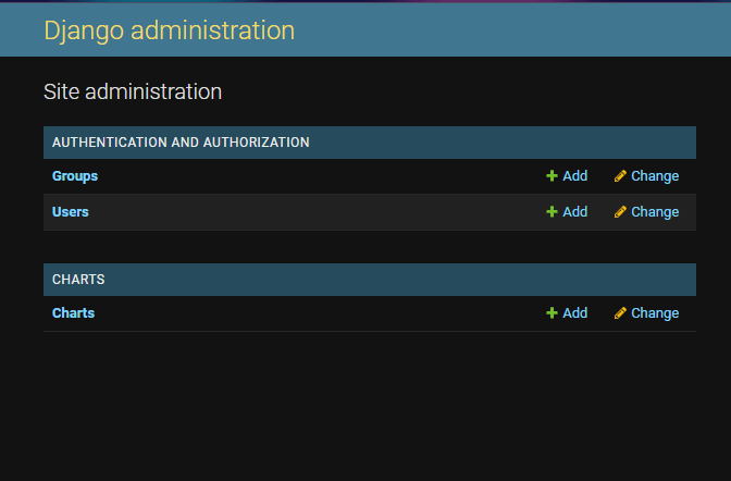
Now, let’s register the model Chart in the admin.py file to modify it in the Django admin section:
from django.contrib import admin
    from .models import Chart

    admin.site.register(Chart)
Next, we need to migrate our model to the database.
Django's migrations allow us to publish changes to our models into the database schema. As a result, when we create a new model, we migrate to the database and create the needed table.
We migrate by running the following command:
 python manage.py makemigrations # migrating the app and database changes
    python manage.py migrate        # final migrations
A superuser has the permissions to create, edit, update and delete data in Django admin.
Create a superuser by running the command below:
python manage.py createsuperuser
We may now access the admin page.
To log in to the admin part of the server, use the following command.
python manage.py runsever
Next, go to http://localhost:8000/admin, and log in with our superuser credentials.
Creating a view
A view in Django is a function that accepts a web request and returns a web response.
Now, let’s create a views.py file in our leading project directory django_plotly and add the following code:
    from django.shortcuts import render
    from charts.models import Chart
    import pandas as pd
    from plotly.offline import plot
    import plotly.express as px
    def index(request):
        qs = Chart.objects.all()
        projects_data = [
            {
                'Project': x.name,
                'Start': x.start_date,
                'Finish': x.finish_date,
                'Responsible': x.responsible.username
            } for x in qs
        ]
        df = pd.DataFrame(projects_data)
        fig = px.timeline(
            df, x_start="Start", x_end="Finish", y="Project", color="Responsible"
        )
        fig.update_yaxes(autorange="reversed")
        gantt_plot = plot(fig, output_type="div")
        context = {'plot_div': gantt_plot}
        return render(request, 'index.html', context)
Let’s take a closer look at our view:
- We imported
pandas, a library we installed earlier. - We also imported some modules from plotly.
- We created a function
index, which takes in a request. Then we defined a queryset that grabs all the data in our database. - Next, we created an object in
projects_datato prepare the data for our chart. TheProject:x.namerepresents our project name,Start:start_daterepresents our project start date,Finish:finish_daterepresents our project end date and finallyResponsible:responsible.usernamerepresents the creator of a project displayed on the chart. - Then we used plotly’s
timelineto plot our chart, where thex_startandx_endmake up the x-axis, andymake up the y-axis. Thecolourhelps us distinguish between projects by assigning different colours. -
plot_divis what we will use in our template, which we will create soon. ## Creating templates
We start by creating a templates directory in our base directory. This templates directory will house our index.html and base.html file.
base.html is the skeleton for all pages in the application.
Next, we add the following lines of code to the base.html file.
<!DOCTYPE html>
    <html lang="en">
    <head>
        <meta charset="UTF-8">
        <meta http-equiv="X-UA-Compatible" content="IE=edge">
        <meta name="viewport" content="width=device-width, initial-scale=1.0">
        <!-- Bootstrap css -->
        <link href="https://cdn.jsdelivr.net/npm/bootstrap@5.1.3/dist/css/bootstrap.min.css" rel="stylesheet" integrity="sha384-1BmE4kWBq78iYhFldvKuhfTAU6auU8tT94WrHftjDbrCEXSU1oBoqyl2QvZ6jIW3" crossorigin="anonymous">
        <title>Plotly Chart</title>
    </head>
    <body>
        <div class="container mt-3">
            {% block content %}
            {% endblock content %}
        </div>
        <!-- Bootstrap Js -->
        <script src="https://cdn.jsdelivr.net/npm/@popperjs/core@2.10.2/dist/umd/popper.min.js" integrity="sha384-7+zCNj/IqJ95wo16oMtfsKbZ9ccEh31eOz1HGyDuCQ6wgnyJNSYdrPa03rtR1zdB" crossorigin="anonymous"></script>
        <script src="https://cdn.jsdelivr.net/npm/bootstrap@5.1.3/dist/js/bootstrap.min.js" integrity="sha384-QJHtvGhmr9XOIpI6YVutG+2QOK9T+ZnN4kzFN1RtK3zEFEIsxhlmWl5/YESvpZ13" crossorigin="anonymous"></script>
    </body>
    </html>
Next, we display our charts by adding the following code in our index.html
    {% extends "base.html" %}
    {% block content %}
        {% autoescape off %}
            {{ plot_div }}
        {% endautoescape %}}
    {% endblock content %}
Next, we need to update the DIRS to the path of the templates folder in our settings.py file.
    TEMPLATES = [
        {
            'BACKEND': 'django.template.backends.django.DjangoTemplates',
            'DIRS': [ BASE_DIR / 'templates' ],
            'APP_DIRS': True,
            'OPTIONS': {
                'context_processors': [
                    'django.template.context_processors.debug',
                    'django.template.context_processors.request',
                    'django.contrib.auth.context_processors.auth',
                    'django.contrib.messages.context_processors.messages',
                ],
            },
        },
    ]
Next, we edit our urls.py by adding the following code:
    from django.contrib import admin
    from django.urls import path
    from .views import index
    urlpatterns = [
        path('admin/', admin.site.urls),
        path('', index)
    ]
Now, let’s add a few projects and another user to our Django admin.
Click on the chart, then click Add Editor to add a project.
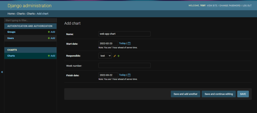
One more project

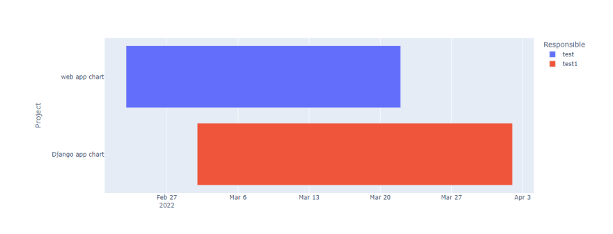
Let’s test this out by starting the server with the following command:
python manage.py runserver
Conclusion
This article introduced Plotly, building a Gantt chart, and, most importantly, integrating Plotly in Django.
Resources
- Plotly Documentation - Getting Started with Plotly in Python
- Kaggle - Plotly Tutorial for Beginners

Top comments (0)