
Svelte and Tailwind tooltip component
Easy to use Tooltip component for your svelte and tailwindcss projects
Install
$npm i @fouita/tooltip -D
Usage
Import the tooltip component and use it like the following

<script>
    import Tooltip from '@fouita/tooltip'
</script>

<div class="m-4 p-4 border rounded text-center relative">
    Element 1
    <Tooltip pointer=middle position=top text="Middle Top" show/>
</div>
Positions
- top
- left
- right
- bottom
Pointer
- start
- middle
- end
Change Color
You can use color and text_color props to customize the color
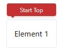
<div class="m-4 p-4 border rounded text-center relative">
    Element 1
    <Tooltip pointer=start position=top text="Start Top" text_color=red-100 color=red-700 show />
</div>
Hover action
To show the tooltip when hovering on an element you can use on:mouseenter and on:mouseleave events and toggle a show flag, like the following.

<script>
    import Tooltip from '@fouita/tooltip'
    let show_elm = false
</script>

<div class="p-4 w-32 m-20 border rounded text-center relative" on:mouseenter={() => show_elm=true} on:mouseleave={() => show_elm=false}>
        Hover
        <Tooltip pointer=middle position=top text="Info to share!" w=48 show={show_elm}/>
</div>
We can also customize the width of the tooltip by adding w attribute and use the scale used in tailwindcss.
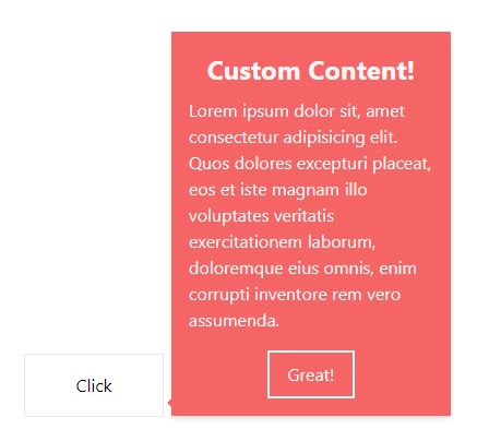
Custom content
To add custom content to a tooltip we can just add children tags and add some html
<script>
    import Tooltip from '@fouita/tooltip'
    let show_elm = false
</script>

<div class="m-20 mt-64 w-32 p-4 border text-center relative cursor-pointer" on:click={() => show_elm=!show_elm} >
        Click
        <Tooltip pointer=end position=right color="red-500" show={show_elm}>
            <div class="p-4 w-64 bg-red-500 text-red-100">
                <div class="text-2xl font-bold mb-2">Custom Content!</div>
                <p class="text-left mb-4">Lorem ipsum dolor sit, amet consectetur adipisicing elit. Quos dolores excepturi placeat, eos et iste magnam illo voluptates veritatis exercitationem laborum, doloremque eius omnis, enim corrupti inventore rem vero assumenda.</p>
                <button class="border-2 border-white py-2 px-4">
                    Great!
                </button>
            </div>
        </Tooltip>
</div>
Source code
Svelte and tailwindcss Tooltip

Top comments (0)