


One perfume concept, three images: a clean product photograph, a coastal campaign scene, and a finished advertisement with a headline. This TIDELINE series was created sequentially in the ChatGPT web app. The bottle is a fictional packaging concept generated from text, not a photograph of a real product.
Disclosure: the prompts and article were drafted by AI, and the images were generated in the ChatGPT web app. The outputs were reviewed before publication. This is a creative workflow example, not an API model benchmark.
Each step has a job: define the product, build its setting, then place the message. Below are the actual outputs, the reference used at each stage, and the complete prompts. Click an image to open the original.
1. Establish the product through its materials
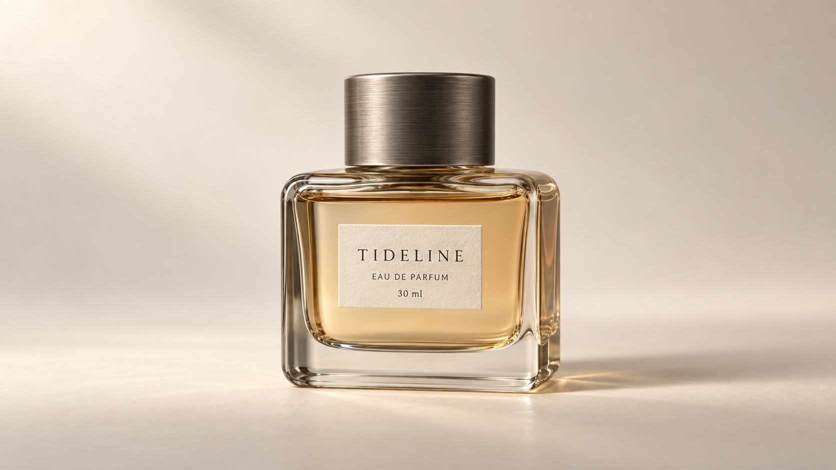
The first image uses a warm neutral background and an almost frontal view. With no props competing for attention, the bottle can establish the visual identity for the rest of the series.
The thick glass base has visible edges and refraction. The cap has horizontal brushed-metal lines, while the label has a slightly textured paper surface. Warm light passes through the bottle and falls onto the table at the right. A contact shadow keeps the product grounded. These materials read differently instead of sharing one smooth, glossy finish.
The three label lines are legible: TIDELINE, EAU DE PARFUM, and 30 ml. They also provide details to check when the packaging appears in later images.
Input: no reference image. Submit the prompt below. If you already have a real product photograph, you can use it as the reference for the next stage without generating a new package.
Create the actual image: a premium product identity photograph for an original fictional
perfume concept named TIDELINE. Landscape 16:9. One squat rectangular pale-smoke glass
perfume bottle, thick clear glass base, rounded shoulders, warm pale amber liquid, and a
low cylindrical cap made of brushed dark pewter. The bottle has a small ivory
rectangular paper label printed with exactly three centered lines: "TIDELINE" / "EAU DE
PARFUM" / "30 ml". No other text. Keep the entire bottle and cap visible, upright,
centered, seen almost straight on with only the right side face slightly visible. Bottle
occupies 62 percent of image height. Background is a seamless warm ivory studio sweep,
subtle tonal gradient; bottle sits directly on the surface with a soft grounded contact
shadow. Large diffused window light from upper left, restrained bright glass-edge
reflections, delicate shadow falling right, realistic glass refraction and paper
texture. Photography feels tactile and precise, 85mm product lens, no artificial bloom.
No plants, flowers, rocks, hands, floating objects, extra bottles, borders or watermark.
The bottle design must be distinctive and simple enough to reuse consistently in later
edits. Render one finished photograph, not a mood board or web page.
The prompt specifies physical materials and limits the supporting objects. This gives the scene a clear focus while leaving room for light and texture to make it interesting.
Not every instruction was followed precisely. The requested cap was low, but the output has a relatively tall cap. The generated design was retained as the reference for the next image; it should not be presented as a dimensionally exact packaging render.
2. Build a coastal scene around the bottle
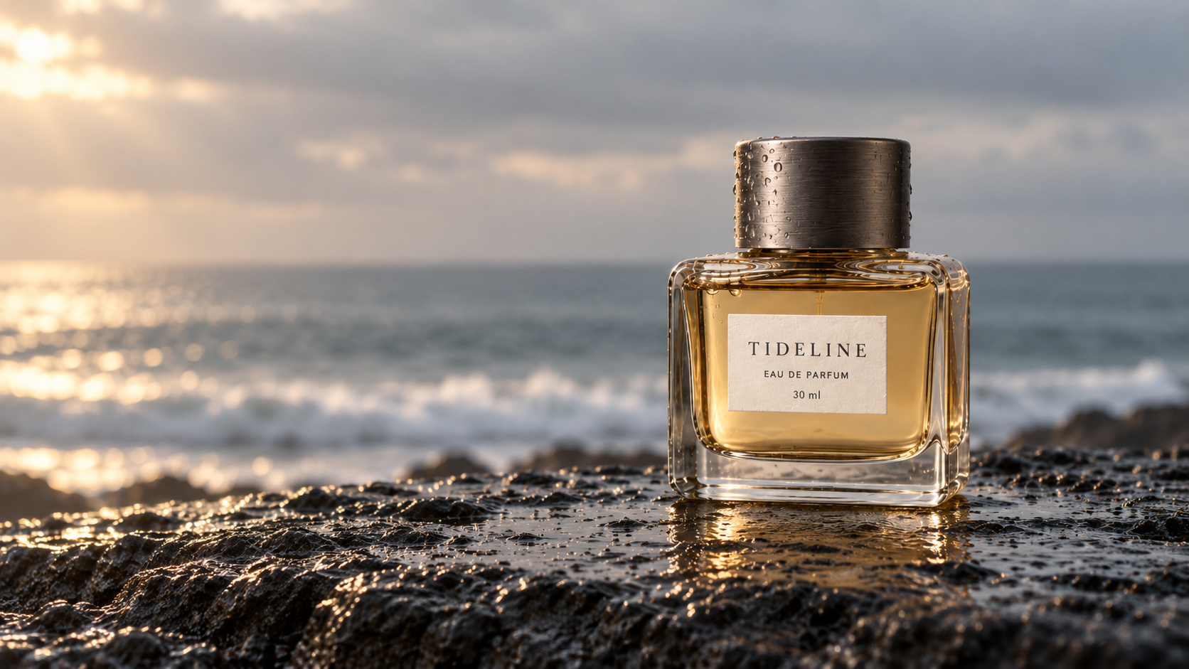
The second image moves the bottle to the right and leaves the sea and sky open on the left. Wet black rock, cool water, and warm amber create a limited palette with a clear contrast.
The lighting helps connect the product to the setting. Warm reflections appear on the water to the left, on the bottle edge, and across the wet rock. Droplets on the cap support the coastal atmosphere while the paper label remains readable.
Input: continue in the same chat after the first product image. In a new chat, upload that first image and identify it as the product reference to preserve.
Use the perfume bottle in the image you just generated as the product reference. Create
an actual new landscape 16:9 campaign photograph. Preserve the same recognizable squat
rectangular bottle, thick clear base, amber liquid, dark brushed-metal cylindrical cap,
ivory label and its exact three lines: "TIDELINE", "EAU DE PARFUM", "30 ml". Do not
redesign the packaging. Place the bottle upright on a low flat shelf of wet black
volcanic basalt at the right third of the composition. The bottle remains almost
front-facing, fully visible, and occupies about 55 percent of image height. A quiet
Atlantic coastline recedes behind it: an out-of-focus pale surf line low in the
distance, steel-blue water, sea haze, and a pale overcast sky. Leave the left 45 percent
of the image as calm atmospheric negative space. A narrow beam of late warm sunlight
enters from the left, making the amber glass glow against the cool coastal background.
Small real water droplets on the cap and upper glass; keep the paper label clean, dry
and readable. Basalt texture is dark, fine and tactile, no towering rocks. Long-lens
luxury fragrance photography, physically coherent contact shadow and glass reflections.
Restrained colors: ink black, steel blue, amber, ivory. No waves splashing over the
bottle, no flowers, no shells, no extra products, no added text, no borders, no
watermark. Render one believable, art-directed advertising photograph.
This instruction changes both the setting and the product placement. It is a reference-led scene reconstruction, not a demonstration that only background pixels changed.
The bottle silhouette, cap, and three-line label remain recognizable, but highlights, small proportions, and the rendering of the lettering vary. The result can support a campaign concept. For an actual product advertisement, check the packaging against the real item and composite the original product where exact fidelity is required.
3. Use the space already reserved for copy
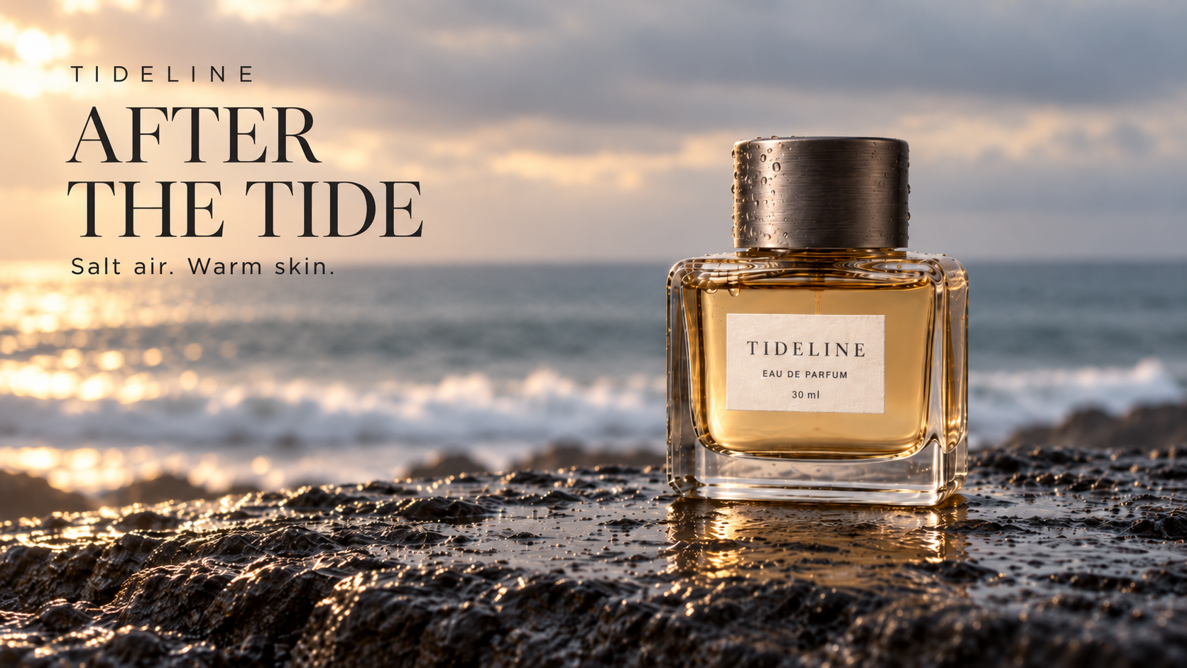
The third step adds typography to the coastal image. A small, widely spaced brand name sits above a large serif headline. A lighter sans-serif line completes the text group. The type occupies the left side without covering the bottle or its label.
The output places AFTER and THE TIDE on separate lines. The supporting sentence, Salt air. Warm skin., keeps the requested spelling and punctuation. The previous composition already had space for this information, so the edit could focus on hierarchy and alignment.
Input: continue from the second, coastal image. If starting a new conversation, upload the coastal image rather than the original studio reference.
Edit the coastal campaign image you just generated into a finished landscape 16:9
fragrance advertisement. Keep the existing photograph: the TIDELINE perfume bottle on
the right, its shape, cap, label wording, liquid color, wet basalt, ocean, horizon,
sunlight and framing. Do not regenerate the packaging or move the bottle. Add only
carefully art-directed typography within the calm left side. Exact text and hierarchy:
at the upper left, small widely spaced uppercase sans-serif "TIDELINE"; below it, a
large refined dark-charcoal editorial serif headline on exactly two lines, "AFTER" on
line one and "THE TIDE" on line two; beneath the headline, a smaller clean sans-serif
line "Salt air. Warm skin.". Align all three text blocks left with the same generous
margin, 6 percent from the left edge. Keep the main text group in the upper-left pale
sky area so it is clearly readable and never overlaps the bottle. Give the headline
confident scale but ample breathing room. No additional copy, no prices, no buttons, no
border, no watermark. The final result should look like one coherent fragrance magazine
campaign, not text pasted randomly over a photo. Render the actual finished image.
This is a candidate for a horizontal campaign visual. At a small mobile size, the headline remains prominent while the supporting sentence becomes less visible. Check the actual placement size before using it; a readable full-resolution image is not enough to establish thumbnail legibility.
Adapt the sequence to your product
Start at the second step with your own clean product photo. Replace the bottle shape, materials, color, and label wording with details of the real item. Choose one setting that fits the intended mood. A coast, pale stone studio, and naturally lit interior offer different directions, so test them separately rather than combining every style into one request.
Specify campaign copy independently, including capitalization, punctuation, line breaks, and position. Aspect ratio, lighting, and camera descriptions in these prompts express the intended visual result. Lens references do not imply real camera metadata.
The most reusable asset in this series is the first product reference. It makes the shape, surfaces, and wording clear enough for the campaign to develop around one recognizable package.


Top comments (0)