When you're asked to improve the UI of an already hosted/build Web Application, We always have this thought of should I go with Mobile First Design Improvement or Web First? What Breakpoints Should I use for better responsiveness?
We'll be looking into it, in this post!
What I do is that, I always ask for analytics panel's credentials or permission to view the analytics console of the Web Application.
First: Let's look into how to look for best possible Breakpoints for the Website?
One way is to go in Analytics Console, go to: Audience -> Technology -> Browser & OS -> Click on Screen resolution Tab.
Here you'll get the screen resolutions of the devices, ordered accordingly to the number of users accessing this Website.
You can prioritise the breakpoint accordingly if you want here.
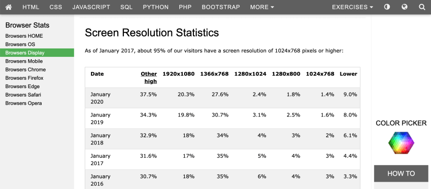
Second way is to go to this link
where you'll see the screen resolution statistics and you can plan accordingly as well.

Secondly: How to make a decision between Web First Design improvement and Mobile First Design improvement?
In Analytics Console, go to: Audience -> Mobile -> Overview
Here you'll be able to see three rows Desktop, Mobile, Tablet, you can make a decision on the basis of number of users as per device.


Top comments (0)