In an ever-changing world, companies must innovate to stay competitive. This ensures that they’ll make decisions with agility and safety, aiming for future results with greater accuracy.
Business Intelligence (BI) tools help companies make intelligent decisions instead of relying on trial and error. These intelligent decisions can make the difference between success and failure in the marketplace.
Microsoft Power BI is one of the industry’s leading business intelligence tools. With just a few clicks, Power BI makes it easy for managers and analysts to explore a company’s data. This is important because when data is easy to access and visualize, it’s much more like it’ll be used to make business decisions.

Power BI includes a wide variety of graphs, charts, tables, and maps. As a result, you can always find visualizations that are a good fit for your data.
BI tools are only as useful as the data that backs them, however. Power BI supports many data sources, and InterSystems IRIS is a recent addition to those sources. Since Power BI provides an exciting new way to explore data stored in IRIS, we’ll be exploring how to use these two amazing tools together.
This article will explain how to use IRIS Tables and Power BI together on real data. In a follow-up article, we’ll walk through using Power BI with IRIS Cubes.
Project Prerequisites and Setup
You will need the following to get started:
* InterSystems IRIS Data Platform
* Microsoft Power BI Desktop (April 2019 release or more recent)
* InterSystems Sample-BI data
We'll be using the InterSystems IRIS Data Platform, so you’ll need access to an IRIS install to proceed. You can download a trial version from the InterSystems website if necessary.
There are two ways to install the Microsoft Power BI Desktop. You can download an installer and, or install it through the Microsoft Store. Note that if you are running Power BI from a different machine than where you installed InterSystems IRIS, you will need to install the InterSystems IRIS ODBC drivers on that machine separately
To create a dashboard on Power BI we'll need some data. We'll be using the HoleFoods dataset provided by InterSystems here on GitHub. To proceed, either clone or download the repository.
In IRIS, I've created a namespace called SamplesBI. This is not required, but if you want to create a new namespace, in the IRIS Management Portal, go to System Administration > Configuration > System Configuration > Namespace and click on New Namespace. Enter a name, then create a data file or use an existing one.
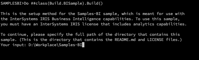
On InterSystems IRIS Terminal, enter the namespace that you want to import the data into. In this case, SamplesBI:

Execute $System.OBJ.Load() with the full path of buildsample/Build.SampleBI.cls and the "ck" compile flags:

Execute the Build method of Build.SampleBI class, and full path directory of the sample files:
Connecting Power BI with IRIS
Now it's time to connect Power BI with IRIS. Open Power BI and click on "Get Data". Choose "Database", and you will see the InterSystems IRIS connector:

Enter the host address. The host address is the IP address of the host for your InterSystems IRIS instance (localhost in my case), the Port is the instance’s superserver port (IRIS default is 57773), and the Namespace is where your HoleFoods data is located.
Under Data Connectivity mode, choose "DirectQuery", which ensures you’re always viewing current data.
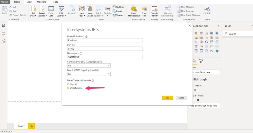
Next, enter the username and password to connect to IRIS. The defaults are "_SYSTEM" and "SYS".

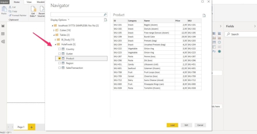
You can import both tables and cubes generated you’ve created in IRIS. Let’s start by importing some tables.
Under Tables and HoleFoods, check:
* Country
* Outlet
* Product
* Region
* SalesTransaction
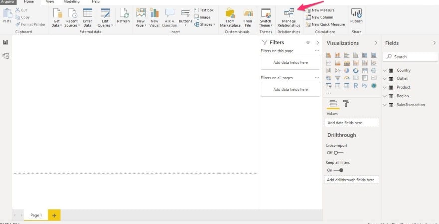
We're almost there! To tell Power BI about the relationship between our tables, click on "Manage Relationships".
Then, click on New.

Let's make two relationships: "SalesTransaction" and "Product relationship".
On top, select the "SalesTransaction" table and click on the "Product" column. Next, select the "Product" table and click on the "ID" column. You'll see that the Cardinality changes automatically to "Many to One (*:1)".

Repeat this step for the following:
* "SalesTransaction(Outlet)" with "Outlet(ID)"
* "Outlet(Country)" with "Country(ID)"
* "Country(Region)" with "Region(ID)":

Note that these relationships are imported automatically if they are expressed as Foreign Keys.
Power BI also has a Relationships schema viewer. If you click the button on the left side of the application, it will show our data model.

Creating a Dashboard
We now have everything we need to create a dashboard.
Start by clicking the button on the left to switch from schema view back to Report view. On the Home tab under the Insert Group, click the TextBox to add a Title.
The Insert Group includes static elements like Text, Shapes, and Images we can use to enhance our reports.

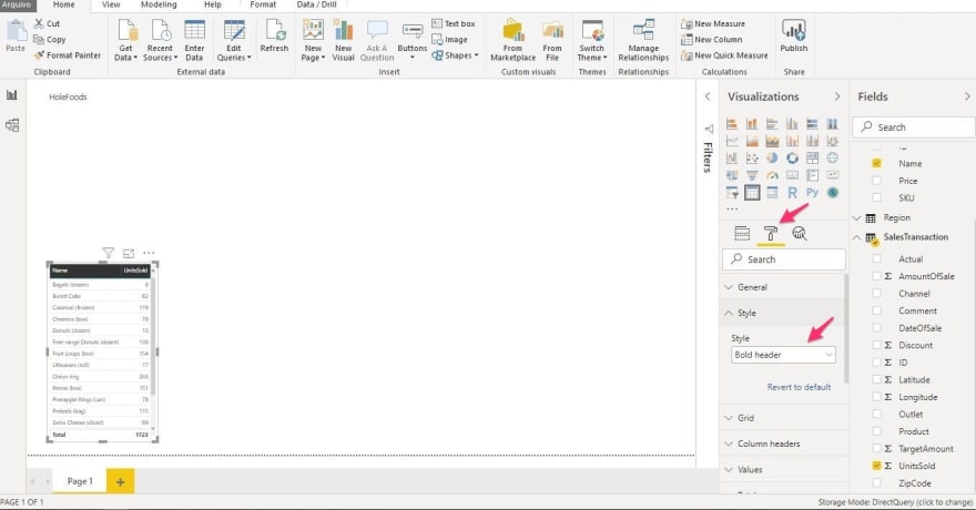
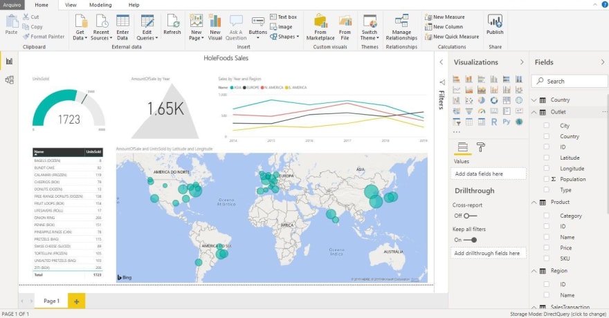
It's time to add our first visualization! In the Fields pane, check "Name" on "Product" and "UnitsSold" on "SalesTransaction".

Next, go to Style and select "Bold Header".
Now it's time to do some data transformation. Click on the ellipsis next to "SalesTransaction" in the Field pane.

Then, click on "Edit Query". It will open the "Power Query Editor".

Select the "DateOfSale" column and click on "Duplicate Column".

Rename this new column to "Year", and click on "Date" and select "Year".
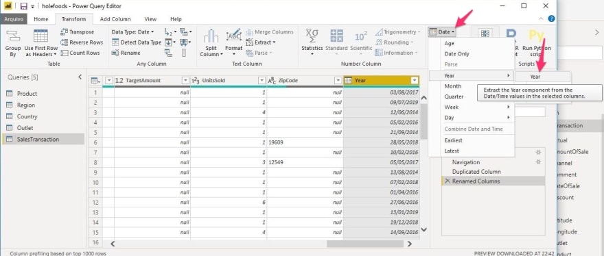
Apply these changes. Next, select the new column and, on the "Modeling" tab, change "Default Summarization" to "Don't Summarize".

Add a "Line Chart" visualization, then drag Year to Axis, drag "Name" from "Region" to Legend, and drag "AmountOfSale" from "SalesTransaction" to Values.

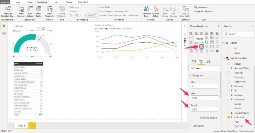
Imagine that the HoleFoods sales team has a target of selling 2000 units. How can we tell if the team is meeting its goal?
To answer, let's add a visual for metrics and targets.
On "SalesTransaction" in the Field pane, check "UnitsSold", then click Gauge Chart. Under the Style properties, set Max to 3000 and Target to 2000.
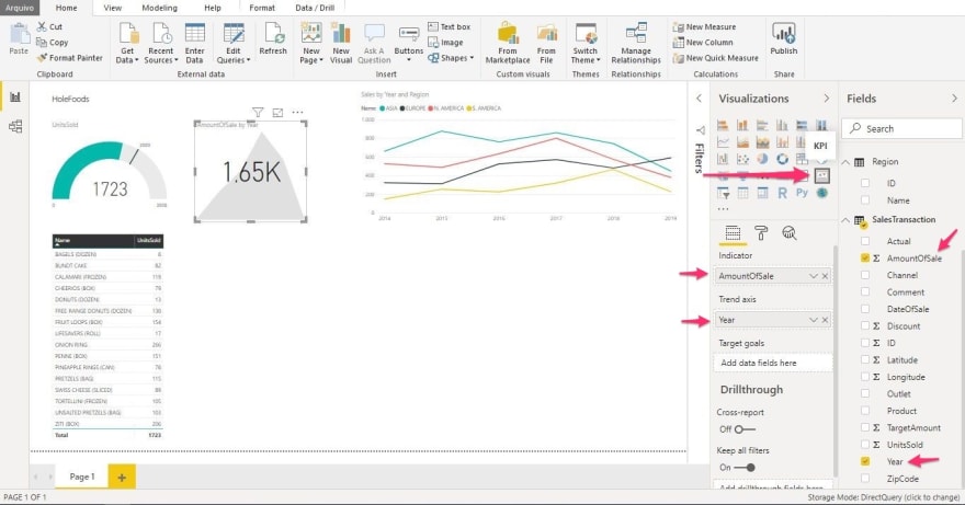
KPIs (Key Performance Indicators) are helpful decision-making tools, and Power BI has a convenient KPI visual we can use.
To add it, under "SalesTransaction", check "AmountOfSale" and choose KPI under “Visualizations”. Then, drag "Year" to "Trend axis".
To align all charts and visuals, simply click and drag a visual, and when an edge or center is close to aligning with the edge or center of another visual or set of visuals, red dashed lines appear.

You also can go to the View tab and enable "Show GridLines" and "Snap Objects to Grid".

We’ll finish up by adding a map that shows HoleFoods global presence. Set Longitude and Latitude on "Outlet" to "Don't Summarize" on the Modeling tab.

You can find the map tool in the Visualizations pane. After adding it, drag the Latitude and Longitude fields from Outlet to respective properties on the map. Also from SalesTransaction, drag the AmountOfSale to Size property and UnitsSold to ToolTips.

And our dashboard is finally complete.
You can share your dashboard by publishing it to the Power BI Service. To do this, you’ll have to sign up for a Power BI account.
Conclusion
In just a few minutes, we were able to connect Power BI to InterSystems IRIS and then create amazing interactive visualizations.
As developers, this is great. Instead of spending hours or days developing dashboards for managers, we can get the job done in minutes. Even better, we can show managers how to quickly and easily create reports for themselves.
Although developing visualizations is often part of a developer’s job, our time is usually better spent developing mission-critical architecture and applications. Using IRIS and Power BI together ensures that developer time is used effectively and that managers are able to access and visualize data immediately — without waiting weeks for dashboards to be developed, tested, and deployed to production.

Oldest comments (0)