
Material ui is a popular library made by Google in 2014 to unify React and Material Design. This library is widely used by the Web Developers and has a lot of free components. In this blog, I will tell you how to use media queries with material-ui and React.
Let's get started now by creating a folder on your desktop.
Then, open your terminal and navigate to that folder you have just created and type the following command in your terminal:
It will take some time for creating a new react project.
After this, open the folder in your favorite code editor.
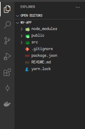
The project structure will be like this.
then type the command given below
It will start the react project in your browser on port 3000(default).
Now install material-ui by typing in terminal

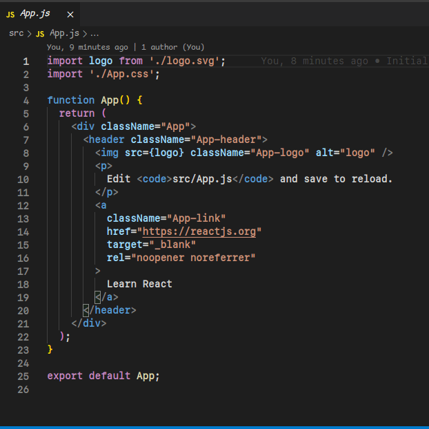
Now comes the coding part, open App.js in src folder in your code editor
Remove the header and import React from 'react'. After this
import Typography and makeStyles from material-ui/core
and declare a variable classes to make use of the styles in your JSX

Now start giving styles first for desktop. Here the theme variable will refer to your styles for your components. You can make use of this variable to change the styling of components at different screen size as

Here,"down" means when your screen size reduces it will apply the style written in these brackets(those are changing) and will not affect which are not changing with screen size.
In this example the fontSize of the "Hello World" changes from "5rem" to "1rem" when switched to extra small screen size and all other style remains same.
You can also use "up" to change styles whenever the screen size increases.


You can also use useMediaQuery in material-ui assigned to a variable by specifying the prop to change whenever the screen size change

It will return true or false whenever the screen size reduces or increases depending on viewport.It can be used to change the styles whenever the screen size change.
In the above code, it will return false when the screen size decreases below 600px.
So, this way you can change styling based on viewport size of the device.
Thanks for reading.

Top comments (1)
Great blog!! Nice way of explanation