This is the first part of two, examining many ways to approach responsive font-sizing
Based on assisting a fellow developer with a more responsive design, I realized how many different ways there are to make your design responsive in regards to font-sizing. From media queries all the way to fluid typography with calc functions, I'm going to work through the most common methods to responsive font-sizing.
For each example I will use the same simple HTML code containing a few headings, a paragraph, and a button.
Pixels
For our font-sizing, let's start somewhere familiar, pixels. Our first example uses pixels to fix our font-sizes for each element.
h1 {
  font-size: 24px;
}
h2 {
  font-size: 20px;
}
p {
  font-size: 14px;
}
button {
  font-size: 18px;
}

The example looks very readable in a smaller screen size, but to a user viewing this on a large desktop, this could be unreadable. It would be awesome if the text got larger when the screen does too. So let's add in a media query so once our screen expands to 600px or wider, our font-sizes can grow along with it.
h1 {
  font-size: 24px;
}
h2 {
  font-size: 20px;
}
p {
  font-size: 14px;
}
button {
  font-size: 18px;
}
@media only screen and (min-width: 600px) {
  h1 {
  font-size: 30px;
  }
  h2 {
  font-size: 24px;
  }
  p {
    font-size: 18px;
  }
  button {
    font-size: 22px;
  }
}

That is much better, but our CSS rules have already doubled in size. If we account for all the possible screen sizes, we might end up with over twenty rules for only four elements. So what other options do we have?
Absolute Keywords
Absolute-size keywords are based on the user's default font size ( medium ). These might be easier to conceptualize when you're coding, but they don't do much extra for you in terms of sizing. We still end up with running a media query to achieve our goal and the possibility of a huge number of rules still looms.
h1 {
  font-size: xx-large;
}
h2 {
  font-size: x-large;
}
p {
  font-size: medium;
}
button {
  font-size: large;
}

@media only screen and (min-width: 600px) {
  h1 {
  font-size: xxx-large;
  }
  h2 {
  font-size: xx-large;
  }
  p {
    font-size: large;
  }
  button {
    font-size: x-large;
  }
}

Using EM
Using an em value creates a dynamic or computed font size. The numeric value acts as a multiplier of the font-size property of the element on which it is used.
html {
  font-size: 100%;
}

h1 {
  font-size: 2em;
}
h2 {
  font-size: 1.5em;
}
div {
  border: 1px solid;
  font-size: 120%;
  padding: 2.5%;
}
p {
  font-size: 1em;
}
button {
  font-size: .69em;
}

@media only screen and (min-width: 600px) {
  html {
    font-size: 120%;
  }
}

For this example I used wrote out em sizes for each element using HTML's default sizing in em. This time I have wrapped the p and button tags inside a div. Em values compound, so when setting our div font-sizes to 120%, everything inside that container will be that much larger.
The cool thing with using em values is now we can write a media queries for only the body tag, keeping our CSS DRY and ensuring the ratios between font sizes remain intact. Our H1 and H2 tags grow to 120% of their original size, and our div items now compound to grow to 144% of their original size, multiplied by both the body tag sizing of 120% and the div tag sizing of 120%.
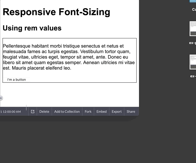
REM
If compounding sizes is too much to keep track of, rem is a better choice for you. Rem values are relative to the HTML root element, so with our same CSS rules values changed from em to rem we get
html {
  font-size: 100%;
}

h1 {
  font-size: 2rem;
}
h2 {
  font-size: 1.5rem;
}
div {
  border: 1px solid;
  font-size: 120%;
}
p {
  font-size: 1rem;
}
button {
  font-size: .69rem;
}

@media only screen and (min-width: 600px) {
  html {
    font-size: 120%;
  }
}
Next
In part two, I will explore my favorite techniques - using viewport units, and fluid typography for responsive font-sizing.
Additional Resources
https://www.w3schools.com/howto/howto_css_responsive_text.asp
https://developer.mozilla.org/en-US/docs/Web/CSS/text-size-adjust
https://webdesign.tutsplus.com/articles/7-css-units-you-might-not-know-about--cms-22573

Top comments (0)