
I'm going to be build this with pure HTML and CSS, using CSS grids.
Intro
I wanted to write about getting started using CSS grids, but damn if MDN docs just nailed it already. So, if you're interested to get started with CSS grids ( and you should ) please check out MDN Web Docs guide to CSS grids.
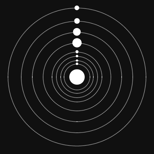
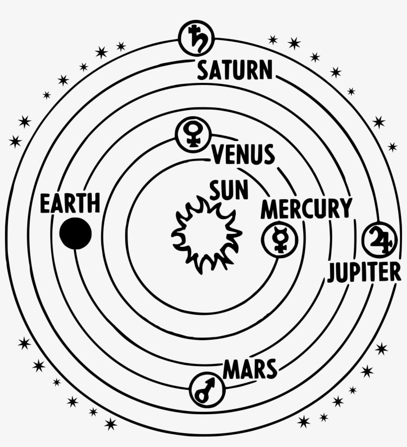
After I realized the basics are well cover, I was seeking a project to build in CSS grids and the original Space Jam web page was brought up to me ( Credit Jessie Wu ). Recreated here using CSS grids, It's a great example of how CSS grids is responsive and awesome. From that idea I decided to create a responsive solar system. Using this image for reference
My goal is to make a 2D responsive “image” containing 8 planets, plus a sun. I want to retain the lines that represent the orbit path for each body. I will not include the names of each planet. Now, let's get started.
Step 1
Opening a blank HTML and CSS document, I will make an empty main element to contain the solar system.
body {
   padding: 0;
   margin: 0;
   box-sizing: border-box;
   display: grid;
   place-items: center;
   height: 100vh;
}
main {
   width: 90vw;
   height: 90vw;
   margin: 5vh 5vw;
   border: 1px solid #cccccc;
}
I added a light border so we can see where we are working, and position it in the middle of the screen.
Neptune & Orbit
I decided to work from the outer planets inward, I'm sure this could be done working from the center out as well, this is the way I chose to build this design. Adding a div that will represent the first planet, Neptune.
.neptune {
   height: 5vmin;
   width: 5vmin;
   border-radius: 50%;
   border: 2px solid #000000;
}
We have a planet, sort of, without an orbit it’s just a circle right now, so let’s add a second div that will be Neptune’s orbit
   <main>
       <div class="neptune"></div>
       <div class="neptune-orbit"></div>
   </main>
.neptune-orbit {
   border-radius: 50%;
   border: 2px solid #000000;
}
I added a border, and border radius 50% to ensure it is a circle, at least eventually. We really need to employ the power of CSS-grids.
Neptune’s Grid
The goal is to have a perfect circle, so if we instruct our “neptune-orbit” element to fill the entire grid, while keeping the border-radius at 50%, it should make a perfect circle.
main {
   width: 90vw;
   height: 90vw;
   margin: 5vh 5vw;
   border: 1px solid #cccccc;
   display: grid;
   grid-template-columns: 1fr 1fr;
   grid-template-rows: 1fr 1fr;
}

.neptune {
   height: 5vmin;
   width: 5vmin;
   border-radius: 50%;
   border: 2px solid #000000;
   grid-row: 1/2;
   grid-column: 1/3;
}

.neptune-orbit {
   border-radius: 50%;
   border: 2px solid #000000;
   grid-row: 1/3;
   grid-column: 1/3;
}
The “neptune” element is positioned inside the first row, and both columns. If we instruct it to “justify-self” to the center, it should be closer to the orbit we it to match up with.
Now we are very close. If we push the item up towards the top by half of it’s height, it should be visually aligned with the orbit. Normally I choose to position an item using the relative position property, but that doesn’t apply within CSS-grids, so I will use the uglier but equally effective negative margin. using a margin-bottom in this case causes some real issues within the grid system
.neptune {
   height: 5vmin;
   width: 5vmin;
   border-radius: 50%;
   border: 2px solid #000000;
   grid-row: 1/2;
   grid-column: 1/3;
   justify-self: center;
   margin-top: -2.5vmin;
}
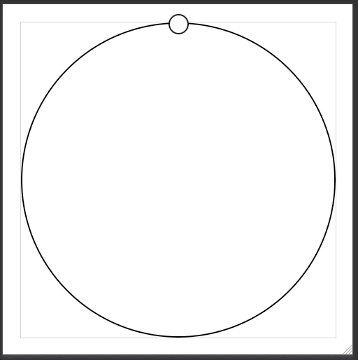
Almost perfect, I would rather not see the orbit line run right through our planet. So, I will switch the HTML to create the orbit first, then add a background color of #fffff to the neptune. Perfect!
Uranus
First things first, I want to abstract out any CSS that I will use for each planet or obit into it’s own class, so I keep my code DRY.
<div class="neptune-orbit"></div>
<div class="neptune planet"></div>
.planet {
   height: 5vmin;
   width: 5vmin;
   border-radius: 50%;
   border: 2px solid #000000;
   background: #ffffff;
}
.orbit {
   border-radius: 50%;
   border: 2px solid #000000;
}
.neptune {
   grid-row: 1/2;
   grid-column: 1/3;
   justify-self: center;
   margin-top: -2.5vmin;
}
.neptune-orbit {
   grid-row: 1/3;
   grid-column: 1/3;
}
Now we can add a planet, or orbit class when we need.
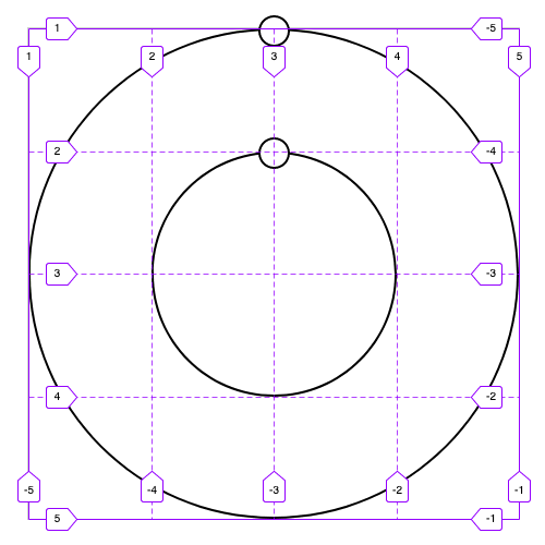
Thinking ahead with our grid, we need a grid of two columns and two rows to make a circle for the orbit, so if we want to add another orbit inside our current orbit, we will need to add two more columns and two more rows to do so.
grid-template-columns: 1fr 1fr 1fr 1fr;
grid-template-rows: 1fr 1fr 1fr 1fr;
But this is already getting ugly, so let’s refactor to account for adding more rows in the future.
grid-template-columns: repeat(4, 1fr);
grid-template-rows: repeat(4, 1fr);
Now let’s adjust Neptune’s grid assignments accordingly
.neptune {
   grid-row: 1/2;
   grid-column: 1/5;
}
.neptune-orbit {
   grid-row: 1/5;
   grid-column: 1/5;
}
Almost there, now let’s add CSS to “uranus” so it positions itself in the proper space.
.uranus {
   grid-row: 2/3;
   grid-column: 1/5;
}
.uranus-orbit {
   grid-row: 2/4;
   grid-column: 2/4;
}
We now have two planets, and a system to go forward.
I'm going to send this to part 2 now, because this is already getting long.

Top comments (0)