Credit Information
This article is highly based on Keith Clark's article.
Another article I found is from orangetable.com
which has simpler approach but also talked about another kind of caveat
found on Safarai and iOS.
My first css parallax example
I have some article about css parallax which is work in process.
and THIS is the first version of working Html+Css.
The Parallax Effects solely by CSS
It has been more than eight years since he posted about parallax effect by using css transformation. the Most of major web browser implements differently, so we need to embrace the caveats in the end.
However it still has technical merit if we could gain those effects even
without javascript. and so many websites have the basic parallax on their
home page..
So why don't you check out?
Css Transformation
the basic concepts are very well explained in
The Theory on Keith's article.
concisely, to get 3d transformation we need:
three elements with some attributes
- base element and a
perspectivefrom where we see the object on the page. (which is generally not moving during transformation) - an
anchor element(normallydiv) contains the elements which is actually transformed. -
transformation origin(default is the center of the anchor (parent) element.
In another words -- in css:
(this is different from original article but using same magic)
.css-parallax-toplevel {
    perspective: 100px;
    height: 100vh;
    overflow-x: hidden;
    overflow-y: auto;
}

.css-parallax-group {
    /* we can have several parallax group but
     * we are going to use only one group here */
    position: relative;
    height: 500px; /* fallback for older browsers */
    height: 100vh;

    /* prevents the browser flattening the `css-parallax-group` elements */
    transform-style: preserve-3d;
}

.css-parallax-layer {
    /* common settings for an element under `css-parallax-group` */

    /* v fill the space of the container */
    top: 0; right: 0; bottom: 0; left: 0;
    position: relative;
}

/* about css selectors:
 * https://www.w3schools.com/cssref/css_selectors.asp
 */
.css-parallax-layer.as-background {
    /* v pull out from the content flow */
    position: absolute;
    transform: translateZ(-400px);
   -webkit-transform: translateZ(-400px);
}

.css-parallax-layer > *
, .css-parallax-layer.as-base {
    z-index: 1;
    /* prevents the browser flattening the `css-parallax-group` elements */
    transform-style: preserve-3d;
}
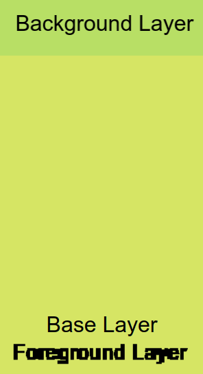
So if the elements are located in different depth (on Z-axis) and moving
relatively to the perspective will be transformed differently.
and which is literally real parallax.
and The Demo #1 is first one for you to understand how the tranformation works.
But Size Matters
As you can see the example above, we only care about moving speed, not transformed size, so Keith explain it as Depth correction.
So we need to scale up if it's below the display plane or vice versa.
He didn't mention about how the value of scale is calculated. (because it is maybe too simple?) and this is a poor explanation from me.
                      /‖    ⤒
                     / ‖
                    /  ‖
                  |/   ‖
                  |    ‖
                 /|⤒   ‖    n
                / |    ‖
               /  |m   ‖
              /   |    ‖
perspective) .____|⤓___‖   ⤓
                  |
                  |    ↑ real position
                  ↑ display plane

             ⇤ p⇥ ⇤ k ⇥


so we can see two triangles:

                    m                         n
  small :  tan θ = ---      large :  tan θ = ----
                    p                        p+k

   or

  p : (p+k) = m : n

and the scale amount we need is transforming from `m` to `n` (real size)
i.e)   `n / m` is the one.
           n     (p+k)
  scale = --- = ------
           m       p

so if we set p(perspective) as 1px and
 if k(negate of translateZ)  is 1px (negate of -1px)

          (1 + 1)
  scale = -------   = 2
             1
So we can control the parallax speed ( which is 1/scale ) with p and k !!
Trouble shootings
Height Calculation wrong!
If seeing the screen capture below, we will find that the scroll
had not stopped up to the where article ended and - even worth -
scrolling kept going beyond the background as well.
Wrong Scroll Position on Edge

but there is no problem on Firefox 97.0 (64-bit)
Why is this happening?
Explanation on Keith's article
However, In my case, the calculation is wrong vertically not horizontally, my similar solution is done by adding perspective-origin and transform-origin as below.
.css-parallax-toplevel {
    /* .. snip .. */
    /* v fix wrong calculation visual size(height) of background
     *   on webkit based browsers.
     */
    perspective-origin: center bottom;
    /* .. snip again .. */
}

.css-parallax-layer {
    /* .. snip .. */

    /* v fix wrong calculation visual size(height) of background
     *   on webkit based browsers.
     */
    transform-origin: center bottom; /* X-axis, Y-axis per each */
    /* .. snip again .. */
}
keep origin on X-axis center but bottom on Y-axis.
More caveat and bugs explained
Unfortunately I don't have any iOS products, MS Windows either.
maybe I should go Apple centre or JB hi-fi for checking those??
However, Keith mentioned about some trouble shooting on different web browsers.
please find more information Here.
Problem on Vivaldi (Work In Progress)
I haven't found working around yet.
But If you select the text, it shows correctly.
(so maybe using javascript to select individually? nah... I guess that a bug report is required.)
Problem on FF(Firefox) for mobile (Work In Progress)
Bottom Menu always revealed on FF Mobile

This bug prevents for user to see content at the bottom which is,
in my opinion, serious problem.
but there is no working around, I think bug report required.
Bug Reported:
https://bugzilla.mozilla.org/show_bug.cgi?id=1764498
Bug with meta viewport ... initial-scale=1
If you are seeing the site with Desktop Mode, there is no problem on Chrome.
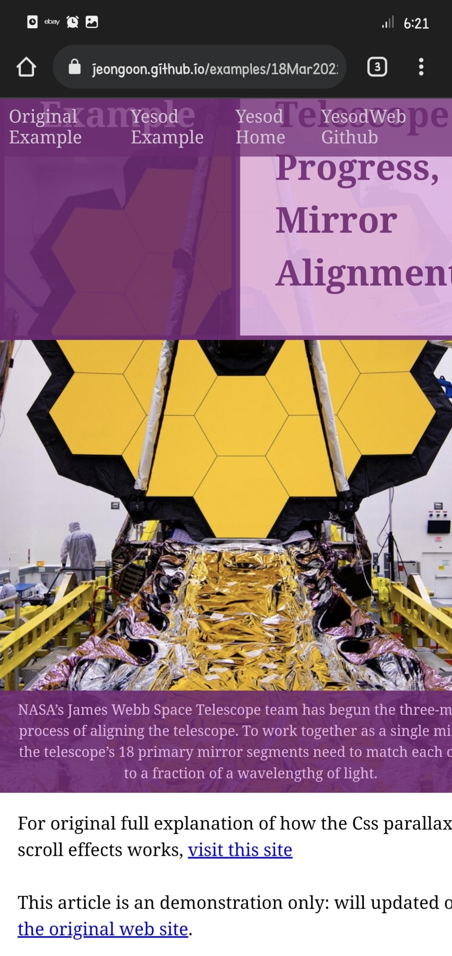
However on Mobile Mode, it looks like below.
Brave mobile also does the same miscalculation.
Right hand side cropped on Chrome Mobile

Solution
remove any line like below
<meta name="viewport" content="width=device-width, height=device-height, viewport-fit=contain, initial-scale=1">
and add your own text level. My testing values are shown below so far:
 /* increase the font size on portrait mode on mobile */
@media only screen and (pointer: coarse) and (orientation: portrait)
       and (max-width: 992px) {
    html, body {
        font-size: 3.5vw;
    }
}

/* but increase not too much on landscape mode on mobile */
@media only screen and (pointer: coarse)  and (orientation: landscape)
       and (max-width: 992px) {
    html, body {
        font-size: 2vw;
    }
}
Explanation
only screenis used to be ignored on older browsersIf screen size is equal or less than medium, scale the font-size as 3.5vw.
(which is maximum value for chrome on android so far)
but, on landscape mode -- viewport normally wider -- use less scaling: 2vw.(pointer: coarse) is used to detect mobile device.
and please don't forget to use all the font size by using
remorem
Conclusion
quick wrapping up
- pros: the effect is smoother than javascript version.
- cons: hard to debug if something goes wrong. (typo, misunderstanding)
I found that this parallax effects is still useful for basic website. And as mobile device is getting faster and more features,
the effect techniques are also applicative on
mobile device as well.
However, I also found that if user made mistake on css or applying on html elements,
the user are unable to get information where the mistake is blocking the effects.
so IMHO, this is where widget or or even javascript helper function required.
Thank you for reading!


Top comments (0)