
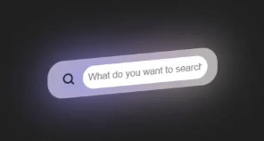
3D Animated Search Bar
HTML Code
<div class="input__container">
  <div class="shadow__input"></div>
  <button class="input__button__shadow">
    <svg fill="none" xmlns="http://www.w3.org/2000/svg" viewBox="0 0 20 20" height="20px" width="20px">
      <path d="M4 9a5 5 0 1110 0A5 5 0 014 9zm5-7a7 7 0 104.2 12.6.999.999 0 00.093.107l3 3a1 1 0 001.414-1.414l-3-3a.999.999 0 00-.107-.093A7 7 0 009 2z" fill-rule="evenodd" fill="#17202A"></path>
    </svg>
  </button>
  <input type="text" name="text" class="input__search" placeholder="What do you want to search?">
</div>
CSS Code
.input__container {
  position: relative;
  background: rgba(255, 255, 255, 0.664);
  padding: 10px 15px;
  display: flex;
  justify-content: center;
  align-items: center;
  gap: 5px;
  border-radius: 22px;
  max-width: 300px;
  transition: transform 400ms;
  transform-style: preserve-3d;
  transform: rotateX(15deg) rotateY(-20deg);
  perspective: 500px;
}

/* Visit https://democoding.in/ for more free css animation */

.shadow__input {
  content: "";
  position: absolute;
  width: 100%;
  height: 100%;
  left: 0;
  bottom: 0;
  z-index: -1;
  filter: blur(30px);
  border-radius: 20px;
  background-color: #999cff;
  background-image: radial-gradient(at 85% 51%, hsla(60,60%,61%,1) 0px, transparent 50%),
    radial-gradient(at 74% 68%, hsla(235,69%,77%,1) 0px, transparent 50%),
    radial-gradient(at 64% 79%, hsla(284,72%,73%,1) 0px, transparent 50%),
    radial-gradient(at 75% 16%, hsla(283,60%,72%,1) 0px, transparent 50%),
    radial-gradient(at 90% 65%, hsla(153,70%,64%,1) 0px, transparent 50%),
    radial-gradient(at 91% 83%, hsla(283,74%,69%,1) 0px, transparent 50%),
    radial-gradient(at 72% 91%, hsla(213,75%,75%,1) 0px, transparent 50%);
}

.input__button__shadow {
  cursor: pointer;
  border: none;
  background: none;
  transition: transform 400ms, background 400ms;
  display: flex;
  justify-content: center;
  align-items: center;
  border-radius: 12px;
  padding: 5px;
}

.input__button__shadow:hover {
  background: rgba(255, 255, 255, 0.411);
}

.input__search {
  width: 100%;
  border-radius: 20px;
  outline: none;
  border: none;
  padding: 8px;
  position: relative;
}
Thanks for Reading ❤️! Check my website Demo coding for updates about my latest CSS Animation, CSS Tools, and some cool web dev tips. Let's be friends!
Don't forget to subscribe our channel : Demo code

Top comments (0)