
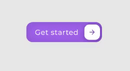
Get Started CSS Button Hover Effect
HTML Code
<button class="cssbuttons-io-button"> Get started
  <div class="icon">
    <svg xmlns="http://www.w3.org/2000/svg" viewBox="0 0 24 24" width="24" height="24"><path fill="none" d="M0 0h24v24H0z"></path><path fill="currentColor" d="M16.172 11l-5.364-5.364 1.414-1.414L20 12l-7.778 7.778-1.414-1.414L16.172 13H4v-2z"></path></svg>
  </div>
</button>
CSS Code
.cssbuttons-io-button {
  background: #A370F0;
  color: white;
  font-family: inherit;
  padding: 0.35em;
  padding-left: 1.2em;
  font-size: 17px;
  font-weight: 500;
  border-radius: 0.9em;
  border: none;
  letter-spacing: 0.05em;
  display: flex;
  align-items: center;
  box-shadow: inset 0 0 1.6em -0.6em #714da6;
  overflow: hidden;
  position: relative;
  height: 2.8em;
  padding-right: 3.3em;
}

/* Visit https://democoding.in/ for more animation */

.cssbuttons-io-button .icon {
  background: white;
  margin-left: 1em;
  position: absolute;
  display: flex;
  align-items: center;
  justify-content: center;
  height: 2.2em;
  width: 2.2em;
  border-radius: 0.7em;
  box-shadow: 0.1em 0.1em 0.6em 0.2em #7b52b9;
  right: 0.3em;
  transition: all 0.3s;
}

.cssbuttons-io-button:hover .icon {
  width: calc(100% - 0.6em);
}

.cssbuttons-io-button .icon svg {
  width: 1.1em;
  transition: transform 0.3s;
  color: #7b52b9;
}

.cssbuttons-io-button:hover .icon svg {
  transform: translateX(0.1em);
}

.cssbuttons-io-button:active .icon {
  transform: scale(0.95);
}
Thanks for Reading ❤️! Check my website Demo coding for updates about my latest CSS Animation, CSS Tools, and some cool web dev tips. Let's be friends!
Don't forget to subscribe our channel : Demo code

Top comments (0)