
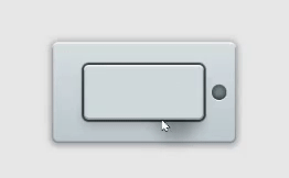
Realistic Switch button in CSS
HTML Code
  <input name="switch" id="switch" type="checkbox">
  <label class="switch" for="switch"></label>
CSS Code
#switch {
  visibility: hidden;
  clip: rect(0 0 0 0);
  position: absolute;
  left: 9999px;
}

.switch {
  display: block;
  width: 130px;
  height: 60px;
  margin: 70px auto;
  position: relative;
  background: #ced8da;
  background: linear-gradient(left,  #ced8da 0%,#d8e0e3 29%,#ccd4d7 34%,#d4dcdf 62%,#fff9f4 68%,#e1e9ec 74%,#b7bfc2 100%);
  filter: progid:DXImageTransform.Microsoft.gradient( startColorstr='#ced8da', endColorstr='#b7bfc2',GradientType=1 );
  transition: all 0.2s ease-out;
  cursor: pointer;
  border-radius: 0.35em;
  box-shadow: 0 0 1px 2px rgba(0,0,0,0.7),
    inset 0 2px 0 rgba(255,255,255,0.6),
    inset 0 -1px 0 1px rgba(0,0,0,0.3),
    0 8px 10px rgba(0,0,0,0.15);
}

/* Visit https://democoding.in/ for more free css animation */

.switch:before {
  display: block;
  position: absolute;
  left: -35px;
  right: -35px;
  top: -25px;
  bottom: -25px;
  z-index: -2;
  content: "";
  border-radius: 0.4em;
  background: #d5dde0;
  background: linear-gradient(#d7dfe2, #bcc7cd);
  box-shadow: inset 0 2px 0 rgba(255,255,255,0.6),
    inset 0 -1px 1px 1px rgba(0,0,0,0.3),
    0 0 8px 2px rgba(0,0,0,0.2),
    0 2px 4px 2px rgba(0,0,0,0.1);
  pointer-events: none;
  transition: all 0.2s ease-out;
}

.switch:after {
  content: "";
  position: absolute;
  right: -25px;
  top: 50%;
  width: 16px;
  height: 16px;
  border-radius: 50%;
  background: #788b91;
  margin-top: -8px;
  z-index: -1;
  box-shadow: inset 0 -1px 8px rgba(0,0,0,0.7),
    inset 0 -2px 2px rgba(0,0,0,0.2),
    0 1px 0 white,
    0 -1px 0 rgba(0,0,0,0.5),
    -47px 32px 15px 13px rgba(0,0,0,0.25);
}

#switch:checked ~ .switch {
  background: #b7bfc2;
  background: linear-gradient(to right, #b7bfc2 0%,#e1e9ec 26%,#fff9f4 32%,#d4dcdf 38%,#ccd4d7 66%,#d8e0e3 71%,#ced8da 100%);
  filter: progid:DXImageTransform.Microsoft.gradient( startColorstr='#b7bfc2', endColorstr='#ced8da',GradientType=1 );
}

#switch:checked ~ .switch:after {
  background: #b1ffff;
  box-shadow: inset 0 -1px 8px rgba(0,0,0,0.7),
    inset 0 -2px 2px rgba(0,0,0,0.2),
    0 1px 0 white,
    0 -1px 0 rgba(0,0,0,0.5),
    -110px 32px 15px 13px rgba(0,0,0,0.25);
}
Thanks for Reading ❤️! Check my website Demo coding for updates about my latest CSS Animation, CSS Tools, and some cool web dev tips. Let's be friends!
Don't forget to subscribe our channel : Demo code

Top comments (0)