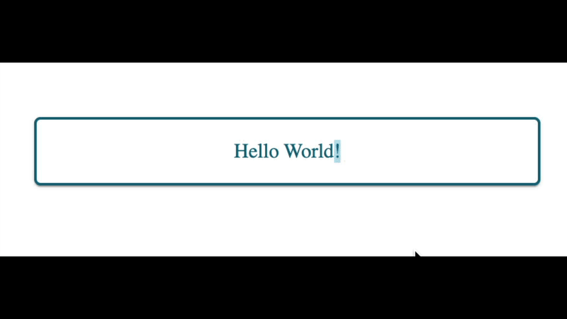
In this tutorial, I want to show you how to make your cards pop out on hover using only CSS. This effect looks like this:

Here's the code, and a codepen. For an explanation of how everything works, read on!
The HTML:
<article class="card-outer">
  <a href="#" class="card-inner">
    Hello World!
  </a>
</article>
The CSS:
.card-outer {
  box-shadow: 0px 2px 1px -1px rgba(0, 0, 0, 0.2),
              0px 1px 1px 0px rgba(0, 0, 0, 0.14),
              0px 1px 3px 0px rgba(0, 0, 0, .12);
  border-radius: 5px;
  background: #82C0CC;
}

.card-inner {
  border-radius: 5px;
  background: #fff;
  border: 2px solid #16697A;
  padding: 1rem 1rem;
  display: block;
  color: #16697A;
  text-decoration: none;
  transition: transform .07s ease-out;
}

.card-outer:hover .card-inner {
  transform: translate(-10px, -10px);
}
Explanation of the code
The first thing to dive into is the card-outer and card-inner classes. We can think of the card-outer as the bottom layer and card-inner as the top layer. The bottom layer is where we apply out accent color, 82C0CC, and the top layer is the one we'll apply the transformation on. The other important piece to get this effect working is to apply display: block on the card-inner class. For the hover effect to work we need the a.card-inner element to take up the entire space of the div.card-outer element; which is what display: block achieves.
Next is the hover effect, .card-outer:hover .card-inner. We are attaching the hover event to the outer layer. When the effect triggers it will apply a style (transform) to the inner layer. The transform will move the inner card up and to the left by 10 pixels. We could have attached the hover effect to the card-inner element. Like so:
.card-inner {
  border-radius: 5px;
  background: #fff;
  border: 2px solid #16697A;
  padding: 1rem 1rem;
  display: block;
  color: #16697A;
  text-decoration: none;
  transition: transform .07s ease-out;
}

.card-inner:hover {
  transform: translate(-10px, -10px);
}
Unfortunately, there's an issue with having the effect on the inner class:
This jitter (for lack of a better term) is caused by the transform. As you hover over card-inner, the transform will move the card away from your mouse cursor. Now that your mouse isn't hovering over the card it will start to move back to the original spot. If your mouse cursor is still there, it will trigger the hover effect again. This will loop forever until you move your mouse away from that spot. By applying the hover effect onto card-outer you prevent this from happening since the transform isn't happening on the outer card.
That's the main points! The rest of the styles are for look rather than functionality. Hopefully, you have all the tools you need to add a fun hover effect to your cards. Can't wait to see how you use it!

Top comments (0)