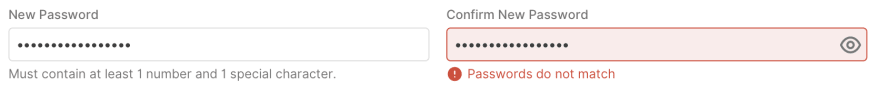
I've been implementing a component library where the implementation of a text input with errors looked something like this:
This conflicted with the advice from Adam Silver in Form Design Patterns that was close to the design in the Gov UK Design System

I wanted to see why Adam suggested this style of implementation.
Looking at others
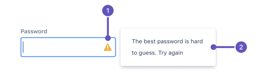
Honestly, looking at others create more uncertainty. Some libraries like Atlaskit suggested putting icons within the text box:
 .
.
Material design suggests replacing any helper text with an error message below the input box:
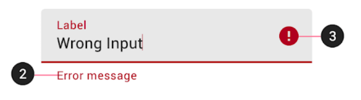
This seemed especially problematic because after an error occurs, the help text is no longer visible which may contain important information that helps the user properly input the data. For instance, if the input is a date input, then the help text may be "Date should be formatted (MM/DD/YYYY)". If no input is provided to a required date input, the error message would be "Enter a date." But how to format that date is gone!
NNGroup goes into why it may not be best to look to other large companies for UX designs:
(article continues after video).
Down the rabbit hole of science
Finding recent journal articles about this topic was very difficult. I began the journey with User-friendly locations of error messages in web forms: Put them on the right side of the erroneous input field. Sure enough in the title, my answer may have been provided. However, this study was conducted in early 2012, before responsive design implementations really took off at the enterprise level. For mobile devices, placing the error messages on the right side would take up a lot of real estate, and the study excluded mobile users.
However, it did note that "There was no significant difference be-tween the four locations near the erroneous input field". So, as long as your error was close to the input, it didn't really matter other than the preference of your user base.
So looking at who had cited this article, I found a few more resources particularly, A Study of Usability of Arabic Forms for Smartphones. This study focused exclusively on mobile devices, and found the following:
The previous discussion applies to the big device groups as well, except that the group that scored the shortest time is the [below label and above input] group. In our opinion and according to the feedback that we got from users in the retrospective think aloud, placing error messages below label scores the best results because users will immediately recognize that the error message belongs to that field, because it is placed between the label and its text box.
This still wasn't the definitive answer I wanted. It seemed to come down more to user preference than anything.
Digging deeper into Adam's book, I found this reference: Avoid Messages Under Fields by Adrian Roselli. Adrian found that placing information on how to fill out the form can be problematic due to browser features covering up that information on desktop and mobile.
Conclusion
My final design looks something like this:
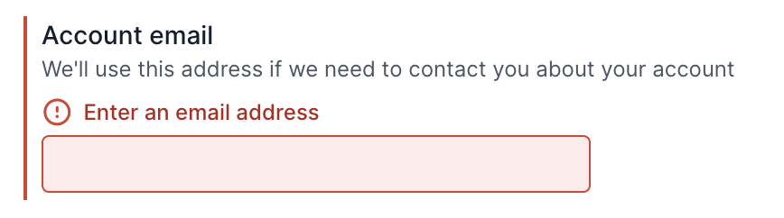
Adding a border to the left may help enforce association between the error, label, description, and input box. However, further testing may show if this is actually necessary.
The lesson here is to understand the usability of something before reaching for others. Large companies may have designs that work for them, but may not necessarily be the best for your users.
This may seem like a lot of effort for something as simple as an error message, but it's important that users have a good experience and understand how their data is being used. Forms can already be a frustrating experience, so making it less so is a huge win.
Special Thanks
Thanks Adam Silver for answering my many twitter questions and for a great book.

Top comments (0)