
TL;DR - CSS Grid and Flexbox are great. I use Grid for layouts and two-dimensional renderings, and Flexbox for one-dimensional renderings and components.
CSS is tough. When I started professionally developing websites about five years ago, there was zero incentive to develop CSS knowledge; even basic layouts seemed hacky, with prolific use of float: right; this and margin: 0 auto; that. It didn't intrinsically make sense and only added to the mystique and inapproachability that was CSS at the time.
Like many other software engineers at the time, I reached for CSS frameworks to solve the problem. I Bootstrapped, Bulma'ed, and Material Designed my way through a lot of them. Frameworks like these enable teams to develop products quickly and with a degree of uniformity. Professionally, I exclusively used frameworks for a long time, with the occasional tweak here and there in regular CSS. But frameworks are not without downsides: they can add a lot of weight to your package bundle, add complexity to your markup, and are yet another thing to learn.
I had all but resigned myself to working with frameworks forever, until I came across this tweet, in a thread discussing how a lot of folk (like me!) think CSS is a pain:
@WebDojo @chriscoyier Modern CSS has solved so much of this. Come back to it with a fresh mind removing any remembrance of floats and Internet Explorer.03:49 AM - 09 Apr 2020
1
108


This inspired me. Have I ignored major improvements in CSS? Is it easier now? Does it make more sense? What if I come back to it with a 'fresh mind'?
And thus, this blog series was born. I'm going to relearn CSS and write about it along the way. I'll be looking at layouts, components, 'pure-CSS' images, and animations.
First up, layouts. Specifically, should I build my layout with CSS Grid or Flexbox?
Grid or Flexbox?
According to our good friends at CanIUse (as of 8 May, 2020) both Flexbox and Grid work with the browsers a significant majority of people use.


While Grid has a bit more red in its image, it still works with the browsers 95% of the population use. For my audience, that works fine. If you need to accommodate for that remaining ~5%, I'd suggest adding appropriate polyfills.
Building Layouts
Most layouts look something like this:
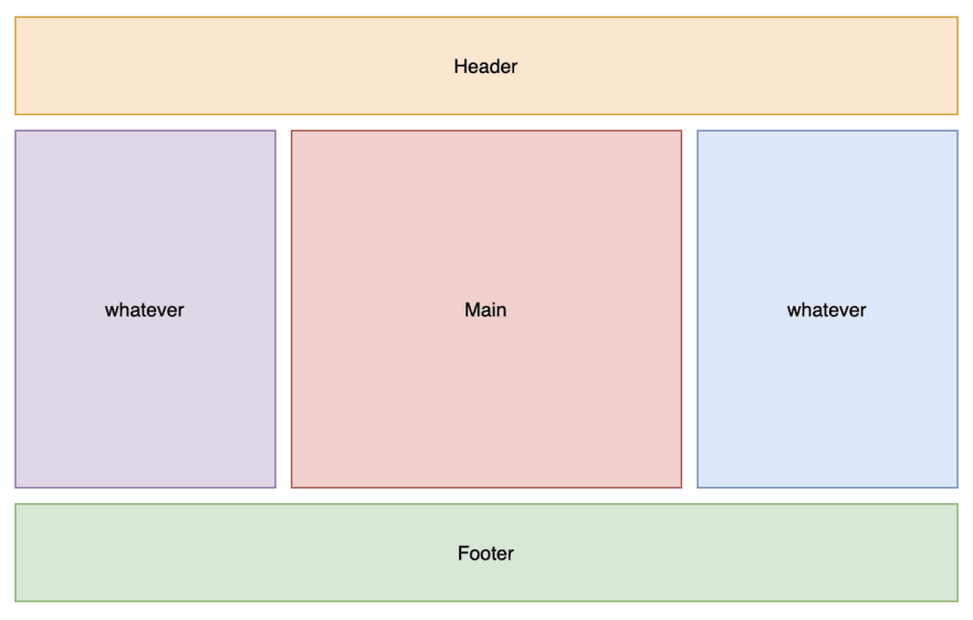
The 'Holy Grail' Layout. What was once a pain, is now pretty simple
I'd hazard a guess that a ridiculous proportion of websites have some form of this basic layout in place, with a header for title/nav/avatar, a footer for contact, external navigation, etc. two sidebars for whatever, and a main section in the middle. This layout is so popular, its been dubbed the 'Holy Grail' Layout!
So, let's build this layout using both CSS Grid and Flexbox!
Here's the layout using Grid:
Overall, pretty simple! However, there are a few things worth noting, that may not be otherwise obvious:
- The element with
display: grid;(here adivwith the id of grid) sets top-level child elements of that div to exist in a grid display; -
grid-template-rowsandgrid-template-columnsset up the grid. Here we have a 3x3 grid, with the header and footer set to 50px height, and the left and right sidebars set to 100px width; -
grid-gapis shorthand forgrid-column-gapandgrid-row-gap. Here I set both to 1em; - Similarly,
grid-columnis shorthand forgrid-column-startandgrid-column-end, where the grid item is not inclusive of the end column. Where I havegrid-column: 1 / 4;, it meansgrid-column-start: 1;, grid-column-end: 4;, which means this grid item spans columns 1, 2, and 3.
Now, let's check out the same layout, this time using Flexbox:
A little more verbose! I wrapped the second row in a section element so I could have rows inside columns (notice how Flexbox's rows/columns are the inverse of Grid's?). Let's break it down a little:
- For the topmost
div, I set the display to flex, set a minimum height and width, and set theflex-directionto column. Column here means one column, with multiple rows; - In the
#mainsection, I again set the display to flex, and setflex-directionto row. Row here means one row, with multiple columns. I also gave the section a margin top and bottom of1em; - I gave the header and footer and the asides default height and width; and
- I gave the main article a margin left and right of
1em, and set it toflex-grow: 1.flex-growallows thearticleelement to expand to take up the extra space in theflex-rowit is in.
BONUS!
Here's the same layout using Bootstrap!
Funnily enough, even though I imported Bootstrap here, I'm still using Flexbox! This is because Bootstrap uses the 12-column grid convention, and I hate it. The 12-column grid layout is a web design convention that, at best, requires you to do some calculations, and at worst, requires you to overuse magic numbers.
I cannot tell you how long I've spent fiddling with different configurations of the 12-column layout to get it just right; tweaking col-10\ to col-8\, adjusting margins as I go. It's a waste of time, and you don't learn anything in the process.
So, if you still need Flexbox to use Bootstrap, why do you need to use Bootstrap. It's a very good question...
Which to use?
In the end, I prefer Grid for layouts or anything two-dimensional, and Flexbox for one-dimensional renderings (like the icons in the bottom of my site!) or for components. Of course, that's personal preference; yours may differ, and mine may change over time!
For me, it is definitely time to rid myself of unnecessary frameworks, wipe the slate clean, and embrace CSS!

Top comments (0)