
Part One: Scenario and Final Result
Let’s imagine a scenario where we have an Avatar component, that shows an image or the user name initials, depending on the type selected: “IMAGE” | “INITIALS”.
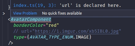
When we select the “IMAGE” type on the Avatar component, it should have a required prop “url”
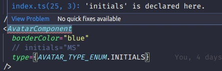
When we select the “INITIALS” type on the Avatar component, it should have a required prop “initials”
This is our expected code:
import React from "react";
import AvatarComponent from "./components/AvatarComponent";
import { AVATAR_TYPE_ENUM } from "./types";

function App() {
  return (
    <div
      style={{
        display: "flex",
        height: "100vh",
        flexDirection: "column",
        justifyContent: "center",
        alignItems: "center",
      }}
    >
      <AvatarComponent
        borderColor="red"
        url="https://i.imgur.com/xb5IBL0.jpg"
        type={AVATAR_TYPE_ENUM.IMAGE}
      />
      <AvatarComponent
        borderColor="blue"
        initials="MS"
        type={AVATAR_TYPE_ENUM.INITIALS}
      />
    </div>
  );
}

export default App;
And this is our expected result:

With “url” and “initials” props being required depending on the type, like the images below after we comment the required prop
Part Two: Types and Interfaces
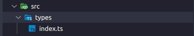
First, let's create a index.ts file and a “types” folder under “src”
Inside index.ts file we are going to define an Enum with the possible components (Avatar with image and Avatar with initials)so we can use it to help us later.
// types/index.tsx

export enum AVATAR_TYPE_ENUM {
  IMAGE = "IMAGE",
  INITIALS = "INITIALS",
  DEFAULT = "DEFAULT",
}
Now, we’re going to define the types of “Avatar with image” and “Avatar with initials” components using the enum that we created before. Note that we’re defining the required props and the type of each component here.
// types/index.tsx

export enum AVATAR_TYPE_ENUM {
  IMAGE = "IMAGE",
  INITIALS = "INITIALS",
  DEFAULT = "DEFAULT",
}

export type AvatarWithImageProps = {
  type: AVATAR_TYPE_ENUM.IMAGE;
  url: string;
};

export type AvatarWithInitialsProps = {
  type: AVATAR_TYPE_ENUM.INITIALS;
  initials: string;
};
Now, comes the tricky part, we are going to create an interface and name it “AllAvatarProps” with the combination of AvatarWithImageProps and AvatarWithInitialsProps.
But defining required props as optional and defining props that both of them have as required.
We also need to extend AvatarWithInitialsProps and AvatarWithImageProps with this AllAvatarProps interface, so the magic can happen.
export enum AVATAR_TYPE_ENUM {
  IMAGE = "IMAGE",
  INITIALS = "INITIALS",
  DEFAULT = "DEFAULT",
}

export interface AllAvatarProps {
  type: AVATAR_TYPE_ENUM;
  borderColor: string;
  url?: string;
  initials?: string;
}

export type AvatarWithImageProps = {
  type: AVATAR_TYPE_ENUM.IMAGE;
  url: string;
} & AllAvatarProps;

export type AvatarWithInitialsProps = {
  type: AVATAR_TYPE_ENUM.INITIALS;
  initials: string;
} & AllAvatarProps;
And the last thing we need to do is export a type with de Union of AvatarWithImageProps and AvatarWithInitalsProps, and name it “SelectedModeProps”
export enum AVATAR_TYPE_ENUM {
  IMAGE = "IMAGE",
  INITIALS = "INITIALS",
  DEFAULT = "DEFAULT",
}

export interface AllAvatarProps {
  type: AVATAR_TYPE_ENUM;
  borderColor: string;
  url?: string;
  initials?: string;
}

export type AvatarWithImageProps = {
  type: AVATAR_TYPE_ENUM.IMAGE;
  url: string;
} & AllAvatarProps;

export type AvatarWithInitialsProps = {
  type: AVATAR_TYPE_ENUM.INITIALS;
  initials: string;
} & AllAvatarProps;

export type SelectedModeProps = AvatarWithImageProps | AvatarWithInitialsProps;
Parth Three: Components
Let’s implement the components with their interfaces
First, I’m going to create a “components” folder under src
Now, I’m going to create the AvatarWithImage component under the “components” folder with the code below.
Note that we need to add AllAvatarProps as AvatarWithImage Interface
import React from "react";
import { AllAvatarProps } from "../types";

const AvatarWithImage: React.FC<AllAvatarProps> = ({ url, borderColor }) => {
  return (
    <img
      style={{
        objectFit: "cover",
        height: 200,
        width: 200,
        borderRadius: "50%",
        border: "3px solid",
        borderColor: borderColor,
      }}
      alt="an avatar"
      src={url}
    />
  );
};

export default AvatarWithImage;
Now we’re going to do the same thing with AvatarWithInitials component:
import React from "react";
import { AllAvatarProps } from "../types";

const AvatarWithInitials: React.FC<AllAvatarProps> = ({
  borderColor,
  initials,
}) => {
  return (
    <div
      style={{
        height: 200,
        width: 200,
        borderRadius: "50%",
        border: "3px solid",
        borderColor: borderColor,
        backgroundColor: "#eee",
        justifyContent: "center",
        alignItems: "center",
        display: "flex",
      }}
    >
      <p style={{ borderColor: borderColor, fontSize: 48 }}>{initials}</p>
    </div>
  );
};

export default AvatarWithInitials;
Ok, now come’s another tricky part, we’re going to implement a third component that will handle which component and which required props are selected as we saw at the beginning of this tutorial.
import React from "react";
import { AVATAR_TYPE_ENUM, SelectedModeProps } from "../types";
import AvatarWithImage from "./AvatarWithImage";
import AvatarWithInitals from "./AvatarWithInitals";

type ISelectedAvatarType = {

};

const AvatarComponent: React.FC<SelectedModeProps> = ({
  ...props
}: SelectedModeProps) => {
  const selectedMode = props.type as AVATAR_TYPE_ENUM;

  const AvatarType: ISelectedAvatarType = {
    IMAGE: <AvatarWithImage {...props} />,
    INITIALS: <AvatarWithInitals {...props} />,
    DEFAULT: <p>Error</p>,
  };

  return AvatarType[selectedMode] || AvatarType.DEFAULT;
};

export default AvatarComponent;
Now we can implement the layout from the beginning of the tutorial:
import React from "react";
import AvatarComponent from "./components/AvatarComponent";
import { AVATAR_TYPE_ENUM } from "./types";

function App() {
  return (
    <div
      style={{
        display: "flex",
        height: "100vh",
        flexDirection: "column",
        justifyContent: "center",
        alignItems: "center",
      }}
    >
      <AvatarComponent
        borderColor="red"
        url="https://i.imgur.com/xb5IBL0.jpg"
        type={AVATAR_TYPE_ENUM.IMAGE}
      />
      <AvatarComponent
        borderColor="blue"
        initials="MS"
        type={AVATAR_TYPE_ENUM.INITIALS}
      />
    </div>
  );
}

export default App;
Achieving the expected result:

With conditional props typing:
Do you know another way to achieve this result? Let me know in the comments :)

Top comments (0)