The introduction
Performance is an issue.
When every project grows to a certain scale, it is almost inevitable to encounter performance problems. When encountering performance problems, we are:
With a dumb face, I know it’s stuck and slow, I don’t know why.
Or:
Can quickly insight into performance bottlenecks and find effective optimization solutions.
It depends on our understanding of performance and whether we have a good set of tools and methods.
Next, I will share with you the three-step method that I often use when locating business performance problems. In order to facilitate memory, I will summarize it in one sentence:
Flame pie under a waterfall.
Not much to say, just drink a mouthful of water!

Introduction to the Performance panel
Before introducing the three-step method, let's briefly understand the Performance panel of Chrome Developer Tools and the basic composition of the performance analysis report.
Generate performance analysis report
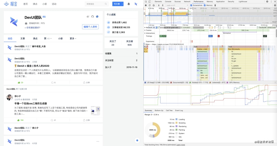
Take the juejin personal homepage of the DevUI team as an example, use the Chrome browser to access: https://juejin.cn/user/712139267650141
Then press F12 to open Chrome's developer tools and select the Performance panel.
At this time we will see a simple guide:
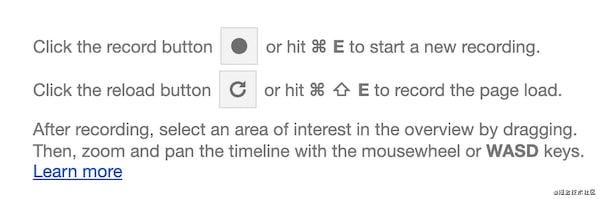
There are two buttons in the guide. The upper button is for manual recording, and the lower is for automatic recording. We click on the fool-like automatic recording, and the automatic recording will automatically refresh the page. After the page is loaded, a performance analysis report of the page is generated. Manual intervention is very convenient.
The report will be generated after a few seconds. At a glance, it is colorful. I don't know where to start?
Composition of performance report
We do a simple panel classification of the generated performance analysis report, and it looks very clear.
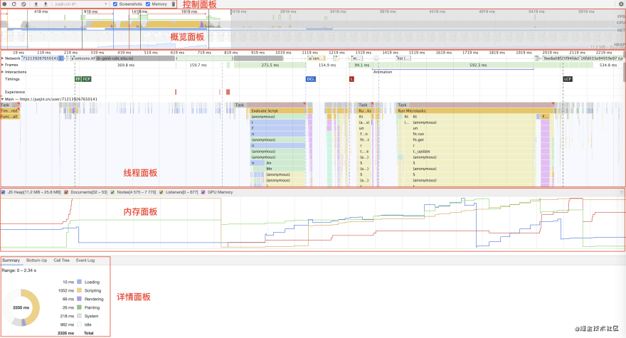
Toolbar
At the top of the performance report is a toolbar (or control panel) with a bunch of buttons. The first three that I use more often are the first three. The first two have been introduced in the guidelines, and the third is for use. To clear the report.
There are also two hidden functions that are also very useful. One is to simulate a slow network speed, and the other is to simulate a slow CPU, which may be used for performance optimization of mobile applications.

Overview panel
Below the toolbar is an overview panel that displays the FPS (Frames Per Second) during the entire page loading process, which is used to evaluate the smoothness of the page. A large red area indicates that the page may be stuck.
Below the FPS is the time spent by the CPU to process each task, and further down is the time consumed by the network request. At the bottom of the overview panel is a screenshot of each frame.
Thread panel
Below the overview panel is the thread panel. The network request waterfall chart is expanded by default, and the details of other threads are collapsed.
Each thread panel is valuable for performance analysis, and the waterfall chart and flame chart are the most commonly used ones. I will focus on these two charts later. How to use these two charts to analyze the performance bottleneck of the website.
Memory panel
Next is the memory panel. The memory panel needs to be opened manually in the control panel. It is a categorized line graph of memory occupancy.
Each polyline is the memory usage of a task over time:
- JS stack
- Documentation
- HTML node
- Event monitoring
- GPU memory
Details panel
At the bottom is the details panel. The first thing you see is a pie chart. This pie chart shows the proportion of various types of tasks. This is very useful. Can you see at a glance what type of task is the performance bottleneck.
Is it resource loading or script execution? Is it page rendering or image drawing? Or is the idle time too long?
Step 1: Look at the pie chart
When I introduced the composition of the Performance panel just now, I mentioned 3 very useful performance analysis tools, namely the detailed pie chart, the request waterfall chart, and the main thread flame chart.
I sum up these three pictures into one sentence:
Flame pie under a waterfall.
This sentence is also a trick that I have tried and tested in performance analysis and optimization myself.
The pie chart in the details panel is used to display the time-consuming proportions of various types of tasks.
There are mainly the following tasks:
- Blue is resource loading
- Yellow is script execution
- Purple is page rendering
- Green is the drawing
- White is free time
Let's take the example just now.

It can be seen from the pie chart that script execution and idleness accounted for the most.
The script execution time is long, we can probably guess that there may be a long task (Long task);
And the idle ratio may be too long to wait for the server's response time.
The pie chart can quickly form a basic judgment, and the specific reasons need to analyze the waterfall chart and the flame chart.
Step 2: Look at the waterfall chart
Let's take a look at the request waterfall chart. Both the waterfall chart and the flame chart are part of the thread panel. The horizontal axis of the waterfall chart is the time axis. There are many colorful color blocks on the waterfall chart. These color blocks are the request blocks. Each color represents One type of resource:
- Blue is the HTML file
- Purple is the CSS file
- Yellow is the JavaScript file
- Green is the picture
- Gray is the background interface
We mainly focus on those long color blocks. Long color blocks mean time-consuming and may be a performance bottleneck.
Let's look at the waterfall chart on the juejin' personal homepage.

Summarize the characteristics of the waterfall chart
Let's observe the characteristics of this picture first, and the ability to observe graphics. I believe you have already cultivated it in elementary school. Generally, we can summarize the following more obvious characteristics:
- Feature 1: The big waterfall is divided into three small waterfalls
- Feature 2: The small waterfall on the far left is mostly yellow blocks, the small waterfall in the middle is mostly gray blocks, and the small waterfall on the far right is mostly green blocks.
- Feature 3: There is a gap between the first two waterfalls, and there is no color block in the middle
- Feature 4: The last two waterfalls are connected together by a "tail" of a gray block
- Feature 5: There is an extra-long gray color block on the top
We can summarize many similar characteristics, but what do these characteristics indicate? Can you help us locate performance bottlenecks?
Answering these questions requires us to have a lot of understanding of the waterfall chart and the principle of the browser. Let's analyze it step by step.
Analyze the meaning of the waterfall chart
We analyze in the order from left to right and top to bottom. There are two color blocks on the far left, a gray color block and a blue color block. We click on these two color blocks respectively, and look at their details in the details panel. Detailed information.
Look at the gray color block first

We have noticed that the initiator of this request is a Chrome plug-in: chrome://new-tab-page/omnibox.mojom-lite.js
So we don’t pay attention, and then look at the blue color block
As we have already introduced, the blue color blocks represent HTML files. We can also verify this from the Mime Type of the details as text/html.
We scroll the mouse wheel to enlarge the waterfall chart and see the details of the blue request block

The composition of the request block
By looking at the detailed map, we have new discoveries:
Each request block consists of four parts:
- Left line: represents the time before the request is sent (Before Request Sent)
- Light-colored block: represents the request has been sent (Request Sent), until the server returns the first byte to the browser (TTFB, Time to First Byte)
- Dark block: all the content returned by the server is downloaded to the browser (Content Download)
- Right line: Waiting for main thread
This HTML file is the starting point for the rendering of the entire web page. After successfully requesting and downloading this file, there will be the next story.
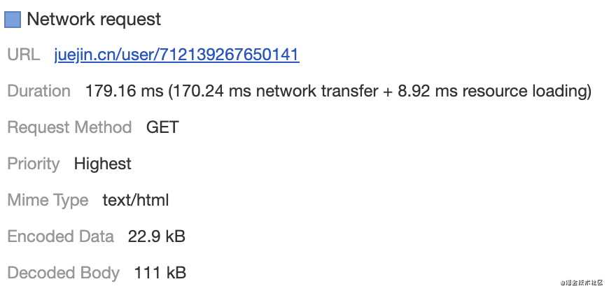
The light-colored part of this request block accounts for a relatively large proportion. According to the previous introduction, the light-colored part represents the response speed of the server. The browser has sent the request early, but the server responded late (the first word Section arrives in the browser).
In the middle, the network may be slow, or the server processing speed may be slow, which requires specific investigation. After all, this HTML file is not too big, only 111KBb, but it took 179ms.
Compared with another file, layouts.default.js, which is 124KB larger than it, the request time is more than half shorter than it, only 74ms. (Later it was found that this data is unstable, this HTML file should not constitute a performance bottleneck)
In addition, all subsequent requests depend on this HTML, and other requests will not happen without it. It is a blocking request and performance must be guaranteed.
Discover possible performance bottlenecks
Let's continue to look at the request block on the right. The long gray block at the top is still a request for the Chrome plug-in. Let's ignore it. Look at the pile of yellow request blocks below. These are JavaScript files.
After the HTML file is downloaded, it will start to parse the HTML tags line by line. When encountering the <script> tag with the src attribute and who is set, it will download the JavaScript script file specified by src.
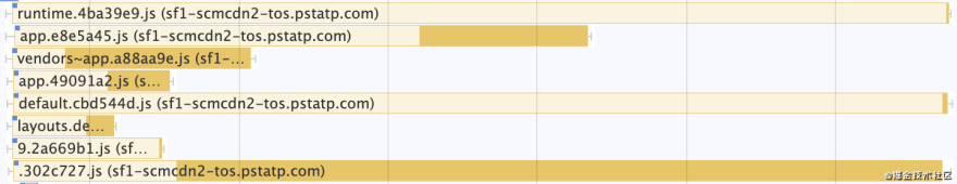
It can be seen from the waterfall chart that a total of 8 JavaScript files have been downloaded in parallel, and their domain names are all the same: sf1-scmcdn2-tos.pstatp.com
Doesn't it mean that the maximum number of concurrent requests for the same domain name in Chrome is 6?
Not only JavaScript files, but there are also 3 image resources with the same domain name below, which are also requested in parallel, which means that 11 requests are initiated almost simultaneously.
This means:
The static resource server of juejin has been upgraded to HTTP/2.
HTTP/2 multiplexing can realize a TCP connection to transmit multiple resources at the same time.
We went to the Network panel to see the details of these JavaScript requests, and it was exactly the same as we guessed. We must give the juejin a thumbs up for this👍.

Send a comparison chart between a certain 86 website and the juejin, let’s get a feel for it
An 86 website:

juejin:

Although the former is more like a waterfall, I like the silky experience of the latter.
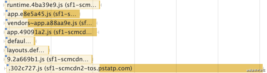
Let's take a closer look at these 8 requests. I believe that you must have discovered a phenomenon in detail:
- What they have in common, except for the domain name just mentioned, the left and right lines of these request blocks are very short
- There are three very long request blocks, 1/5/8 respectively, which require special attention
It is a good phenomenon that the left and right lines of the request block are very short, indicating that there is no waiting time, and all the time is spent on transmitting data.
We click on the 1/5/8 request block to see their details
| Request block | Details |
|---|---|
| 1 | Size: 4KB Time consuming: 635ms |
| 5 | Size: 90KB Time consuming: 635ms |
| 8 | Size: 3.9MB Time consuming: 633ms |
This is very strange. 1/5 of the resource size and 8 are not in the same order of magnitude, but it takes more time than 8.
In order to determine whether this was accidental or inevitable, I recorded the performance report of this juejin personal homepage twice.
This time it is basically the same as expected. 8 takes longer than the others. This JavaScript file is 3.9MB, which is too big and may be a performance bottleneck.
Others
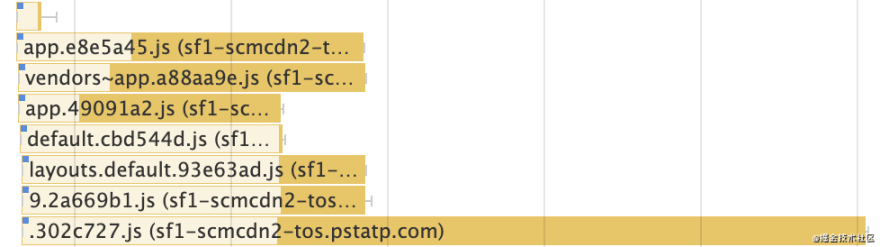
Let us continue to analyze, there are three color blocks under the yellow JavaScript color block:
- Purple: CSS style file
- Green: Picture file
- Gray: font file (189KB in size)
These files are not large in size, and after generating performance reports many times, it is found that these requests are not as long as the eighth JavaScript file, so it is preliminary judged that these requests do not constitute a performance bottleneck.
Then look at the middle waterfall. After generating performance reports several times, I found that the middle waterfall does not have any particularly time-consuming requests, but no matter how many reports are generated, one thing is certain, that is
There is always a gap between these three waterfalls
What do these blanks show?
After reading the flame map, I believe you will suddenly be enlightened.
Step 3: Look at the flame graph
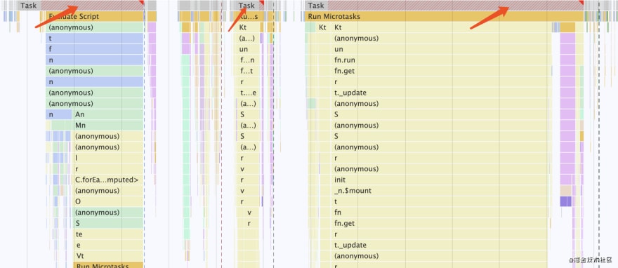
Before looking at the official flame diagram, let’s take a look at the effect of a waterfall diagram and a flame diagram together.
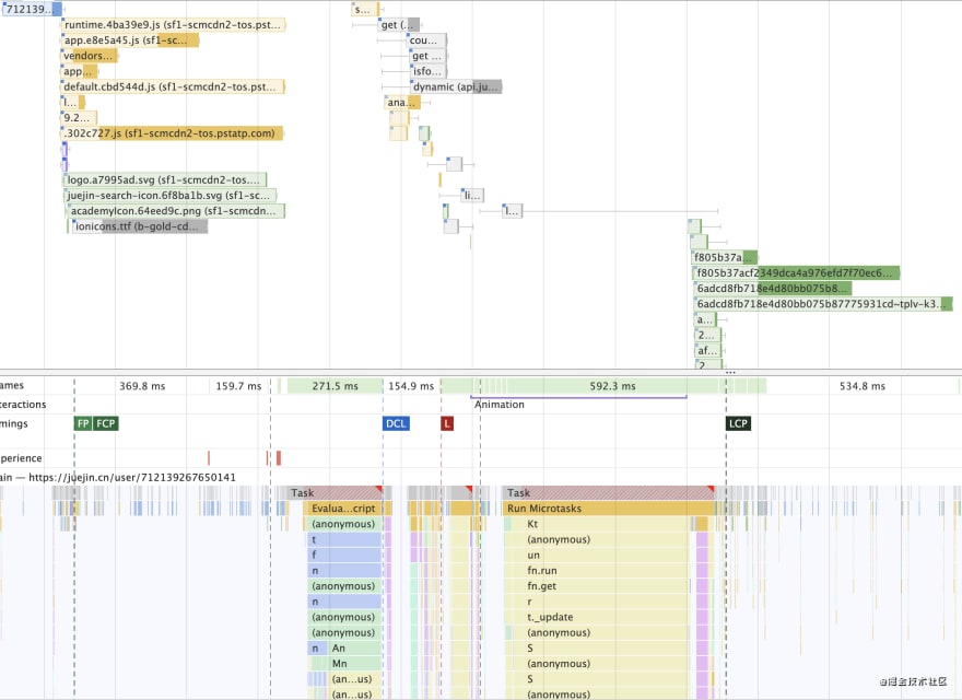
After reading this comparison picture of waterfall and flame, you must have seen a phenomenon
If there are blank places in the waterfall chart, the flame chart will have colors;
Where the waterfall chart has colors, the flame chart is blank.
But Why?
To answer this question, you need to understand the principle of the browser's main thread to perform tasks, and what the flame graph does. Don't worry, let's analyze it step by step.
What is the flame graph
The flame graph is also part of the thread panel, which represents the task flow of the browser's main thread:
As the page loads and time goes by, what does the main thread do in turn
The horizontal axis of the flame graph is time, and the vertical axis is each macro task.
There are several micro tasks under each macro task, and there may be many sub tasks under each micro task, and so on.
Because some tasks have a deep nesting level and some have a shallow nesting level, they appear to be inverted flames.
The color of each type of task is different (no need to remember, just have a general impression):
- Parse HTML Parse HTML: blue
- Parse Stylesheet: Blue
- Evaluate Script: yellow
- Recalculate Style: dark purple
- Paint: dark green
- Perform microtasks Microtasks: yellow
- Ajax request XHR Load: yellow
- Function Call: Yellow
- Trigger the timer Timer Fired: yellow
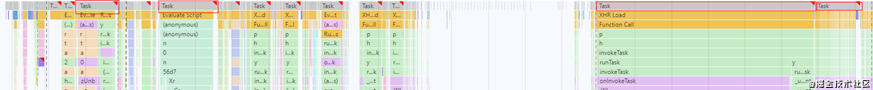
Let’s take a look at the flame map of the juejin’ personal homepage.
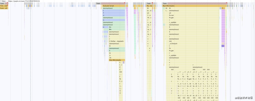
Summarize the characteristics of the flame graph
Then use the skills of look at pictures and find patterns that we learned in elementary school to find out the characteristics of this picture, and at a glance, we can summarize at least the following characteristics:
- Feature 1: Generally speaking, there are blanks on both sides, with three big flames in the middle
- Feature 2: The two big flames on both sides correspond to the two blanks in the waterfall chart (this explains why there are blanks between the three small waterfalls in the waterfall chart)
- Feature 3: Some macro tasks are particularly long, and the background color is a red hatching line (not gray), and there is a small red triangle in the upper right corner
Spend more time, maybe we can find more, but these are the most obvious.
In order to answer these questions, we need to observe the flame diagram at close range.
Analyze the meaning of the flame graph
Since the flame graph represents what the main thread is doing at each point in time, the blank naturally means that the main thread is not doing work, so what is it doing?
It's waiting
What are you waiting for?
Wait for the server to return some necessary resources and data
and so
The blank space of the flame graph is that the browser is waiting for the server to return data
Looking for long tasks
Among all the tasks performed by the main thread, we especially need to pay attention to those long tasks that take a long time (Long tasks). The characteristics of these long tasks have been mentioned earlier:
The background color is a red shaded line
There is a small red triangle in the upper right corner
Three long tasks were found in 1s
Analyze long tasks
The next step is to analyze long tasks and find specific modules/components/methods that take a long time.
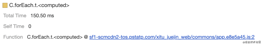
Let's zoom in on the largest flame on the far right to see what secrets are inside.
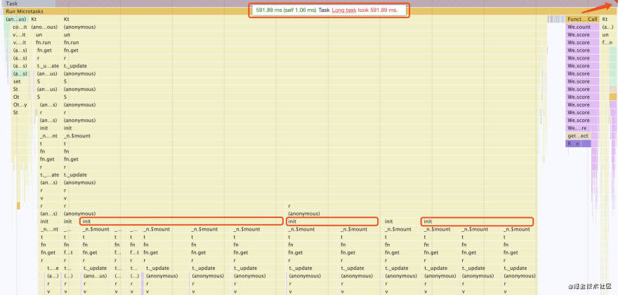
After zooming in, we quickly discovered that this long task that took 591ms, 90% of the time was spent on a method called init, this method was executed a total of 6 times, of which 3/4/6 time-consuming Especially long
| The nth init method | Details |
|---|---|
| 3 | Time consuming: 197ms |
| 4 | Time consuming: 93ms |
| 6 | Time consuming: 111ms |
What exactly does this init method do?
It may be hung in the Vue component. Could it be that some of the components are particularly large and the logic inside is too complicated. Here we need the front-end of juejin to give the answer.
Look at the second largest flame on the left, and scroll the mouse wheel to enlarge it
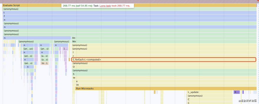
We found that one of the forEach loops was particularly time-consuming. This loop seemed to be calculating something and took 150ms in total.
This still needs to look at the specific source code to find the root cause of the problem.
Cases of finding performance bottlenecks through flame graphs
Finally, I will share with you a performance problem of a dependent library that I found in the XBoard Kanban project through the flame graph.
Follow the same idea:
- Find long tasks
- Enlarge the flame map of the long mission
- Look down layer by layer until you find a time-consuming method with a name (most of the code on the live network is compressed and confused, and the name is not visible, the development environment will be more convenient to locate the method with performance problems)
- Click this method in the flame chart, see the link after Function in the details panel, click this link to jump directly to the specified method in the corresponding file
- Search the method name in the source code and find it
- Find a solution
At the time, there were a lot of long tasks on the XBoard board page, I found TOP3 among them
Then I zoomed in on the first long task, and I quickly gained a reward. I found that there is a method called drawQrCode that takes a long time, and it took 192ms in total.
Then, by looking at the details, I found that this is a method of relying on a library. The dependent library defines a drawQrCode to draw a QR code. This QR code is actually not on the Kanban page, but needs to be hovered to a button by the mouse. Just load it out.
So the solution at that time was to delay the execution of the drawQrCode method, namely:
When the home page is loaded, the drawQrCode method is not executed, and only executed when the mouse is moved to the corresponding button.

The relationship between waterfall graph and flame graph
The waterfall chart and the flame chart are mutually complementary and mutually verifying.
The waterfall chart represents that the browser initiates a request to the server, and then the browser executes the corresponding logic and page rendering through the script according to the data returned by the server.
When the waterfall chart has a request block, it means that the browser is requesting data from the server. If the browser must rely on this data to do the next page rendering, it is likely that the browser will have nothing to do before the server returns the data, and then the flame chart If there is a blank on the pie chart, Idle will also appear on the pie chart.
When the browser gets the data returned by the server, the main thread is processing the data and rendering the page, so it is very likely that it will not be able to send a request to the server, and the waterfall chart will appear blank at this time.
and so
- It is found that the waterfall chart is blank, and there may be a long task. It is necessary to find a specific time-consuming method and optimize it
- It is found that the flame graph is blank. It is likely that some background interfaces are slow or there are very large static resources. You need to locate the reason for the slowness and find a way to optimize it.
Summary
This article first briefly introduces how to generate a website performance analysis report, as well as the general composition of this report;
Then I will share with you the three-step method I often use when locating business performance problems: using flame scones under the waterfall;
From the pie chart, we can have a general understanding of the performance of the website. From the waterfall chart, we can quickly find slow interfaces and large resources. From the flame chart, we can get a detailed insight into which module/component/method is possible. Become a performance bottleneck.
Finally, I recommend Google's official performance evaluation guide: https://developers.google.com/web/tools/chrome-devtools/evaluate-performance
About DevUI team
DevUI is a team with both design and engineering perspectives, serving for the DevCloud platform of Huawei Cloud and several internal middle and background systems of Huawei, serving designers and front-end engineers.
Official website: devui.design
Ng component library: ng-devui (Welcome to star🌟)

Top comments (0)