
Hey! My name is Timur, I am an Android developer at KTS.
This article is a continuation. In the previous part, we figured out what edge-to-edge mode is in mobile apps and how to work with WindowInsets in Android.
Now we’ll cover examples of how to handle insets not only in View, but also in Jetpack Compose. And when you can find the articles about working with Insets in View on the web, the information about working with them in Jetpack Compose can only be found in the official documentation.
All the examples from the article can be viewed in this repository.
Content of this article:
- Examples of processing insets:
- System Window Insets
- Ime Insets (Keyboard Processing)
- Stable Insets
- Immersive mode (full screen mode without UI elements)
- To hide the UI
- To show the UI
- Display Cutouts (Display cutout support)
- System Gesture Insets
- Mandatory System Gesture Insets
- Tappable element insets
- Conclusion
System Window Insets
This type of insets is the main one. They’re needed to handle elements like the Status Bar and Navigation Bar. For example, with full screen rendering, the toolbar will be under the Status Bar.

In this case, we need to set the insets for the toolbar that’s in the AppBarLayout with a magenta background. This will give us the effect of extending the AppBar behind the Status Bar. The example below uses the insetter library.
toolbar.applyInsetter {
   type(navigationBars = true, statusBars = true) {
       padding(horizontal = true)
       margin(top = true)
   }
}
In Jetpack Compose, you can achieve the same effect by setting insets in contentPadding of the TopAppBar function. In this example, we use WindowInsets.systemBars for horizontal and top so that when the screen is rotated, the Navigation Bar doesn’t overlap the beginning of the header or the exit button.
TopAppBar(
    contentPadding = WindowInsets.systemBars
        .only(WindowInsetsSides.Horizontal + WindowInsetsSides.Top)
        .asPaddingValues(),
    backgroundColor = MaterialTheme.colors.primary
) {
    // content...
}
Jetpack Compose also has many extensions for Modifier, such as systemBarsPadding(), navigationBarsPadding(), statusBarsPadding() and others.
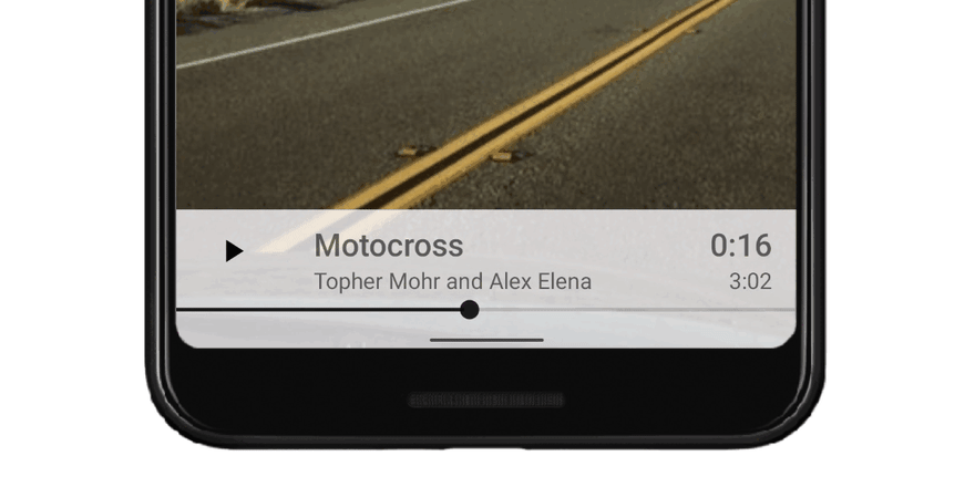
After installing insets, the toolbar will look like this:
Ime Insets (Keyboard Processing)
The keyboard is handled with WindowInsetsCompat.Type.ime(). Also for ime insets, it’s possible to additionally handle keyboard animation with the new API ViewCompat.setWindowInsetsAnimationCallback. You can learn more about the animation features of ime insets here.
The setWindowInsetsAnimationCallback call is implemented in the insetter library (activated by the animated flag on padding/margin) and allows you to additionally link the animation not only to the View on which the DSL is called, but also to other View in order to synchronize the animation on several UI elements (syncTranslationTo method).
An example of keypad processing with insetter animation.

private fun setupInsets() = with(binding) {
   messageWrapper.applySystemBarsImeInsetter(syncTranslationView = list) {
       margin(horizontal = true, bottom = true, animated = true)
   }
}

inline fun View.applySystemBarsImeInsetter(
   syncTranslationView: View? = null,
   crossinline insetterApply: InsetterApplyTypeDsl.() -> Unit
) {
   applyInsetter {
       type(ime = true, navigationBars = true, statusBars = true) {
           insetterApply()
       }
       syncTranslationView?.let {
           syncTranslationTo(it)
       }
   }
}
To achieve this effect in Jetpack Compose, you need to use the imePadding() extension for the Modifier (don’t forget to inset the Navigation Bar with navigationBarsPadding()):
@Composable
fun BottomEditText(
    placeholderText: String = "Type text here..."
) {
    val text = rememberSaveable(stateSaver = TextFieldValue.Saver) {
        mutableStateOf(TextFieldValue(""))
    }
    Surface(elevation = 1.dp) {
        OutlinedTextField(
            value = text.value,
            onValueChange = { text.value = it },
            placeholder = { Text(text = placeholderText) },
            modifier = Modifier
                .fillMaxWidth()
                .padding(horizontal = 16.dp, vertical = 8.dp)
                .navigationBarsPadding()
                .imePadding()
        )
    }
}
Jetpack Compose also allows you to open the keyboard with a scroll using imeNestedScroll():
LazyColumn(
    contentPadding = contentPadding,
    reverseLayout = true,
    modifier = Modifier
        .weight(1f)
        .imeNestedScroll()
) {
    items(listItems) { SampleListItem(it) }
}

Stable Insets
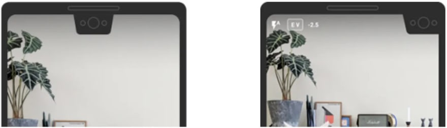
Stable Insets are only useful in full-screen applications such as video players, galleries, and games. In player mode, you may have noticed that you have the entire UI system hidden, including the Status Bar, which moves across the edge of the screen. But as soon as you touch the screen, the Status Bar appears at the top. The peculiarity of the insets in the gallery or player is that empty insets come into View when you show/hide the UI system (when the UI system is hidden). For this reason, the Ui elements of the application that work with insets can jump back and forth, as you can see in the following image.

Therefore, there’s a special type of Stable Insets that the system always outputs with values as if the system UI were displayed. The insetter has a method ignoreVisibility which tells the system that there should be Stable Insets for this View.
toolbar.applyInsetter {
    type(navigationBars = true, statusBars = true) {
        padding(horizontal = true)
            margin(top = true)
    }
    ignoreVisibility(true)
}
Surprisingly, there’s no ready-made solution for Stable Insets in Jetpack Compose, but we can implement it as follows:
class StableStatusBarsInsetsHolder {
   private var stableStatusBarsInsets: WindowInsets = WindowInsets(0.dp)

   val stableStatusBars: WindowInsets
       @Composable
       get() {
           val density = LocalDensity.current
           val layoutDirection = LocalLayoutDirection.current
           val statusBars = WindowInsets.statusBars
           return remember {
               derivedStateOf {
                   if (statusBars.exclude(stableStatusBarsInsets).getTop(density) > 0) {
                       stableStatusBarsInsets
                                   = statusBars.deepCopy(density, layoutDirection)
                   }
                   stableStatusBarsInsets
               }
           }.value
       }

}

private fun WindowInsets.deepCopy(density: Density, layoutDirection: LayoutDirection): WindowInsets {
   return WindowInsets(
       left = getLeft(density, layoutDirection),
       top = getTop(density),
       right = getRight(density, layoutDirection),
       bottom = getBottom(density)
   )
}
Example of use:
val stableInsetsHolder = remember { StableStatusBarsInsetsHolder()}
SampleTopBar(
   titleRes = R.string.insets_sample_fullscreen_stable,
   contentPadding = stableInsetsHolder.stableStatusBars
       .only(WindowInsetsSides.Horizontal + WindowInsetsSides.Top)
       .asPaddingValues(),
)
Now, when we use Stable Insets, the processing insets elements don’t bounce.

Immersive mode (full screen mode without UI elements)
To show or hide the Ui instead of putting certain UI_FLAGS combinations, a new class WindowInsetsController (its compat version WindowInsetsControllerCompat) is used since API 30 which has a convenient API based on the new API 30 classes.

How you can return the system Ui to the screen is set with the WindowInsetsController flags (set via the setSystemBarsBehavior method):
- BEHAVIOR_SHOW_BARS_BY_SWIPE — A swipe is required to return SystemUi, remove on your own;
- BEHAVIOR_SHOW_TRANSIENT_BARS_BY_SWIPE — A swipe is required to return the system Ui, hiding automatically after a while.
There are the following extension functions with the ability to add calls to the WindowInsetsController via extraAction.
To hide the UI
fun Window.hideSystemUi(extraAction:(WindowInsetsControllerCompat.() -> Unit)? = null) {
    WindowInsetsControllerCompat(this, this.decorView).let { controller ->
        controller.hide(WindowInsetsCompat.Type.systemBars())
        extraAction?.invoke(controller)
    }
}

// Usage
hideSystemUi{
    systemBarsBehavior =
    WindowInsetsControllerCompat.BEHAVIOR_SHOW_TRANSIENT_BARS_BY_SWIPE
To show the UI
fun Window.showSystemUi(extraAction: (WindowInsetsControllerCompat.() -> Unit)? = null) {
    WindowInsetsControllerCompat(this, this.decorView).let { controller ->
        controller.show(WindowInsetsCompat.Type.systemBars())
        extraAction?.invoke(controller)
    }
}

// Usage
showSystemUi()
In Jetpack Compose, you can use the rememberSystemUiController() from the accompanist system ui controller library to hide or show the system user interface.
val systemUiController = rememberSystemUiController()

InsetsExamplesTheme {
   FullscreenCutoutSample(
       systemUiController.toggleUi
   )
}

val SystemUiController.toggleUi: () -> Unit
   get() = {
       isSystemBarsVisible = !isSystemBarsVisible
   }
But this library doesn’t allow changing flags of WindowInsetsControllerCompat. So a class based on rememberSystemUiController() from the accompanist systemui controller was written. In this implementation, BEHAVIOR_SHOW_TRANSIENT_BARS_BY_SWIPE is set for WindowInsetsControllerCompat.
Example of use:
val systemUiVisibilityController = rememberSystemUiVisibilityController()
InsetsExamplesTheme {
   FullscreenCutoutSample(
       systemUiVisibilityController.toggleUi
   )
}
Display Cutouts (Display cutout support)
Bangs and cutouts are appearing more and more frequently on cell phones. They’re located in different places on the screen and can have different sizes and shapes.
Android 9 (api 28) introduced the DisplayCutout class, which allows you to handle the cutout area. In addition, there’s a set of flags in WindowManager.LayoutParams that allow you to enable different behavior around the cutouts.
To set the flags, layoutInDisplayCutoutMode is used to determine how your content is displayed in the cutout area. There’re the following values:
- LAYOUT_IN_DISPLAY_CUTOUT_MODE_DEFAULT — in portrait mode the content is displayed below the cutout area, and in landscape mode there will be a black bar.
- LAYOUT_IN_DISPLAY_CUTOUT_MODE_SHORT_EDGES — Content is displayed in the cutout area in both portrait and landscape modes.
- LAYOUT_IN_DISPLAY_CUTOUT_MODE_NEVER — Content is never displayed in the cutout area.
- LAYOUT_IN_DISPLAY_CUTOUT_MODE_ALWAYS — In this mode, the window expands beneath the cutouts at all edges of the display in both portrait and landscape orientations, regardless of whether the window hides the system panels ( LAYOUT_IN_DISPLAY_CUTOUT_MODE_SHORT_EDGES full analogue, but available with 28 api when LAYOUT_IN_DISPLAY_CUTOUT_MODE_ALWAYS appeared only in 30 api).
Example of use:
if (Build.VERSION.SDK_INT >= Build.VERSION_CODES.P) {
    window.attributes.layoutInDisplayCutoutMode =  WindowManager.LayoutParams.LAYOUT_IN_DISPLAY_CUTOUT_MODE_SHORT_EDGES
}
There is a flag for displayCutout in the insetter library, so you can handle padding and margin from the cutout area.
applyInsetter {
   type(displayCutout = true) {
       // specify the sides you need
       // for example padding(top = true)
       padding()
   }
}
In Jetpack Compose you also need to use layoutInDisplayCutoutMode to set the mode for DisplayCotout. In compose, you can use WindowInsets.displayCutout or Modifier.displayCutoutPadding() to handle padding.
If you suddenly need to get a cutout area, you can use DisplayCutoutCompat.getBoundingRects() to do that. This method returns a list of rectangles, each of which is a bounding rectangle for a non-functional area on the display.
ViewCompat.setOnApplyWindowInsetsListener(root) { view, insets ->
   val boundingRects = insets.displayCutout?.boundingRects
   insets
}
In Jetpack Compose, you can’t get boundingRects with WindowInsets.displayCutout.
I think that arranging elements relative to the cutout makes no sense for the following reasons:
- where there’s no cutout is information from the Status Bar (time, icons)
- api returns a list, which means there can be several cutouts
- cutouts come in different shapes and sizes
In general, everything says that it’s better not to do so, but if you really need, you can do it.
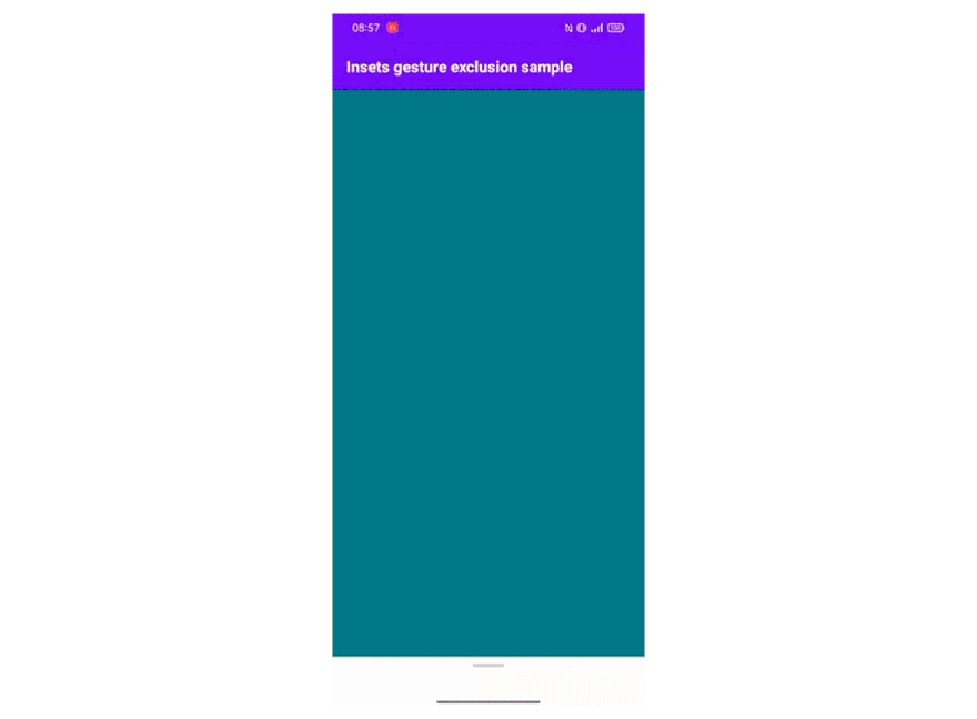
System Gesture Insets
This kind of insets appeared in Android 10. They return the gesture areas home from below and back to the right and left of the screen.
If there’re scroll elements in these areas, users can, for example, accidentally trigger a backward gesture. Therefore, if you can’t move the interface element away from the edge, but you need to fix the problem with gestures, use this type of inserts
For example: in the gif below, the user wants to scroll but will trigger an exit without excluding gestures. You should also remember that large areas with gesture exclusions can lead to incomprehensible behavior for the user, so it’s worth excluding gestures only in places where it’s necessary. If we look at the example below, a gesture should only be excluded for an element with a horizontal scroll.
While implementing the example for View, I encountered a problem that windowInsets.getInsets(WindowInsetsCompat.Type.systemGestures()) returns an empty value. I agonized over this for a long time, until I decided to run the example on an emulator and saw that everything worked. To make sure, I sent the apk to my colleagues and got the answer: everything works. The problem was that I was testing the example on my device (Realme c21). Vendors are messing around as usual.
To exclude gestures in Jetpack Compose, you can use Modifier.systemGestureExclusion().
LazyRow(
   modifier = Modifier
       .padding(vertical = 16.dp)
       .systemGestureExclusion(),
   contentPadding = PaddingValues(horizontal = 16.dp),
   horizontalArrangement = Arrangement.spacedBy(16.dp)
) {
    //...
}
Mandatory System Gesture Insets
This type of insets appeared in Android 10 and is a subtype of System Gesture Insets. They specify areas of the screen where system gesture behavior will always take priority over in-app gestures. Mandatory gesture areas can never be excluded by apps (with android 10, the mandatory gesture area is the home gesture area). Mandatory insets move content away from mandatory gesture inserts. For example, if you have a seekbar at the bottom of the screen, you need to use Mandatory System Gesture Insets to avoid calling gestures.
In View, mandatory insets can be processed using the insetter library:
seekBar.applyInsetter {
   type(mandatorySystemGestures = true) {
       padding(bottom = true)
   }
}
In Jetpack Compose, mandatory gestures can be obtained with WindowInsets.mandatorySystemGestures:
Surface(
   modifier = Modifier
       .fillMaxWidth()
       .windowInsetsPadding(
           WindowInsets.mandatorySystemGestures
               .only(WindowInsetsSides.Bottom)
               .union(
                   WindowInsets.navigationBars.only(WindowInsetsSides.Horizontal)
               )
       ),
   color = Color.LightGray.copy(alpha = 0.3f)
) {
   // content
}
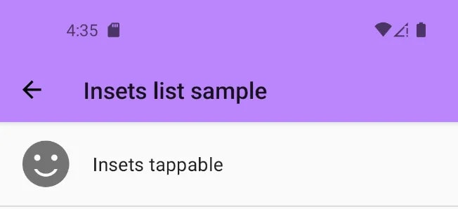
Tappable element insets
This type of insets appeared in android 10 and is needed to handle different Navigation Bar modes. This type of insets is rarely used, because the differences from the system window insets are minimal. But you should agree that it’s nice to know that your application is written in the coolest way possible.
In the picture below you can see that tappable element insets and system window insets work the same when the device is set to navigate with buttons. The difference can only be noticed in gesture-based navigation mode.

The point is that when navigating with gestures, we don’t click, but swipe from bottom to top. This means that we can use interactive elements in this area (e.g. FloatingActionButton), which means that we don’t need to indent and tappable element insets will return 0.
An example of using the c view (still using the insetter library):
fab.applyInsetter {
   type(tappableElement = true) {
       margin(bottom = true)
   }
}
In Jetpack Compose we use WindowInsets.tappableElement:
Scaffold(
   floatingActionButton = {
      FloatingActionButton(
          modifier = Modifier.padding(
              bottom = WindowInsets.tappableElement
                  .only(WindowInsetsSides.Bottom)
                  .asPaddingValues()
                  .calculateBottomPadding()
          ),
          backgroundColor = backgroundColor,
          onClick = onClick
      ) {
          Icon(
              imageVector = Icons.Filled.Add,
              contentDescription = null
          )
      }
){ // content... }
Conclusion
You can find all the code from the article in this repository.
We looked at the nuances of implementing e2e in Android mobile apps and an example of implementation using the insetter library for View, and used the built-in insets in Jetpack Compose. In this article I wanted to let all android developers know that e2e is in fact very easy to implement and worth the time invested. I hope you found this article useful and more and more developers will adopt e2e in their applications.
Do you implement edge-to-edge in your applications? Do you use libraries to work with insets? What problems have you faced when implementing edge-to-edge?
Thanks to Vadim for his help in preparing this article.

Oldest comments (0)