Flexbox (CSS Flexible Box Layout Module) is a layout module that makes creating responsive web applications a lot easier. It allows you to lay out your elements in rows and columns, and helps you deal with different sized and resized screens without having to write media queries for 12 breakpoints. Flexbox allows you to step beyond block, inline and positioned elements and to stop fiddling with float and position values.
Personally, I find myself using flexbox for headers, footers, and main content that features repeated elements, like cards. This lends itself to React applications, but really can be used for any application or website with elements you want to lay out in rows or columns.
The Basics
You need at least two things to make use of flexbox: a flex container and one or more flex items. Your flex container will serve as a parent to the children flex items, and its display attribute will be assigned the value flex. You will also assign your parent container a flex direction, which determines the direction in which the child elements are laid out. The default is row.
#flx-cont{
  display: flex;
  flex-direction: column;
}
When row is used, child items will appear next to each other in...a row, and will all be the same height. When column is used, child items will stack neatly on top of one another, and be the same width.
Flexbox Secret Sauce
The secret sauce to flexbox, specifically when using flex-direction row, is flex-wrap.
#flx-cont{
  display: flex;
  flex-direction: row;
  flex-wrap:wrap;
}
Flex-wrap is set to nowrap by default, shoving all child items onto one row, whether they fit or not. Changing the property's value to wrap allows the layout module to be flexible. You don't have to write CSS for three child items that breaks when a fourth item is added or the app is viewed on a smaller screen. When the row runs out of room, child items are shuffled onto a new row.
Justify-Content & Align-Items
But Liz, you say, what about horizontal flow of child items? Justify-content my friend.
Do you want child items to be all packed together at beginning of the container and only take up the space at the start of the container that they need? (i.e. like the people in the checkout line at Costco, scared someone is going to skip them) Flex-start.
The same thing, but be bunched up at the end of the container? (i.e. kids standing in line to do math problems on the board) Flex-end.
Bunched in the center? (a line of kids, but the kid in the middle smuggled a frog into school and everyone wants to look at it) Center.
Do you want the child items to be spaced out evenly, except the first and last items are flush with the edge of the container? (the checkout line at Target) Space-between.
How about each child item has the same space on both sides, including the first and last items? Space-around. Perfectly evenly spaced?! Space-evenly.
There are other options, but I personally never use them.
The align-items property helps control the vertical flow of child items.
Stretch will get you even heights, and is the default. It's also the one I use the most. Read about the other values at CSS-Tricks.
#flx-cont{
  justify-content: space-evenly;
  align-items: stretch;
}
And the Rest
The only other properties you have to know (IMOO) are flex-grow* and flex-basis. Both are properties given to the child items.
Flex-basis allows you to give child items a default size. Flex-grow gives the child item permission to take up proportionally more space than its siblings, if available.
#flx-item{
  flex-basis: 100px;
  flex-grow: 3;
}
YellowBitRoad
YellowBitRoad is my Ruby on Rails application designed to help self-taught programmers keep track of their coding learning goals. Users can chart their own roads to learning new programming languages and concepts.
When users first enter the application, they’re presented with a list of roads that have already been created. Each road is presented as a “card” with its name, languages/skills featured, total courses and a button leading to more details. Each card is a li tag, within the parent ul.
<ul class="card-display">
  <li class="outer-card">
    <div class="card-details">
      <h2>Front End Development</h2>
      <div class="topic-holder">
        <div class="topic">CSS</div>
        <div class="topic">HTML</div>
        <div class="topic">Python</div>
        <div class="topic">Web Design</div>
      </div>
      <strong>6 courses</strong>
      <div><a class="btn" href="/roads/2">Road Map</a></div>
    </div>
  </li>
</ul>
Flexbox allowed me to display all these cards (and potentially a lot more) in a responsive layout that takes varying road name lengths into account. I make use of several layers of flex containers and flex items.
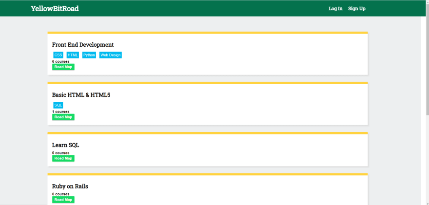
This is how the application looks, without the flexbox layout applied to the main content of the page.
The relevant CSS:
.card-display{
    flex-wrap: wrap;
    display: flex;
    list-style: none;
    justify-content: space-between;
    padding-left: 0px;
}
.outer-card{
    flex-basis: 350px;
    box-sizing: border-box;
    flex-shrink: 0;
    margin-bottom: 30px;
    display: flex;
}

.outer-card .card-details {
    padding: 20px;
    box-sizing: border-box;
    background: #fff;
    border-top: 10px #FFD23F solid;
    box-shadow: 5px 5px 5px #ddd;
    display: flex;
    flex-direction: column;
    justify-content: space-between;
    flex-basis: 350px;
}
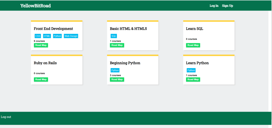
With the CSS applied:

Top comments (0)