
Written by Rosario De Chiara✏️
A heatmap is a type of data visualization that uses color-coded grids to represent data. Each cell in the grid is assigned a different color based on its value, allowing you to easily identify patterns and trends in the data. Heatmaps provide a quick and intuitive way to explore large datasets and identify areas of high or low activity, allowing for easy understanding of complex data.
Commonly used in the fields of data analysis, biology, and geology, heatmaps are also used frequently in UX and marketing to visualize user engagement on websites and mobile apps. You've probably seen the one below from GitHub, which shows the number of contributions a user has made throughout the year: 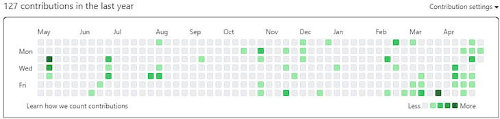
In this article, we’ll explore three popular libraries we can use to create and manipulate heatmaps in React: react-heat-map, D3.js, and Syncfusion. To follow along, you can find the full code in this companion GitHub repository.
Jump ahead:
- Creating the React boilerplate app
- react-heat-map: The basic option
- D3.js: The advanced option
- Syncfusion components library: The commercial option
- Conclusion + comparison table
Creating the React boilerplate app
To create the boilerplate app, I followed the Create React App setup covered here. If you’ve followed it precisely, you should have a directory with the following structure: 
In the App.js source, you’ll find the entry point of the React web app, and once compiled, in development mode, run the command npm run start.
You will see the different rendering of the same random data generated by the function generateFakeCommitData. This simply fills an array whose indices are the dates of the last 365 days, while the values are a random number between 0 and 100.
The web app will render the same data using different libraries to compare them visually (in the web app itself) and in terms of configuration options (in this article).
react-heat-map: The basic option
The first library we’ll cover is react-heat-map, which is available with an MIT license. It is focused on reproducing the GitHub commits heatmap, but it also offers a nice set of configurations.
react-heat-map is a good choice for projects where you just need a basic heatmap visualization; it doesn’t offer many of the other options available in the solutions we’ll describe below.
In the components directory of the companion GitHub repo, you’ll find the basic.js file, which contains a customized version of the heatmap. Together with the basic representation, we have also included a slider to manipulate the styling for the cells in the heatmap. We adjusted the roundness of the cells in the example below: 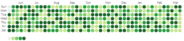
Even though it does offer some degree of configuration, the component we’re using is pretty focused on the single purpose of drawing a date-based heatmap. Of course, if you need to reproduce something similar to the GitHub commits chart, this component will help you do so quickly.
In the companion repo, the file basic.js provides the basic component. The basic component will receive, as input, the array with the fake commits data described above:
<HeatMap
  value={commitsData.commitsData}
    startDate={new Date(commitsData.commitsData[0].date)}
   width={600}
  />
In the code above, you can see how the HeatMap component from the library is configured:
-
value: The array of objects that contains, for each date, a number (e.g., the number of commits on a repository for that day). Please note that the array we generate above has the format expected by this component, so no manipulation is needed to let it ingest it -
startDate: The start date in the array, being ordered we pick the first element date -
width: The width of the component
And that’s everything you need to render a very basic heatmap with this component. Some configuration is possible, of course:
- Labels for rows and (days of the week) and columns (months) are configurable to provide some support for i18n
- It is possible to specify in detail how to render the single rectangle (check the source code)
-
It is possible to enable some basic support for tooltips. From the same author, for example, you can use
npm i @uiw/react-tooltipto install a simple tooltip React component and enable the rendering of the tooltip by specifying the proper rendering chunk of code for the rectangles of the heatmap:
rectRender={(props, data) => {
 return (
  <Tooltip
    key={props.key}
    placement="top"
    content={`count: ${data.count || 0}`}>
    <rect {...props} />
  </Tooltip>
  );
}}
D3.js: The advanced option
In my opinion, the most effective solution for heatmaps — and for any other diagrammatic need — is D3.js. For a more thorough introduction, you can read my previous post on creating visualizations with D3.
As you may know, D3 offers a more agnostic approach for the kind of diagrammatic visualization you may need. But on the other hand, it offers a complete set of functions to manipulate the data and assemble together the bits (e.g., labels, colors, shapes, etc.) that will constitute your visualization. You can see the final result in the image below: 
The advanced.js file, as you may suspect, contains a D3-based component for a heatmap. The code is more convoluted than the one described above, but the possibilities for configuration are much wider. By using D3.js, you need to assemble the graphical representation piece by piece, with more control on each aspect of the output:
var heatMap = svg.selectAll(".grid")
  .data(values)
  .enter()
  .append("rect")
  .attr("width", gridSize)
  .attr("height", gridSize)
  .attr("x", function (d) { return (d.week - 1) * gridSize; })
  .attr("y", function (d) { return (d.day) * gridSize; })
  .attr("rx", 4)
  .attr("ry", 4)
  .style("fill", function (d) { return colorScale(d.type); })
In the code above, we define how each element of the values array will be used in the process of drawing the rect elements, which are round-bordered rectangles, that will make up the HeatMap component.
First, we specify the width and height of each cell. The gridSize variable is just calculated by dividing the width of the heatmap by the number of weeks we will show. Then, by specifying the x and y attributes, we place the rect for each cell. Of course, the x coordinate will depend on the week, while the y coordinate will depend on the day each element of the value array refers to.
The rx and ry attributes define the radius of the roundness of the rect element. By fiddling with these values, you can go from a rectangle to a circle. Then, we specify the filling style by using a color from the colorScale based on the number of commits for that element of the array:
 var colors = ["#EBEDF0", "#C6E48B", "#7BC96F", "#239A3B", "#196127"];
 var colorScale = d3.scaleOrdinal()
    .domain([0, 100])
      .range(colors);
In the snippet above, you can see how we have implemented the gradient of colors used to fill the rect elements in the HeatMap. In D3.js, colorScale is a scaleOrdinal functional that will take as input a domain (0, 100) and a range of values (colors). It will be used to map colors on the range in order to return, given an input value, the color corresponding to that value.
This is just one of the approaches to generating colors in D3.js, which offers many different scales to scale a domain of numbers on a range of values.
At the moment, we have placed a rect element in the correct place with respect to its week and day of the week. Then, we colored them coherently with the number of commits. We just need to add two more details: the axis labels and the legend. See below:
svg.selectAll(".day") // add day labels
  .data(days)
  .enter()
  .append("text")
  .text(function (d) { return d; })
  .attr("x", 0)
  .attr("y", function (d, i) { return i * gridSize; })
  .style("text-anchor", "end")
  .attr("transform", "translate(-6," + gridSize / 1.3 + ")")
  .attr("class", "label");

svg.selectAll(".week") // add week labels
  .data(d3.range(1, 53))
  .enter()
  .append("text")
  .text(function (d) {
    if (d % 5 === 0)
      return months[d / 5]
    else
      return ""
  })
  .attr("x", function (d, i) { return i * gridSize; })
  .attr("y", 0)
  .style("text-anchor", "middle")
  .attr("transform", "translate(" + gridSize / 2 + ", -6)")
  .attr("class", "label");
The code above contains the generation of the labels for the two axes. The approach is simple:
- We pass an array
- Add data containing the labels we want to show
- For each element of the array, we add a
textelement that we put in place using theattrmethod for"x"and"y" - And, finally, center it on the cell by leveraging the
transformattribute
An interesting piece of code that deserves particular attention is the way we generate labels for the weeks. The text function will pick the label from the array named months only when the week number d is divisible by 5 (we check the modulo). In this case, a new month is starting, and we pick the label and return it.
The last bit of code — the adding of the legend — is similar to the heatmap itself. The only difference is that the rect elements are as many as the elements in the colors array. The idea of the legend is to have one rect for each color. As you can see:
var legend = svg.selectAll(".legend") // create legend; legend data is the color domain
  .data(colors, function (d) { return d; }) // d is each element in the data
  .enter().append("g")
  .attr("class", "legend");

legend.append("rect") // define legend rectangles
  .attr("x", function (d, i) { return legendElementWidth * i; })
  .attr("y", gridSize * 8)
  .attr("width", legendElementWidth)
  .attr("height", gridSize)
  .attr("class", "bordered")
  .attr("rx", 4)
  .attr("ry", 4)
  .style("fill", function (d, i) {
    return d;
  }) // map color domain array (d) to color range array
Syncfusion components library: The commercial option
Syncfusion is an incredibly comprehensive set of components that can be compared only with D3.js in terms of its completeness and customization. It also comes in different flavors that will accommodate any taste in terms of framework or language. For consistency’s sake, we’ll use the React version here. 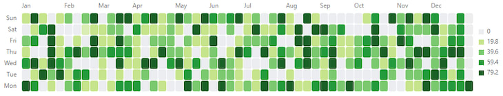
Being a commercial library, you will have to pay a fee to use its components. This is enforced right in the component you can download with the usual:
npm install @syncfusion/ej2-react-heatmap --save
Once your code includes the component, on the first time you execute your application in the browser, you will get a message asking you to register for a free trial. Your application will keep working, but it will present a message on top of the window reminding you that the component is not registered: 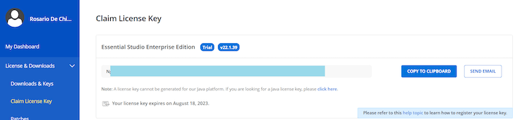 Then you have to actually register for a trial of their components and get a key — remember, it is temporary and valid for just a month. The folks at Syncfusion are also open to offering free keys for personal use; you can apply under certain conditions (particular types of companies, for example, or if you’re a student).
Once you get a license key, you can follow these instructions to actually use it in your project. The example component using the Syncfusion heatmap is available in the file commercial.js in the companion repository.
Let’s take a look at the most interesting part of the code:
    return (<HeatMapComponent
        dataSource={values}
        width='1000px'
        height='200px'
        xAxis={{
            opposedPosition: true,
            valueType: 'DateTime',
            minimum: new Date(2023, 0, 1),
            maximum: new Date(2023, 11, 31),
            intervalType: 'Days',
            showLabelOn: 'Months',
            labelFormat: 'MMM',
            increment: 7,
        }}
        yAxis={{
            labels: daysLabels,
        }}
        paletteSettings={{
            palette: [
                { color: "#EBEDF0" },
                { color: "#C6E48B" },
                { color: "#7BC96F" },
                { color: "#239A3B" },
                { color: "#196127" }
            ],
            type: "Fixed"
        }}
        cellSettings={{
            border: {
                radius: 4,
                width: 1,
                color: 'white'
            },
            showLabel: false,
            format: '{value}',
        }}>
        <Inject services={[Legend, Tooltip, Adaptor]} />
    </HeatMapComponent>);
The code above is just the part in charge of assembling the final look of the component and returning it to the caller in order to assemble the final visualization of the page.
As you can see, the code is pretty straightforward: we return a HeatMapComponent, which will just describe how the array passed by the datasource field will be handled. Then, we specify the width and height of the heatmap. The meaty part is where we describe, using xAxis and yAxis, how the axes and, consequently, the data will be represented.
The xAxis will represent dates (see the valueType field) laying in a specific range (minimum and maximum). In particular, we represent dates on the scale of Days via the intervalType field, and we want to represent the label on the scale of Months. Their aspect will be a three-letter label (the labelFormat parameter).
The final parameter of the xAxis is increment, which states how many elements of data will be collected in a single cell. The yAxis just contains the list of labels we want to apply on it.
Then, we have the field paletteSettings. This contains the description of the palette we‘ll use to colorize the cells, as well as how to manage them. In this case, we used them in the fixed mode (see field type).
This means that the range of the data cells will be colorized using the palette as it is, without shading it. The alternative is the Gradient type, which will render the colors of the palette in a way that is proportional to the intensity of the value they represent.
The last bit of information is the cellSettings object, which, unsurprisingly, describes how we’ll render a single cell of the heatmap. It defines the cell border and, more importantly, the elements of the array to be used to colorize the cell. This is the value that will represent the “heat” of the cell in the heatmap.
Conclusion + comparison table
If you simply need a calendar-based heatmap, react-heat-map is the go-to solution, but you must be certain your needs won’t grow more complex in the future. D3.js has a learning curve and is more complex (I still struggle with its logic sometimes), but its complexity is a direct result of its power and flexibility.
Another point in favor of D3.js is that there is a huge number of examples available from which to draw inspiration. The solution you can find in our companion repo just scratches the surface of what you can do with D3.js and React; it is an autonomous component that incentivizes reuse and offers opportunity for further customization.
From a programmability point of view, the Syncfusion component we built (and, in general, all the others components of the library) offers a really different approach from D3.js.
In D3.js, you actually assemble the visualization by handling each of its aspects by hand. You draw the cells with a given color in a given position and both — the color and the position — are calculated by leveraging some of the helpers that D3.js makes available.
This is totally different from the Syncfusion heatmap approach, where you just specify the data (an array of JSON objects) and draw a heatmap using it. The general feeling of using Syncfusion is something like, “I want a heatmap of this array that contains data divided in days,” and it will just assemble a good enough representation of it, which you can then customize as much you like.
Syncfusion has a huge offering in terms of components and frameworks/languages to use them, but this flexibility come at a price (literally).
Here’s a brief comparison of the three options:
| react-heat-map | D3.js | Syncfusion | |
|---|---|---|---|
| Open source | ⭐⭐⭐ | ⭐⭐⭐ | ❌ |
| Programmability | ⭐ | ⭐⭐ | ⭐⭐⭐ |
| Documentation | ⭐ | ⭐⭐⭐ | ⭐⭐⭐ |
| Cost | $0 | $0 | Commercial license available. Free trial available. |
Get set up with LogRocket's modern React error tracking in minutes:
1.Visit https://logrocket.com/signup/ to get an app ID.
2.Install LogRocket via NPM or script tag. LogRocket.init() must be called client-side, not server-side.
NPM:
$ npm i --save logrocket

// Code:

import LogRocket from 'logrocket';
LogRocket.init('app/id');
Script Tag:
Add to your HTML:

<script src="https://cdn.lr-ingest.com/LogRocket.min.js"></script>
<script>window.LogRocket && window.LogRocket.init('app/id');</script>
3.(Optional) Install plugins for deeper integrations with your stack:
- Redux middleware
- ngrx middleware
- Vuex plugin

Top comments (0)