
Written by David Omotayo✏️
Qwik is a cutting-edge JavaScript framework that revolutionizes the concept of reactive UI and significantly improves web page loading performance, regardless of site complexity. The primary premise of the framework is to serve HTML with minimal JavaScript, only increasing interaction incrementally as needed. This method, known as resumability, is thought to be superior to hydration.
Qwik offers several benefits for web application development, but its ecosystem is still in its infancy and the framework is not yet extensively used. In this tutorial, we'll explore how to use the Qwik React package, which is in beta as of this writing, to integrate Qwik with React. We’ll also look at how to use Qwik components, referred to as “islands”, with native React components.
Jump ahead:
- Prerequisites
- What is Qwik React?
- Getting started
- Understanding the project structure
- Using the
qwikify$()function - Hydrating components
- Achieving interactivity without hydration
- Understanding inter-component communication
- Integrating React libraries
- Limitations of Qwik React
Prerequisites
To follow along with this tutorial, you should have the following:
- Working knowledge of Typescript and React
- Node.js installed on your machine
- A code editor, preferably VS Code
What is Qwik React?
The Qwik React package is a unique combination of Qwik components with React designed to produce highly efficient applications. Given their varied performance and internal architecture, you might ask why anyone would want to combine Qwik and React.
Well, incorporating React components into a Qwik application can be helpful for a number of reasons, particularly in terms of performance and time-to-interactivity. However, there are some advantages that React brings to the table compared to Qwik, such as community.
The React ecosystem has grown significantly in recent years, establishing itself as one of the largest web development communities on the internet. Consequently, there is an abundance of tools and libraries developed by the community specifically for React, which improves the process of creating web applications with this framework. While the Qwik community is still growing, there are currently a limited number of tools and libraries available that can compete with or divert attention away from React.
In an effort to leverage the extensive React ecosystem and the wide range of readily available tools and libraries, the Qwik team devised the "Qwik React" solution. This approach involves converting React components into Qwik components, also known as islands. By doing so, we can harness the power of React's vast ecosystem, which includes popular libraries such as MUI, ThreeJs, and React Spring, to enhance our applications.
Getting started
Before we dive into the technical aspect of Qwik React and its benefits, we’ll need to create and configure a Qwik development environment.
If you don’t already have a Qwik application, you can quickly set one up by following these steps:
Step 1: Open your terminal and run the below commands to bootstrap a Qwik project, install the dependencies, and start the development server:
npm create qwik@latest
cd qwik-app
npm start
After running the command, the CLI will guide you through an interactive menu to set up the app according to your preference. You can use the options shown in the screenshot below as a guide. 
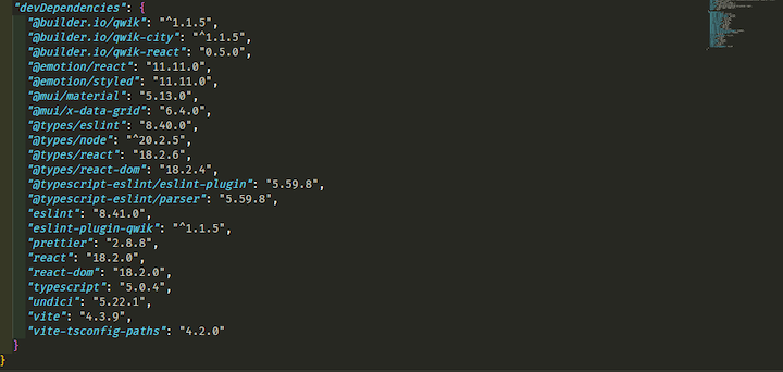
Step 2: Once your project is set up and ready, install Qwik React and the required dependencies for the project by running the following command:
npm run qwik add react
This code will install react, react-dom, and other required packages. It will also create a demo and react route for showcasing the React integration at http://localhost:5173/react/ and http://localhost:5173/demo/. Additionally, it will create an integration folder where React components will be stored in our project: 
We’ll talk more about the integration folder later in this article.
Step 3: Next, configure Vite to use the qwik-react plugin. You can do this by navigating to the vite.config.ts file and adding the following code:
import { qwikReact } from '@builder.io/qwik-react/vite';

export default defineConfig(() => {
   return {
     ...,
     plugins: [
       ...,
       // The important part
       qwikReact()
     ],
   };
});
We’re all set. Now we can start using the package to convert React components into Qwik islands.
Understanding the project structure
Once you’ve completed the project setup and successfully integrated Qwik React, you’ll notice that the structure of your project becomes slightly more complex than its initial state, especially if you are still getting accustomed to Qwik's project structure.
As mentioned previously, the Qwik React package adds two new folders, routes and integration, to a project upon installation. The routes folder automatically generates a route for each file added within it, while the integration folder stores and isolates React components. This separation is necessary because it's bad practice to place Qwik and Qwik React components in the same directory.
By default, the routes folder contains two routes, react and demo. Within the demo route, there are two nested routes:, flower and todolist.
We can access these routes in our browser by navigating to either the demo/flower or demo/todolist address: 
The react route has just one route that renders a number of islands from the mui.tsx React component within the integration folder:  This component houses three MUI components:
 Button, Slider, and TableApp components that are being wrapped with a qwikify$() function and exported:
/** @jsxImportSource react */
import { qwikify$ } from "@builder.io/qwik-react";
import { Button, Slider } from "@mui/material";
import { DataGrid, GridColDef, GridValueGetterParams } from "@mui/x-data-grid";
export const MUIButton = qwikify$(Button);
export const MUISlider = qwikify$(Slider, { eagerness: "hover" });
export const TableApp = qwikify$(() => {
  const columns: GridColDef[] = [
    { field: "id", headerName: "ID", width: 70 },
    { field: "firstName", headerName: "First name", width: 130 },
    { field: "lastName", headerName: "Last name", width: 130 },
    {
      field: "age",
      headerName: "Age",
      type: "number",
      width: 90,
    },
    {
      field: "fullName",
      headerName: "Full name",
      description: "This column has a value getter and is not sortable.",
      sortable: false,
      width: 160,
      valueGetter: (params: GridValueGetterParams) =>
        `${params.row.firstName || ""} ${params.row.lastName || ""}`,
    },
  ];
  const rows = [
    { id: 1, lastName: "Snow", firstName: "Jon", age: 35 },
    { id: 2, lastName: "Lannister", firstName: "Cersei", age: 42 },
    { id: 3, lastName: "Lannister", firstName: "Jaime", age: 45 },
    { id: 4, lastName: "Stark", firstName: "Arya", age: 16 },
    { id: 5, lastName: "Targaryen", firstName: "Daenerys", age: null },
    { id: 6, lastName: "Melisandre", firstName: null, age: 150 },
    { id: 7, lastName: "Clifford", firstName: "Ferrara", age: 44 },
    { id: 8, lastName: "Frances", firstName: "Rossini", age: 36 },
    { id: 9, lastName: "Roxie", firstName: "Harvey", age: 65 },
  ];
  return (
    <>
      <h1>Hello from React</h1>
      <div style={{ height: 400, width: "100%" }}>
        <DataGrid
          rows={rows}
          columns={columns}
          // @ts-ignore
          pageSize={5}
          rowsPerPageOptions={[5]}
          checkboxSelection
          disableSelectionOnClick
        />
      </div>
    </>
  );
});
Using the qwikify$() function
qwikify$() is a handy utility function in Qwik React that lets you turn React components into Qwik islands that you can reuse throughout your application. The @builder.io/qwik-react package exports the function, and it works by wrapping an existing React component, transforming it into a Qwik component. This way, you can customize the components and control when they get hydrated, making your app significantly faster.
Here’s a simple example of how to use the qwikify$() function:
///integrations/react/dropdown.tsx

/** @jsxImportSource react */

import { qwikify$ } from "@builder.io/qwik-react";
import { Select, MenuItem} from "@mui/material";

export const Dropdown = qwikify$(
  ({ value, onChange } : { value: string; onChange: Function }
) => {
    return (
      <div className="dropdown">
        <Select
          value={value}
          onChange={(e) => onChange(e)}
          sx={{
            width: 250,
            height: 50,
            backgroundColor: "gray",
            border: "solid 2px white",
            color: "white",
          }}
        >
          <MenuItem value={"Rice"}>Rice</MenuItem>
          <MenuItem value={"Beef"}>Beef</MenuItem>
          <MenuItem value={"Pizza"}>Pizza</MenuItem>
          <MenuItem value={"Milk"}>Milk</MenuItem>
          <MenuItem value={"Sausage"}>Sausage</MenuItem>
        </Select>
      </div>
    );
  }
);
Here, we created a dropdown component in the integration folder, used MUI’s Select and MenuItem components to build a dropdown, and then exported the component as an island using the qwikify$() function.
N.B., the/** @jsxImportSource react */ import at the top of the code enables us to< tell the compiler to use React as the default JSX factory; it is required at the top level of every Qwik React component
Now that the component is wrapped with the qwikify$() function, we can use it as a Qwik component in a Qwik route like the react route:
import { component$, useSignal } from "@builder.io/qwik";
import type { DocumentHead } from "@builder.io/qwik-city";
import { Dropdown } from "~/integrations/react/example";

export default component$(() => {
  const food = useSignal<"Rice" | "Beef" | "Pizza" | "Milk" | "Sausage">(
    "Rice"
  );

  return (
    <>
      <Dropdown
        value={food.value}
        onChange$={(e: any) => {
          food.value = e.target.value;
        }}
      />
    </>
  );
});

export const head: DocumentHead = {
  title: "Qwik React",
};
 Notice that code in the below snippet is being wrapped with the
 component$ utility function:
export default component$(() => {
...

});
The reason for the wrapping is that this component is a Qwik component. Unlike the files in the integration folder, all the files in the route folder are Qwik components.
Hydrating components
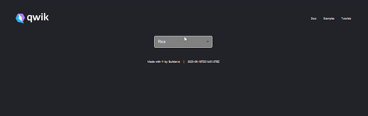
The qwikify$() utility function converts React components into plain simple HTML that only runs on the server. This means that the components are not interactive by default when rendered.
For example, the dropdown that we created earlier is not interactive when clicked. This is because React is not loaded yet and the component is running on the server as plain HTML, meaning the component hasn’t been hydrated yet: 
We have two options to make the component interactive. We can use Qwik signals and the host: listener to make the component interactive as a server-side component. Alternatively, we can load React on the client side and hydrate the component based on certain conditions using the eagerness property on the qwikify$() function.
Partial hydration with the eagerness property
One of the quirks of building an application with React is the hydration task that unconditionally happens at load time, adding a massive overhead and making the app slower. Qwik lets us mitigate this problem by only partially hydrating the application, thereby boosting performance.
We can use the qwikify$() function to achieve partial hydration in our Qwik React components. This function takes a second object argument that can have an eagerness property with values that can be used to hydrate components based on certain conditions like load, hover, idle, or visible.
To make our dropdown component interactive, we can add the eagerness property to the qwikify$() function, like so:
export const Dropdown = qwikify$(
  ({ value, onChange}:{value: string, onChange: Function}) => {
    return (
      <div className="dropdown">
        <Select
          value={value}
          onChange={(e) => onChange(e)}
          sx={{
            width: 250,
            height: 50,
            backgroundColor: "gray",
            border: "solid 2px white",
            color: "white",
          }}
        >
          <MenuItem value={"Rice"}>Rice</MenuItem>
          <MenuItem value={"Beef"}>Beef</MenuItem>
          <MenuItem value={"Pizza"}>Pizza</MenuItem>
          <MenuItem value={"Milk"}>Milk</MenuItem>
          <MenuItem value={"Sausage"}>Sausage</MenuItem>
        </Select>
      </div>
    );
  },
  { eagerness: "hover" }
);
Now the component will become interactive when our cursor hovers over it: 
Partial hydration with the client: property
Another method to partially hydrate Qwik React components is to use the client: JSX property with the following conditions:
-
visible: the component hydrates when it becomes visible on the viewport -
load: the component eagerly hydrates when the DOM loads -
idle: the component eagerly hydrates when the browser becomes idle -
hover: the component eagerly hydrates when the user mouses over it -
signal: the component hydrates whenever the assigned signal becomestrue -
event: the component eagerly hydrates when specified events are fired -
only: the component will only run on the client side
These conditions can be prefixed to the client: property (for example, client:visible) and assigned to the component to be partially hydrated.
The client: property is similar to the eagerness property on the qwikify$() function, except it offers more hydration conditions.
Here's an example of how we can use the client: property on our dropdown component:
export default component$(() => {
  const food = useSignal<"Rice" | "Beef" | "Pizza" | "Milk" | "Sausage">(
    "Rice"
  );

  return (
    <>
      <Dropdown
        client:hover
        value={food.value}
        onChange$={(e: any) => {
          food.value = e.target.value;
        }}
      />
    </>
  );
});
By eagerly hydrating React components, we gain a performance boost since React is only loaded for the component being hydrated, rather than the entire application. However, this approach contradicts the purpose of converting the component into an island in the first place.
Achieving interactivity without hydration
With the host: listener, we don't have to hydrate an entire component just to make handlers, such as onClick, functional. Instead, we can make them functional on the server without the need to download React on the client side.
To use the host: listener, simply replace React's onClick handler with Qwik's onClick$ handler and add the host: prefix to it, as demonstrated below:
export default component$(() => {
...

  return (
    <div>
        ...
      <MUIButton
        host:onClick$={() => alert("Working without hydration")}
        variant="contained"
      >
        click
      </MUIButton>
    </div>
  );
});
Now, the component will be interactive without hydration, and if you go to the dev tool, you'll also see that no React code was downloaded: 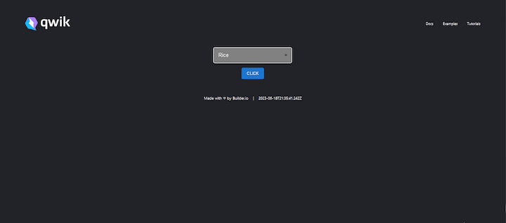 The only drawback to using the
 host: listener is that we can only use it in a native Qwik component like the react route, where our components are being rendered. The host:onClick$ handler is assigned to the MUIButton component in the react route, rather than the integration/react/dropdown directory, as shown in the code example above.
Understanding inter-component communication
As your application grows, inter-component (or inter-island) communication becomes crucial. Particularly during this growth phase, it’s essential to understand the behavior of these components.
By now, you're likely aware that selectively hydrating components is the optimal approach, avoiding unnecessary hydration of static or non-interactive components. However, dynamic components whose props are connected to an interactive component will get hydrated when their prop changes.
The example below shows how inter-component communications work in Qwik React:
//react/index.tsx

import { Display, Dropdown } from "~/integrations/react/example";

export default component$(() => {
  const food = useSignal<"Rice" | "Beef" | "Pizza" | "Milk" | "Sausage">(
    "Rice"
  );

  return (
    <div>
      <Dropdown
        value={food.value}
        onChange$={(e: any) => {
          food.value = e.target.value;
        }}
      />
      <Display food={food.value} />
    </div>
  );
});
export const Dropdown = qwikify$(
  ({ value, onChange }: { value: string; onChange: Function }) => {
    return (
      <div className="dropdown">
        <Select
          value={value}
          onChange={(e) => onChange(e)}
          sx={{
            width: 250,
            height: 50,
            backgroundColor: "gray",
            border: "solid 2px white",
            color: "white",
          }}
        >
          <MenuItem value={"Rice"}>Rice</MenuItem>
          <MenuItem value={"Beef"}>Beef</MenuItem>
          <MenuItem value={"Pizza"}>Pizza</MenuItem>
          <MenuItem value={"Milk"}>Milk</MenuItem>
          <MenuItem value={"Sausage"}>Sausage</MenuItem>
        </Select>
      </div>
    );
  },
  { eagerness: "hover" }
);

export const Display = qwikify$(({ food }:{food: string}
) => {
  return (
    <div style={{ marginLeft: "250px", fontSize: "27px" }}>
      {" "}
      Food Value:{" "}
      <span
        style={{
          backgroundColor: "white",
          color: "black",
          padding: "5px",
          borderRadius: "5px",
        }}
      >
        {food}
      </span>
    </div>
  );
});
Here, we created a Display component that shows the current value of the food signal, which is derived from the selected menu item on the dropdown component. When a food item on the dropdown is clicked, the Display component is automatically hydrated as soon as its prop changes: 
Integrating React libraries
The Qwik React package installs two React libraries by default: emotion and Material UI. One of the primary benefits of using Qwik React is that we can install and integrate any React library into our project and use it just like we would in a React application.
For instance, if you wish to install a library such as React Query into your project, you can conveniently install it via the terminal using the following command:
npm i react-query
Then, under the integration folder, create a file and give it a name. Next, add your component logic, and wrap it in the qwikify$() method as follows:
/** @jsxImportSource react */

import { qwikify$ } from "@builder.io/qwik-react";

import {
  useQuery,
  QueryClient,
  QueryClientProvider,
} from "react-query";

const TodoList = () => {
  const getTodos = async () => {
    const res = await fetch("https://jsonplaceholder.typicode.com/todos");
    return res.json();
  };

  const { data } = useQuery("todos", getTodos);

  return (
    <div className="todo">
      {data &&
        data.map((t: any) => {
          return (
            <div key={t.id} className="todo__items">
              <p>{t.title}</p>
            </div>
          );
        })}
    </div>
  );
};

export const Todo = qwikify$(
  () => {
    const queryClient = new QueryClient();
    return (
      <QueryClientProvider client={queryClient}>
        <TodoList />
      </QueryClientProvider>
    );
  },
  { eagerness: "visible" }
);
You can now use React query in your application to display the data that was fetched in any of the routes.
//react/index.tsx

import { component$, useSignal } from "@builder.io/qwik";
import { Todo } from "~/integrations/react/animate";

export default component$(() => {

  return (
    <div>
      <h2 class="title">Todos Lists</h2>
      <Todo />
    </div>
  );
});

Limitations of Qwik React
Before opting to use Qwik React, there are a few constraints to consider. As of this writing, the package is still in beta; therefore, it’s not recommended for use in production. Right now, Qwik React is only a migration option for you to move your applications to Qwik. Let’s look at a couple of other limitations.
Components are isolated
Every instance of a qwikified component is a separate React application, with its own set of states, style, context, and ability to be hydrated independently.
Consider the dropdown component we created earlier. Let’s render multiple instances of the Dropdown in the react route, like this:
export default component$(() => {
  const food = useSignal<"Rice" | "Beef" | "Pizza" | "Milk" | "Sausage">(
    "Rice"
  );

  return (
    <div>
      <Dropdown
        value={food.value}
        onChange$={(e: any) => {
          food.value = e.target.value;
        }}
      />

      <Dropdown
        value={food.value}
        onChange$={(e: any) => {
          food.value = e.target.value;
        }}
      />

      <Dropdown
        value={food.value}
        onChange$={(e: any) => {
          food.value = e.target.value;
        }}
      />
    </div>
  );
});
Here, each Dropdown will function as a separate self-contained React application. This means that they will each have their own state, lifecycle methods, and other React features that are independent of one another. Changes or alterations to the state of one dropdown instance will have no effect on the state of other instances.
qwikify$() is not so quick
It's easy to abuse the qwikify$() function when using it to wrap components, leading to a loss in performance gains for your application.
Consider a situation where multiple MUI components are needed to build a form. The common approach is to wrap each MUI component in a qwikify$() function and export them, like so:
/** @jsxImportSource react */

import { qwikify$ } from "@builder.io/qwik-react";
import {
  Select,
  MenuItem,
  FormControl,
  FormLabel,
  TextField,
  FormGroup,
  Checkbox,
} from "@mui/material";

export const MUICheckbox = qwikify$(Checkbox);
export const MUIFormGroup = qwikify$(FormGroup);
export const MUITextField = qwikify$(TextField);
export const MUIFormLabel = qwikify$(FormLabel);
export const MUIFormControl = qwikify$(FormControl);
export const MUIMenuItem = qwikify$(MenuItem);
export const MUISelect = qwikify$(Select);
Adopting such an approach is detrimental because it reduces the performance of the application, and since every instance is independent, it results in duplicated styles and isolated contexts, and makes theming impossible.
The optimal approach is to construct the entire form as a single qwikified React component and export it as a unified entity:
/** @jsxImportSource react */

import { qwikify$ } from "@builder.io/qwik-react";
import {
  Select,
  MenuItem,
  FormLabel,
  TextField,
  FormGroup,
  Checkbox,
  Button,
} from "@mui/material";

export const Form = qwikify$(() => {
  return (
    <div>
      <form>
        <FormLabel>Enter Firstname</FormLabel>
        <TextField />
        <br />
        <FormLabel>Enter Lastname</FormLabel>
        <TextField />
        <br />
        <FormGroup>
          <Checkbox />
          <Checkbox />
          <Checkbox />
        </FormGroup>
        <br />
        <Select>
          <MenuItem>1</MenuItem>
          <MenuItem>2</MenuItem>
          <MenuItem>3</MenuItem>
          <MenuItem>4</MenuItem>
          <MenuItem>5</MenuItem>
        </Select>
        <br />
        <Button>submit</Button>
      </form>
    </div>
  );
});
Conclusion
Qwik React offers an intriguing solution for converting React components to Qwik islands. However, it is not a "silver bullet"; you will eventually need to migrate your applications to Qwik.
This introduction to the Qwik React package aims to supply you with the fundamental knowledge to build applications that take advantage of the benefits of both ecosystems: Qwik and React. Refer to the documentation to learn more about the Qwik React package and how you can leverage what you’ve already built to create complex functionalities.
Get set up with LogRocket's modern React error tracking in minutes:
1.Visit https://logrocket.com/signup/ to get an app ID.
2.Install LogRocket via NPM or script tag. LogRocket.init() must be called client-side, not server-side.
NPM:
$ npm i --save logrocket

// Code:

import LogRocket from 'logrocket';
LogRocket.init('app/id');
Script Tag:
Add to your HTML:

<script src="https://cdn.lr-ingest.com/LogRocket.min.js"></script>
<script>window.LogRocket && window.LogRocket.init('app/id');</script>
3.(Optional) Install plugins for deeper integrations with your stack:
- Redux middleware
- ngrx middleware
- Vuex plugin

Top comments (0)