
Written by Habdul Hazeez ✏️
Introduction
You can achieve a basic hover event in React by using the native CSS :hover selector, but there are two limitations that you can encounter:
- You can’t make changes or alter the actual
:hoverselector through JavaScript - You can’t use it to show other components on hover
This article explains two alternative ways you can overcome these limitations in React. The first will make use of two event handlers supported by React SyntheticEvent, and the second employs an npm library called React Hover. The latter allows you to show other components on hover.
A quick overview of events in React
React handles events that you would usually write in vanilla JavaScript, but with some key differences:
- The event handlers are named using the camel-case convention. For example,
onclickbecomesonClick - You cannot return
falseto prevent a default behavior as you would in JavaScript; instead, you must explicitly callpreventDefault - Your event handlers receive instances of the
SyntheticEvent
What is SyntheticEvent?
SyntheticEvent is React's cross-browser wrapper that wraps around the browser's native event, which allows your events to work identically across all browsers.
Supported events
React supports an array of SyntheticEvent types, but for this article, our main concern is Mouse Events.
The available Mouse Events are listed in the next code block. You'll notice as you read through them that there is no onHover, which would allow you to create a hover event.
onClick onContextMenu
onDoubleClick onDrag
onDragEnd onDragEnter
onDragExit onDragLeave
onDragOver onDragStart
onDrop onMouseDown
onMouseEnter onMouseLeave
onMouseMove onMouseOut
onMouseOver onMouseUp
This is what we’re here to talk about — and luckily, there is a workaround.
Let’s take a look at this in the next section.
How to create hover events using SyntheticEvent
In this section, I'll demonstrate how to create a hover event using two event handlers supported by React's SyntheticEvent. They are onMouseEnter and onMouseLeave.
For this demonstration, you'll create a tooltip, which is a UI element whose content is shown when a user hovers over a webpage element.
Creating a React tooltip
First, you'll need to set up a React project if you don’t already have one. You can either create a React project on CodeSandbox or set up a local project using Create React App.
For this article, I'll go for the latter option.
npm install create-react-app
Once the installation completes, do the following:
- Delete the contents of
App.jsandindex.css - Create two folders inside the
srcfolder and name themcssandcomponent - Within the
cssfolder, create a new file calledTooltip.css - Locate the
componentfolder created earlier, create a new file calledTooltip.js
Now, in Tooltip.js, let's write some code. We’ll write the code for Tooltip.css later in the article.
Since React allows you to write component-based code, the code for the main tooltip functionality would, indeed, be a component.
The next code block imports React, useState from React, and the css file we created earlier. You'll need useState to manage the application state when the user chooses to view the tooltip.
// src/components/Tooltip.js
import React, { useState } from 'react'
import '../css/Tooltip.css'
With those import statements out of the way, you can start writing the code that implements the core functionality of the tooltip. This core functionality would reside within a component called Tooltip, which is a function that returns data.
In this case, it's an arrow function.
// src/components/Tooltip.js
import React, { useState } from 'react'
import '../css/Tooltip.css'
const Tooltip = (props) => {
// All the code that will make the
// tooltip work resides here
}
Within the Tooltip component, you'll do the following:
- Set up a timer to determine the time interval between when the tooltip is shown and when it is hidden
- Set up state using
useState - Write a function to show the tooltip
- Write a function to hide the tooltip
- Return JSX, which contains a single-parent HTML element and its children. This parent HTML element would have the
onMouseEnterandonMouseLeaveevents handlers attached to it - Write the argument for
onMouseEnter, which will be the function that shows the tooltip - Write the argument of
onMouseLeave, which will be the function that hides the tooltip - Define the children element; i.e., the tooltip content would have a class name and attribute that would be styled via CSS
All of these steps are covered in the next code block.
// src/components/Tooltip.js
// Code truncated, check the previous
// code block.
const Tooltip = (props) => {
// All the code that will make the
// tooltip work resides here
// Set up timer and state
let TooltipTimeout;
const [activeToolTip, setActiveToolTip] = useState(false);
// Write a function to show the tooltip
const showToolTip = () => {
TooltipTimeout = setTimeout(() => {
setActiveToolTip(true);
}, props.delay || 300);
};
// Write a function to hide the tooltip
const hideToolTip = () => {
setActiveToolTip(false);
clearInterval(TooltipTimeout);
};
// Return JSX which contains the HTML
// data for the tooltip
// Note the usage of the 2 supported event handlers
// mentioned earlier in this article. They make
// it is possible to create the hover event in React.
return (
<div
className="Tooltip-Container"
onMouseEnter={showToolTip}
onMouseLeave={hideToolTip}
>
{props.children}
{activeToolTip && (
<div className={`Tooltip-Content ${props.direction} || "top"}`}>
{props.content}
</div>
)}
</div>
);
};
// Export the tooltip
export default Tooltip
The tooltip is now ready for use, but before we can deploy it, we’ll need to import it into App.js (or any other component where you’d find it useful).
The next code block does the trick:
// App.js
import React from "react"
import Tooltip from './components/Tooltip';
import './index.css';
const App = () => {
return (
<div className="App">
<div className="tooltip-wrapper">
<Tooltip content="I am a tooltip" direction="top">
Hover your mouse here
</Tooltip>
</div>
</div>
)
}
export default App
And now we can move on to styling.
Styling our React tooltip
Switch to the Tooltip.css file, and write the following:
/* css/Tooltip.css */
/**
* The CSS class name starts with a
* capital letter to indicate it's a
* component.
*/
.Tooltip-Container {
position: relative;
display: inline-block;
}
.Tooltip-Content {
position: absolute;
left: 50%;
padding: 8px;
color: #ffffff;
background: #1a1a1a;
font-size: 0.85em;
border-radius: 6px;
transform: translateX(-50%);
z-index: 1;
white-space: nowrap;
}
.Tooltip-Content::before {
left: 50%;
position: absolute;
content: " ";
border: 6px solid transparent;
margin-left: -6px;
}
.Tooltip-Content.top {
top: -30px;
}
.Tooltip-Content.top::before {
top: 100%;
border-top-color: #1a1a1a;
}
/**
* The following styles are
* variations of the tooltip when you
* change the value if the "direction" attribute
* in the App component.
*/
.Tooltip-Content.right {
top: 50%;
left: calc(100% + 20px);
transform: translateY(-50%);
}
.Tooltip-Content.right::before {
top: 50%;
left: -6px;
transform: translateY(-50%);
border-right-color: #1a1a1a;
}
.Tooltip-Content.bottom::before {
bottom: 100%;
border-bottom-color: #1a1a1a;
}
.Tooltip-Content.left {
top: 50%;
right: calc(100% + 30px);
left: auto;
transform: translateY(-50%);
}
.Tooltip-Content.left::before {
top: 50%;
right: -12px;
left: auto;
transform: translateY(-50%);
border-left-color: #1a1a1a;
}
Afterward, switch to index.css, which should still be empty, and write the following:
/* index.css */
.App {
font-family: "Trebuchet MS", Verdana, Geneva, Tahoma, sans-serif;
padding-top: 16px;
padding-right: 16px;
padding-bottom: 120px;
padding-left: 16px;
}
.tooltip-wrapper {
padding: 16px 120px;
}
Now, when you hover your mouse over the text "Hover your mouse here," the tooltip appears. When you move your mouse away from the text, the tooltip disappears.
Great! You’ve not only achieved this despite React lacking a default onHover method, but you've also leveraged two event handlers supported by React’s SyntheticEvent (onMouseEnter and onMouseLeave) to create it.
In the next section, I'll explain how to do something similar using an npm library called React Hover.
Create hover events using React Hover
As stated on its official npm page, "React Hover allows you to turn anything into a 'hoverable' object." This "anything" could be plain old HTML or another component in your application.
Before we dive into the syntax of React Hover and how it works, let’s install it.
npm install --save react-hover
The above command installs React Hover in your current project directory. You can verify its successful installation by checking your package.json file.
Now, for the syntax.
The React Hover syntax
React Hover provides the following options for creating a "hoverable" object:
-
<ReactHover>: You'll wrap this around two things, which are the<Trigger>and<Hover>components -
<Trigger>: This is the wrapper for the<Trigger>component -
<Hover>: This is the wrapper for the<Hover>component -
options: This is an attribute of<ReactHover>, and its value is an object that determines the behavior and position of the<Hover>component when you move the cursor over the<Trigger>component. The object accepts the next three properties:-
followCursor: Accepts a boolean value that determines whether the<Hover>component will follow the cursor when you move the cursor over the<Trigger>component -
shiftX: Determines the position of the<Hover>component along the X-axis, i.e. left or right -
shiftY: This determines the position of the<Hover>component along the Y-axis, i.e. top or bottom
-
-
type: This attribute identifies the component as a trigger or a hover; therefore, its value would be<Trigger>for the trigger component, and<Hover>for the hover component
Side note: If you prefer to use pure HTML with React Hover rather than a component, write the HTML code directly within <Trigger> and <Hover> respectively.
Implementing React Hover
Okay, enough theory — it's time for some code!
Create two files in your component folder, namely TriggerComponent.js and HoverComponent.js. Switch to your editor and type the next code block in TriggerComponent.js:
// components/TriggerComponent.js
import React from 'react'
const TriggerComponent = () => {
return (
<p>Hover on me</p>
)
}
export default TriggerComponent
Next, switch to HoverComponent.js and type the following:
// components/HoverComponent.js
import React from 'react'
const HoverComponent = () => {
return (
<p>I am a hover component.</p>
)
}
export default HoverComponent</pre>
With these files all set up, you can use them in App.js or any other location in your app. Mind you, in App.js, you'll write the object that you'll pass to the options attribute. As stated earlier, this object will determine the behavior of the hovered component when the cursor is moved over the <Trigger> component.
That being said, in the next code block, we’ll continue with App.js:
// App.js
import React from 'react'
import ReactHover, { Trigger, Hover } from 'react-hover'
import TriggerComponent from './components/TriggerComponent'
import HoverComponent from './components/HoverComponent'
// Set the option that determines the position
// and behavior of the hover component
const OptionsCursorTrueWithMargins = {
followCursor: true,
shiftX: 20,
shiftY: 0
}
// The App function
const App = () => {
return (
<ReactHover options={OptionsCursorTrueWithMargins}>
<Trigger type="trigger">
<TriggerComponent />
</Trigger>
<Hover type="hover">
<HoverComponent />
</Hover>
</ReactHover>
)
};
export default App
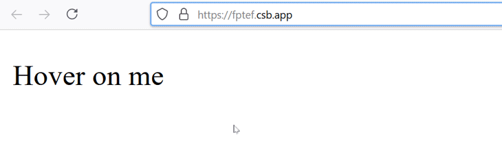
Save your files, add some styling to suit your needs, and then test it out in your Web browser. You should have something similar to the GIF below.
Conclusion
This article covers two good options to have available in your arsenal when you intend to create hover events in React. The first option makes use of two event handlers supported by React’s SyntheticEvent, and the second option incorporates React Hover, a JavaScript library available on the npm registry.
Full visibility into production React apps
Debugging React applications can be difficult, especially when users experience issues that are difficult to reproduce. If you’re interested in monitoring and tracking Redux state, automatically surfacing JavaScript errors, and tracking slow network requests and component load time, try LogRocket.


LogRocket is like a DVR for web apps, recording literally everything that happens on your React app. Instead of guessing why problems happen, you can aggregate and report on what state your application was in when an issue occurred. LogRocket also monitors your app's performance, reporting with metrics like client CPU load, client memory usage, and more.
The LogRocket Redux middleware package adds an extra layer of visibility into your user sessions. LogRocket logs all actions and state from your Redux stores.
Modernize how you debug your React apps — start monitoring for free.

Top comments (0)