
Written by Tomi Adekanye✏️
In this article, we’ll take a look at how the font-size-adjust attribute helps you auto-adjust your font size. We’ll cover the following topics:
- How the CSS
font-size-adjustattribute works - Browser compatibility for
font-size-adjust - How the
font-sizeCSS attribute compares tofont-size-adjust
How CSS font-size-adjust works
Developers often employ numerous font families and font sizes on a single webpage for style and readability purposes. A developer might, for example, use the Open Sans typeface for headlines and the Roboto Mono font for the body.

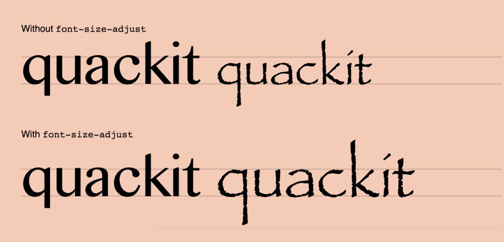
When a font cannot be accessed, the browser falls back on the second font provided, which may cause a significant shift in font size, and, in turn, shift around other parts of our UI. To give a better depiction of this as it would appear when implemented, take a look at the below illustration.
 Source: quackit.com
This example compares two typefaces with differing x-heights and demonstrates how the x-height of one may be adjusted to match the x-height of the other using font-size-adjust. Though both examples use the same two fonts, in the first line without font-size-adjust applied, all of the lowercase letters in the first font are much taller than those in the second font.
This is where font-size-adjust comes in handy — in the second line, the attribute adjusts the size of the letters in the second font to match the x-height of the first font’s letters.
font-size-adjust is useful because it determines font readability based on the size of lowercase letters, rather than the size of capital letters, and adjusts the size of lowercase letters to the size of those in the font currently in use.
Using the font-size-adjust attribute can help prevent this from happening by giving you more control over the font size. However, not all typefaces are supported by all browsers, and using unsupported typefaces may make your website look weird, as previously discussed. Let’s take a look at browser compatibility in the next section.
Browser compatibility for font-size-adjust
Before we move into the details, let’s review browser support for the font-size-adjust property. As of writing of this article, the CSS font-size-adjust property is currently only supported by Firefox by default.
Chrome and Opera support this property behind the "Experimental Web Platform Features" flag, which may be activated in chrome:/flags, and ranges from version 43 to 30. The CSS font-size-adjust attribute isn't currently supported by Edge or Safari.
 Source: MDN Docs
Now, let's take a brief look at the CSS font-size property more broadly before diving into the CSS font-size-adjust property.
The CSS font-size property
The font-size CSS property sets the size of the font overall. There are some key things to note about the font-size property:
- When the
font-sizeproperty is set to a fixed value inem, the size is calculated based on the font size of the parent element - If other elements are stated in
em, changing the font size of one element may impact the font size of others - When font size is provided as a percentage, it is calculated relative to the font size of the parent element
Here is a sample of the font-size syntax:
/ absolute-size /
font-size: medium | xx-small | x-small | small | large | x-large | xx-large;
/ relative-size /
font-size: smaller | larger;
/ percentage /
font-size: 10%;
/ length /
font-size: 5px;
The CSS font-size-adjust property
As we mentioned before, the CSS attribute docs specify that the element's font size should be adjusted based on the height of lowercase letters, rather than the height of uppercase letters.
When the primary font type cannot be accessed, the CSS font-size-adjust property allows developers to control font size at the component level. In such cases, a font backup is referenced, and the browser switches to display the secondary font.
But if there is a variation in the aspect ratio of the desired original and current fonts, this may cause issues with legibility and accessibility. The CSS font-size-adjust property may be used in situations where we need to retain the text's legibility while maintaining its aesthetic.
The font-size-adjust syntax is as follows:
number | none | initial | inherit;
-
Number: Thefont-size-adjustproperty is set to a number -
None: This is the default value -
Initial: Sets the value of this property to its default -
Inherit: Thefont-size-adjustproperty is passed down from parent to child
Let’s look at an example. Say that the font-size-adjust property receives a value of 0.5, which will return a font size that is half the given font size for lowercase letters.
See the Pen font-size-adjust by Adekanye Oluwatomiyin (@Adetomi) on CodePen.
We can also set this property as a number and multiply it by the font-size property to make it compatible with browsers that do not support font-size-adjust. Here’s another example:
font-size: 20px;
font-size-adjust: 0.5;
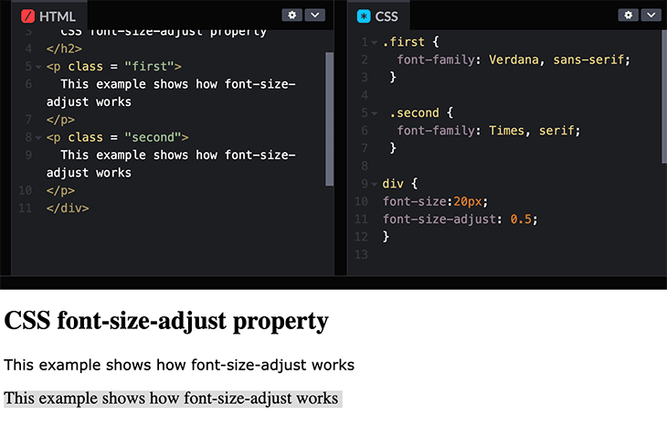
This sets the x-height of the font’s lowercase letters to 20 * 0.5, which is equal to 10px.
In browsers that do not support font-size-adjust, a 20px font will still be executed when using this method.
Based on the image above, the difference between the two fonts isn’t very obvious. Whereas, if you use none, the predefined font, and its given size:
font-size-adjust: none

You can more clearly see that there is a clear difference between these two fonts. The size of both sentences is based on the font-size property, using the predefined font-size.
Conclusion
You should now have a better understanding of what the CSS font-size-adjust property does, why it's important, and how to include it in your CSS styles.
You can start using this property in your web applications in order to improve legibility and aesthetics. Given that it is only supported by one browser, to avoid size difference due to browser incompatibility, it’s probably still a best practice to pick typefaces with closely comparable ratios.
Thank you, and happy styling.
Is your frontend hogging your users' CPU?
As web frontends get increasingly complex, resource-greedy features demand more and more from the browser. If you’re interested in monitoring and tracking client-side CPU usage, memory usage, and more for all of your users in production, try LogRocket.

LogRocket is like a DVR for web and mobile apps, recording everything that happens in your web app or site. Instead of guessing why problems happen, you can aggregate and report on key frontend performance metrics, replay user sessions along with application state, log network requests, and automatically surface all errors.
Modernize how you debug web apps — Start monitoring for free.

Top comments (0)