
Written by Emmanuel Yusuf✏️
With the number of new frameworks introduced to the JavaScript ecosystem, an issue has emerged for teams that now need their codebase to support several different frameworks while working on a single project. This increases the amount of work they will be doing, because it requires devs to write the same component in different framework syntaxes.
Minze was invented in order to reduce this stress. With Minze, you can write a component that is native anywhere. If your team is using React and Vue and HTML, Minze allows your component to behave natively in all of them.
In this article, we will learn about Minze, and walk through how to get started using this wonderful new framework in your next project by building a sample button component that will work natively in most popular JavaScript frameworks.
Prerequisites
In order to follow along with this tutorial, you should have the following:
- Working knowledge of JavaScript
- Node.js installed on your PC
- A terminal (CMD or any other terminal of your choice)
- A text editor (Visual Studio Code or any other one you prefer)
What is Minze?
According to their website, Minze is a “dead-simple framework for native web components.” It is a modern tool to build cross-framework component libraries or design systems. The main goal is to improve code reusability without framework barriers, which have been a great problem for JavaScript developers in the past.
Let’s take, for example, Ant Design, which is a design system for React. If a team wants to use Ant Design with Vue, then the developers will have to write the codebase again to support Vue syntax. This is why a lot of component libraries or design systems decide to stick with just one framework, unless they have a large number of developers to work on the project, or it is open source with a robust community of contributors.
Minze gives us the ability to create a shareable component that can be defined once and used everywhere. The components are compressed into tiny file sizes for easy use.
How components are structured with Minze
Every JavaScript framework has a specific component structure to follow, and Minze is no exception.
You can see how Minze structures components with the following code:
import { MinzeElement } from 'minze'
export class ComponentName extends MinzeElement {
  //attribute and method declaration section

  //html section
  html = () => `

  `

  css = () => `

  `
}
The Minz component structure is divided into three parts: the declaration section, HTML section, and CSS section. The declaration section is where data is managed. It may come in the form of variable declaration or a declaration of methods. The HTML section shows the structure of how the component visuals, while the CSS section adds style to make it more presentable.
Defining data with Minze
Minze has multiple ways of defining data. Every way serves its own purpose, but all forms of data will end up being accessible to the component in form of properties.
this
this is required to access a defined method or property within a component. This refers to the component itself.
Let’s look at this code example to understand:
import Minze, { MinzeElement } from 'minze'

const count = "two"

class Element extends MinzeElement {
  count = 'three'

  onReady() {
    console.log(
      count, // two
      this.count// three
    )
  }
}

Minze.defineAll([Element])
Looking at the code above, the constant that is declared outside the component serves as a global variable, while the property that was declared inside the component serves as a local variable that can be accessed inside the component.
Properties
Properties are nonreactive data, or a property added to a component. They serve as a component variable that does not accept dynamic changes.
The code below demonstrates how properties work:
import Minze, { MinzeElement } from 'minze'

class Element extends MinzeElement {
  greet = 'Hello World!'

  onReady() {
    console.log(this.greet) // Hello World!
  }
}

Minze.defineAll([Element])
The syntax above shows how a property can be declared and used with the this method to classify it with its parent element.
Reactive properties
Reactive properties are a type of property that accepts changes though every change on the property triggers a component re-render, it is declared in form of an array that contains one or more strings or tuples. The code syntax below explains how reactive properties can be declared:
import Minze, { MinzeElement } from 'minze'

class Element extends MinzeElement {
  reactive = [
    'time',
    ['name', 'Emmanuel Yusuf'],
    ['favNum', 6]
  ]

  onReady() {
    console.log(
      this.time, // null
      this.name, // Emmanuel Yusuf
      this.favNum // 6
    )
  }
}

Minze.defineAll([Element])
Note that declaring a reactive property with just a string gives the property a name with no value added. Adding it inside a tuple with two values makes the first value the name, and the second value the value assigned to it.
Attribute properties
Attribute properties are dynamic, reactive properties that allow a property value to be added when the component is declared. You might notice that this is very similar to props in React.
Attribute properties use the same syntax as reactive properties, except the property value can be overridden if specified when the component is called.
Getting started with Minze
In this section, we will learn how to set up our first Minze project.
To get started, open your terminal and run the following command:
npm i -g minze
This command will install Minze globally.
Next, run this command to scaffold a new project:
npm init minze@latest
Running the command above will show you a template to use either JavaScript or TypeScript. Select the one you would like to work with.
After the selection, it will set up the whole project like so:
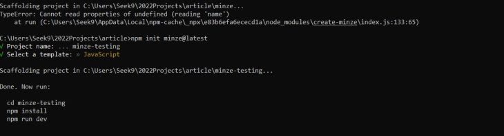
Now, follow the command as listed in the response:
cd minze-testing
This will take you to the project directory. Note that minze-testing is just the name I am using for this example, but you can name it whatever you’d like.
Next, run:
npm install
And finally:
npm run dev
After a successful compilation, you will see a response telling you to go to localhost:3000 (or the port that is being used to run the project). The port should show the following:

We have successfully set up our first project with Minze! Next, let’s take a look at the project structure.
File structure in a Minze app
Below, you can see the file structure in the Minze app we have just set up:

You can see that we have a vite.config file, because Minze uses Vite as its build tool to help improve the frontend experience. We also have a rollup.config file, which is used as a module bundler to compile a small piece of code into something larger and more complex.
The src folder contains the assets and lib folders. Assets contains the external assets required for the program to run while the libs folder contains the components that will be created.
The src folder also includes the module.js file where all the components created in the project will be exported. Template.js is what is rendered when the project is started.
Lastly, the vite.js file serves as the main entry point where the template file is assigned to the app ID.
Creating a dynamic button component with Minze
To begin, we need to set up some CSS variables to help declare consistent styling throughout the project.
Open vite.css in the assets folder, and add the following code:
:root {
  --primary-default: #0B5FFF;
  --primary-hover: #0053F0;
  --primary-active: #004AD7;
  --primary-disabled: rgba(11, 95, 255, 0.5);
  --white: #ffffff;
  --padding-y-sm: .5rem;
  --padding-x-sm: .75rem;
  --padding-y-md: .75rem;
  --padding-x-md: 1rem;
  --padding-y-lg: .875rem;
  --padding-x-lg: 1.125rem;
  --border-radius: .4rem;
  --font-size-sm: .875rem;
  --font-size-md: 1rem;
  --font-size-lg: 1.125rem;
}
The code above contains the colors, padding, border radius, and font size that we will be using for the component.
In order to create the dynamic button components, we need to delete all of the components in the lib folder except for minze-button.js and minze-counter.js.
Now, open minze-button.js and replace the content with the following code:
import { MinzeElement } from 'minze'

export class MinzeButton extends MinzeElement {
  html = () => `
    <button class="button">
      <slot></slot>
    </button>
  `
}
In the code above, we are creating a button component by extending from the MinzeElement class. Following the Minze component structure, we then create the HTML that serves the button. This HTML adds a slot that gives the button the ability to add a child element into the button component.
To make the button dynamic, we will add some variations to it to give the user something to select. To do so, we will add a few attributes to the component in order to accept a value based on what the user wants, such as the button size or the button type.
You can do so with the following code, added above the HTML section:
attrs = [
  ['size', 'small'],
  ['outline', false],
  ['disabled', false],
]
Looking at the code above, we are adding attributes with the values size, outline, and disabled to the components. Each attribute takes a default value in case it is not declared when calling the component.
With this, we can continue by adding style to the button. Add the CSS to the component using the following code:
css = () => `
    .button {
      background: ${this.outline ? 'none' : this.disabled ? 'var(--primary-disabled)' : 'var(--primary-default)'};
      color: ${this.outline ? 'var(--primary-default)' : 'var(--white)'};
      font-size: ${this.size === 'small' ? 'var(--font-size-sm)' : this.size === 'medium' ? 'var(--font-size-md)' : 'var(--font-size-lg)'};
      font-weight: 600;
      border: ${this.outline ? '2px solid var(--primary-default)' : 'none'};
      border-radius: var(--border-radius);
      padding: ${this.size === 'small' ? 'var(--padding-y-sm) var(--padding-x-sm)' : this.size === 'medium' ? 'var(--padding-y-md) var(--padding-x-md)' : 'var(--padding-y-lg) var(--padding-x-lg)'};
      cursor: pointer;
      transition: background 0.3s ease-in-out;
    }
    .button:hover {
      background: ${this.outline ? 'none' : this.disabled ? 'var(--primary-disabled)' : 'var(--primary-default)'};
      color: ${this.outline ? 'var(--primary-default)' : 'var(--white)'};
      boder-color: ${this.outline ? 'var(--primary-active)' : 'none'};
    }
  `
In the code above, we are adding the CSS to target the button style and hover state. We are calling the attributes using a ternary operator to add dynamic styling based on the value assigned to each attribute.
To see what we have been working on since the start of the project, open the minze-counter.js file and paste in the following code:
import { MinzeElement } from 'minze'
export class MinzeCounter extends MinzeElement {
  html = () => `
    <minze-button size="large">
      Large Button
    </minze-button>
    <minze-button size="small">
      Small Button
    </minze-button>
    <minze-button size="medium" outline=true>
      Medium Outline Button
    </minze-button>
    <minze-button size="medium" disabled=true>
      Medium Disabled Button
    </minze-button>
  `
  css = () => `
    :host {
      width: 100%;
      min-height: calc(100vh - 2rem);
      display: flex;
      flex-direction: column;
      justify-content: center;
      align-items: center;
      gap: 1.5rem;
      padding: 40px;
    }
  `
}
The code above creates a component for the MinzeButton. Looking at the code, you will see that the Button component is called with different attributes in order to check the different variants that are available for the users to explore.
In the CSS, we are using :host to target the entire component, which we are giving a width of 100 percent and a height of 100vh - 2rem.
Our final product should look like this:

Conclusion
Hopefully by the end of this article you are able to create a dynamic button component with Minze. You should be able to use this component in all frameworks including React, Vue, Svelte, regular HTML, and many more.
This solution will help in relieving the stress developers will have to go through in converting components from one framework syntax to the other. You can check out the code for this project on my GitHub here.
LogRocket: Full visibility into your web apps

LogRocket is a frontend application monitoring solution that lets you replay problems as if they happened in your own browser. Instead of guessing why errors happen, or asking users for screenshots and log dumps, LogRocket lets you replay the session to quickly understand what went wrong. It works perfectly with any app, regardless of framework, and has plugins to log additional context from Redux, Vuex, and @ngrx/store.
In addition to logging Redux actions and state, LogRocket records console logs, JavaScript errors, stacktraces, network requests/responses with headers + bodies, browser metadata, and custom logs. It also instruments the DOM to record the HTML and CSS on the page, recreating pixel-perfect videos of even the most complex single-page and mobile apps.

Top comments (0)