
Written by Ochuko Onojakpor ✏️
Have you ever wanted to build and display graphs in your React applications, or are you finding it difficult to do so with your current library? If yes, this article is just what you need: we’ll be exploring Plotly and how we can utilize it in React applications.
Plotly is a free and open source data visualization framework that offers a variety of plot types such as line charts, scatter plots, histograms, cox plots, and more.
By enabling us to endlessly customize our graphs, we can make our plots more relevant and intelligible to others. Plotly is presently only available in Python, R, Julia, Matlab, F#, and Javascript applications.
Prerequisites
To follow this tutorial, you will need the following:
- Working knowledge of React
- A good understanding of how graphs work
- The Plotly library to build charts
- Chakra UI to create the data fields to make our charts dynamic
To install Plotly and Chakra, run the commands below in your terminal:
npm install react-plotly.js plotly.js
npm i @chakra-ui/react @emotion/react@^11 @emotion/styled@^11 framer-motion@^4
How Plotly works
In Plotly, users pass data points and configurations for a graph or chart to the Plot component:
<Plot
      data={[
        {
          x: [1, 2, 3],
          y: [2, 6, 3],
          type: 'scatter',
          mode: 'lines+markers',
          marker: {color: 'red'},
        },
        {type: 'bar', x: [1, 2, 3], y: [2, 5, 3]},
      ]}
      layout={ {width: 320, height: 240, title: 'A Fancy Plot'} } />
In the image below, we have two different plots in the chart: a bar chart and a scatter plot. To achieve this, we used the JSON format to pass the two plots along with their data points and configurations as items in a list to the data prop in the Plot component.

The example above is a static bar chart and scatter plot where we passed the data directly to the props. Later in this tutorial, we will look at a more dynamic approach to creating graphs.
Different types of Plotly graphs and charts
Plotly goes beyond the simple bar chart and scatter plot. We’ll review other charts we can implement with Plotly and how to use them in React.
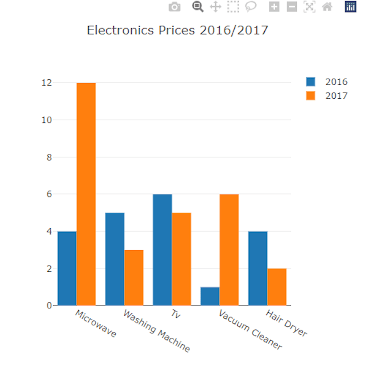
Grouped bar chart
A grouped bar chart compares two different data points for the same data group. Let’s see how to build it with Plotly:
const GroupedBarChart = (props) =>{
  var plot1 = {
  x: ["Microwave", "Washing Machine", "Tv", "Vacuum Cleaner", "Hair Dryer"],
  y: [4, 5, 6, 1, 4],
  name: "2016",
  type: "bar",
};

var plot2 = {
  x: ["Microwave", "Washing Machine", "Tv", "Vacuum Cleaner", "Hair Dryer"],
  y: [12, 3, 5, 6, 2],
  name: "2017",
  type: "bar",
};

var data = [plot1, plot2];
    return(
      <Plot
      data={data}
      layout={ {width: 500, height: 500, title: 'Electronics Prices 2016/2017'} } />
    )
}
In the code above, we created two bar chart plots (plt1 and plot2), then grouped them using the same x values and passed both plots to the data prop of the Plot component. With this method, we can group two or more bar charts.
The code then outputs the graph below:
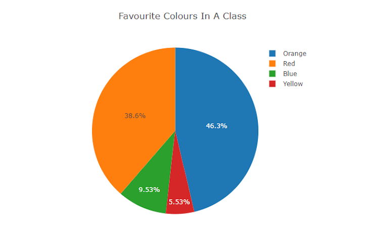
Pie chart
A pie chart compares different areas of a particular data set or data group. Our example of a pie chart will compare the choices of students' favorite colors in a class.
Let’s see how we can implement this with Plotly:
const PieChart = (props) =>{
  var data = [
    {
      values: [112, 454, 65, 544],
      labels: ["Blue", "Red", "Yellow", "Orange"],
      type: "pie",
    },
  ];

    return(
      <Plot
      data={data}
      layout={ {width: 500, height: 500, title: 'Favourite Colours In A Class'} } />
    )
}
In the code above, we passed labels, values, and type for the chart, containing the colors, number of students, and the type of chart, respectively.
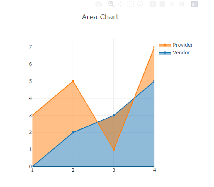
Area chart
An area chart depicts the evolution of one or more quantities over time and is comparable to a line graph. Data points are plotted and then joined by line segments in both area charts and line graphs to illustrate the value of a quantity at various periods.
However, area charts vary from line graphs because the region between the x-axis and the line is filled in with color or shading.
Area charts are a suitable alternative when we want to demonstrate a pattern over time but aren't concerned with providing exact values.
To build an area chart with Plotly, we just need to add a value for the fill property of a scatter plot. For this example, we will build an area chart to find the price trend between providers and vendors:
const AreaChart = (props) =>{
  var data = [
    {
         x: [1, 2, 3, 4],
         y: [0, 2, 3, 5],
         fill: 'tozeroy',
         type: 'scatter',
         name: 'Vendor'
       },
       {
         x: [1, 2, 3, 4],
         y: [3, 5, 1, 7],
         fill: 'tonexty',
         type: 'scatter',
         name: 'Provider'
       }
  ];

    return(
      <Plot
      data={data}
      layout={ {width: 500, height: 500, title: 'Area Chart'} } />
    )
}
The output for the code is below.
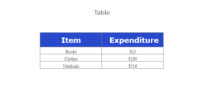
Tables
A table is an organization of information in rows and columns with cells that allow easy comparison and contrast. To build a table with Plotly, we must pass the header and cell values, as seen in the code below.
For this example, we will compare the cost of some essential expenditures:
const Table= (props) =>{
  const values = [
    ["Books", "Clothes", "Medicals"],
    ["$22", "$190", "$516"],
  ];
  const headers = [["<b> Item </b>"], ["<b> Expenditure </b>"]];
  const data = [
    {
      type: "table",
      header: {
        values: headers,
        align: "center",
      },
      cells: {
        values: values,
        align: "center",
      },
    },
  ];

    return(
      <Plot
      data={data}
      layout={ {width: 500, height: 500, title: 'Table'} } />
    )
}
By passing two headers for our expenditure table and a list for each header, the content of the first list occupies the cells under the first header, and the content of the second list occupies the cells under the second header.
The code then outputs the following:

We can also style our table:
const Table= (props) =>{
  const values = [
    ["Books", "Clothes", "Medicals"],
    ["$22", "$190", "$516"],
  ];
  const headers = [["<b> Item </b>"], ["<b> Expenditure </b>"]];
  const data = [
    {
      type: "table",
      header: {
        values: headers,
        align: "center",
        fill: { color: "#2849cc" },
        font: { color: "white", size: 20 },
      },
      cells: {
        values: values,
        align: "center",
        font: { family: "Ubuntu" },
      },
    },
  ];

    return(
      <Plot
      data={data}
      layout={ {width: 500, height: 500, title: 'Table'} } />
    )
}
Creating dynamic charts with Plotly
Now that we learned how to build graphs, plots, and charts, let's learn how to make them dynamic. To do this, we must update the data plotted with React states. Let's see how a dynamic scatter plot looks:
import Plot from 'react-plotly.js';
import React, { useState } from "react"
import { HStack,Input, Text } from "@chakra-ui/react"

const GraphCard = (props) =>{

  const [ scatter, setScatter ] = useState(
    {
          x: [1,2,3],
          y: [2,5,3],
          type: 'scatter',
          mode: 'lines+markers',
          marker: {color: 'red'},
        }
  );
  const [ data, setData ] = useState([scatter]);

  const handleChange = (i,j,e) => {
    const newScatter = {...scatter};
    newScatter\[i\][j]=parseInt(e.target.value);
    setScatter(newScatter);
    setData([scatter]);
  }

    return(
      <>
      <Plot data={[{
            x: \[data[0\]["x"]\[0],data[0\]["x"]\[1],data[0\]["x"][2]],
            y: \[data[0\]["y"]\[0],data[0\]["y"]\[1],data[0\]["y"][2]],
            type: 'scatter',
            mode: 'lines+markers',
            marker: {color: 'red'},
          }]} layout={ {width: 500, height: 500, title: 'A Dynamic Fancy Plot'} } />
    <HStack align="center" marginTop="2rem" padding="2rem">
      <Text fontSize="md">X1</Text>
      <Input type="number" placeholder={data\[0\]["x"][0]} onChange={(e) => handleChange("x",0,e)}/>
      <Text fontSize="md">X2</Text>
      <Input type="number" placeholder={data\[0\]["x"][1]} onChange={(e) => handleChange("x",1,e)}/>
      <Text fontSize="md">X3</Text>
      <Input type="number" placeholder={data\[0\]["x"][2]} onChange={(e) => handleChange("x",2,e)}/>
      <Text fontSize="md">Y1</Text>
      <Input type="number" placeholder={data\[0\]["y"][0]} onChange={(e) => handleChange("y",0,e)}/>
      <Text fontSize="md">Y2</Text>
      <Input type="number" placeholder={data\[0\]["x"][1]} onChange={(e) => handleChange("y",1,e)}/>
      <Text fontSize="md">Y3</Text>
      <Input type="number" placeholder={data\[0\]["x"][2]} onChange={(e) => handleChange("y",2,e)}/>
    </HStack>
      </>
    )
}

export default GraphCard;
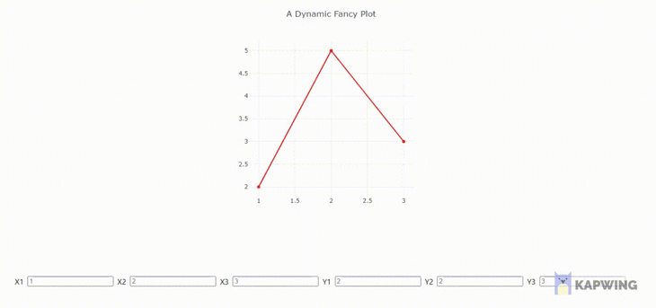
In the code above, we built our user interface using the Chakra UI library, defined our scatter plot data in a scatter state, and wrapped it in a data list state.
By creating a handleChange function and attaching it to the onChange events on our Chakra inputs, the handleChange function tracks changes to the input on all data points and updates the data for the plot, making the scatter plot dynamic.
Below is the output of the code above:
Customizing charts with Plotly
Here we will learn how to configure and customize our plots for better use and experience.
Labeling axis
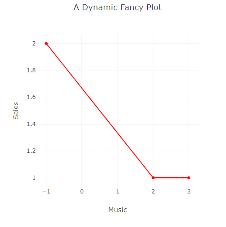
To label the x and y-axis of a plot, use the xaxis and yaxis keys in the layout property as seen in the code below:
<Plot data={data} layout={ {width: 500, height: 500, title: 'A Dynamic Fancy Plot', xaxis:{title:"Music"}, yaxis:{title:"Sales"}} } />
Doing this renders a plot with a "Music" and "Sales" axis.
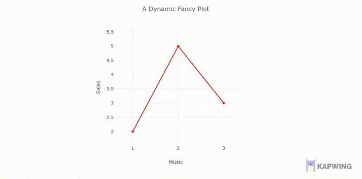
Scroll-to-zoom
This function allows the user to zoom scatter plot charts, making it easier to browse the data. We may use it to check or obtain a more detailed perspective of a layout. To implement scroll-to-zoom in our plot, set scrollZoom in the config property:
<Plot data={data} layout={ {width: 500, height: 500, title: 'A Dynamic Fancy Plot', xaxis:{title:"Music"}, yaxis:{title:"Sales"}}} config={{scrollZoom:true}}/>
Adding legend names
For a situation where we have two plots on one graph, we must label them with legends. To do this, set their name properties where we defined their data. Let’s see an example of a graph with a scatter plot and bar chart:
<Plot
      data={[
        {
          x: [1, 2, 3],
          y: [2, 6, 3],
          type: 'scatter',
          mode: 'lines+markers',
          marker: {color: 'red'},
name: "scatterplot"
        },
        {type: 'bar', x: [1, 2, 3], y: [2, 5, 3], name:"bar chart},
      ]}
      layout={ {width: 500, height: 500, title: 'A Fancy Plot'} } />
In the code above, we set a name value for each data set in the list. Doing so adds labels to the data set and renders them on the right side of the plot.

Conclusion
This article taught you how to build charts, graphs, and dynamic plots with Plotly. You can learn more about Plotly in their official documentation here. If you have any questions, don't hesitate to contact me on Twitter at @LordChuks3.
Full visibility into production React apps
Debugging React applications can be difficult, especially when users experience issues that are hard to reproduce. If you’re interested in monitoring and tracking Redux state, automatically surfacing JavaScript errors, and tracking slow network requests and component load time, try LogRocket.

LogRocket is like a DVR for web apps, recording literally everything that happens on your React app. Instead of guessing why problems happen, you can aggregate and report on what state your application was in when an issue occurred. LogRocket also monitors your app's performance, reporting with metrics like client CPU load, client memory usage, and more.
The LogRocket Redux middleware package adds an extra layer of visibility into your user sessions. LogRocket logs all actions and state from your Redux stores.
Modernize how you debug your React apps — start monitoring for free.

Top comments (0)