
Written by Elijah Asaolu ✏️
Introduction
Earlier this year, the Bootstrap team announced a major release: Bootstrap v5, which was shipped with some interesting changes such as the migration from jQuery to vanilla JavaScript, tons of updated components, and other updated utility classes.
A couple of weeks back, the team again announced the first minor release of Bootstrap 5: v5.1.0. Throughout this article, we will be exploring what’s new in this first minor release, as well as how things work now compared to previous versions.
Bootstrap 4 vs. 5.0
ICYMI, some of the notable changes differentiating Bootstrap 4 from the latest Bootstrap 5 include:
- Dropped jQuery — Compared to the previous version that relied on jQuery to run JavaScript-related code, Bootstrap 5 dropped support for jQuery to favor vanilla JavaScript instead
- No older browsers support — In v5, the Bootstrap team also decided to drop support for tons of older browsers, such as IE 10 and 11, Microsoft Edge legacy, and more
- Newer Color — A newer color system was introduced in v5, so you can easily customize the look and feel of your app, plus existing color palettes were also improved to make them even more accessible
- Form elements — Form elements are now designed to have a consistent look, irrespective of browser or operating system
- Extensibility — Bootstrap now lets users modify, extend, or create their utility classes easily
Latest features in 5.1.0
If you are not already familiar with the installation process, you can start using Bootstrap by including its minified CSS and JavaScript CDN in your markup like below:
<!DOCTYPE html>
<html lang="en">
  <head>
    <!-- Required meta tags -->
    <meta charset="utf-8" />
    <meta name="viewport" content="width=device-width, initial-scale=1" />

    <!-- Bootstrap CSS -->
    <link
      href="https://cdn.jsdelivr.net/npm/bootstrap@5.1.1/dist/css/bootstrap.min.css"
      rel="stylesheet"
    />
    <title>Bootstrap App</title>
  </head>
  <body>
    <div>
      <!-- main content here -->
    </div>
    <!-- Bootstrap bundled JS -->
    <script src="https://cdn.jsdelivr.net/npm/bootstrap@5.1.1/dist/js/bootstrap.bundle.min.js"></script>
  </body>
</html>
For more installation options, head over to the official download page.
CSS Grid
This newer version of Bootstrap features an experimental option to enable a separate grid system that’s built on CSS Grid.
On previous versions of Bootstrap, under the hood, grid systems are built on top of the CSS display: flex; property. This latest update in v5.1.0 can enable an option that lets you use the traditional CSS grid system (i.e., the display: grid; property).
How it works
This feature is not enabled by default, as it is experimental. To enable it, you’ll need to first disable the default grid system by setting $enable-grid-classes: false in your uncompiled Bootstrap Sass file, and finally, enable the new CSS Grid by setting $enable-cssgrid: true, then you can recompile your Sass file.
Implementing this feature is pretty straightforward, all you need to do is:
- Replace all instance of
.rowwith.grid - Replace all instance
.col-*classes with.g-col-*classes
For example, to create a two-column grid system, with equal width across all viewports:
<div class="grid">
  <div class="g-col-6">.g-col-6</div>
  <div class="g-col-6">.g-col-6</div>
</div>
And for responsiveness, Bootstrap utility classes for different viewports and devices (xs, sm, md, lg, xl) are still supported:
<div class="grid">
  <div class="g-col-4 g-col-md-6">..</div>
  <div class="g-col-4 g-col-md-6">..</div>
  <div class="g-col-4 g-col-md-6">..</div>
</div>
Placeholder component
Bootstrap 5.1.0 introduces the new and exciting placeholder components (also known as skeleton loaders), which are temporary gray blocks that are used to depict the structure of a block before its contents are loaded.
This new component is a game-changer, as it helps to enhance the experience of your application, plus it is built with only HTML and CSS, (i.e., you don’t need any JavaScript code to get started in integrating them, although you’ll still need to write some custom JavaScript code to toggle the visibility of its contents).
How it works
You can easily create placeholders by adding the .placeholder class to a specific element you want to display as a placeholder:
<h1 class="placeholder col-4"></h1>
<p class="placeholder col-6"></p>
<button
  class="col-3 btn btn-primary disabled placeholder"
  style="height: 40px"
></button>
Which produces the output below:

Width and sizing
The placeholder width can be adjusted by using Bootstrap grid column classes (like in the example above), width utilities (w-50, w-75), or inline styles.
By default, the size of placeholders is based on the typographic style or content of the parent element. However, we can customize its size using the inbuilt sizing modifiers utility classes: .placeholder-lg, .placeholder-sm, or .placeholder-xs.
Placeholder animation
You can also add animations to the placeholder to give the user a better understanding that something is being actively loaded. Currently, there are only two supported classes for animating placeholders: .placeholder-glow and .placeholder-wave.
Below is an example:
<p class="placeholder-glow">
  <span class="placeholder col-4"></span>
</p>
<p class="placeholder-wave">
  <span class="placeholder col-4"></span>
</p>

Horizontal collapse
For a while now, only vertical collapse is supported in Bootstrap, but in this latest version, the team has added support for horizontal collapse.
How it works
If you’d worked with the Bootstrap collapse in the past, all you need to get horizontal collapse working is to add the .collapse-horizontal modifier class to your collapsible element, and this new class will transition the width (rather than the height) of this element when you toggle your collapse.
Below is a code sample:
<p>
  <button
    class="btn btn-primary"
    type="button"
    data-bs-toggle="collapse"
    data-bs-target="#horizontalCollapseExample"
    aria-expanded="false"
    aria-controls="horizontalCollapseExample"
  >
    Toggle Horizontal Collapse
  </button>
</p>
<div style="min-height: 120px">
  <div class="collapse collapse-horizontal" id="horizontalCollapseExample">
    <div class="card card-body" style="width: 300px">
      Placeholder content here, this is hidden by default.
    </div>
  </div>
</div>
And when we run this, we have the following output:

Updated utility classes (.bg-* and .text-*)
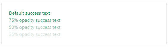
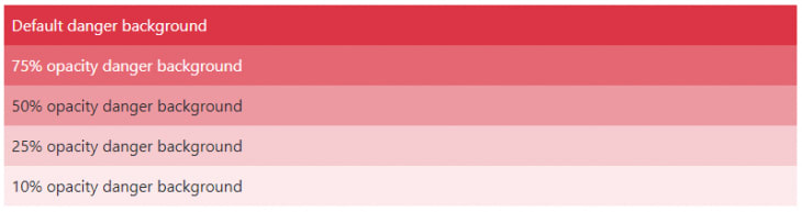
Newer .text-opacity-* and .bg-opacity-* classes have also been introduced to easily adjust text, and background elements' opacity. Although, before you can get this new utility class to work, the element (depending on the property you want to adjust) must have a prior .text-* or .bg-* utility class.
text-opacity example
<div class="text-success">Default success text</div>
<div class="text-success text-opacity-75">75% opacity success text</div>
<div class="text-success text-opacity-50">50% opacity success text</div>
<div class="text-success text-opacity-25">25% opacity success text</div>
This will produce:
bg-opacity example
<div class="bg-danger p-2 text-white">Default danger background</div>
<div class="bg-danger p-2 text-white bg-opacity-75">
  75% opacity danger background
</div>
<div class="bg-danger p-2 text-dark bg-opacity-50">
  50% opacity danger background
</div>
<div class="bg-danger p-2 text-dark bg-opacity-25">
  25% opacity danger background
</div>
<div class="bg-danger p-2 text-dark bg-opacity-10">
  10% opacity danger background
</div>
This will produce:
Newer CSS variables
In this latest minor release, the :root variables have been updated to include a new gray color palette and new RGB color theme variables. Additionally, CSS variables now control the <body> tag along with some other tags and custom utility classes. This will make customizing and extending default Bootstrap styles way easier.
Conclusion
Throughout this post, we covered some of the new changes that were introduced in Bootstrap 5.1.0, the first minor release for Bootstrap 5. We also looked into the changes differentiating Bootstrap v4 from v5, as well as how to get started with using the new Bootstrap 5.1.0.
For a full reference of all the new changes, check out Bootstrap creator Mark Otto’s official announcement.
Is your frontend hogging your users' CPU?
As web frontends get increasingly complex, resource-greedy features demand more and more from the browser. If you’re interested in monitoring and tracking client-side CPU usage, memory usage, and more for all of your users in production, try LogRocket.

LogRocket is like a DVR for web apps, recording everything that happens in your web app or site. Instead of guessing why problems happen, you can aggregate and report on key frontend performance metrics, replay user sessions along with application state, log network requests, and automatically surface all errors.
Modernize how you debug web apps — Start monitoring for free.

Top comments (0)