EDA is a data analysis technique that mainly focuses on on understanding the characteristics of a dataset. It involves using various statistical and visualization tools to explore data, identify patterns and uncover insights and relationships.
Exploratory data analysis is an important step in the data analysis step. This is because it ensures that the data is really what it is claimed to be and that there are no obvious errors e.g missing values, outliers etc. EDA enhances accuracy, efficiency and reliability of data.
Data visualization on the other hand represents the various techniques used to represent data visually through charts, tables, maps, graphs and other visual elements. These techniques usually help to represent complex data in a more simplified and understandable format.
Common graphs used while performing EDA
Scatter Plot
Pair plots
Histogram
Box plots
Violin Plot
Performing EDA
We are going to use a sample dataset which is the Haberman Dataset to perform EDA.
We start by importing several python libraries'

Table Headers

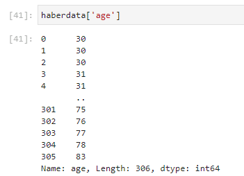
Age -Represents the age of the patients undergone the surgery. It ranges from 30 to 83.
Year- Year in which the patients had the operation. It ranges from 1958-1969.
Nodes - A lymph node, or lymph gland is a kidney-shaped organ of the lymphatic system, and the adaptive immune system.
Status — Denoted by 1 and 2. 1 means the patient survived 5 years or longer and 2 means the patient died within 5 years.

From the above code, 225 patients survived 5 years or longer and 81 patients died within 5 years.
Data Visualization plots
Helps us understand the dataset much better in a visual way.
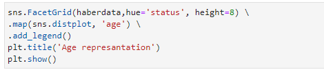
Histograms
These are 2-D plots where the X axis can be divided into time intervals or numerical bin ranges. Histograms help in identifying patterns such as skewness, central tendencies, and outliers.
From our example above:

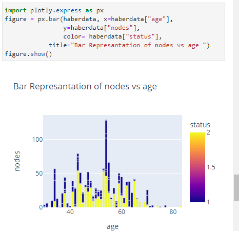
Bar Charts
Bar charts are suitable for visualizing categorical or discrete data. They help understand trends.
Scatter Plots
It is a type of plot which will be in a scatter format. It is mainly between 2 features. Here we will plot nodes Vs age and see if there is any linearity.
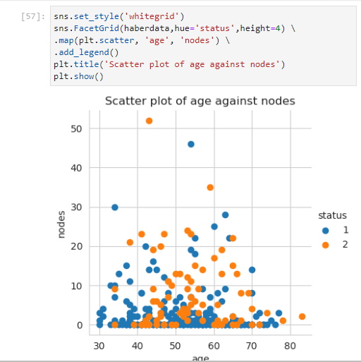
Here blue and orange dots represent the survival status of the patients. blue represents the patient survived 5 years or longer and orange dot represents the patient died within 5 year.
Pair Plots
They display scatter plots for all possible pairs of continuous variables in a dataset. They provide a comprehensive view of the relationships between variables and are especially useful when exploring multiple variables simultaneously.

From the above plot we can get some interesting facts. We can say that plot 6(Year vs Nodes)is readable compared to the other two but certainly we cannot make any concrete observations based on this graph. The plot 4, plot 7 and plot 8 are the inverted plots of plot 2, plot 3 and plot 6 respectively.
Box Plots
Box plots tell us the percentile plotting which other plots cant tell easily. It also helps in detection of outliers.

In conclusion, these are some basic plots used in EDA. It is always important to read and understand what the plot is saying. It is never good to skip EDA for a machine learning project.

Top comments (0)