
Introduction
When it comes to websites, the first idea I think of is the way teams devise a plan to convey their idea to the world. How do you create a color palette? How do you get the user to instinctively go to a certain feature? What's easy on the eyes? All these question, plus more, play a role in creating a well thought-out, well developed website design.
MY THOUGHT PROCESS
User experience has always struck a special chord with me. I find myself always working out ways to better engineer or reinvent the wheel. From how the wheel is structured or even its mechanics, the wheel we have now seems....boring...
When trying to design the layout, or structure, for a web application I try to keep a few key points in my head:
- What is the goal with the site?
- What is my target audience?
- How can I make this site accessible to all humans (disabled or not)?
These few questions have helped my numerous times when laying out colors, grids, etc.
Let's talk about color palettes
Colors are a huge deal when it comes to appearance. Although my favorite color is black (it's not just a phase mom...), not everything can have that color.
We need to choose colors that work off the complimentary color chart and that appeal to the desired audience.
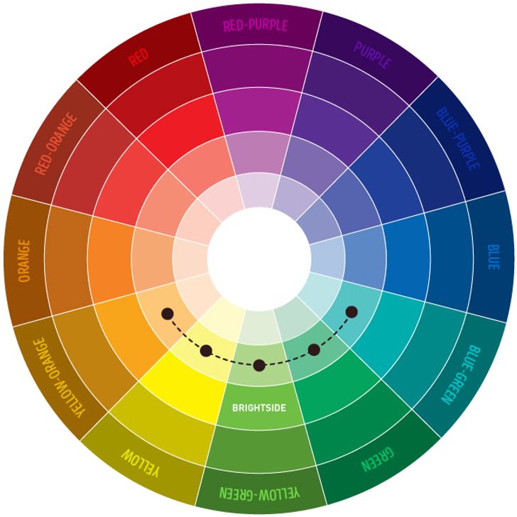
Generally older generations prefer matte, simple colors while younger generations prefer bold and bright. These distinctions can really help you decided on how you want to present your site!
I rely on a few different sites to help with palettes:
- https://colorhunt.co/ (palettes)
- https://imagecolorpicker.com/en/ (getting hex codes off pictures)
- https://uigradients.com/#Neuromancer (gradients)
Structure? I barely even knew 'er.
Layouts for a page, whether mobile app or browser app, really make the site. You can have all the fancy colors you want, but having a good structure....

With structure, you want to make something that promotes the features you want and steers the user smoothly. You want the website to feel natural and look natural...not forced in certain direction. Don't create harsh lines denoting different spaces, unless necessary (form boxes, editing areas, etc).
The goal of structure is to create your box areas but without the boxes. Think more of a "bubble-ized" sectioning of the page.
I like to use a site for their grid system (though the pack offers TONS MORE!).
Material-Ui has been a savior. The complexity begins when you start to nest columns inside of rows that are inside of columns. Then those columns are inside of larger row...see where I'm going with this?
Allowing yourself to break these components down by drawing the structure out will help you immensely!
Accessibility. So my mom can read it...
Accessibility plays a MAJOR role in UX design. Every person is made differently but deserves the same opportunity to experience the world around them.
In regards to tech, using features such as: talk to text, translation, larger text, monochromatic themes, etc...allow users to interact with your application.
I like to use this as a good guideline: Accessibility Guide.
All in all, the goal with making your site accessible to all people is to make life easier on your neighbor. Because remember kids, you don't make decisions just for yourself. That's bad practice. You want to make decisions that benefit you AND the rest of humanity. Selfishness isn't a good color on anyone :D
Is it a burrito or is it a wrap?
To sum it all up, user experience makes or breaks your application. Without the user, the app does not have a purpose. Design with the user in mind. Make it easy on them by choosing easy to look at colors that compliment each other. Use structure and grid systems to get your user where you want them. Finally, don't be selfish! Make an app accessible to ALL walks of life!

Top comments (0)