
A draggable slider enables users to scroll through its contents by dragging with a mouse or a similar input device, enhancing user interaction and information-sharing efficiency.
Moreover, when implementing draggable sliders on mobile devices, it’s common to provide alternative navigation methods like swiping. This approach ensures a smooth user experience across various devices.
With that in mind, this article explains how to implement the following features for our slider using plain HTML, CSS, and JavaScript:
- Autoplay functionality
- Dragging option for non-mobile devices
- Swiping option for mobile devices.
Codepen here:
This article also serves as a sequel to my previous piece on this topic, where I extensively covered the HTML and CSS aspects. Although I’ll provide the starter code (HTML and CSS) here, I recommend reviewing the prior article to ensure we’re on the same page.
Prerequisites
To get the most out of this article, you should have:
- A basic understanding of HTML and CSS.
- A basic understanding of JavaScript and DOM manipulation.
Setting Things Up
Paste the following HTML and CSS codes in your editor to get started.
The HTML
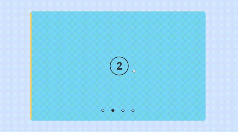
In the body element, we’ll create a slider section to showcase our slides. This container will include:
- Four unique radio inputs, one for each slide.
- A
ulwith the classslides-flexcontaining fourlielements. Eachlirepresents an individual slide and carries the classslide. - A
divwith thenavigationclass housing fourlabelelements. Eachlabelelement is linked to one of the radio inputs described earlier and has a unique class and anidranging from 1 to 4.
<body>
    <section class="slider">
      <!-- radio buttons start -->
      <input type="radio" name="radio-btn" id="radio1" checked />
      <input type="radio" name="radio-btn" id="radio2" />
      <input type="radio" name="radio-btn" id="radio3" />
      <input type="radio" name="radio-btn" id="radio4" />
      <!-- radio buttons end -->
      <!-- slides start -->
      <ul class="slides-flex">
        <li class="slide">
          <h2>1</h2>
        </li>
        <li class="slide">
          <h2>2</h2>
        </li>
        <li class="slide">
          <h2>3</h2>
        </li>
        <li class="slide">
          <h2>4</h2>
        </li>
      </ul>
      <!-- slides end -->
      <!-- navigation start -->
      <div class="navigation">
        <label for="radio1" class="btn1" id="1"></label>
        <label for="radio2" class="btn2" id="2"></label>
        <label for="radio3" class="btn3" id="3"></label>
        <label for="radio4" class="btn4" id="4"></label>
      </div>
      <!-- navigation end -->
    </section>
  </body>
The output:

With the HTML structure in place, let’s add in some styling.
The CSS
Here we’ll:
- Center our slider using CSS grid.
- Hide the radio inputs.
- Style
.slideras our container with responsive dimensions and relative positioning. - Use flexbox to horizontally arrange
.slides-flexand add absolute positioning to enable smooth sliding within.slider. - Ensure each
.slidefills the entire container’s width, displaying only one slide at a time. - Style navigation labels to mimic radio inputs.
- Utilize the
:checkedpseudo-class to adjust.slides-flex’s position and change navigationlabelbackgrounds based on the selected radio input.
* {
  padding: 0;
  margin: 0;
  box-sizing: border-box;
}

:root {
  --primaryColor: #333;
}

body {
  display: grid;
  height: 100vh;
  place-items: center;
  background-color: rgb(208, 230, 249);
  font-family: "Poppins", sans-serif;
}

ul {
  list-style: none;
}

.slider {
  position: relative;
  width: 80%;
  aspect-ratio: 1;
  max-width: 50rem;
  max-height: 31.25rem;
  border-radius: 0.7rem;
  overflow: hidden;
  cursor: grab;
}

.slider input {
  display: none;
}

/* SLIDES */
.slides-flex {
  position: absolute;
  left: 0;
  width: 400%;
  height: 100%;
  display: flex;
  transition: 0.8s;
}

.slide {
  width: 25%;
  display: grid;
  place-items: center;
}

.slide:nth-child(1) {
  background-color: #fed050;
  border-radius: 0.7rem 0 0 0.7rem;
}

.slide:nth-child(2) {
  background-color: #7fdbee;
}

.slide:nth-child(3) {
  background-color: #4cf89c;
}

.slide:nth-child(4) {
  background-color: #f79191;
  border-radius: 0 0.7rem 0.7rem 0;
}

.slide h2 {
  user-select: none;
  color: var(--primaryColor);
  height: 5rem;
  width: 5rem;
  font-size: 3rem;
  border-radius: 50%;
  display: grid;
  place-items: center;
  text-align: center;
  outline: 3px solid;
}

/* NAVIGATION */
.navigation {
  position: absolute;
  user-select: none;
  width: 100%;
  bottom: 2.5rem;
  display: flex;
  gap: 2rem;
  justify-content: center;
}

.navigation label {
  border: 2px solid var(--primaryColor);
  padding: 0.3rem;
  border-radius: 50%;
  cursor: pointer;
  transition: 1s;
}

/* ON RADIO CHECKED */
#radio1:checked ~ .slides-flex {
  left: 0%;
}

#radio2:checked ~ .slides-flex {
  left: -100%;
}

#radio3:checked ~ .slides-flex {
  left: -200%;
}

#radio4:checked ~ .slides-flex {
  left: -300%;
}

#radio1:checked ~ .navigation .btn1 {
  background: var(--primaryColor);
}

#radio2:checked ~ .navigation .btn2 {
  background: var(--primaryColor);
}

#radio3:checked ~ .navigation .btn3 {
  background: var(--primaryColor);
}

#radio4:checked ~ .navigation .btn4 {
  background: var(--primaryColor);
}
The output:

With the setup complete, let’s proceed to the JavaScript portion.
Selecting DOM Elements
Our first task is to select the HTML elements we’ll work with and assign them to variables using the querySelector method:
const slideContainer = document.querySelector(".slider");
const slideFlex = document.querySelector(".slides-flex");
const navigation = document.querySelector(".navigation");
IIFEs
An IIFE (Immediately Invoked Function Expression) is a JavaScript function that executes as soon as it is defined. Its typical syntax is:
(function (){
  // some code
})()
IIFEs establish a private scope, thereby preventing the issue of namespace pollution.
Namespace pollution occurs when global variables or functions lead to conflicts in your code, especially within large projects.
To address this issue and promote code reusability, we’ll create an IIFE named slider. This function will take our selected elements as arguments and encapsulate the remainder of our code:
(function slider(container, slideFlex, navigation){
  // our code
})(slideContainer, slideFlex, navigation)p
Setting Initial Values
In the slider IIFE, we’ll define initial variables that we can access and modify later in our code:
let initialX,
    finalX,
    leftPos = -100,
    isDragging = false,
    slideDistance,
    interval = null,
    slidesWidth = slideFlex.offsetWidth,
    numberOfSlides = slideFlex.childElementCount,
    counter = 0,
    threshold = 40;
These variables serve the following purposes:
-
initialX: Stores the user’s initial horizontal position when clicking or tapping. -
finalX: Stores the user’s final horizontal position after dragging or swiping. -
leftPos: Initialized at -100. We’ll use this value to adjust theleftproperty ofslideFlexin the CSS, either by addition or subtraction, to shift the slides. -
isDragging: Keeps track of user intent, set tofalsewhen not dragging andtruewhen the user intends to drag. -
slideDistance: Stores the horizontal distance of swipes or drags within the slider. -
interval: initialized at null to avoid interval conflicts. It will store the returned interval ID of our upcomingsetInterval()function. -
slidesWidth: Monitors the current width ofslideFlexin pixels. -
numberOfSlides: Determines the number of slides withinslideFlex. -
counter: Keeps track of the currently displayed slide. Starts at 0 and ends atnumberOfSlides - 1. -
threshold: Initializes at 40, representing the minimum swipe or drag percentage required for a slide switch.
Setting Event Listeners
Event listeners are functions that respond to user events or interactions on a specific HTML element.
In this section, I’ll outline the various event listeners that enable user interaction with our slider.
Initiate interval
document.addEventListener("DOMContentLoaded", createInterval);
In the above code, we attach an event listener to the entire webpage using the document object. This listener responds to the “DOMContentLoaded” event, which indicates the full loading and parsing of the HTML document.
As a result, this event listener ensures that all page elements are available and accessible before the associated function executes, thereby enhancing webpage performance.
The listener triggers the callback function, createInterval, which, in turn, enables the autoplay feature.
Mouse events
container.addEventListener("mousedown", dragStart);
Here, we attach a “mousedown” event listener to the container argument, which serves as our slider container.
The “mousedown” event activates when the user presses a mouse button. It signifies the user’s intent to initiate a drag action and subsequently triggers the dragStart function to handle this interaction.
Touch events
Touch and mouse events share many similarities, but significant differences affect how they interpret user interaction.
Notably, touch events always target the element initially tapped, whereas mouse events target the element currently under the cursor.
This distinction becomes especially evident during “touchmove” and “mousemove” events. “touchmove” continues to trigger even when the touch moves outside the element, whereas “mousemove” ceases as soon as the mouse pointer exits the element’s boundaries.
To ensure consistent behavior for our slider on both touch and mouse-based platforms, we must adjust our event listeners accordingly:
container.addEventListener("touchstart", dragStart);
container.addEventListener("touchmove", dragging);
container.addEventListener("touchend", dragStop);
In this code, we attach three distinct event listeners to the container element:
-
“touchstart”: Activates when users touch the element and triggers thedragStartcallback function. -
“touchmove”: Activates when users swipe along the element and triggersdragging. -
“touchend”: Activates when the user stops touching the screen and triggersdragEnd.
If you’re curious about the mouse-based alternatives to our “touchmove” and “touchend” events, remember that we aim to avoid sudden interruptions when the mouse pointer exits the element’s boundaries. To achieve this, we must connect the “mousemove” and “mouseup” event listeners to the entire webpage.
However, it’s essential to declare these mouse-based listeners only after the user has initiated a drag action. Therefore, we’ll incorporate the additional listeners within dragStart .
Functions and Callbacks
In JavaScript, it’s considered best practice to modularize your code. Hence, we’ll break our code into separate functions, each responsible for distinct tasks.
In this section, I’ll outline the various functions and callback functions used in our slider.
moveSlide()
As its name suggests, this function is responsible for shifting the slides. The code for this function is as follows:
function moveSlide() {
    slidesFlex.style.left = `${leftPos * counter}%`;
    document.getElementById("radio" + (counter + 1)).checked = true;
  }
The function:
- Updates the position of
slidesFlexby multiplyingleftPos(-100) with the current value ofcounter. - Checks the radio input at that position, so we know what slide we’re on.
animate()
This function automates slide shifts, and calling it repeatedly enables the autoplay feature. Here’s the code:
function animate() {
    counter++;
    if (counter > (numberOfSlides - 1)) {
      counter = 0;
      slidesFlex.style.transition = "none";
    } else {
      slidesFlex.style.transition = "0.8s";
    }
    moveSlide();
  }
The function:
- Increments
counterto move to the next slide, and resets it when it reaches the last slide. - Adjusts the transition time of
slidesbetween the last and first slide to provide smoother motion for a better user experience. - Calls
moveSlide()to shift the slides.
createInterval()
This function establishes the interval that repeatedly calls our animate() function. Here’s the code:
function createInterval() {
    if (!interval) {
      interval = setInterval(animate, 5000);
    }
  }
The function:
- Checks that another interval isn’t running before proceeding.
- Utilizes the
setInterval()function to callanimate()every five seconds.
At this point, we’ve successfully implemented the autoplay feature, causing our slides to switch automatically every five seconds:

dragStart()
This callback function triggers when a user interacts with the container. It has a dual purpose, managing manual navigation and initiating slider dragging. Here’s the code:
function dragStart(e) {
    clearInterval(interval);
    interval = null;

    // handling manual navigation
    if (navigation.contains(e.target)) {
      counter = e.target.id ? parseInt(e.target.id) - 1 : counter;
      slidesFlex.style.transition = "0.8s";
      moveSlide();
      createInterval();
      return;
    }
//initiating drag action
    e.preventDefault(); // for touchscreen defaults

    // sliding animation
    slidesFlex.style.transition = "0.5s";
    container.style.cursor = "grabbing";
    document.body.style.cursor = "grabbing";

    clicked = true;

    if (e.type == "touchstart") {
      initialX = e.touches[0].clientX;
    } else {
      initialX = e.clientX;
      document.onmousemove = dragging;
      document.onmouseup = dragStop;
    }
  }
The function accomplishes the following:
-
Clearing Autoplay Interval: The function starts by clearing any existing interval and setting it to
null. This action prevents conflicts between the autoplay and user-initiated dragging. -
Manual Navigation Handling: When a user interacts with the navigation elements, the function:
- Updates counter to the
idof the clicked label element, if available. - Adjusts the transition timing of
slidesFlexto 0.8 seconds for a smoother transition effect. - Calls the
moveSlide()function to shift the slides to the selected position. - Calls
createInterval()to resume autoplay.
- Updates counter to the
-
Dragging Functionality Handling: In the case of dragging, the function:
- Prevents default touch events to ensure the slider functions as intended on touchscreen devices.
- Adjusts the transition timing to 0.5 seconds for a more responsive sliding effect.
- Changes the cursor style of the container and the document to
“grabbing”to indicate a dragging action. - Updates
clickedtotrue, signifying the user’s intent to drag the slider. - Updates the
initialXto the current horizontal position of the user (clientX). On touchscreen devices, it first accesses the touches property, an array of touch points, and usestouches[0]for the first touch point on the element. - Declares event listeners for
“mousemove”and“mouseup”events ondocument, enabling the dragging action.
As shown below, clicking the navigation buttons both shifts the slides to your desired position and resets the interval timer. Conversely, clicking the slider itself readies it for dragging and temporarily pauses the interval:

dragging()
This callback function updates the position of slideFlex as the user drags it within the container. Here’s the code:
function dragging(e) {
    if (!clicked) return;

    if (e.type == "touchmove") {
      finalX = e.touches[0].clientX;
    } else {
      finalX = e.clientX;
    }

    let currentPosition = counter * leftPos;

    slideDistance = ((initialX - finalX) / (slidesWidth / numberOfSlides)) * 100;

    if (Math.abs(slideDistance) < threshold) {
      slidesFlex.style.left = `${currentPosition - slideDistance}%`;
    }
  }
The function:
- Checks if there was a prior
“mousedown”or“touchstart”event before allowing dragging. - Updates the value of
finalXto the user’s final horizontal position. - Calculates the current position of
slidesFlex. - Determines the slide distance as a percentage of the width of each slide.
- Ensures the slide distance is within the specified
thresholdbefore subtracting it from the current position.
Here, we’ve successfully implemented the dragging motion based on the pointer’s direction. However, this action does not yet trigger a slide switch:
This callback function handles slide switching when the user stops dragging. Here’s the code:
function dragStop(e) {
    if (navigation.contains(e.target)) return;

    // Check threshold and counter before changing slides
    if (finalX < initialX && counter < (numberOfSlides - 1) && slideDistance >= threshold) {
      counter++;
    } else if (
      finalX > initialX &&
      counter > 0 &&
      -slideDistance >= threshold
    ) {
      counter--;
    }
    moveSlide();

    // Reset to default
    createInterval();
    document.body.style.cursor = "default";
    container.style.cursor = "grab";
    initialX = undefined;
    finalX = undefined;
    clicked = false;
    document.onmousemove = null;
    document.onmouseup = null;
  }
The function:
- Ensures the user intends to drag rather than use manual navigation.
- Checks the distance and direction of the user’s drag before updating
counteraccordingly. - Calls
moveSlide()to switch slides to the current counter value. - Calls
createInterval()to resume autoplay. - Resets all other variables and cursor styles in preparation for the next dragging action.
- Sets
documentevent listeners tonullto prevent unnecessary resource usage.
As shown below, the callback functions (dragStart to dragEnd) combine to create a smooth dragging experience:

Finally, to prevent redundancy, let’s comment out the following sections in our CSS:
- The transition timing on .slide-flex
- The repositioning of .slide-flex during the checked state of the radio inputs
This removal is necessary because inline styles applied via JavaScript take precedence over external CSS.
.slides-flex{
...
/* transition: 0.8s */
}
...

/* ON RADIO CHECKED */
/* #radio1:checked ~ .slides-flex {
  left: 0%;
}

#radio2:checked ~ .slides-flex {
  left: -100%;
}

#radio3:checked ~ .slides-flex {
  left: -200%;
}

#radio4:checked ~ .slides-flex {
  left: -300%;
} */
Conclusion
In this tutorial, we’ve explored the fundamental elements needed to create a draggable slider using nothing but HTML, CSS, and JavaScript. Equipped with this knowledge, you’re ready to enhance user interactivity and improve the user experience in your projects.
If you found this article enlightening or have any thoughts to share, please give it a like and leave your comments below.
Some Helpful Links
Explore further:

Top comments (0)