
Storybook is a UI development environment for your UI components. With it, you can visualize different states of your UI components and develop them interactively.Being able to quickly visualize components and interact with them is very useful.
With Storybook, it’s easy to leverage those React components for UI testing.
Once you’ve made a React component, you will need to add styling and test how the component renders with different data sets. You can pass data into a component, and Storybook will render the component by itself.
This can be helpful for special cases like no data (where a “no results” message might be displayed), or longer content that might mess up the UI. Storybook tests allow you to test out these UI cases without having to fiddle with test data in your database, hardcoded into your component, and so on.
Get Started
Storybook runs alongside your app in development mode. It helps you build UI components isolated from the business logic and context of your app.
Setup React Storybook
To set up React Storybook the first thing you’ll need is a React project. If you don’t have a suitable one at the moment, you can easily create one using create-react-app.
The easiest way to get started with Storybook is to use the getstorybook tool, a CLI that scans your app and will make the (small) changes required to get storybook working. You can use it like so:
npm i --save-dev @storybook/react

cd [your-app]
getstorybook
Note: I use yarn package manager in my project since I found some issues with running getstorybook command inside my npm project.
getstorybook will add a folder to your react app called .storybook/ which includes a file config.js and addons.js. This file is the “entrypoint” for your storybook and from here you need to require each file that contains a story for any component. The default is simply to start at a file named stories/index.js, although you can customize this.
To run Storybook, execute yarn run storybook and open the address displayed (http://localhost:9009/). The app should look like this:

Writing a New Story
configuration
We have to let Storybook know where the stories are in .storybook/config.js.
import { configure} from '@storybook/react';

const req = require.context('../src/components', true, /\.stories\.js$/);

function loadStories() {
   req.keys().forEach(path => req(path)); // customized stories path
}

configure(loadStories, module);
Either it could be direct story path or customized stories path where it takes all the files matching the regex /\.stories\.js$/.
A simple Stroy
Writing a simple welcome.js component which just contains welcome text.
import React, { Component } from 'react'

export default class Welcome extends Component {

 render() {
   return (
     <div>
       <h1>{this.props.message}</h1>
     </div>
   )
 }
}
Creating a simple welcome.stories.js story.
import React from 'react';
import { storiesOf } from '@storybook/react';
import Header from '../components/Welcome';

const stories = storiesOf('Welcome', module);

stories.add('welcome message', () => (

   <Header
     message="Welcome to Storybook!"
   />

));
Storybook will look like this.

Addons
Storybook is extremely useful by itself, but to make things better it also has a number of addons. In this article, we’ll cover only some of them, but be sure to check out the official list later.
Note: the version of the addons should be compatible with version of Storybook.
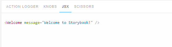
This Storybook addon shows you the JSX of the story. It can be useful to see what props you set, for example.
yarn add -D @storybook/addons

yarn add -D storybook-addon-jsx
After installing we need to globally configure it in .storybook/config.js.
import { configure} from '@storybook/react';
import JSXAddon from 'storybook-addon-jsx';

setAddon(JSXAddon);

const req = require.context('../src/components', true, /\.stories\.js$/);

function loadStories() {
   req.keys().forEach(path => req(path)); // customized stories path
}

configure(loadStories, module);
Now we have to replace the .add with .addWithJSX.
stories.addWithJSX('welcome message', () => (

   <Header
     message="Welcome to Storybook!"
   />

));
Storybook Addons section would look like this.
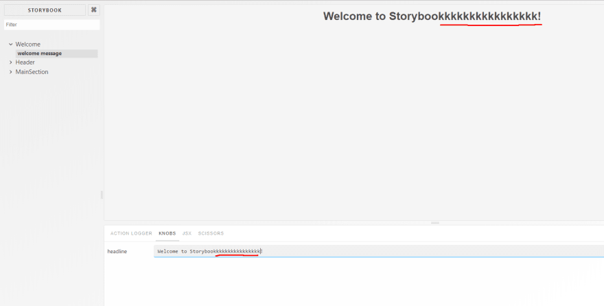
Storybook Addon Knobs allow you to edit React props dynamically using the Storybook UI. You can also use Knobs as a dynamic variable inside stories in Storybook.
yarn add -D @storybook/addon-knobs
Now we have to add the .addDecorator(withKnobs) to use the knob in our welcome.stories.js.
import React from 'react';
import { storiesOf } from '@storybook/react';
import Header from '../components/Welcome';

import { withKnobs, text, boolean, number } from '@storybook/addon-knobs/react';

const stories = storiesOf('Welcome', module);

stories.addDecorator(withKnobs).add('welcome message', () => (

   <Header
     message={text('headline','Welcome to Storybook!')}
   />

));
Storybook Addons section would look like this.
Before using these addons we have to register these plugins inside the .storybook/addons.js file(some specific addons need not be registered like this, Please refer NPM site for details on each addons).
import '@storybook/addon-actions/register';
import '@storybook/addon-links/register';
import '@storybook/addon-knobs/register';
import 'storybook-addon-jsx/register';
Few Other Addons are;

Top comments (0)