It is no secret today that an app performance is an important component in the user experience. According to a study conducted by Google, 53% of mobile users will leave a page if it takes longer than 3 seconds to load.
After finally shipping out my personal project, City Secrets, I decided to run some Lighthouse Test and improve the performance.
Note: If you are unfamiliar with Lighthouse, it's an open source tool that allows you to run audits on your web pages not only for performance but also accessibility, SEO, progressive web apps and more. The best way I found to run it is from the Chrome DevTools.
The problem: Images loading too slowly
City Secrets' homepage contains one header image and 4 smaller ones. Thanks to the Lighthouse tool, I discovered I was spending far too much time loading them. This in turn impacted the time it took for the app to be interactive (and as a result, useful for the user). Yikes!
Thankfully, the Lighthouse report also includes ways to improve your score.
But, what are next-gen formats?
Next-gen formats include WebP, JPEG 2000 and JPEG XR. Those image formats possess superior compression (making images even lighter than JPEG and PNG) without losing in quality.
But how big of a difference is it? Is it worth putting any effort into it?
Well, my header image went from 357 kB in JPEG to 184 kB in WebP! That's 51% smaller!
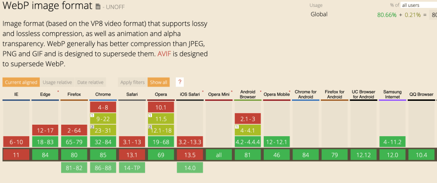
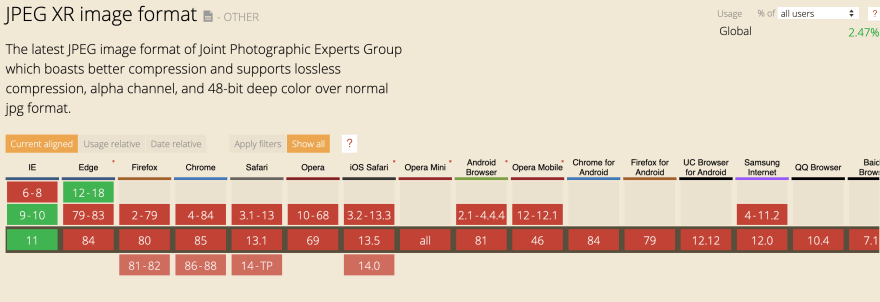
WebP vs JPEG 2000 vs JPEG XR
The only downside to next-gen formats is that none of them have universal browser compatibility today.
WebP
While WebP is making great progress in being recognized by browsers, there are still a few that don't recognize it. Like Safari, though the next release should, and Internet Explorer (a surprise to everyone, I imagine).
JPEG 2000
Currently only supported by Safari and iOS Safari.
JPEG XR
Developed by Microsoft in 2009 and as a result, supported by Internet Explorer.
With these three formats, we now have universal browser compatibility.
Convert JPEG/PNG images to WebP/JPEG 2000/JPEG XR
Here is a tool to convert an image to all three formats: https://www.aconvert.com/image/
For WebP, I also like this one: https://squoosh.app/
Next-gen images in HTML with the picture tag
Now that we have the same images in a whole bunch of formats, what to do? Well, thankfully, HTML5 offers a handy tag called picture. This tag supports multiples sources and gives developers more flexibility in specifying images sources.
For examples, this would be an image displayed on the homepage:
<picture>
   <source srcset="assets/img/bordeaux.webp"
type="image/webp">
   <source srcset="assets/img/bordeaux.jxr" type="image/jxr">
   <source srcset="assets/img/bordeaux.jp2" type="image/jp2">
   <source srcset="assets/img/bordeaux.jpg" type="image/jpeg">
   <img src="assets/img/bordeaux.jpg" alt="Photo of Bordeaux" />
</picture>
This way, all our formats are included and the different browsers can process the one they support.
Create an Image component with React
This is very nice but a big chunky. Let's continue by abstracting this logic into a component.
import React from 'react';

const ImgNextGen = ({
  srcWebp,
  srcJrx,
  srcJp2,
  fallback,
  alt,
  ...props

}) => {
  return (
    <picture>
       <source srcset={srcWebp} type="image/webp" />
       <source srcset={srcJrx} type="image/jxr" />
       <source srcset={srcJp2} type="image/jp2" />
       <source srcset={fallback} type="image/jpeg" />
       <img src={fallback} alt={alt} {...props} />
    </picture>
  );
};

export default ImgNextGen;
And if we wanted to use it:
<ImgNextGen
    srcWebp="assets/img/bordeaux.webp"
    srcJrx="assets/img/bordeaux.jrx"
    srcJp2="assets/img/bordeaux.jp2"
    fallback="assets/img/bordeaux.jpg"
    alt="Photo of Bordeaux"
/>
Next-gen in CSS
What about background-images for example? Checking for WebP/JPEG 2000/JPEG XR compatibility is a tiny bit more tricky but certainly not impossible.
To achieve it, I recommend Modernizr. It's a free and handy tool that allows you to check what HTML/CSS/Javascript features the browser supports. It works by adding a class to the html tag . In the case of WebP for example, modernizr would add .webp or .no-webp depending on the user's browser which allows you to then use the right image.
Here is how it works:
- Head to Modernizr
- Go to Download
- Check three features: Webp, JPEG 2000, JPEG XR
- Click Build
You then have a few choices. You can download the js file and import it into your React project.
Personally, I decided to click on "Open build on codepen.io" and then copy the javascript portion. Next, open your public/index.html file in your React project and paste the javascript into the head (Don't forget the <script> tag).
It should look similar to this:
<script>
/*! modernizr 3.6.0 (Custom Build) | MIT *
 * https://modernizr.com/download/?-jpeg2000-jpegxr-webp !*/
!function(A,n,e){function o(A,n){return typeof A===n}function a(){var A,n,e,a,t,i,r;for(var l in s)if(s.hasOwnProperty(l)){if(A=[],n=s[l],n.name&&
...
</script>
As I mentioned, if you find it too long, simply download the js file and import it into your head.
Either way, depending on your user's browser, the correct class is added to your html. This allows us to structure our CSS this way:
.home-bg {
    background-image: url('assets/img/home-header.jpg')  /* default */
}

.webp .home-bg {
    background-image: url(assets/img/home-header.webp')
}

.jpeg2000 .home-bg {
   background-image: url('assets/img/home-header.jp2')
}

.jpegxr .home-bg {
   background-image: url('assets/img/home-header.jxr')
}
That's it! I hope it was helpful. Don't hesitate to contact me if you have any questions.
Here are some resources mentioned in this tutorial (in case, you missed them):
Lighthouse documentation on next-gen formats: https://web.dev/uses-webp-images/?utm_source=lighthouse&utm_medium=devtools
To check browser compatibility of your format: https://caniuse.com/
To convert images to WebP/JPEG 2000/ JPEG XR: https://www.aconvert.com/image/
Modernizr: https://modernizr.com/


Top comments (0)