Creating an Interactive Dashboard and Reports with Streamlit
Data visualization is essential for understanding patterns, making informed decisions, and sharing insights with others. With tools like Streamlit, it’s possible to quickly create interactive dashboards and generate reports, without needing advanced web development skills. In this article, we'll explore how to build an interactive dashboard that shows multiple visualizations and generates dynamic reports.
Why Use Streamlit for Dashboards and Reports?
Streamlit is an open-source tool designed to quickly create interactive web applications with just a few lines of Python code. It’s ideal for building visual dashboards and generating reports with minimal effort. Some of the benefits of using Streamlit include:
- Fast prototyping: Dashboards can be built in minutes.
- Interactivity: Allows adding interactive elements like sliders, dropdown menus, charts, and more.
- Easy sharing: Applications can be deployed on platforms like Streamlit Cloud, making it easy to share results with others.
Practical Example: Online Store Sales Dashboard
In this example, we will create an interactive dashboard that shows sales data for an online store and generates a dynamic sales report. The application will include various visualizations like bar and line charts, and users will be able to select a date range to filter the data.
Step 1: Install Streamlit and Other Dependencies
If you don’t have Streamlit installed yet, you can do so with the following command:
pip install streamlit pandas matplotlib
Step 2: Write the Dashboard and Report Code
Here is the code to create an interactive Streamlit app that shows sales data for an online store and generates a report dynamically:
import streamlit as st
import pandas as pd
import numpy as np
import matplotlib.pyplot as plt
# Dashboard title
st.title("Online Store Sales Dashboard")
# Simulating some sales data
np.random.seed(0)
dates = pd.date_range(start='2023-01-01', periods=100, freq='D')
sales = np.random.randint(10, 100, size=100)
products = np.random.choice(['Product A', 'Product B', 'Product C'], size=100)
# Create DataFrame
df = pd.DataFrame({'Date': dates, 'Sales': sales, 'Product': products})
# Show the first few rows of the data
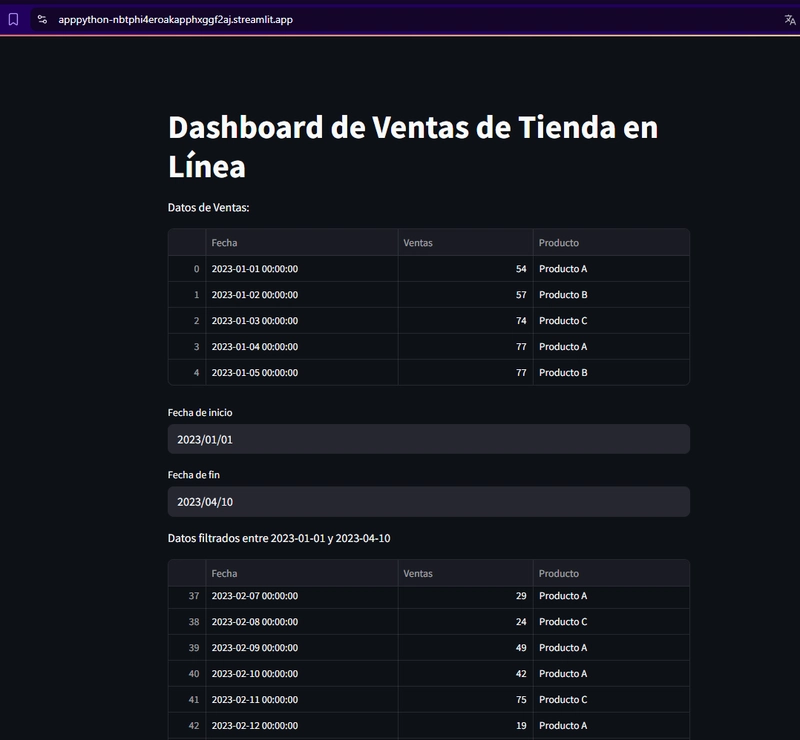
st.write("Sales Data:", df.head())
# Date filter
start_date = st.date_input('Start Date', df['Date'].min())
end_date = st.date_input('End Date', df['Date'].max())
# Filter data based on selected date range
filtered_df = df[(df['Date'] >= pd.to_datetime(start_date)) & (df['Date'] <= pd.to_datetime(end_date))]
# Show filtered data summary
st.write(f"Filtered data from {start_date} to {end_date}", filtered_df)
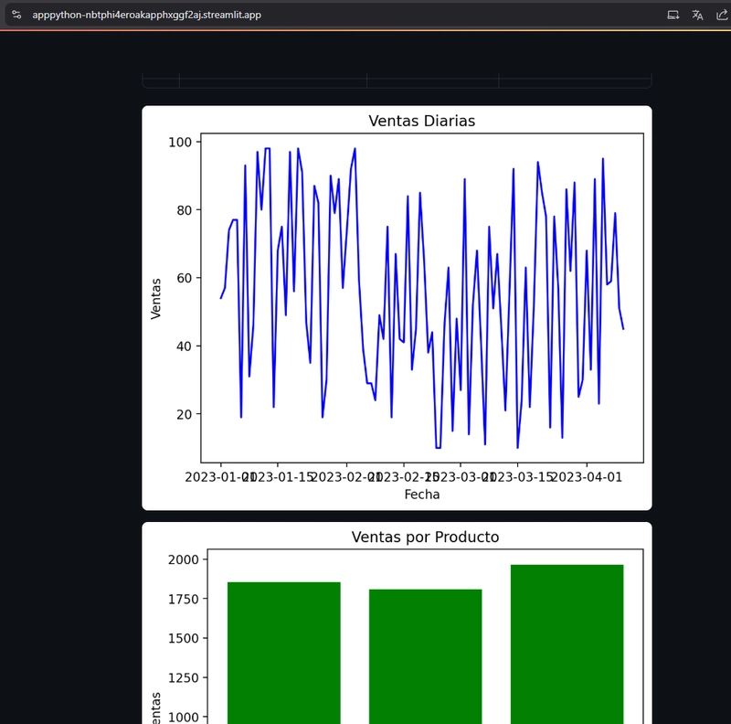
# Generate Charts
# Sales by Date chart
fig, ax = plt.subplots()
ax.plot(filtered_df['Date'], filtered_df['Sales'], label='Daily Sales', color='blue')
ax.set_title('Daily Sales')
ax.set_xlabel('Date')
ax.set_ylabel('Sales')
st.pyplot(fig)
# Sales by Product chart
sales_by_product = filtered_df.groupby('Product')['Sales'].sum()
fig2, ax2 = plt.subplots()
ax2.bar(sales_by_product.index, sales_by_product.values, color='green')
ax2.set_title('Sales by Product')
ax2.set_xlabel('Product')
ax2.set_ylabel('Sales')
st.pyplot(fig2)
# Generate Sales Report
st.subheader("Sales Report")
# Show sales summary
total_sales = filtered_df['Sales'].sum()
avg_sales = filtered_df['Sales'].mean()
best_selling_product = sales_by_product.idxmax()
# Display the report
st.write(f"Total Sales: {total_sales}")
st.write(f"Average Sales: {avg_sales:.2f}")
st.write(f"Best Selling Product: {best_selling_product}")
# Button to download the report as text
if st.button("Generate Text Report"):
report = f"""
Sales Report:
Total Sales: {total_sales}
Average Sales: {avg_sales:.2f}
Best Selling Product: {best_selling_product}
"""
st.text(report)
Explanation of the Code
Simulating Sales Data: In this example, we generate a DataFrame with simulated sales data using NumPy. This DataFrame contains columns for
Date,Sales, andProduct.Date Filter: We use
st.date_input()to allow the user to select a date range. The data is filtered based on the selected start and end dates.
Visualizations:
Daily Sales Chart: A line chart created with Matplotlib that shows sales over time.
Sales by Product Chart: A bar chart that displays total sales per product.
Sales Report:
We calculate total sales, average sales, and the best-selling product in the selected date range.
The "Generate Text Report" button displays the dynamic report in text format in the interface.
Step 3: Deploy the Dashboard on Streamlit Cloud
Once the code is written and tested locally, you can deploy your app to Streamlit Cloud to make it accessible from anywhere.
Upload the File to GitHub: Save your file, for example,
app.py, in a GitHub repository.Connect to Streamlit Cloud: Go to Streamlit Cloud and connect your GitHub account. Streamlit Cloud will allow you to link your repository and deploy the app.
Deploy the App: After linking the repository, Streamlit Cloud will automatically detect the
app.pyfile and deploy the app.Access the URL: Once deployed, Streamlit will provide a unique URL where you can access your dashboard and interactive report.
Conclusion
With Streamlit, you can create interactive dashboards and generate dynamic reports without much effort. In this example, we built an app that allows users to analyze sales data for an online store, view interactive charts, and generate a sales report based on selected date ranges.
This kind of tool is highly useful in business scenarios where data needs to be analyzed and shared quickly and effectively.
link repository: https://github.com/Marant7/streamlitpython.git
link deploy: https://apppython-nbtphi4eroakapphxggf2aj.streamlit.app/

Top comments (5)
Excellent article! It demonstrates how, with just a few lines of Python code, you can create an interactive dashboard and generate dynamic reports using Streamlit. The implementation of date range filters and clear visualizations make analyzing sales data easy. A powerful tool for effectively sharing insights without the hassle of web development.
I really enjoyed this article! It clearly shows how easy and powerful Streamlit can be for building interactive dashboards and generating dynamic reports. The online store example was practical and helped me understand how to implement filters and visualizations with just a few lines of Python code.
An excellent contribution of this article is how it demonstrates how tools like Streamlit democratize access to data analytics, allowing professionals without web development experience to build interactive dashboards and generate useful reports in minutes. This capability is key in business and academic environments where real-time data visualization and analysis can make a difference in informed decision-making.
This interactive dashboard built with Streamlit is a great example of how data visualization and analysis can be made simple and accessible. The app allows users to filter sales data by date range and generate key insights through interactive charts like daily sales and sales by product. The ability to download the report in text format further enhances the user experience, making it easy to share and document the results. Streamlit's rapid prototyping capabilities shine in this application, offering an intuitive interface with minimal code. It's an excellent tool for businesses and analysts who need to analyze and present data quickly, all while maintaining a clean and user-friendly interface.
I find it amazing how Streamlit lets you build interactive dashboards and dynamic reports with just a few lines of Python code. It makes data analysis more accessible and shareable, which is great for both academic and real-world projects.