
TL;DR
This article describes how I've used an asterisk from Google Fonts as place markers for embedded Google Maps in a web app. More specifically:
- How to add place markers to Google Maps embedded in a web page (Sections 2 and 3)
- How I've changed the shape of place markers to an asterisk from Google Fonts (Section 4)
- How I've chosen (and coded) the color of place markers for both light and dark modes (Sections 5 and 6)
1. Motivation
I'm making a web app called My Ideal Map App, which aims to improve the UX of Google Maps. The core feature is to let the user save the places of their interest and then to show these saved places around the user's current locations or around searched places (with everything else in grayscale) so that the user can easily notice the places of their own interest nearby (see Day 1 of this blog series for more detail).
So the place markers to indicate the user's saved places are the most important UI components in My Ideal Map App. This article describes how I've customized the shape and color of place markers with Google Maps API.
Throughout the article, I'll go back and forth between UI design and web development. If you're interested in only one of the two, skip reading some sections where appropriate.
2. Mock user data in JSON format
I haven't created the data server for My Ideal Map App yet. So I create a mock user data in the JSON format, commonly used for data in a web app. Maybe I should use the GeoJSON format instead, but I'll postpone the decision until I start designing the database to create a data server.
The mock user data contains the list of the places in Kyoto that have been mentioned in this blog series. :-)
Each place is defined as an object. For example, Lorimer Kyoto, the fish breakfast restaurant mentioned in Day 3 of this blog series, is saved as follows:
    {
      "id": 0,
      "name": "Lorimer Kyoto",
      "latitude": 34.99365616,
      "longitude": 135.76098633
    },
Then, create an array of these objects representing the (mock) user's saved locations and use it as the value of the "places" property. This way, we can access to each place data as places[i] in JavaScript, where i refers to the order starting from 0:
{
  "places": [
    {
      "id": 0,
      "name": "Lorimer Kyoto",
      "latitude": 34.99365616,
      "longitude": 135.76098633
    },
    {
      "id": 1,
      "name": "Walden Woods Kyoto",
      "latitude": 34.99334717,
      "longitude": 135.76315308
    },
    {
      "id": 2,
      "name": "DD Shokudo Kyoto",
      "latitude": 35.00046921,
      "longitude": 135.76280212
    },
    {
      "id": 3,
      "name": "Okaffe Kyoto",
      "latitude": 35.00230408,
      "longitude": 135.76216125
    },
    {
      "id": 4,
      "name": "Bread & Espresso & Arashiyama Garden",
      "latitude": 35.01486588,
      "longitude": 135.67489624
    },
    {
      "id": 5,
      "name": "Fukuda Art Museum",
      "latitude": 35.01386642,
      "longitude": 135.67628479
    },
    {
      "id": 6,
      "name": "Osen",
      "latitude": 35.00626373,
      "longitude": 135.77001953
    },
    {
      "id": 7,
      "name": "Gion Niti",
      "latitude": 35.00185013,
      "longitude": 135.77493286
    }
  ]
}
Once this data is saved as mockUserData.json, I can import it in the JavaScript code to embed Google Maps in a web app:
import userData from 'mockUserData.json';
Incidentally, I initially used the import * as userData from ... syntax, as suggested in Yeen (2016). But this caused the console to print a warning like this:
Should not import the named export 'places'.'length' (imported as 'userData') from default-exporting module (only default export is available soon)
Apparently, Webpack 5 (which is part of Next.js) doesn't like named import (Kamal et al 2020). I'm not sure why.
3. Render markers on embedded Google Maps
Once the JSON file is imported, I render markers at the locations specified in the JSON file, with the following code:
for (let i = 0; i < userData.places.length; i++) {
  const userPlace = userData.places[i];
  new google.maps.Marker({
    map: map,
    position: {
      lat: userPlace.latitude,
      lng: userPlace.longitude,
    },
    title: userPlace.name,
  });
}
This code is an application of the snippet shown in Google Maps Platform documentation's section entitled for "Complex Marker Icons".
The first line is the standard for loop over array elements. Then, I save each array element as userPlace. So far it's a standard JavaScript technique.
To render markers, Google Maps JavaScript API offers the google.maps.Marker() function. Its argument, given as an object, specifies how markers are rendered.
- The
mapproperty refers to the embedded Google Maps in which the marker will be added. Here, I refer to themapvariable that is given by the following code (see Day 5 of this blog series for detail):
   map = new google.maps.Map(googlemap.current, {
     center: {lat: 35.011636, lng: 135.768029}, // Kyoto City Hall
     zoom: 17,
     mapId: nightMode ? mapIdNighttime : mapIdDaytime,
   });
- The
positionproperty specifies where the marker is rendered. Here I refer to the latitude and longitude of each saved place:
       position: {
         lat: userPlace.latitude,
         lng: userPlace.longitude,
       },
- Finally, the
titleproperty sets the text to be shown when the mouse user hovers over the marker. It will also be the "accessible name" of the marker for screen reader users. Here I refer to each saved place's name such as "Lorimer Kyoto":
title: userPlace.name,
The above code will render markers with the iconic Google Maps pin in red.
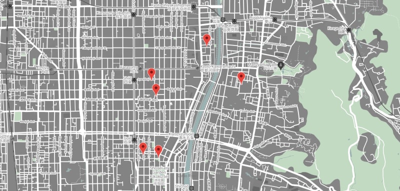
Default place markers, rendered on a custom-colored Google Maps (screenshot by the author)
Of course, I want to customize the shape and color of place markers, which is what the rest of this article is all about.
4. Using an asterisk as a place marker
I start with the shape of a place marker, and I've chosen an asterisk for it.
4.1 Why asterisk?
I want to avoid the icons often used for map applications. Such icons won't create a feel of personalization. The design concept of My Ideal Map App is "Dye Me In Your Hue From The Sky" (see Day 2 of this blog series). When the user saves a place, the map will be "dyed in the user's hue". Standard map icons cannot represent "the user's hue", that is, the user's personality.
My Ideal Map App, therefore, uses a non-standard icon as a place maker: an asterisk. And not the standard asterisk but the one beautifully designed by Christian Thalmann for Cormorant, a typeface available in Google Fonts.
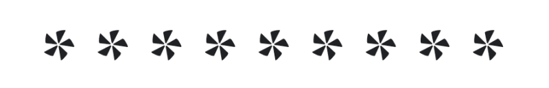
Asterisks in Cormorant Bold (image source: Google Fonts)
An asterisk is actually an appropriate design motif for saving a place on a map. It's long been used to call out a footnote (Trueman 1880, p. 27). In data science, asterisks indicate statistical significance in a table of regression results. The user saves a place on a map in My Ideal Map App, partly because they want to make the place stand out from the rest of the map and partly because they want to add some note about the place.
But the standard asterisk doesn't create a feel of personalization, just like standard map icons don't. Some typefaces, especially those inspired by pre-industrial metal types, often contain a fancy-looking asterisk. One such example is Cormorant, a typeface inspired by Claude Garamond's type design in the 16th century.
Cormorant is one of my favorite fonts from Google Fonts, and I'm aware that its asterisk is fancy and uniquely designed. An idea to use it as a place marker icon for My Ideal Map App suddenly occurred to me at an early stage of making the app. Then I realized that an asterisk makes sense as a place marker icon, as described above.
Cormorant has five weights (light, regular, medium, semi-bold, bold), and I find the bold weight is appropriate to be used as an UI icon.
But how can I use an asterisk from a particular font as a place marker in embedded Google Maps?
4.2 Converting Google Fonts characters into an SVG image
A solution I've found is to convert the glyph of an asterisk in a font file into an SVG image with google-font-to-svg-path, a little tool developed by Dan Marshall.
This tool is awesome. You select a font in Google Fonts (or upload a font file) and enter characters in the "Text" field (focused in orange in the screenshot below). Then it returns an SVG code for the glyphs from the specified font!

The user interface of google-font-to-svg-path (screenshot by the author)
The provided SVG code includes some unnecessary parts. Trimming those yields something like the following:
<svg
  height="38.173"
  viewBox="0 0 37.802 38.173"
  width="37.802"
  xmlns="http://www.w3.org/2000/svg"
>
  <path d="M 37.584 21.217 L 20.084 18.517 A 0.223 0.223 0 0 1 19.939 18.458 Q 19.858 18.39 19.787 18.242 A 1.561 1.561 0 0 1 19.734 18.117 A 0.969 0.969 0 0 1 19.706 18.031 Q 19.629 17.746 19.823 17.643 A 0.396 0.396 0 0 1 19.884 17.617 L 31.184 11.117 Q 31.884 10.817 33.134 12.267 A 17.768 17.768 0 0 1 34.295 13.78 Q 34.845 14.577 35.385 15.515 A 30.585 30.585 0 0 1 35.584 15.867 Q 36.784 18.017 37.434 19.617 Q 37.986 20.976 37.709 21.18 A 0.204 0.204 0 0 1 37.584 21.217 Z M 16.584 20.417 L 11.084 32.317 Q 10.784 32.917 8.884 32.417 A 21.37 21.37 0 0 1 6.795 31.744 A 28.357 28.357 0 0 1 4.834 30.917 Q 3.104 30.112 1.795 29.34 A 22.664 22.664 0 0 1 1.184 28.967 Q -0.266 28.048 0.06 27.831 A 0.227 0.227 0 0 1 0.084 27.817 L 15.684 19.817 A 0.296 0.296 0 0 1 15.901 19.728 Q 16.048 19.728 16.245 19.843 A 1.514 1.514 0 0 1 16.284 19.867 Q 16.673 20.11 16.589 20.4 A 0.425 0.425 0 0 1 16.584 20.417 Z M 17.684 16.017 L 15.084 3.217 A 0.693 0.693 0 0 1 15.079 3.131 Q 15.079 2.402 16.644 1.801 A 8.575 8.575 0 0 1 16.734 1.767 A 23.005 23.005 0 0 1 18.39 1.227 Q 19.248 0.98 20.222 0.76 A 40.816 40.816 0 0 1 20.884 0.617 A 39.171 39.171 0 0 1 22.593 0.298 Q 23.94 0.079 25.034 0.017 Q 26.784 -0.083 26.584 0.417 L 18.684 16.017 Q 18.596 16.283 18.231 16.313 A 1.182 1.182 0 0 1 18.134 16.317 Q 17.701 16.317 17.685 16.038 A 0.379 0.379 0 0 1 17.684 16.017 Z M 15.484 17.817 L 2.384 16.317 A 0.598 0.598 0 0 1 1.976 16.038 Q 1.682 15.613 1.6 14.553 A 9.532 9.532 0 0 1 1.584 14.317 Q 1.484 12.417 1.784 9.967 Q 2.011 8.115 2.323 6.72 A 19.196 19.196 0 0 1 2.534 5.867 Q 2.967 4.28 3.261 4.497 A 0.205 0.205 0 0 1 3.284 4.517 L 15.784 16.917 Q 15.984 17.017 15.834 17.467 A 1.575 1.575 0 0 1 15.787 17.592 Q 15.661 17.884 15.503 17.825 A 0.194 0.194 0 0 1 15.484 17.817 Z M 21.184 38.017 L 18.284 20.817 A 0.171 0.171 0 0 1 18.266 20.739 Q 18.266 20.566 18.585 20.306 A 2.737 2.737 0 0 1 18.634 20.267 A 2.387 2.387 0 0 1 18.745 20.185 Q 19.096 19.943 19.184 20.115 A 0.181 0.181 0 0 1 19.184 20.117 L 28.784 29.017 Q 29.384 29.517 28.334 31.117 A 22.37 22.37 0 0 1 27.218 32.661 Q 26.688 33.335 26.062 34.042 A 37.103 37.103 0 0 1 25.634 34.517 A 39.929 39.929 0 0 1 24.439 35.768 Q 23.838 36.369 23.284 36.863 A 19.629 19.629 0 0 1 22.634 37.417 A 10.725 10.725 0 0 1 22.31 37.671 Q 21.271 38.453 21.184 38.017 Z"/>
</svg>
4.3 Using an SVG image file to customize Google Maps place markers
Once we get an SVG image file, the rest is to just follow what Google Maps Platform documentation describes in the "Complex icons" section.
All you need to do is to add the icon property to the argument of google.maps.Marker() as follows:
new google.maps.Marker({
  // ADDED FROM HERE
  icon: {
    anchor: new google.maps.Point(
      asterisk.width / 2,
      asterisk.height / 2
    ),
    url: asterisk.filePath,
  },
  // ADDED UNTIL HERE
  map: map,
  position: {
    lat: userPlace.latitude,
    lng: userPlace.longitude
  },
  title: userPlace.name
});
where I specify the asterisk object as follows:
const asterisk = {
  filePath: '/asterisk.svg',
  height: 38.173,
  width: 37.802,
}
For the values of height and width, I just copy and paste them from the SVG code shown above in this article.
Back to the arguments for google.maps.Marker(), the icon option specifies the shape of a marker. It takes an object as its value, and the object needs to have two properties, anchor and url, for our purpose.
The url property specifies the file path for an SVG image to be used as a placemark icon. If you use Next.js (as I do), save the SVG image file in the /public folder, which allows you to use a relative file path like /asterisk.svg (for detail, see Next.js docs).
The anchor property sets which part of the marker will be fixed to the map when the user changes the zoom level. By default, it’s set to be the top-left corner of the box in which the marker is drawn. For a symmetric shape like an asterisk, it will create an impression that the place marker moves across the map when the zoom level changes. To avoid such an impression, you need the center of the asterisk to be fixed to the map. For this purpose, divide the width and height of the SVG image box in half and use these values as the anchor point.
(asterisk.width / 2, asterisk.height / 2)
But Google Maps API requires us to convert a pair of these values into what they call a Point object. The google.maps.Point() function just does that.
By executing the above code, place markers are now rendered as follows:

The asterisk of the Cormorant typeface used as a placemark (screenshot by the author)
By default, an SVG image is filled in black.
Before discussing how to specify the color of place makers, let me describe why I don't use alternative ways of using an SVG image as a placemark on Google Maps. If that's too much detail for you, please skip to Section 5.
4.4 Why not directly specifying an image file path?
Google Maps Platform documentation suggests a simpler way of using an SVG image as a placemark is as follows:
new google.maps.Marker({
  icon: asterisk.filePath, // CHANGED
  map: map,
  position: {
    lat: userPlace.latitude,
    lng: userPlace.longitude
  },
  title: userPlace.name
});
But this does not allow us to change the anchor point. It will create an impression that the placemark moves around when the user zooms in and out the map.
4.5 Why not using path option?
Google Maps Platform documentation mentions another way of using an SVG image as a placemark is as follows:
new google.maps.Marker({
  icon: {
    anchor: new google.maps.Point(
      asterisk.width / 2,
      asterisk.height / 2
    ),
    path: asterisk.path, // CHANGED
  },
  map: map,
  position: {
    lat: userPlace.latitude,
    lng: userPlace.longitude
  },
  title: userPlace.name
});
where asterisk.path refers to the SVG path used as the d attribute value of the <path> element in the SVG code:
'M 37.598 21.2 L 20.098 18.5 A 0.223 0.223 0 0 1 19.953 18.442 Q 19.872 18.374 19.801 18.226 A 1.561 1.561 0 0 1 19.748 18.1 A 0.969 0.969 0 0 1 19.72 18.014 Q 19.643 17.729 19.837 17.626 A 0.396 0.396 0 0 1 19.898 17.6 L 31.198 11.1 A 0.656 0.656 0 0 1 31.467 11.044 Q 32.344 11.044 33.848 13.15 Q 35.598 15.6 36.898 18.45 A 31.297 31.297 0 0 1 37.195 19.119 Q 38.087 21.203 37.637 21.203 A 0.235 0.235 0 0 1 37.598 21.2 Z M 15.498 17.8 L 2.398 16.3 Q 1.598 16.122 1.509 13.888 A 14.869 14.869 0 0 1 1.498 13.3 A 27.715 27.715 0 0 1 1.704 10.008 A 35.748 35.748 0 0 1 2.148 7.25 Q 2.776 4.109 3.264 4.471 A 0.303 0.303 0 0 1 3.298 4.5 L 15.798 16.9 Q 15.998 17.1 15.848 17.5 Q 15.707 17.876 15.522 17.81 A 0.212 0.212 0 0 1 15.498 17.8 Z M 0.098 27.8 L 15.698 19.8 L 15.898 19.7 A 0.71 0.71 0 0 1 16.312 19.835 A 1.012 1.012 0 0 1 16.448 19.95 Q 16.698 20.2 16.598 20.4 L 11.098 32.3 A 0.333 0.333 0 0 1 10.939 32.483 Q 10.796 32.565 10.537 32.59 A 2.552 2.552 0 0 1 10.298 32.6 A 4.849 4.849 0 0 1 9.486 32.522 Q 8.662 32.38 7.508 31.982 A 27.544 27.544 0 0 1 6.348 31.55 A 34.706 34.706 0 0 1 3.629 30.342 A 26.81 26.81 0 0 1 1.648 29.25 Q -0.327 28.046 0.065 27.816 A 0.247 0.247 0 0 1 0.098 27.8 Z M 17.698 16 L 15.098 3.2 A 0.591 0.591 0 0 1 15.088 3.094 Q 15.088 2.049 18.848 1.05 A 39.76 39.76 0 0 1 21.416 0.452 Q 22.679 0.205 23.782 0.093 A 17.021 17.021 0 0 1 25.498 0 Q 26.687 0 26.6 0.392 A 0.286 0.286 0 0 1 26.598 0.4 L 18.698 16 Q 18.609 16.266 18.245 16.296 A 1.182 1.182 0 0 1 18.148 16.3 Q 17.715 16.3 17.699 16.022 A 0.379 0.379 0 0 1 17.698 16 Z M 21.198 38 L 18.298 20.8 L 18.298 20.7 A 0.26 0.26 0 0 1 18.338 20.568 Q 18.425 20.421 18.698 20.25 Q 19.098 20 19.198 20.1 L 28.798 29 A 0.559 0.559 0 0 1 28.987 29.367 Q 29.078 30.056 28.023 31.593 A 17.385 17.385 0 0 1 27.698 32.05 Q 25.898 34.5 23.598 36.55 A 29.312 29.312 0 0 1 23.025 37.048 Q 21.492 38.345 21.242 38.096 A 0.171 0.171 0 0 1 21.198 38 Z'
I initially used this approach (as written in the previous version of this article). As long as the placemarks are not meant to be clicked by the user, it’s fine. However, I want the user to click these placemarks to see the detailed information of the places. Once I introduce this feature, however, I notice the following bug:
Clickable region of an SVG placemark if we use the path option (screenshot by the author)
In the above screenshot, one of the two placemarks gets focused with the Tab key. Notice that its focus ring completely covers the other placemark nearby. Clicking any area within this focus ring will be interpreted as the clicking of the focused placemark, not the other.
Apparently, using the path option to specify the SVG path does not allow us to change the size of a clickable area.
Instead, using the url option to specify the file path of an SVG image renders the clickable area as follows:

Adjacent placemarks can now be clicked (screenshot by the author)
Notice that an unoverlapped part of the second placemark is outside the focus ring for the first placemark. When the user clicks that part, the second placemark gets clicked.
For this reason, the SVG path approach isn’t appropriate as long as you expect the user to interact with placemarks.
5. Customizing the color of place markers
I first describe design considerations (Sections 5.1 and 5.2) and then explain how to code (Section 5.3).
5.1 Fill color
For My Ideal Map App's default color of place markers, I use a shade of yellow. (Later I will enhance the feature so the user can choose the color of place markers.)
Yellow is among the brightest pure hues, and this is a scientific fact (see Blauch (2014) for why humans perceive yellow to be very bright). I speculate that this is why the symbolism of yellow includes "caution" and "warning", as used in traffic lights and the yellow card in football. It's the color that people are forced to take notice of and therefore to give some thought to, at least briefly.
The core feature of My Ideal Map App is to let the user notice their saved places on a map. Yellow is clearly the most suitable hue for this purpose.
Now the question is which shade of yellow? When I get lost in the visual aspect of design, I get back to the mood board for guidance. The daytime mood board (see Day 3 of this blog series) contains this painting of Piet Mondrian.
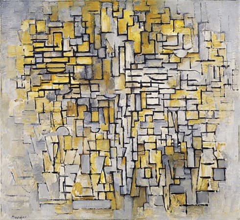
"Tableau No. 2/Composition No. VII", painted by Piet Mondrian in 1913 (image source: Gugghenheim Museum)
In this painting, to my eyes, black lines and gray blocks allude to street maps while the ochre yellow represents place markers. It represents the design concept (see Day 2 of this blog series) in which the place markers are the user's "hue", that is, the user's own personality, in contrast to the grayscale of nobody's Google Maps.
Using an eye dropper in the Sketch app, I decipher the hue value of the yellow in this painting as somewhere between 38 and 51 (i.e., orange-ish yellow). Trying each of these hue values, I figure out that the value of 51 fits best with the color scheme of the map.
But the exact color on the painting turns out to be a bit too dark once placed on the map, because the contrast is not large enough against the background of the street map.
So I increase the chroma, the share of pure hue, to 90%. A higher value would become out of place; a lower value would make markers less noticeable against the grey background.
For luminance, I go for a high value, that is, a lighter shade of gray is mixed with the pure hue of orange-ish yellow, to be consistent with the map color scheme which contains pure white and lighter shades of gray, pale cyan, and pale green.
After trying several shades, I settle with #f6d410:

The user interface of Triangulum Color Picker, showing the color code of #f6d410 (screenshot by the author)
5.2 Stroke color
Now the trouble is that this shade of yellow is not dark enough to satisfy the luminance contrast ratio of 3 to 1 against the gray of city blocks so that place markers are perceptually distinct enough from its background (§1.4.11 of WCAG 2.1).
I wondered how the Google Maps app deals with this problem. Investigating its place markers reveals something I didn't notice even though I use the app all the time: the place markers in Google Maps are all outlined in a slightly darker shade of the fill color.
Take the marker for restaurants as an example:
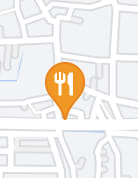
The fill color is #f09824. But the marker is outlined in #e88522, a darker shade of orange. The luminance contrast is so small that you don't realize the marker is outlined.
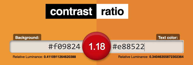
The ratio of contrast in luminance between #f09824 and #e88522 (image source: contrast-ratio.com)
But the outline increases the contrast ratio against the light gray of city blocks and the white of streets, which helps the user recognize the place marker.
Following this approach, I choose the outline color as follows:
The hue is the same as the fill color.
Luminance satisfies the 3-to-1 contrast ratio against the gray of city blocks (
#898989; see Day 4 of this blog series for detail), which means the contrast ratio against pure black is 2 to 1.Saturation is as high as possible to satisfy these two requirements.
It's not possible to pick a color this way with standard color pickers. So I rely on Triangulum Color Picker, a free web app that I myself have built:
This gives me a color code of #463d01.
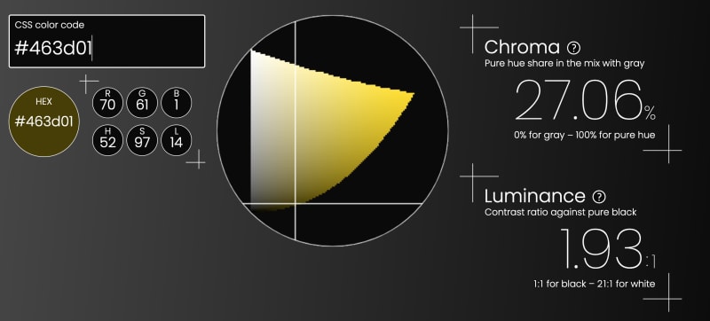
The user interface of Triangulum Color Picker, showing the color code of #463d01 (screenshot by the author)
5.3 Coding
To set the color of place markers, edit the SVG code directly as follows (notice that fill and stroke attributes are newly added):
<!-- asterisk.svg -->
<svg
  fill="#f6d410"
  height="38.173"
  stroke="#463c01"
  viewBox="0 0 37.802 38.173"
  width="37.802"
  xmlns="http://www.w3.org/2000/svg"
>
  <path d="M 37.584 21.217 L 20.084 18.517 A 0.223 0.223 0 0 1 19.939 18.458 Q 19.858 18.39 19.787 18.242 A 1.561 1.561 0 0 1 19.734 18.117 A 0.969 0.969 0 0 1 19.706 18.031 Q 19.629 17.746 19.823 17.643 A 0.396 0.396 0 0 1 19.884 17.617 L 31.184 11.117 Q 31.884 10.817 33.134 12.267 A 17.768 17.768 0 0 1 34.295 13.78 Q 34.845 14.577 35.385 15.515 A 30.585 30.585 0 0 1 35.584 15.867 Q 36.784 18.017 37.434 19.617 Q 37.986 20.976 37.709 21.18 A 0.204 0.204 0 0 1 37.584 21.217 Z M 16.584 20.417 L 11.084 32.317 Q 10.784 32.917 8.884 32.417 A 21.37 21.37 0 0 1 6.795 31.744 A 28.357 28.357 0 0 1 4.834 30.917 Q 3.104 30.112 1.795 29.34 A 22.664 22.664 0 0 1 1.184 28.967 Q -0.266 28.048 0.06 27.831 A 0.227 0.227 0 0 1 0.084 27.817 L 15.684 19.817 A 0.296 0.296 0 0 1 15.901 19.728 Q 16.048 19.728 16.245 19.843 A 1.514 1.514 0 0 1 16.284 19.867 Q 16.673 20.11 16.589 20.4 A 0.425 0.425 0 0 1 16.584 20.417 Z M 17.684 16.017 L 15.084 3.217 A 0.693 0.693 0 0 1 15.079 3.131 Q 15.079 2.402 16.644 1.801 A 8.575 8.575 0 0 1 16.734 1.767 A 23.005 23.005 0 0 1 18.39 1.227 Q 19.248 0.98 20.222 0.76 A 40.816 40.816 0 0 1 20.884 0.617 A 39.171 39.171 0 0 1 22.593 0.298 Q 23.94 0.079 25.034 0.017 Q 26.784 -0.083 26.584 0.417 L 18.684 16.017 Q 18.596 16.283 18.231 16.313 A 1.182 1.182 0 0 1 18.134 16.317 Q 17.701 16.317 17.685 16.038 A 0.379 0.379 0 0 1 17.684 16.017 Z M 15.484 17.817 L 2.384 16.317 A 0.598 0.598 0 0 1 1.976 16.038 Q 1.682 15.613 1.6 14.553 A 9.532 9.532 0 0 1 1.584 14.317 Q 1.484 12.417 1.784 9.967 Q 2.011 8.115 2.323 6.72 A 19.196 19.196 0 0 1 2.534 5.867 Q 2.967 4.28 3.261 4.497 A 0.205 0.205 0 0 1 3.284 4.517 L 15.784 16.917 Q 15.984 17.017 15.834 17.467 A 1.575 1.575 0 0 1 15.787 17.592 Q 15.661 17.884 15.503 17.825 A 0.194 0.194 0 0 1 15.484 17.817 Z M 21.184 38.017 L 18.284 20.817 A 0.171 0.171 0 0 1 18.266 20.739 Q 18.266 20.566 18.585 20.306 A 2.737 2.737 0 0 1 18.634 20.267 A 2.387 2.387 0 0 1 18.745 20.185 Q 19.096 19.943 19.184 20.115 A 0.181 0.181 0 0 1 19.184 20.117 L 28.784 29.017 Q 29.384 29.517 28.334 31.117 A 22.37 22.37 0 0 1 27.218 32.661 Q 26.688 33.335 26.062 34.042 A 37.103 37.103 0 0 1 25.634 34.517 A 39.929 39.929 0 0 1 24.439 35.768 Q 23.838 36.369 23.284 36.863 A 19.629 19.629 0 0 1 22.634 37.417 A 10.725 10.725 0 0 1 22.31 37.671 Q 21.271 38.453 21.184 38.017 Z"/>
</svg>
The fill attribute specifies the color to fill an SVG image. The default value is #000000 (black). I go with #f6d410 as described in Section 5.1 above.
The stroke attribute sets the color of the outline of an SVG image. The default value is none. I go with #463d01 as described in Section 5.2 above.
Now we see the map rendered like this:
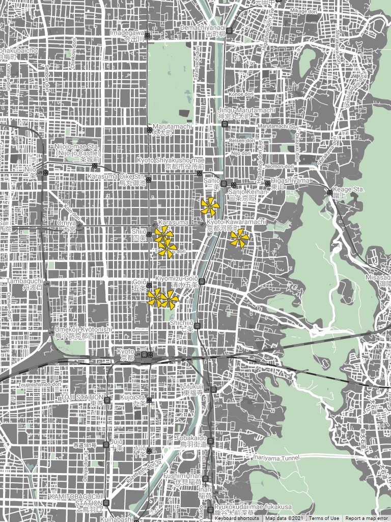
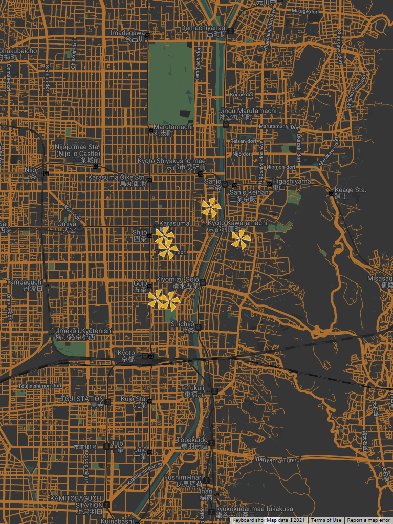
The map of Kyoto, with place markers customized as described in this article (screenshot by the author)
6. Dark mode color of place markers
My Ideal Map App changes its color scheme to the dark mode if the user visits the app between 6pm and 6am (see Day 5 of this blog series for detail). So every time I set the color of UI components, I need to consider its dark mode equivalent.
6.1 Choosing color
For the dark mode, I initially picked a different shade of the same orange-ish yellow (i.e., the hue value of 51). But it didn't look harmonious with the map color scheme no matter which shade I chose.
Again, I go back to the mood board for guidance. In the nighttime mood board, there is a yellow shade in the following piece of art:
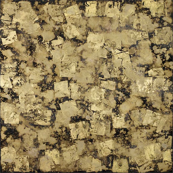
"Magic Dusts", composed by Makiko Nakamura in 2014 (image source: John Martin Gallery)
It's a piece of art that I discovered at a gallery in London during my stay there for studying interior design back in 2014. According to the gallery staff, the artist pasted gold leafs, allowing them to crack, over a piece of paper dyed in pigments.
The hue value of gold leafs on this piece of art is around 42 degrees.
For saturation, I find the pure hue share of 80% works best. A lower value will have an insufficient level of contrast against the map color scheme. A higher value will look out of place. As described above, the pure hue share was set to be 90% for the daytime map, but the same value doesn't go well with the dark mode map. A dark mode color scheme is known to demand less saturated colors (Kravets 2021).
For luminance, I choose a lower range given the hue and the saturation so it'll be harmonious with the map color scheme in dark shades of gray, cyan, and green.
Triangulum Color Picker allows me to pick such a color: #dfa513.

The user interface of Triangulum Color Picker, showing the color code of #dfa513 (screenshot by the author)
For the outline color, the luminance contrast needs to satisfy the 3 to 1 ratio against #ae6f2f, the dark orange of streets (the brightest color in the dark mode map color scheme; see Day 5 of this blog series). This means the contrast ratio against pure black is at least 15.33.
Since the yellow hue is very bright, a high level of saturation can achieve this requirement. But then place markers look blurry with the fill color of highly saturated yellow.
So I reduce the level of saturation to somewhere similar to the outline color for the daytime map: around 27%. This gives me #efdba7.

The user interface of Triangulum Color Picker, showing the color code of #efdba7 (screenshot by the author)
6.2 Coding to switch color
To switch the color scheme for place markers by the time of the day, I first duplicate the SVG image file asterisk.svg and save it as asterisk-dark.svg with the fill and stroke attributes replaced as follows:
<!-- asterisk-dark.svg -->
<svg
  fill="#dfa513"
  height="38.173"
  stroke="#efdba7"
  viewBox="0 0 37.802 38.173"
  width="37.802"
  xmlns="http://www.w3.org/2000/svg"
>
  <path d="M 37.584 21.217 L 20.084 18.517 A 0.223 0.223 0 0 1 19.939 18.458 Q 19.858 18.39 19.787 18.242 A 1.561 1.561 0 0 1 19.734 18.117 A 0.969 0.969 0 0 1 19.706 18.031 Q 19.629 17.746 19.823 17.643 A 0.396 0.396 0 0 1 19.884 17.617 L 31.184 11.117 Q 31.884 10.817 33.134 12.267 A 17.768 17.768 0 0 1 34.295 13.78 Q 34.845 14.577 35.385 15.515 A 30.585 30.585 0 0 1 35.584 15.867 Q 36.784 18.017 37.434 19.617 Q 37.986 20.976 37.709 21.18 A 0.204 0.204 0 0 1 37.584 21.217 Z M 16.584 20.417 L 11.084 32.317 Q 10.784 32.917 8.884 32.417 A 21.37 21.37 0 0 1 6.795 31.744 A 28.357 28.357 0 0 1 4.834 30.917 Q 3.104 30.112 1.795 29.34 A 22.664 22.664 0 0 1 1.184 28.967 Q -0.266 28.048 0.06 27.831 A 0.227 0.227 0 0 1 0.084 27.817 L 15.684 19.817 A 0.296 0.296 0 0 1 15.901 19.728 Q 16.048 19.728 16.245 19.843 A 1.514 1.514 0 0 1 16.284 19.867 Q 16.673 20.11 16.589 20.4 A 0.425 0.425 0 0 1 16.584 20.417 Z M 17.684 16.017 L 15.084 3.217 A 0.693 0.693 0 0 1 15.079 3.131 Q 15.079 2.402 16.644 1.801 A 8.575 8.575 0 0 1 16.734 1.767 A 23.005 23.005 0 0 1 18.39 1.227 Q 19.248 0.98 20.222 0.76 A 40.816 40.816 0 0 1 20.884 0.617 A 39.171 39.171 0 0 1 22.593 0.298 Q 23.94 0.079 25.034 0.017 Q 26.784 -0.083 26.584 0.417 L 18.684 16.017 Q 18.596 16.283 18.231 16.313 A 1.182 1.182 0 0 1 18.134 16.317 Q 17.701 16.317 17.685 16.038 A 0.379 0.379 0 0 1 17.684 16.017 Z M 15.484 17.817 L 2.384 16.317 A 0.598 0.598 0 0 1 1.976 16.038 Q 1.682 15.613 1.6 14.553 A 9.532 9.532 0 0 1 1.584 14.317 Q 1.484 12.417 1.784 9.967 Q 2.011 8.115 2.323 6.72 A 19.196 19.196 0 0 1 2.534 5.867 Q 2.967 4.28 3.261 4.497 A 0.205 0.205 0 0 1 3.284 4.517 L 15.784 16.917 Q 15.984 17.017 15.834 17.467 A 1.575 1.575 0 0 1 15.787 17.592 Q 15.661 17.884 15.503 17.825 A 0.194 0.194 0 0 1 15.484 17.817 Z M 21.184 38.017 L 18.284 20.817 A 0.171 0.171 0 0 1 18.266 20.739 Q 18.266 20.566 18.585 20.306 A 2.737 2.737 0 0 1 18.634 20.267 A 2.387 2.387 0 0 1 18.745 20.185 Q 19.096 19.943 19.184 20.115 A 0.181 0.181 0 0 1 19.184 20.117 L 28.784 29.017 Q 29.384 29.517 28.334 31.117 A 22.37 22.37 0 0 1 27.218 32.661 Q 26.688 33.335 26.062 34.042 A 37.103 37.103 0 0 1 25.634 34.517 A 39.929 39.929 0 0 1 24.439 35.768 Q 23.838 36.369 23.284 36.863 A 19.629 19.629 0 0 1 22.634 37.417 A 10.725 10.725 0 0 1 22.31 37.671 Q 21.271 38.453 21.184 38.017 Z"/>
</svg>
Then, revise the code for rendering placemarks in Google Maps as follows:
const asterisk = {
  // REVISED FROM HERE
  filePath: nightMode
    ? '/asterisk-dark.svg'
    : '/asterisk.svg',
  // REVISED UNTIL HERE
  height: 38.173,
  width: 37.802,
}

...

new google.maps.Marker({
  icon: {
    anchor: new google.maps.Point(
      asterisk.width / 2,
      asterisk.height / 2
    ),
    url: asterisk.filePath,
  },
  map: map,
  position: {
    lat: userPlace.latitude,
    lng: userPlace.longitude
  },
  title: userPlace.name
});
The arguments for google.maps.Marker are the same as before. I just need to replace asterisk.filePath with a ternary operator expression:
nightMode ? '/asterisk-dark.svg': '/asterisk.svg',
where nightMode is true if the user location’s current time is between 6pm and 5:59am (see Day 5 of this blog series for detail). In that case, the filePath takes the string value of /asterisk-dark.svg so that Google Maps will use the dark mode version of the SVG image. Otherwise, the original version of the SVG image (/asterisk.svg) will be used.
The above code will render the map like this between 6pm and 5:59am:
The map of Kyoto in the dark mode, with place markers customized as described in this article (screenshot by the author)
7. Next step
Next step will be about either (1) showing the user's current location; (2) searching for a place; (3) selectively showing the user's saved places by tag. I'm simultaneously working on each, by setting up a branch in Git for each feature. If I get stuck on one feature, I'll switch to another, because working on one feature often lets me realize why I'm stuck on another feature.
Changelog
Apr 10, 2023 (v2.0.0): Use the url option, not the path option, of the icon property to use an SVG image as a placemark icon. Revise Sections 4.2, 4.3, 5.3, and 6.2 accordingly. Add Sections 4.4 and 4.5. The title is also revised to make it more approachable.
References
Blauch, David N. (2014) “Color”, Virtual Chemistry Experiments (site discontinued; archived on February 16, 2016)
Kamal, Muhammad (2020) "Error: Should not import the named export 'version' (imported as 'version')", Stack Overflow, Nov 24, 2020.
Kravets, Una (2021) "The new responsive: Web design in a component-driven world", web.dev, May 19, 2021.
Trueman, H. P. (1880) The Eclectic Hand-book of Printing: Containing Practical Instructions to Learners. Second edition. London: Abel Heywood & Son.
Yeen, Jecelyn (2016) "How to Import json into TypeScript", Hacker Noon, Nov 28, 2016.

Top comments (0)