
TL;DR
In the previous article, I discussed the importance of having a design concept before starting to design the user interface of an app (or anything to be designed). Design concept alone doesn't help the design process, however. Designers need to visualize the concept with what is known as a mood board.
Here's how I have created mood boards for the web app I'm creating, starting with an example of user experience that I want to achieve with the app called My Ideal Map App.
User Experience (Part 3): Save a place with a link
On my smartphone, I'm reading &Travel, an online travel magazine published by Asahi Shimbun (Japan's broadsheet newspaper). The magazine features a weekly column on Kyoto, the city I'm living in. Its latest installment introduces Lorimer Kyoto, a fish restaurant open from 8am.
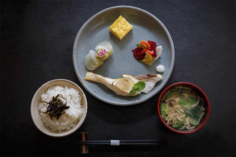 Lorimer Kyoto's breakfast meal set (Image source: &Travel)
At first glance, it appears to serve a typical Japanese breakfast: grilled fish, pickled vegetables, miso soup, and steamed rice. However, the grilled fish is first marinated in herb-infused fruit juice (thyme and orange, for example) for three days before being cooked.
That sounds interesting. It's a fusion cuisine bridging Japanese and European culinary traditions! When I have time, I want to visit the place.
Now, if I switch off the smartphone screen and move on to do something else, I will forget about this restaurant for sure. Taking note doesn't work, because I will forget the fact that I took note. What can remind me of the restaurant when I have a chance to visit it?
Enter My Ideal Map App. I tap its icon on the home screen of my smartphone. In the search field that appears at the top of the screen, I start typing "Lorimer Kyoto". By the time I type "Lorimer K", the name of Lorimer Kyoto appears at the top of suggested places below the search field. I tap it, and the app shows the street map around the restaurant. So far it's the same as what Google Maps would do.
Tapping the location of the restaurant opens up a box of text fields to save a place. (Google Maps requires one swipe and two taps to start saving a place, by the way.)
I can edit the place name, but "Lorimer Kyoto" is already shown. So I leave it as it is. (Google Maps doesn't allow you to change the place name when you save it, by the way.)
In the field for tags, I enter "breakfast". I use this tag for restaurants that open before 10am. Then, when I need to eat out for breakfast, My Ideal Map App will be able to show only the restaurants open before 10am among all the places I've saved. (Google Maps offers the same feature.)
I also tag the place with "lunch" because Lorimer Kyoto opens until late afternoon.
Finally, in the "note" field, I copy and paste the URL of the web article about Lorimer Kyoto. This way, when I wonder why I want to visit this place, I can tap the link and read the article again. This is where My Ideal Map App greatly differs from Google Maps, which only allows plain text as a note. Pasting an URL won't create a link; the URL text cannot even be selected to copy-and-paste on mobile screens.
Tapping the "Save" button at the bottom right of the screen saves the place, which is now marked with a flower-like icon in blue and yellow. Blue is the color I have chosen for the saved places tagged "breakfast"; and yellow for "lunch". This is another feature that Google Maps doesn't offer.
The restaurant is located near Gojo subway station in central Kyoto. Whenever I have a chance to visit this station, I will see the placemark for Lorimer Kyoto on My Ideal Map App. Then, I won't forget the fact that I am interested in visiting this fusion fish restaurant.
This way, My Ideal Map App enriches my life in Kyoto!
Well, My Ideal Map App doesn't exist yet, because I am currently creating it. :-) One of the first things I did to create My Ideal Map App is to build a mood board.
Mood board
Importance of visualizing a design concept
As mentioned in the previous post, I studied interior design at Inchbald School of Design for the 2014-2015 academic year. For the final project of the course, I designed a museum of nightclub music housed in the building that used to be The End, the legendary nightclub in London.
The design concept that I developed for the museum was Creative Destruction, because nightclub music is often created by decomposing the existing music into pieces and then reassembling them into a new form. Also many nightclubs, including The End, are built by renovating the buildings that were used for other purposes.
But the phrase Creative Destruction alone didn't take me anywhere. I needed to visualize this phrase, to get more concrete design ideas.
Here is what I came up with: 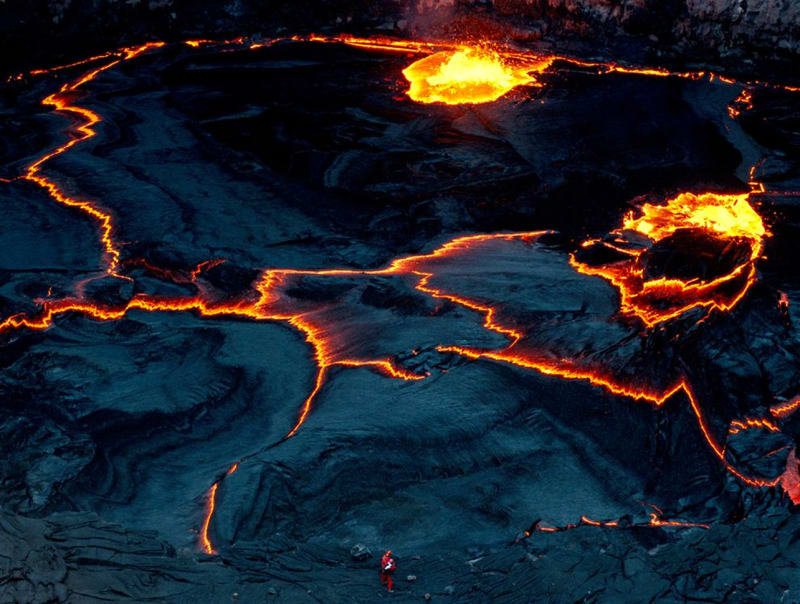 Lava lake in Erta Ale, a volcano in Ethiopia (Photographed by Carsten Peter; image source: National Geographic)
It is a photo of lava lake. But the main point is that light spills out through cracks. Cracks represent "destruction" while light stresses the "creative" part of cracks: the pattern of cracks is very creative while it is a form of destruction.
And this lava lake image echoes the atmosphere of nightclubs with lighting effects.
Inspired by this "mood board", which represents the design concept of Creative Destruction, I designed the main bar of the museum as follows: A scale model of the museum of nightclub music that I created (Photographed by the author. More detail can be found at my Behance page.)
This design experience taught me the importance of visualizing a design concept with a mood board. So I do the same for My Ideal Map App.
Image collection
In the above example, I managed to create a mood board with just one image. But typically a mood board is a collage of various photos and illustrations. The first step to create a mood board is to collect images.
I have a stock of images that I find beautiful for some reason or another. Whenever I find images beautiful, I save them in my Notion app and tag them with their color palette.
For each design project, I prefer searching over my own image repository instead of relying on Google Images, Pinterest, or Instagram. With the latter, I'd find what other people, not I myself, find attractive. Such images are less likely to inspire me than those I've found beautiful at some point in time during my life.
During the process of finding the design concept of Dye Me In Your Hue From The Sky (see the previous article for detail), the imagery of adding hues to a neutral-colored map came up in my mind. So I search over my image repository for "Blue Grey", "Red Grey", "Green Grey", etc.
Without thinking too much, I pick whichever images I find in tune with what I feel I'm looking for. Once I've exhausted the stock, I'll start judging which ones are really appropriate for this design project. For a creative process, it is important to separate the process of generating ideas from that of judging the quality of ideas (a lesson I learned from a book written by Masaharu Kato, a Japanese advertising agent). Otherwise, the amount of ideas to be generated will be limited, reducing the chance that at least one of them turns out to be a super good one.
The images I've picked include photographs from National Geographic and Vogue, residential interior design by Tricia Guild, historical pieces of art, poster design, and my own snapshots. There are about 50 of them.
Then, at the second stage, I think harder about which images will really go in line with the design concept for My Ideal Map App, although it is still an intuitive process rather than a logical one. Inspirations from visual images often leapfrog what I logically understand. Once all the intuitively-selected images are lined up, then I may start seeing the logic behind.
Day and night
For My Ideal Map App, I need two versions of mood boards: one for daytime and the other for nighttime. I'm not yet sure if this is feasible, but ideally I want the map to be rendered in dark mode in the evening, by detecting the clock in the user's time zone. The design concept is Dye Me In Your Hue From The Sky. And this "sky" is the one above the user. In the evening, the map—a view of the user's city from the sky—should be dark overall.
Changing user interface by the time of the day can add a bit of warmth to digital experiences. That is a lesson I learned from the solar-powered website for Low←Tech Magazine. Its user interface changes by the level of energy storage for the web server in Barcelona, to help the visitor anticipate whether the website may go offline anytime soon. Visiting this website always makes me imagine Barcelona's sky: I'm like "Oh, Barcelona has a clear sky today!" or "Seems like there's been a series of cloudy days recently over there." I find this brief moment of thought comfortable, a kind of experience I've never had with other websites. (Maybe because I've been to Barcelona a few times, and I love its city beach.)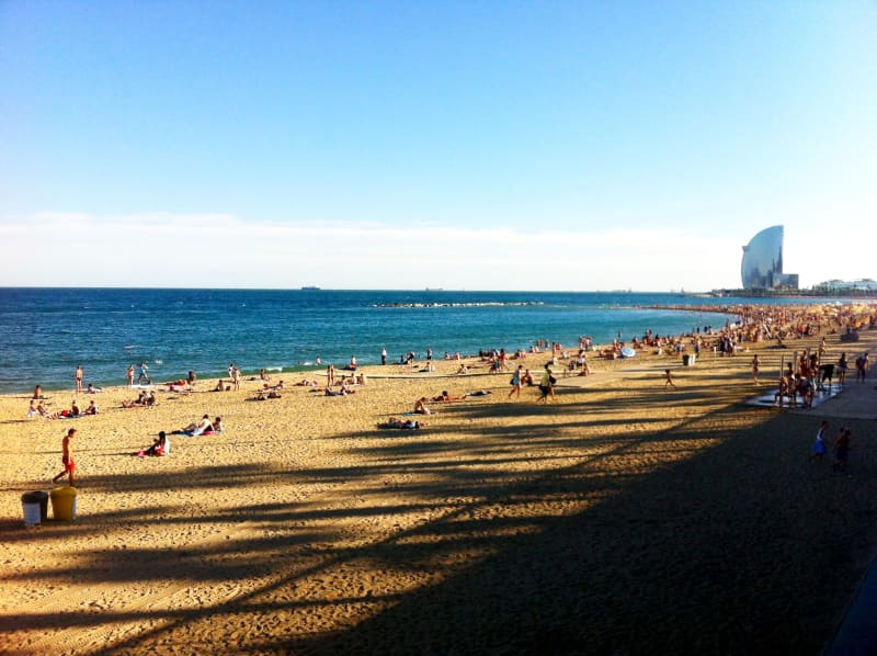 Playa de la Barceloneta in Barcelona (photographed by the author around 6pm on 24 Sep, 2012)
Anyway, here are the two mood boards I've created for My Ideal Map App.
For daytime
For daytime, I end up with the following images: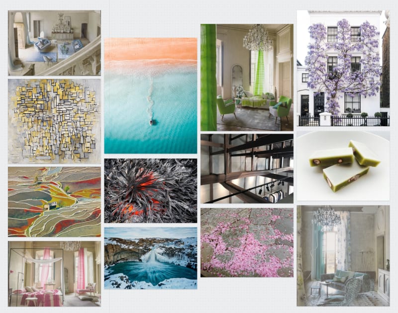 The mood board for the daytime UI of My Ideal Map App (Created by the author)
After seeing these images altogether, I realize what I am after.
First, different shades of grey or neutral colors like beige form a grid structure of straight lines or flowing curves, just like streets on a map.
Second, bright natural hues are "painted" over the neutral-colored network of "streets". These hues represent the saved places of the user's interest.
This is something you probably won't expect for a UI design project. At this moment, I'm not sure how this mood board will translate into an user interface. But this mood board is what I will come back to whenever I need a guidance during the process of building up an user interface.
For nighttime
For the dark mode, I get this mood board: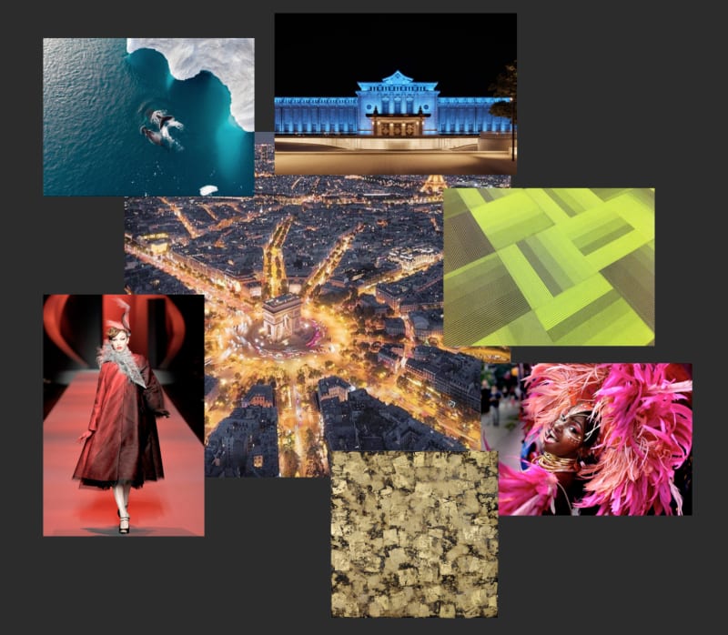 The mood board for the daytime UI of My Ideal Map App (Created by the author)
The image at the center is a bird's eye view of Paris in the evening. Roads are illuminated in orange with street lamps. The surrounding images in deep hues corresponds to the placemark icons saved by the user.
Unlike the mood board for daytime, I unconsciously picked less images from the nature, which is pitch-black at night. Instead, I tended to choose images of artificial light that illuminates cities in the evening or those of fashion that people may wear for night-outs.
Next step: Styling the map
Armed with these mood boards, I'm now ready to customize the style of Google Maps to be used for My Ideal Map App!

Top comments (0)